Jonathan Barnbrook was a British designer who studied at the Royal College of Art in London where he gained publicity for his innovative typography. After graduating he started his own studio where he took inspiration from Milton Glaser and Neville Brody.
His work was drawn from British influences and makes strong statements about war, consumerism, corporate culture and international politics, working both commercially and non-commercially. He uses originality with wit as well as irony in his work to create designs with strong political statements.
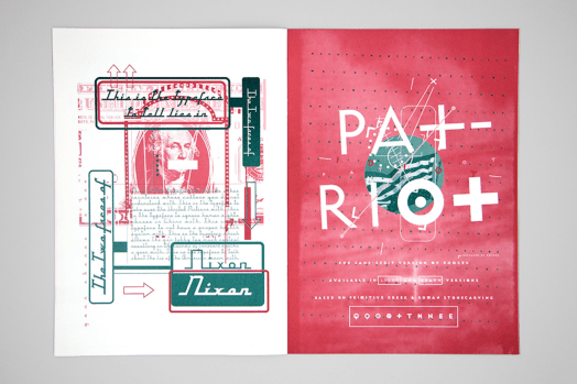
Barnbrook is best known for his interesting font names, such as Mason, Exocet, Bastard, Prozac, Nixon and Drone. He uses several layers in his work, using language and letterforms in harmony. His typefaces are full of personality, however they can be limited in their application because of this.
Overall I’m a big fan of his work and I love the way he layers his typography and images to create a sense of hierarchy and draw your eye to the text and images, as well as the bright contrasting.

Jonathan Barnbrook, Image source: barnbrook.net
