The Uninhabitable Earth: A Story of the Future by David Wallace-Wells
The brief – Timely and provocative, this New York Times and Sunday Times bestselling book has helped climate change to take centre-stage in our everyday news, coinciding with new green movements lead by Extinction Rebellion and Greta Thunberg. The cover design needs to reflect the themes and message of the book in a clear and engaging way and appeal to the broadest possible audience.
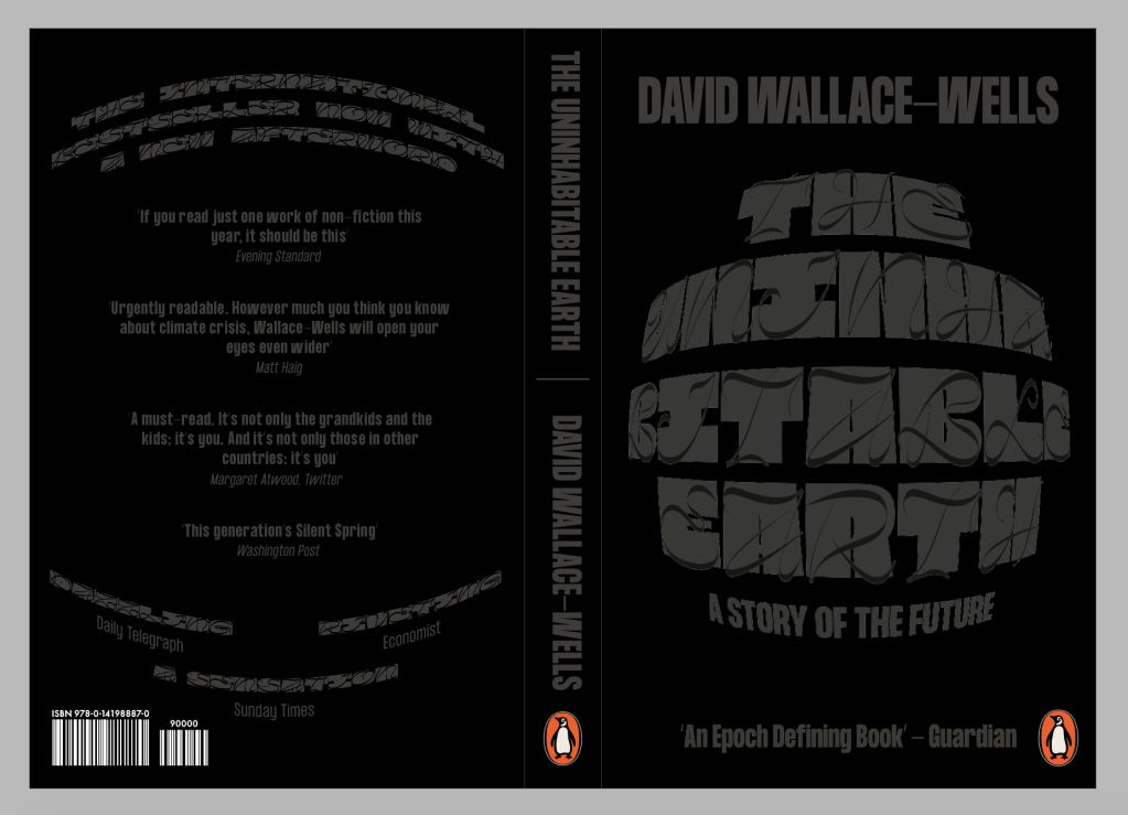
The book is about Climate Change and Global Warming. The author states “It is worse, much worse, than you think”, After reading the book its very clear that everything coming to us is very scary, almost like something out of a horror book. The book goes into how much of the earth will be uninhabitable by the end of the century if we don’t sort it out.
As you can imagine, 90% of book covers out there about climate change all follow the same theme. Fire, the earth melting, pollution etc and are all very obvious representations of the issue. Although they clearly work well and explain the problem, I wanted my cover design to still contain the sense of heat and warming but be much less obvious and cliche.
The Idea
The uninhabitable Earth is a terrifying rundown of the horrors which await in an ever-warming world. Wallace- Wells draws from the latest research in climate science to give us a final warning. Runaway wildfires, submerged cities, polluted air and global pandemics – these and other climate-induced catastrophes not only await in the very near future but in some cases have already arrived.
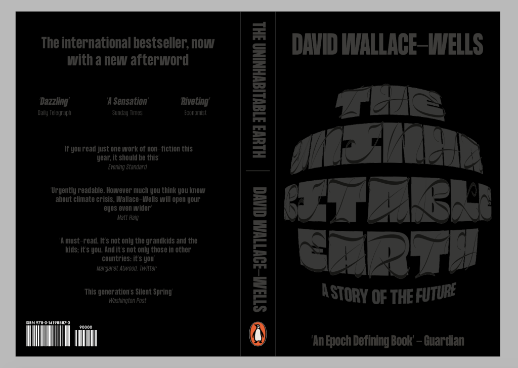
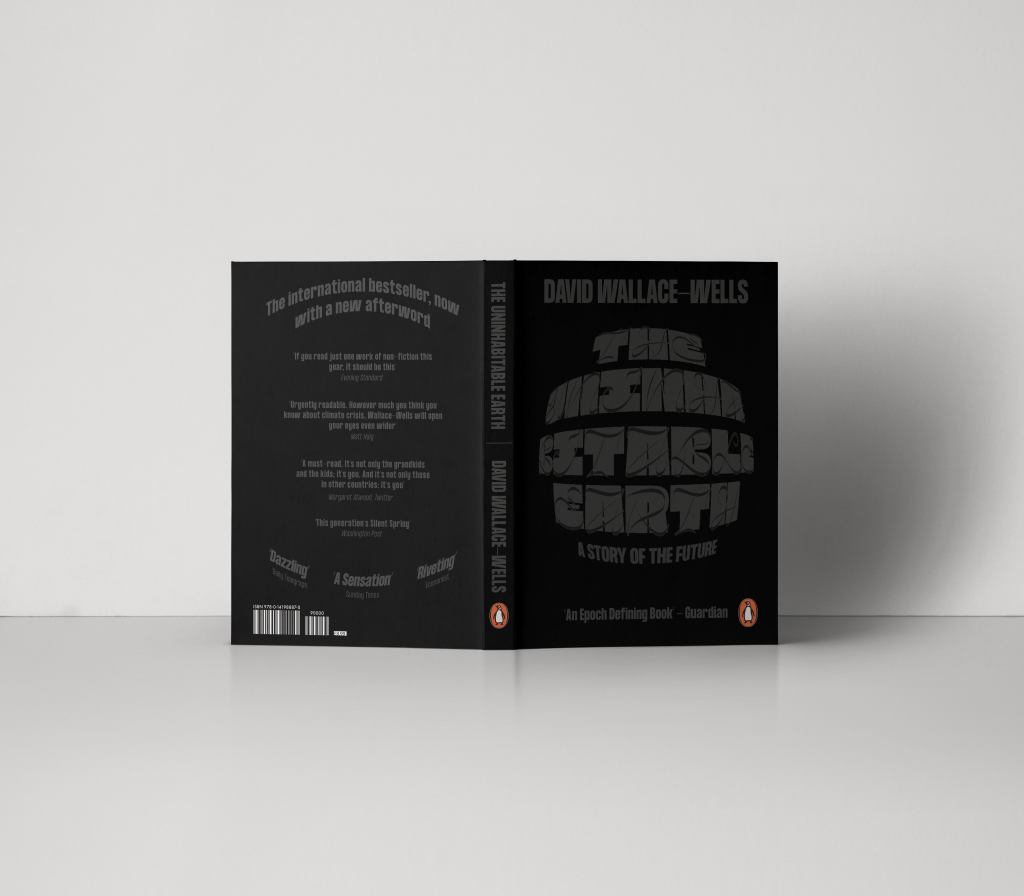
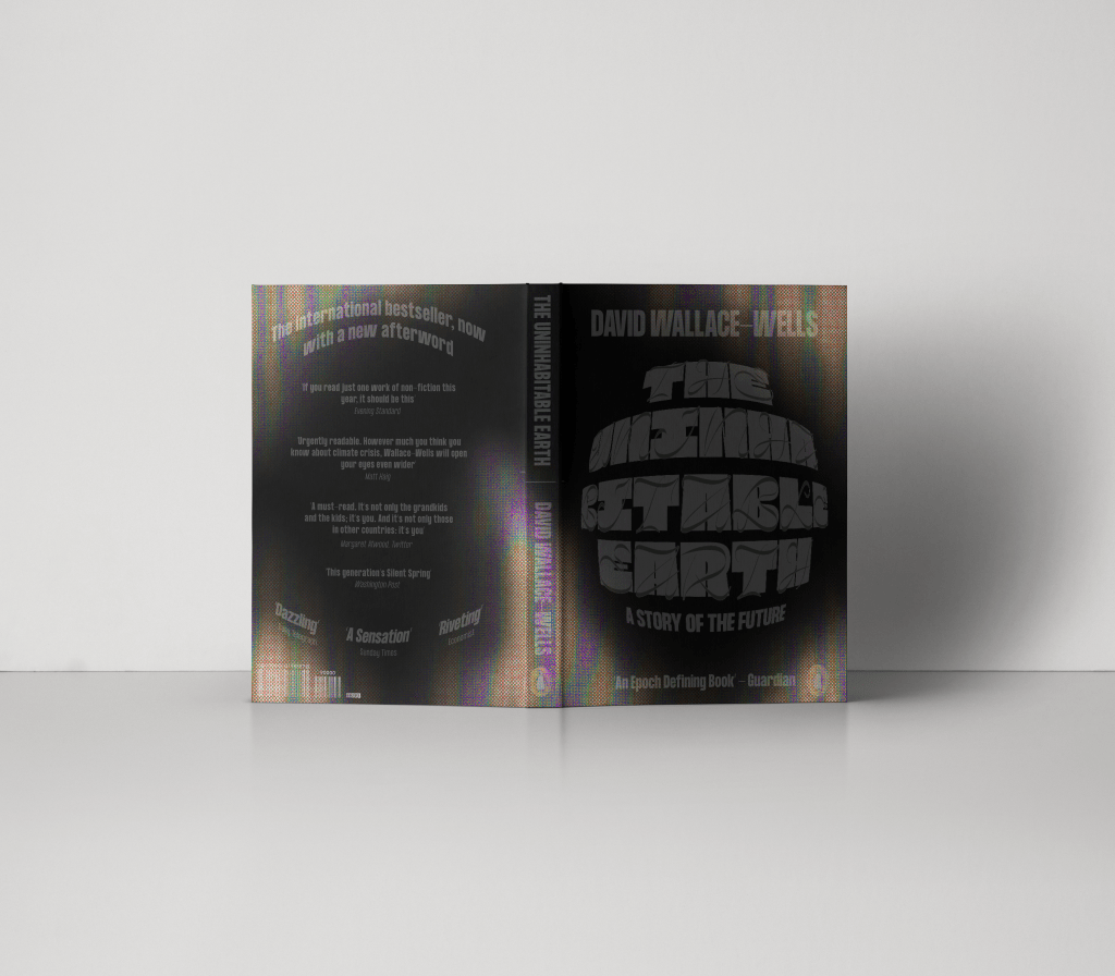
The book holds nothing back in shocking the reader through horrifying facts figures, as well as giving very worrying warnings as to what could happen in the very The concept behind the book cover was to create something which was as dark as the book itself. I wanted to ensure the cover was an illustration of a gloomy life which awaits us if we carry on how we are going, without living up to cliche’s of fire and ice caps which have already been overdone. The cover uses typography, featuring a dual typeface which looks at the duality between the beautiful serenity which nature can be, coupled with the daunting, scary side of nature which we are starting to bring out through climate change.
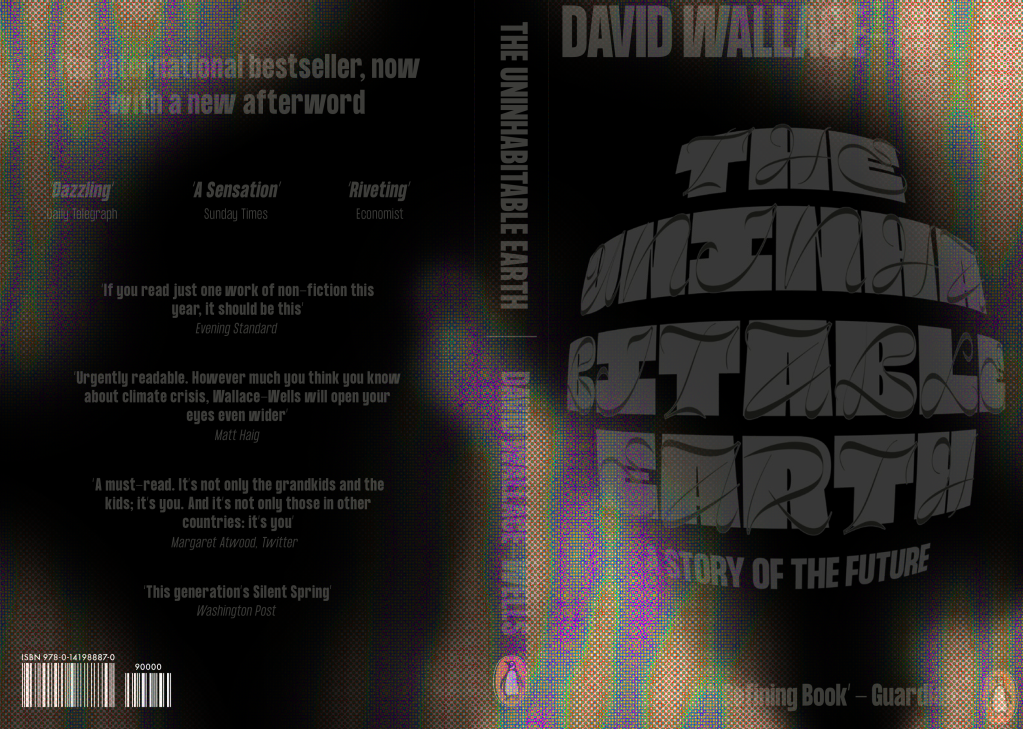
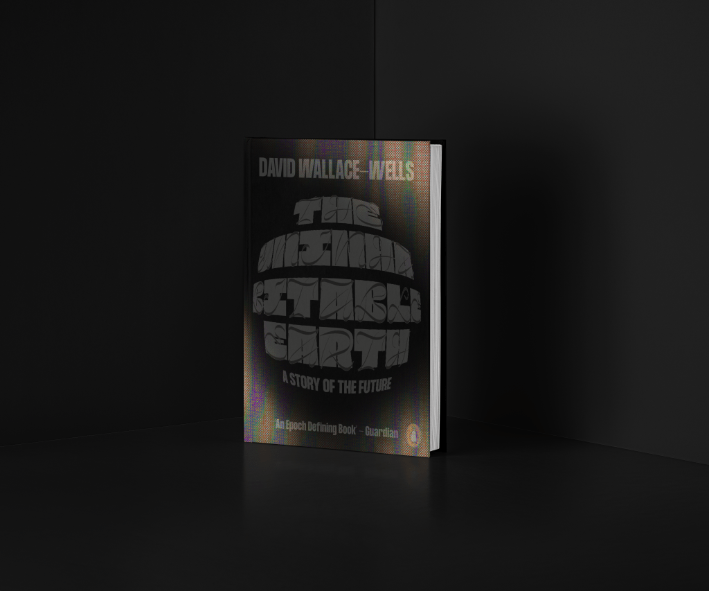
As well as the book cover itself being a metaphor for nature and climate change, the book boasts a heat sensitive cover which changes to a thermal imagery when heated by touch, the idea is to allude to heat and global warming in a subtle way without using the cliche of fire.
First Draft
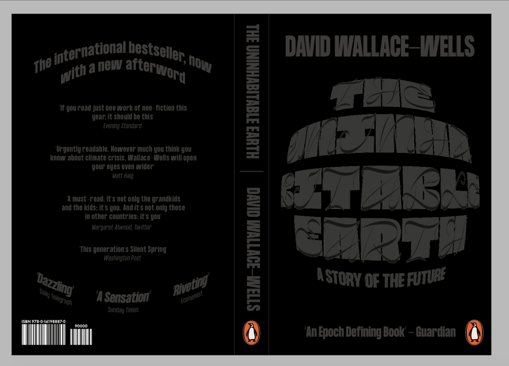
The first draft was a very simple version of was I was looking for, I didn’t have time to properly experiment with the back of the cover so it ended up being fairly simple and boring.
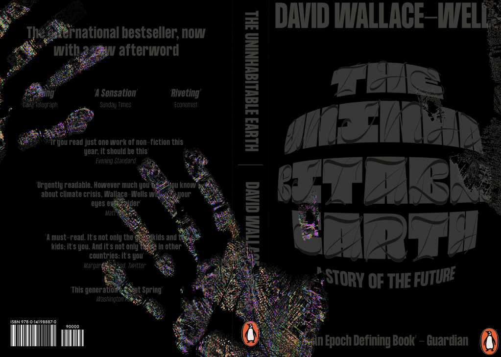
Experimenting with creating the look of a heat sensitive book. I tried using hand prints and fingerprints to get the desired effect but I think it looks a little too edited, so I think the first example works better to give a sense of it.
Feedback – The idea is strong, they liked the idea of the heat sensitive cover and how it alludes to heat and global warming without showing fire. The feedback was more about typesetting etc in order to make the design stronger.
Change size of the authors name ensure it doesn’t cut off and doesn’t fill too much of the page
Change the back spread to fit in better with the font, it looks too disconnected at the moment.
Development
I changed the sizing of the authors name just to make it slightly smaller and ensure it doesn’t take cup too much space on the page, or hang off the ends.
I then looks to change the back of the spread, I didn’t want to bring too much the front cover design onto the back and I liked the simplicity of thew from so I dint want to add anymore elements which flow from front to back covers. I thought the best way to add a bit more synergy between front and back was by using the curve of the main title on the front, just to show they’re part of the same cover and make them fit slightly together. I think it keeps it simple but also ensures both sides of the cover work together.
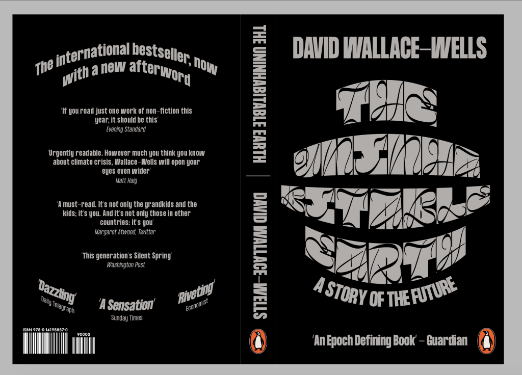
First idea didn’t work, the typeface doesn’t work at smaller sizes and isn’t legible at all.
Much better using the body copy typeface, is much more legible and stronger overall.
I also tried to change the colour to be slightly lighter, but I don’t like the way it looks and I also think it takes away from the original idea of the cover being dark and gloomy to reflect the aura of the book.
I decided to go with the second idea. Using mostly the same attributes, with a bit of resizing of some elements on the page and adding a curve to the top and bottom of the blurb to ensure the front and back both follow the same system. It hasn’t changed a large amount, but I think it is enough to take it up a level and make it more effective as a book cover.
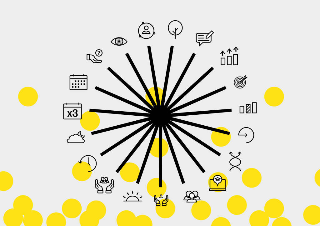
The feedback I received in terms of the star graphic was that it didn’t make enough sense in terms of the brand. It was too disconnected from the icons and guidelines themselves and the link needed to be stronger. This was the first thing that needed amending.
After deliberating about the star graphic and how I could incorporate it further into the branding of the project, I tried changing the logo itself, however in the end I think the most effective way to change it was not by changing the logo or icons themselves, but instead changing the way I incorporate them into the designs. Instead of using the logo and icons separately, I decided to ensure I used them together to clearly illustrate the fact that each icon is equal to one line.
The star graphic is designed in a way that it can be small or large, centred to the page or used along the outside of it with only a few lines showing, it allows me to incorporate the icons much more effectively which not only allows me to incorporate the logo to the brand more, but also allows the icons to become more prominent on the page.
Billboards/Posters
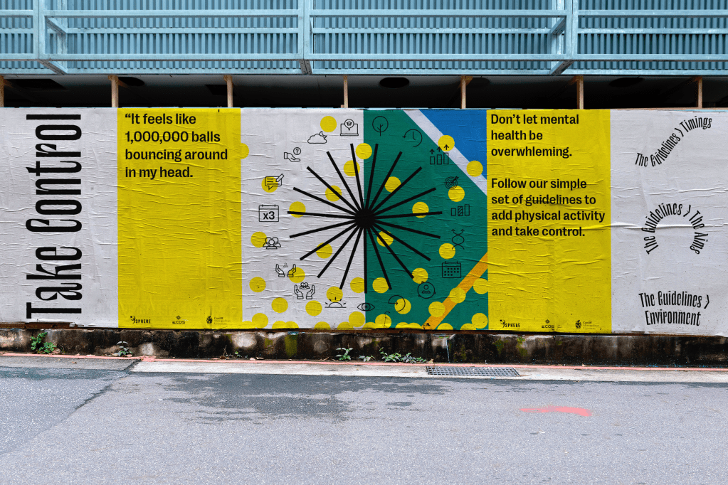
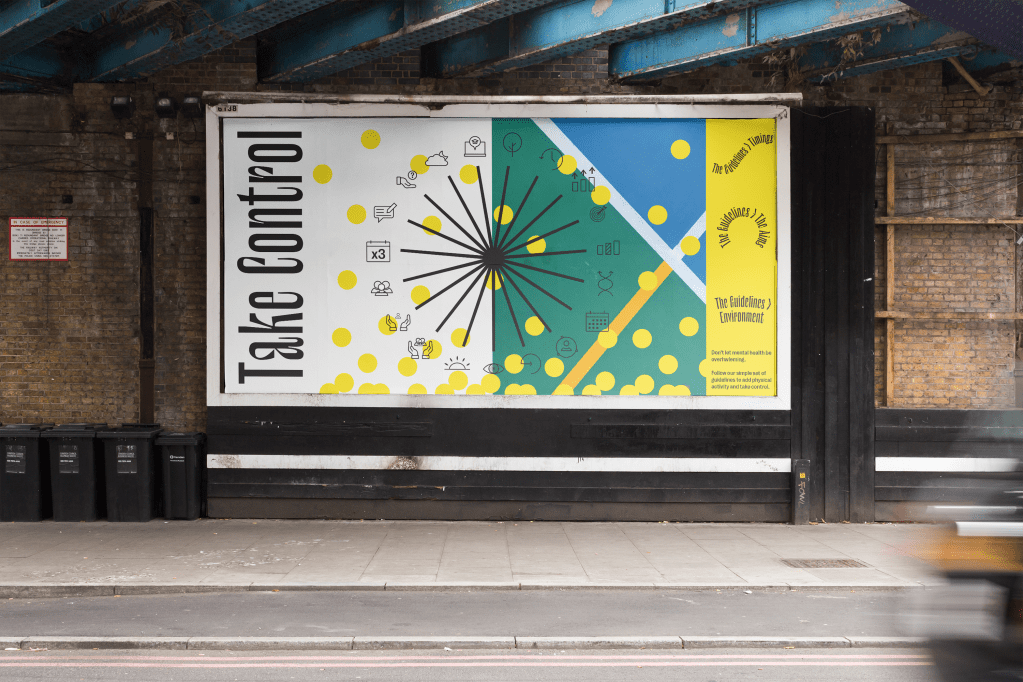
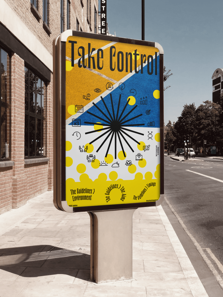
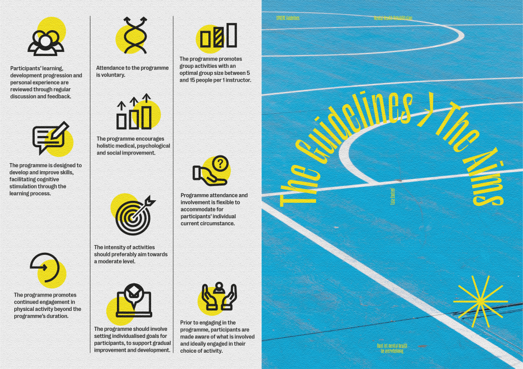
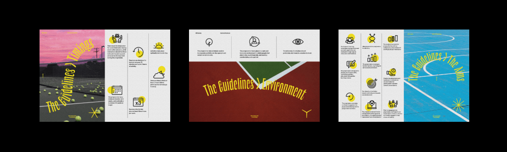
One of the other aspects of the campaign mentioned in my feedback was the clarity of the guidelines across my deliverables. Personally I was happy that the booklet, leaflet and website had a good balance between the visual style and the guidelines, however the second billboard to me seems more decorative than informative at first glance and doesn’t add anything to the campaign, so new billboards and posters were needed which show more about the guidelines and their link to the logo, making use of the icons. I do however think the first billboard is vital to the campaign, as although it doesn’t specifically show the guidelines it sets up the metaphor for the visual style and explains why the guidelines may be useful for a lot of people.
Taking the updated logo and icons I developed, I created new billboards which make much better use of all the icons and guidelines rather than a select few as shown in my earlier poster series. I think it’s much clearer to see what the billboard is about than previously and links the logo to the brand much more effectively. I kept the balls explanation because I think it acts as an important reminder of what the guidelines are all about and what they stand for, as well as why they are important to get involved with.
I attempted billboards and posters with more information about the guidelines however ultimately they were too clustered and actually added more information than was needed. The icons were designed to be visual representations of the guidelines so I think they were enough in the end.
The feedback was to cut down the noise to what really matters and go for purpose over decoration. I think the new billboard and poster style does just that in giving more information and insight into the cause and the guidelines, whilst insuring the design is still bold and eye-catching to viewers.
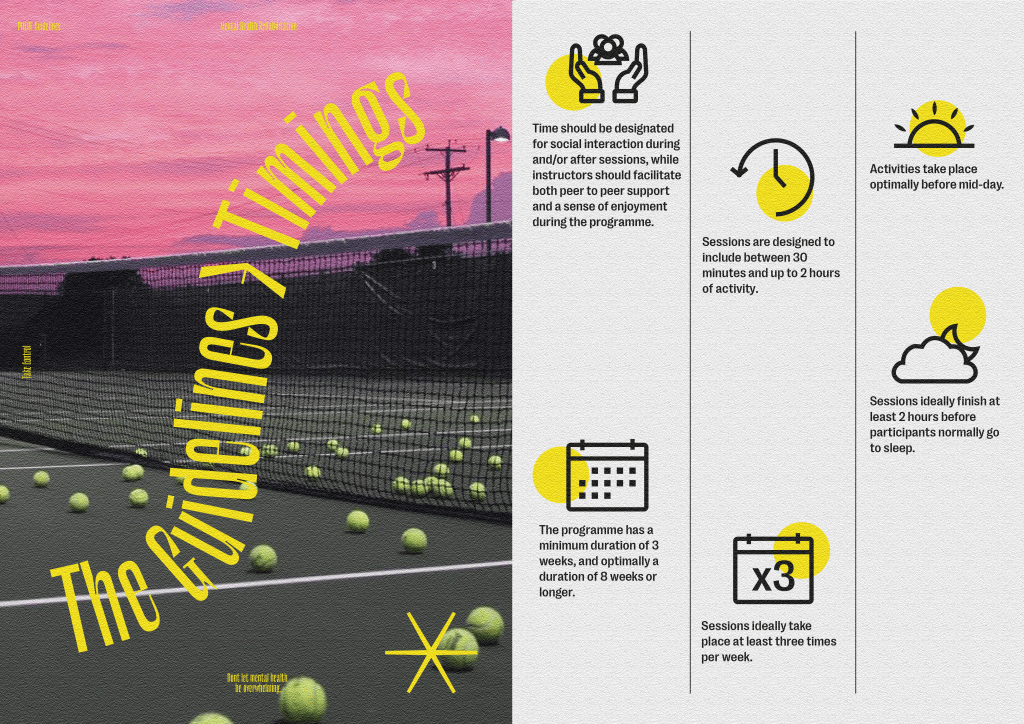
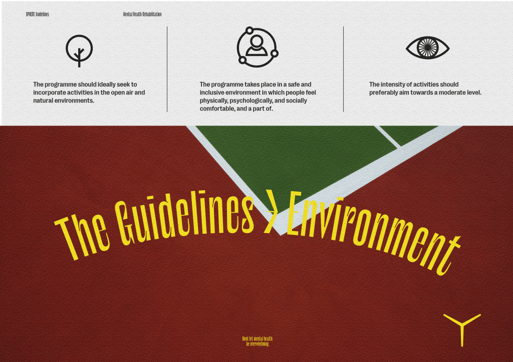
The feedback was that the leaflet and booklet both worked effectively to communicate the guidelines and some more information about the cause, therefor I decided to create posters similar to the spreads in the leaflet which can be handed out alongside other printed media to give a run down of all of the guidelines and exactly what each of them do.
I think it’s effective in terms of information design, giving the viewer exactly what they are looking for, without too much distraction from decorative design, if they want to find out more or use the guidelines. The posters can also be used within hospitals and sports centres on walls or as hand outs which was another important part of the brief, especially for an older audience who may not be as accustomed to digital media.
Animation
One of the touchpoints the clients mentioned was a video or animation explaining the guidelines and why they are useful. I don’t think the idea of a long-winded video explaining all the guidelines would be useful due to the amount of information, I think it would be useful to create a short animated video for the campaign.
One of the designs the clients were looking for initially was an animation, which unfortunately I wasn’t able to complete the first time around, so I decided to add a short animation to act as advertisement for the guidelines.
I created a storyboard and attempted to create an animation running through all of the guidelines, but ultimately the video was far too long and boring to be used. I instead went for a much more simple, short and quick animation which runs through the balls metaphor and how the guidelines can help to take control, followed by the logo and icons to give the user a glimpse of them. The animation also gives the link to the website where the user can find the in depth guidelines alongside the research.
App
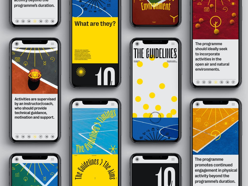
The website was an important and useful feature of the campaign in order to reach a younger audience, so I think an app which is similar and runs through information about Sphere and the guidelines would be useful.
The website received good feedback due to it being a great place for a younger target audience to read up about the guidelines and accompanying research. The website works because it allows the viewer to read extensively into the guidelines after being drawn into the campaign through promotional media, so I thought a more portable version of the website would also work well for the campaign.
The app is similar to the website in that it gives background information as to what the guidelines are, as well as individual pages for each of theguidelines, so the viewer can read them exactly like a guide. Again, I made use of the star graphic which is used as a wheel which spins to present each new guideline, allowing the logo to be incorporate into the design system.
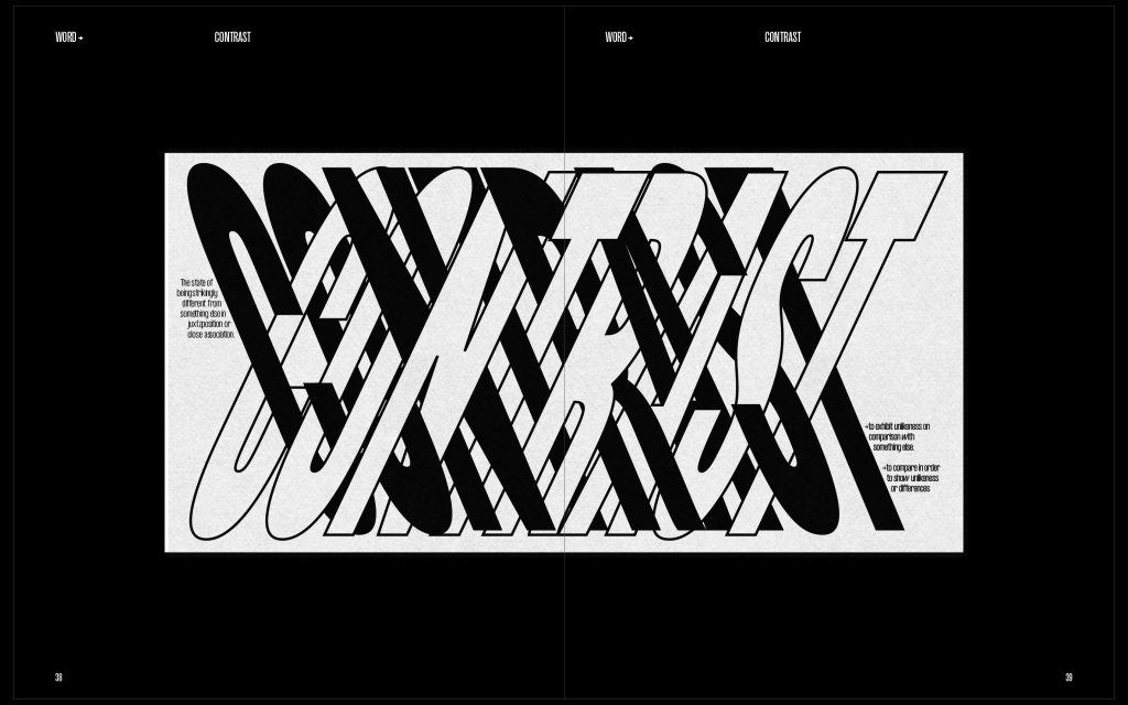
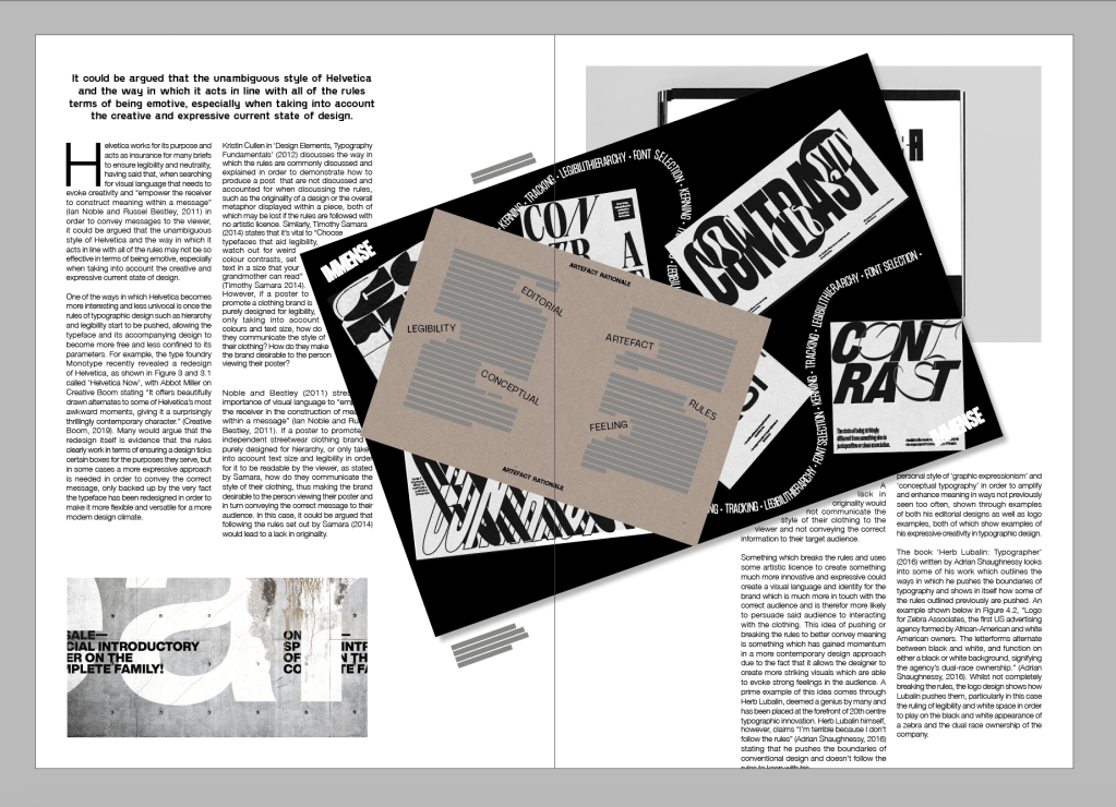
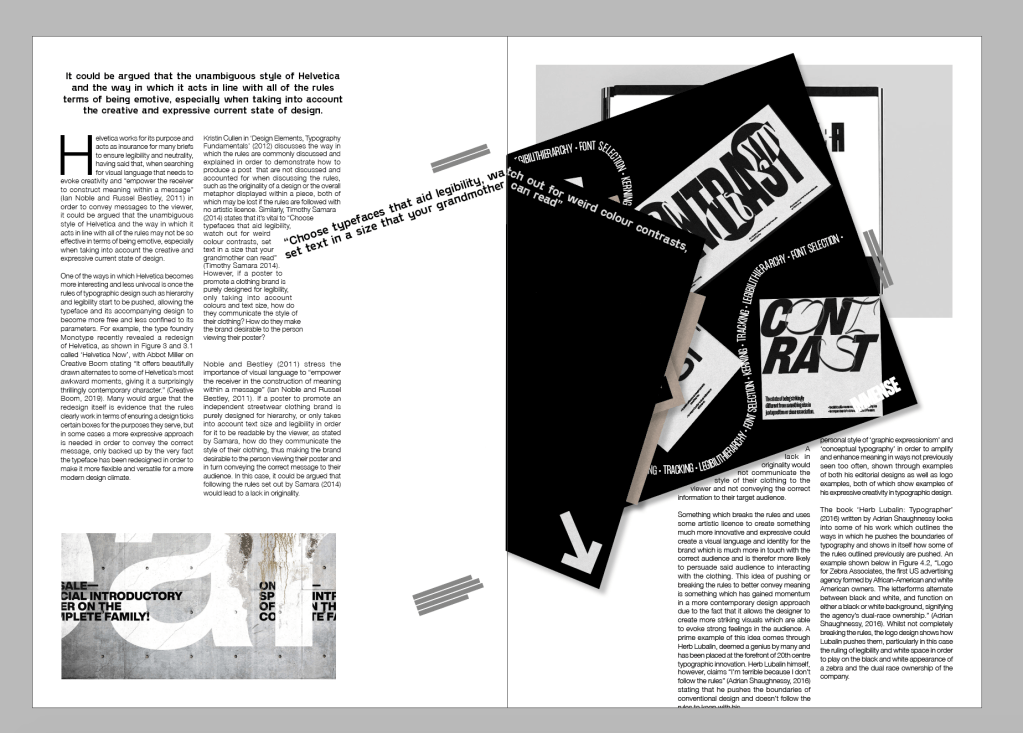
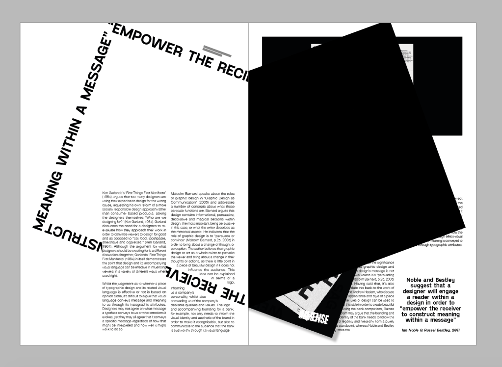
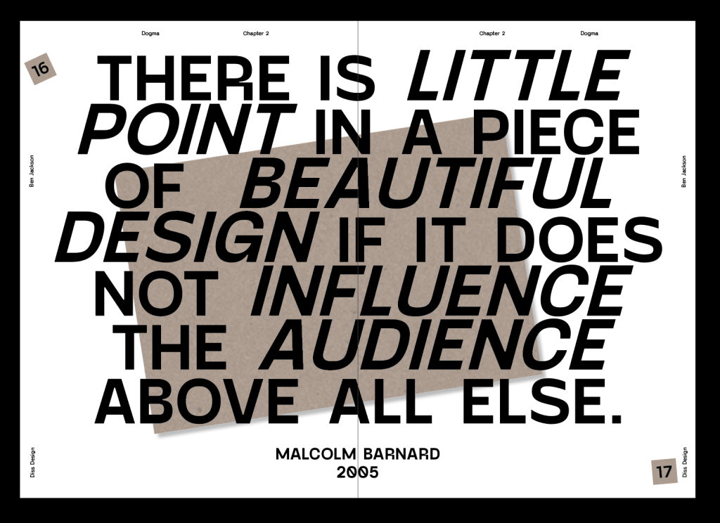
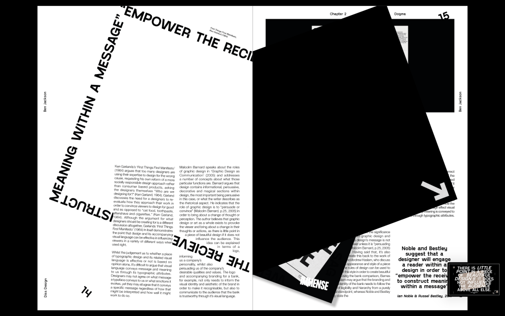
One of the most crucial aspects of design for both aspiring designers and senior designers alike, is to ensure that a design carries out a particular function and communicates the correct concept and emotion to the viewer regardless of its the way it may look. In my dissertation, I looked to investigate the communication of meaning within typographic design in order to determine what the differences are between using the rules or not using them on the overall transmission of messages through design to the viewer. Therefor, by experimenting with the guidelines and how they change designs visually, altering our perception of them, the focus is to transmit an understanding of the rues and their counterpart in terms of their specific purpose in the face of design.
As a designer, when to follow the rules of typography and when to push them is something I constantly ask myself in order to create design which accurately communicates the correct message to the viewer, so the dissertation was my way to find out more on the topic and create a broader understanding of it.
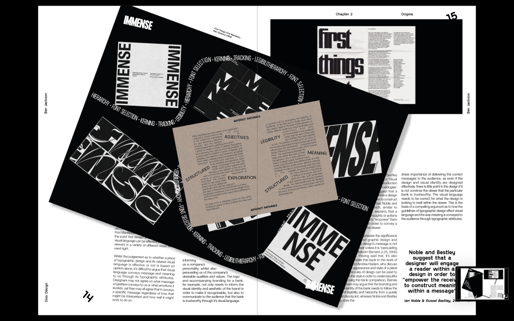
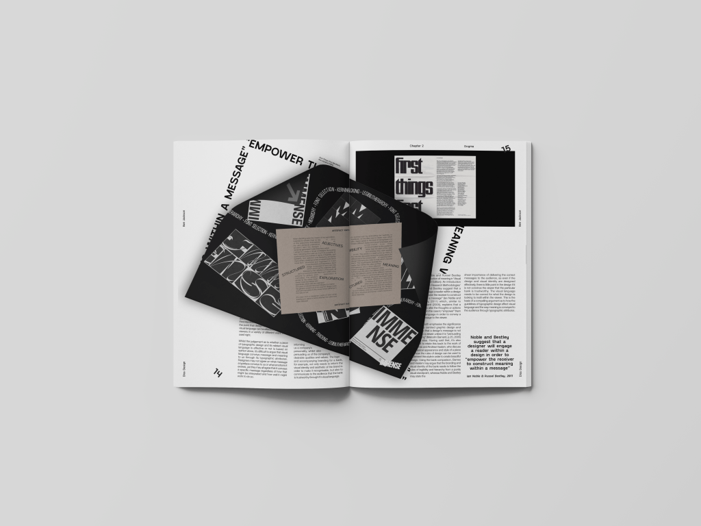
The dissertation was accompanied by an editorial which looks to investigate and encapsulate many of the ideas discussed throughout the essay, based around both illustrating many of the points outlined through my research and also experimenting further with the concept of following and breaking the rules. The aim would be for designers to see the publication alongside the essay and use it as a visual encapsulation of the ways in which the rules may be used, as well as the ways the rules may be pushed and notice the differences the two approaches may have in order to better understand them and better appreciate that they aren’t a set of authoritative guidelines which much be followed at all costs.
The concept behind the editorial was to take many of the ideas researched within the dissertation and visualise them. Following and pushing the rules to create an editorial which uses many of the guidelines to editorial design such as grid systems and hierarchy, whilst pushing them and tweaking them slightly to illustrate the fact that it can be done as long as it’s done for a reason, for example to draw attention to something or away from something. I also wanted to ensure I add my artefact into the design in some way shape or form.
The good thing about having an artefact already made was that I already had a basic idea of the style, very simplistic, most black and white but with some strong elements to go alongside.
Inspiration
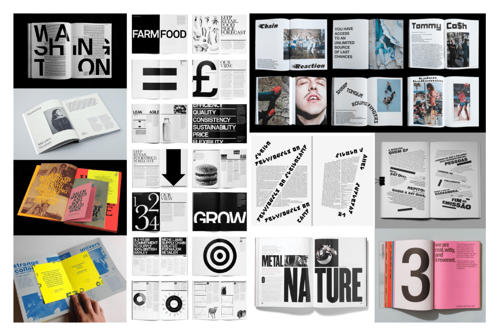
For my inspiration, I wanted to take a look at some examples of editorials which use very strong layouts and have a strong sense of typography throughout. The base of the editorial would be quality design which follows most of if not all of the rules, so the designs had to be solid technically, especially from first glance. The editorials particularly on the left are examples of editorials which are. very strong layout wise, following grid systems and particular layouts so it was important I took everything I could from them.
I also had a look into some design which pushes the boundaries a bit more, mostly shown on the right. The designs play around with legibility and grid systems to create something a bit more experimental, but the interesting thing I noticed was the way the type which tends break the rules tends to be some of the more important aspects of the page, headings, subheadings, pullout quotes etc and helps with the hierarchy of the spreads. It was interesting seeing editorials using ‘rule-breaking’ design to draw attention to parts of the page which are more important.
First Draft
The first draft was a very basic idea, but I wanted to show David the basic principle of solid editorial design, following the rules creating a strong spread, but with the application of the artefact, the rules start to be pushed slightly. The artefact would be added as a separate page within the spread, but on an angle to draw attention to it and ensure its place as the most important part of the page.
The artefact page would turn over to show the rest of the spread underneath it.
FEEDBACK –
David liked the idea of the strong editorial mixed with areas of slight chaos, but he mentioned that I could push it slightly further than I did in the initial draft. He mentioned moving captions around to fit around the artefact rather than the grid system, and even moving some other elements on the page to do the same sort of thing. Ultimately the idea is there but it definitely could be pushed further to make it stronger.
Second Draft
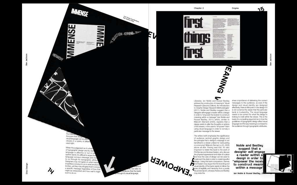
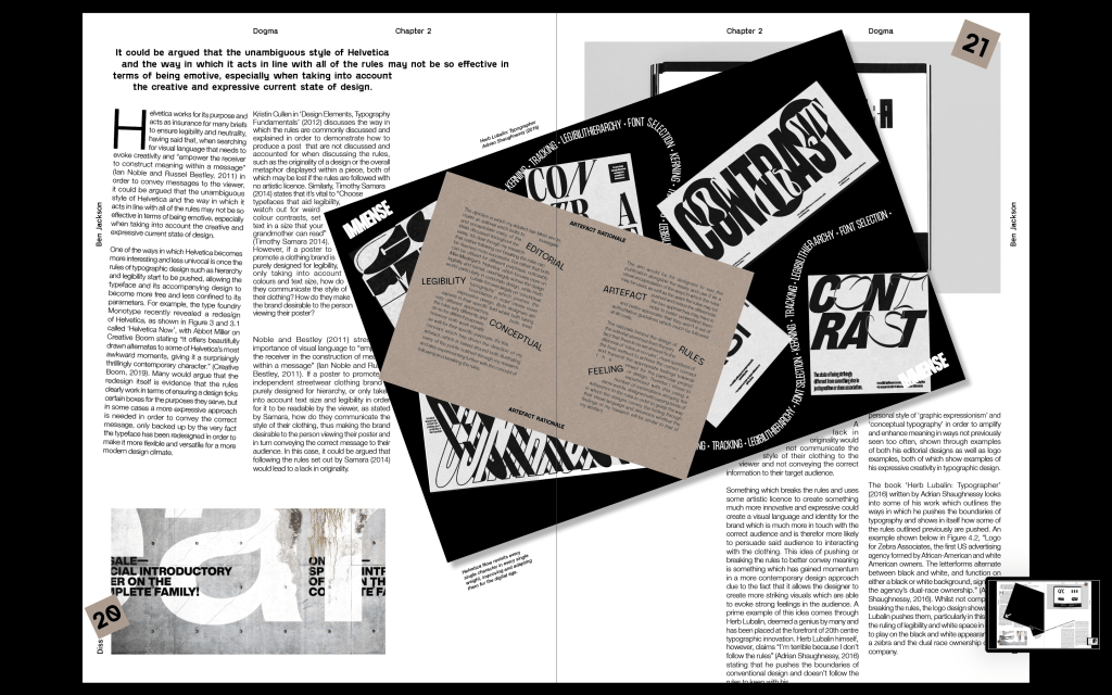
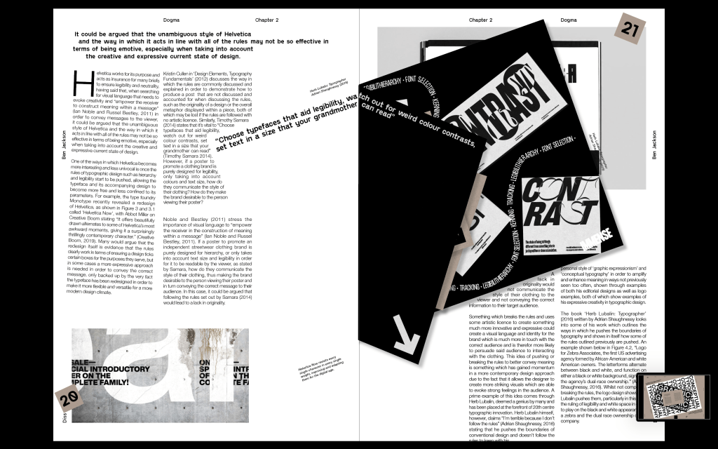
My second draft took the idea of the first spread I designed but definitely took the general design up a level. I changed the main typeface, first off I was using Helvetica Neue due to the fact the spread was about Helvetica and it’s uses in following the rules of typographic design. However, it didn’t feel strong enough and I didn’t like the slightly condensed look of it, I wanted to go for something which was still a very structured and well formed sans serif, but with a bit more character. Again this was one of the things I researched into within my dissertation, that pushing the rules slightly at the right times, in this case some of the quirky letterforms within the typeface, it draws the viewers attention to those details more, and if the idea is to be expressive that can work really well.
I kept the style of the first spread very much the same, just changing some minor things to make it look more polished. Changing some of the imagery because I think they just fit much nicer on the page and adding a few details like a drop. cap, turning some of the captions to fit in with the artefact etc. I also adding in a few more details like the bottom body copy hanging off the page, the shape of the artefact cutting into the body copy on the left page etc. Just to really hit hime with the idea of the rules being pushed and broken to some extent.
Also adding pull out quotes to the inside of the artefact page to make it feel slightly more involved with the spread itself. I also added an extra page for the explanation of the artefact as another extra page within the spread. Although I wanted to keep the page black and white, I added the brown colour of the page, again just to draw that little bit of attention to it. The brown was to add a colour but still keep it fairly neutral, matching the style of the artefact.
Feedback – Add some other elements around the page to fill it in a bit more, folio etc. Maybe add a few more ‘quirky’ elements on the page, if Im going by the idea that some areas which push the rules are done so to draw attention to them, make sure I do so for the first paragraph on each page, and pull out quotes etc to ensure that it draws attention to some important parts.
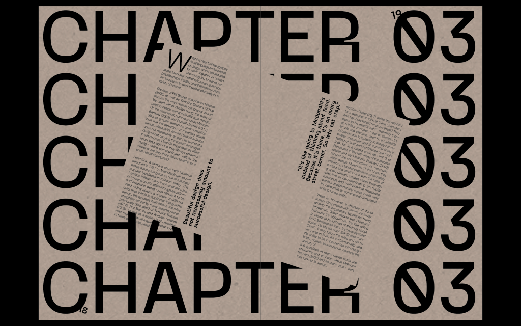
After feedback from the previous spread, I started adding a page numbers, spreading them around the page so they aren’t all uniform and what you would expect to see. Again, as seen on the previous spread I left the body copy on the left to hang over its borders, again just to draw attention to that first paragraph. I also added a split mid way through a sentence on the right side, not necessarily to draw attention to it but just to further the feeling of not everything being perfect.
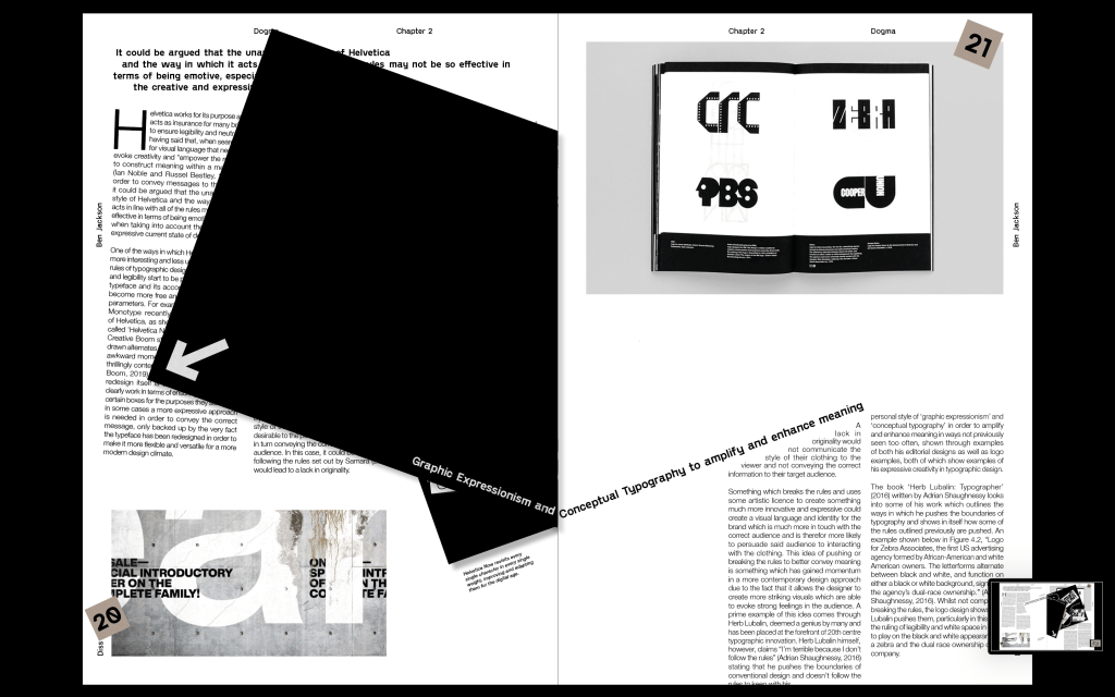
Feedback – David liked the spread and just had a few things about typesetting etc which I could improve on. After showing Joe and Jez they had the idea to push it a step further and have the whole spread sitting landscape instead of portrait just to change it up a bit, this was something I would only be able to do on one spread but I felt like its important for the chapter page to stand out, so having it landscape would help with this.
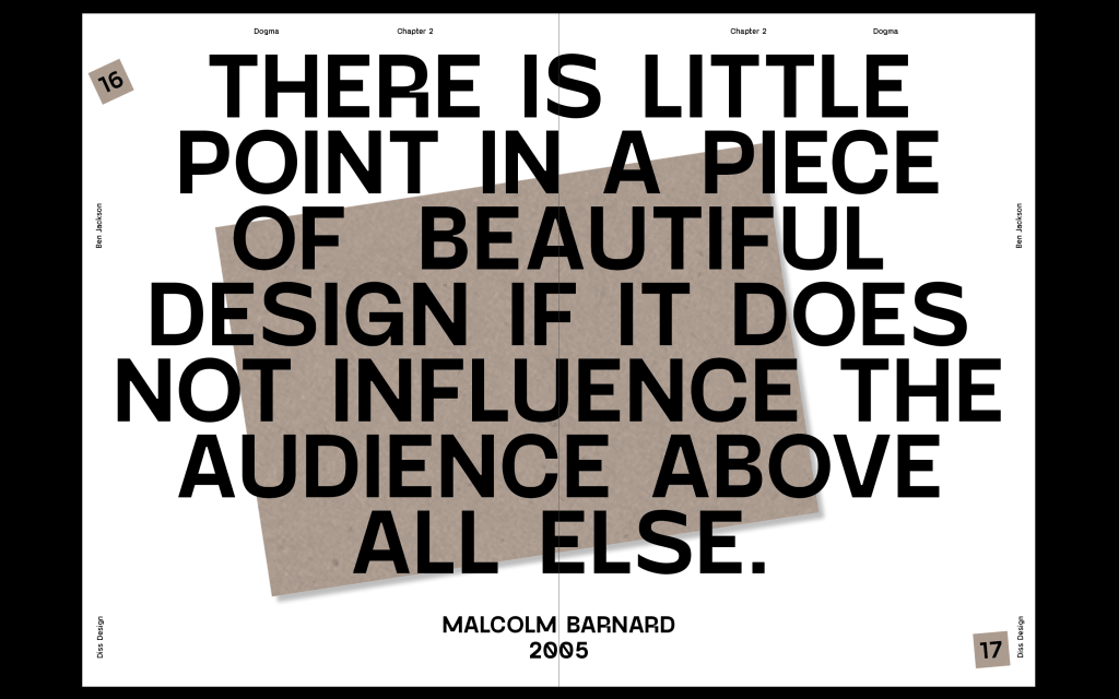
I designed a 3rd spread to sit mostly in line with the first spread, something similar but with a slight change I layout and overall design. After using the artefact page in the first spread to change some of the body copy shapes, I also wanted to use the shape again with this spread, and I though adding a pullout quote in the shape of it would be really strong.
Feedback – Strong spread, but definitely needs some other elements on the page, particularly on the left side as it’s definitely a bit too white and empty. The base is there, but it isn’t as strong and developed as the previous two so I need to to a bit of work to get it up to scratch. The artefact page also needs an arrow on the inside. I think it also needs something on the first paragraph. I think it’s fairly clear that that is where the reading starts, however a little rotation or something a bit different would draw attention to it.
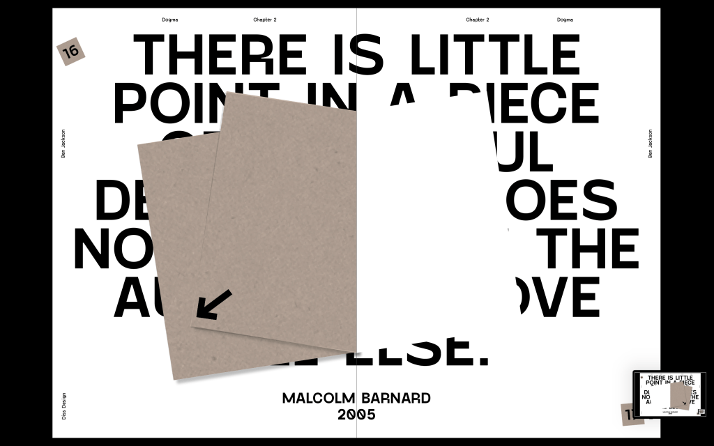
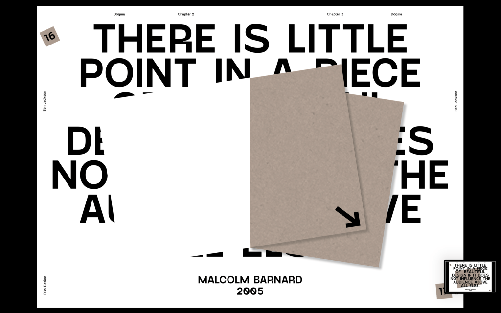
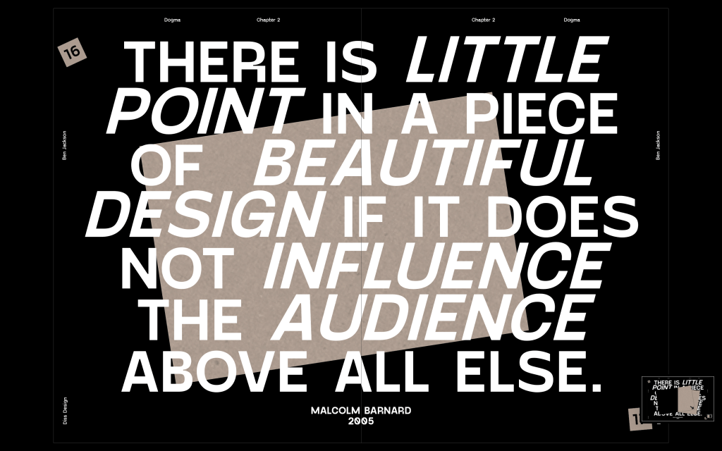
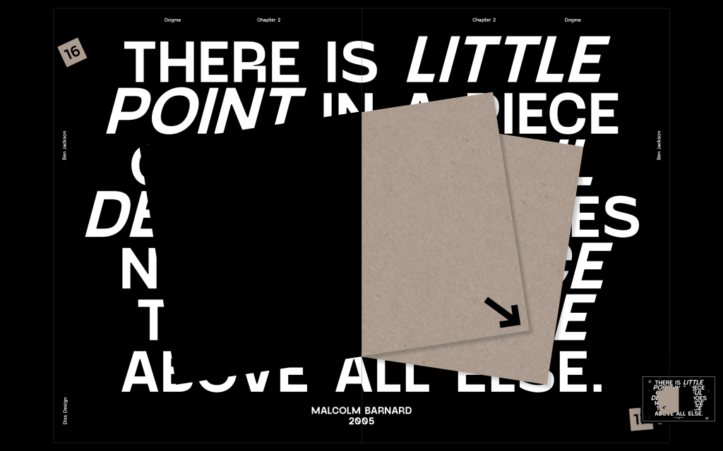
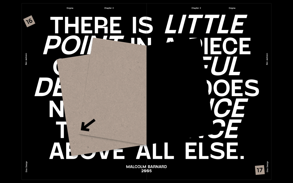
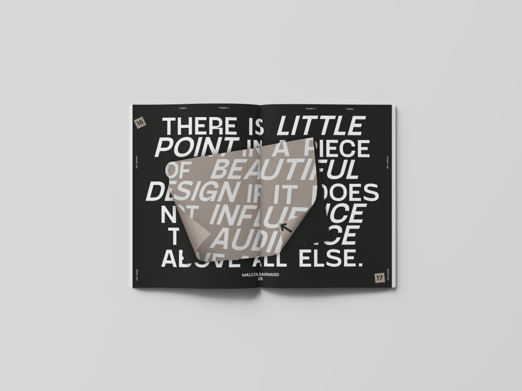
The idea behind the 4th spread was to break up the pace a bit and ensure not every page is just body copy. I used a pull out quote from the previous spread and filled the page with it, making use of the inside pages to change to add another feature to the spread. The idea is that the quote is about beautiful design being influential, so the influential part is to convince the viewer to turn the inside pages, revealing that there isn’t actually anything there, but the design was strong enough to get them to do it in the first place. I also added some elements around the page, including the folio, name of the book, chapter number and my name.
Feedback – David liked the spread a lot and though it was strong, but asked a few questions about making the sense of typography stronger, maybe pulling out some words and making them bigger or bolder to really hit home with the idea. he also though the elements around the page were strong and would elevate the previous spreads.
I experimented with a few ideas playing around with the layout and I think the spread on the right works the best out pf what I tried, it feels much stronger than the first spread in pulling out some aspects of the quote. It needs a bit of work on some of the spacing but it is much stronger than the original spread.
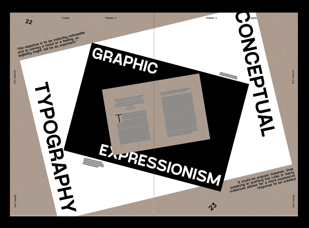
The final spread I attempted to design something using this idea of graphic expressionism and conceptual typography which I speak about within the dissertation. The idea was to give the body copy and explanation alongside a graphic behind it which gives a sense of expressionism through typography. Overall I like the idea of it, but it needs a lot of work if I want to show the idea of expressionism, at the minute it really isn’t showing that. I also need to play around with the pullout quotes a bit more.
The spreads all need a little bit of development on the typesetting part as well, a few too many rivers in the justified text.
Final Designs
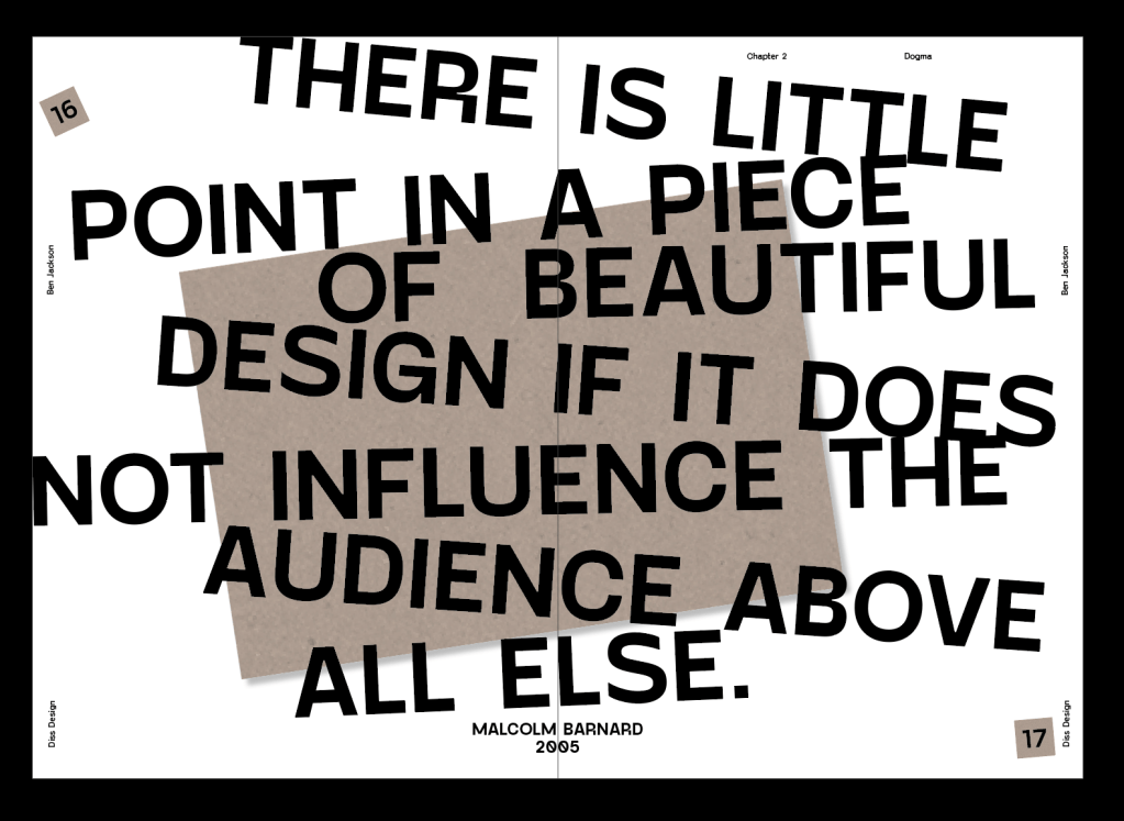
Added elements around the page which really fill it out, specifically the left page which now doesn’t feel so empty. I also slightly rotated the first paragraph in order to draw attention to it in a slightly different way than a drop cap or pull out quote. I also sorted out some of the body copy and got rid of some rivers.
I used the development of the previous spread and changed it slightly more on the spacing side. I also changed the colour to black because I thought the pace needed a bit of a change in colour.
I turned the spread sideways and I think it is much more effective this way, the spread is important as it is the change of chapter so having it sideways really draws attention to that change. I think is much stronger when in landscape.
Again adding elements around the page which really fill it out. I rotated the first paragraph, again to draw attention to it and add to that sense of hierarchy. I improved some of the justification, particularly on the paragraphs which are cut off by the artefact page. I also added arrows to the inside of the artefact page.
this spread has improved a lot from the beginning, just using a bit of license to be much more expressive with the typography has allowed it to improve leaps and bounds from the start. Im much happier with it and how everything sits on the page.(Black box was a glitch on indesign, it’s gone now)
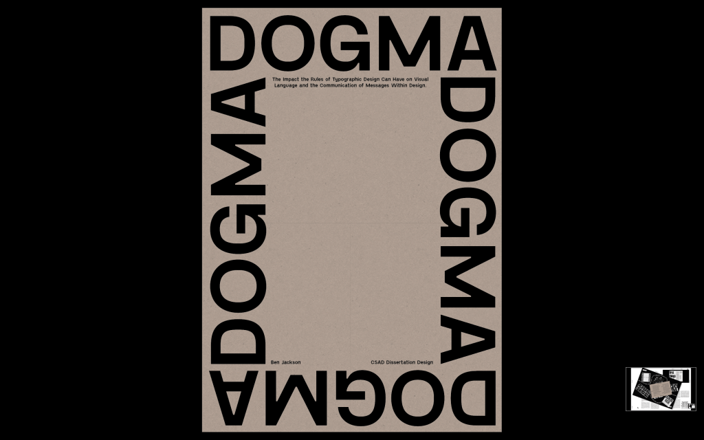
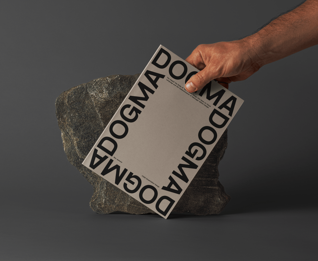
Finally, I designed the front cover. I wanted it to be very simple, with such a strong name as dogma all I wanted to do was draw attention to the name and celebrate it, alongside giving the name of the dissertation itself, with my name and CSAD.
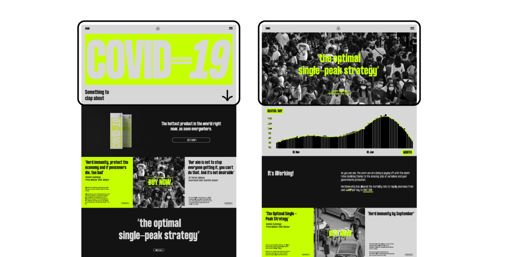
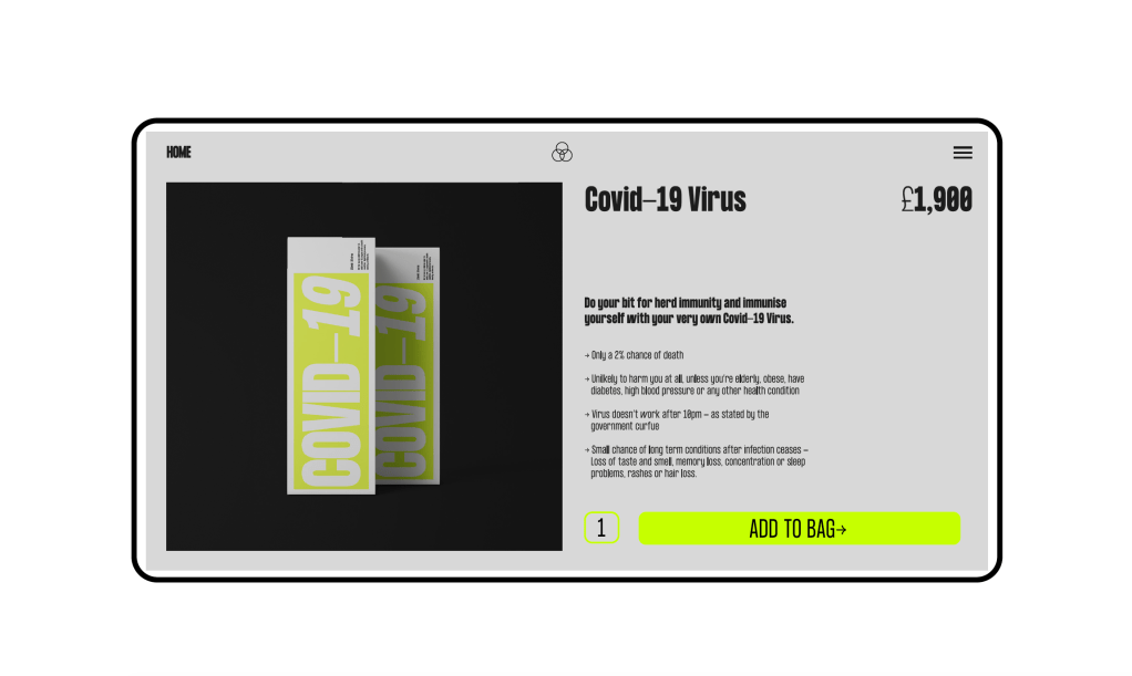
The death toll itself tells the story of how the pandemic has effected the UK and unfortunately in other countries worldwide the rates have not been much better. Unfortunately the virus was not handled correctly in the early stages, from late lockdown, to the eat out to help out scheme, to 20,000 deaths being consered a job well done, the pandemic has not been handled correctly in the Uk from the very start. The virus was not seriously enough to start and many schemes put forward by our ‘superiors’ didn’t take the virus seriously enough, in turn losing thousands of lives. The idea is to create a website to sell Covid as a product in itself, using controversial comments and actions from our public figures as ways to market it. The main points I took away from the feedback was that the design of the website was strong, but the rhetoric within the website was confusing, which upon reflection I would agree with. The idea was to use phrases from government officials in an ironic way to ‘sell’ the virus to people in order to show how crazy some of the comments were that they could be used in that way. And while that is still partly the idea behind the project, the originial contained some parts about herd immunity, some about death rates, some about lockdowns and more, so overall there was too much going on which ultimately made it hard to understand.
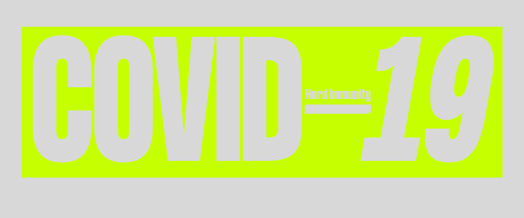
After more research and discussion about the design, I am still confident that using government officials phrases works well to criticise the government in showing just how ridiculous some of the comments sound, especially when used in an ironic way, However, due to their being too many different topics going on, I decided to stick with just one area, herd immunity. Keeping the idea of the virus being sold for purchase in order to help out with herd immunity, which has been discussed extensively and in the early stages was documented as being the governments proposed response to the pandemic.
Whilst using the same design, I have changed the tone of voice so each part of the website is based around selling the Covid-19 virus as a way to build up herd immunity as was proposed by the government. It is clear now that the government were warned away from herd immunity in the initial stages due to the fact that it would be risking thousands of peoples lives, however many still continued to back the idea regardless. After outrage, the government claimed they never planned to use herd immunity despite it being reported that it was the official plan until it was ‘ditched’.
The idea is the same as before, using irony and the government officials comments to show how useless many of them were in the beginning of the pandemic, however now the idea has streamlined to being all about the idea of using herd immunity to solve the problem. From changing the name to “optimal single-peak strategy” to hide what it really is, to discussing the fact that it is not desirable to stop everyone getting the virus, the website looks to criticise the actions and decisions of those high up within the government in relation to inititial calls for herd immunity by using their own comments to market the product.
Changing the tone of voice was something I thought about a lot, however I decided that ultimately the irony and sarcasm was the best way to ensure it’s clear that the project is criticising the government officials and not stating that whatever is said on the website is true.
The release video for the brand was the most important part and the one which had to be perfect, even more so than everything else. The other outcomes, as long as the government response based visual language I created were in there, had some license to play around a bit and create design which was striking and captivating with the soul aim of looking great and encouraging viewers to engage. The release video, whilst it still needed to be all of those things, also needed to sum up the project and what the brand stands for in one place so it was important I got it right.
The brand builds up to the 21st of June 2021, the date of an ‘upcoming release’ for the brand, which is in-fact the date of the end of lock-down in the UK, another Covid reference hidden away within the branding. The day of the 21st is actually a release date for the real reason behind the branding and where it all came from.
The idea is that on the 21st, the website and app, as well as promotional material through augmented reality will change completely in their design to reveal the real reasons for each of the aspects of the visual identity with facts and explanations for each design choice. The release video is at the forefront of this, giving the initial explanation when the website or app is opened.
I kept the initial video short and snappy, giving few facts and figures and instead relying more on strong visuals and the most important, captivating pieces of information to draw the viewer in and convincing them to want to find out more.
1st Iteration
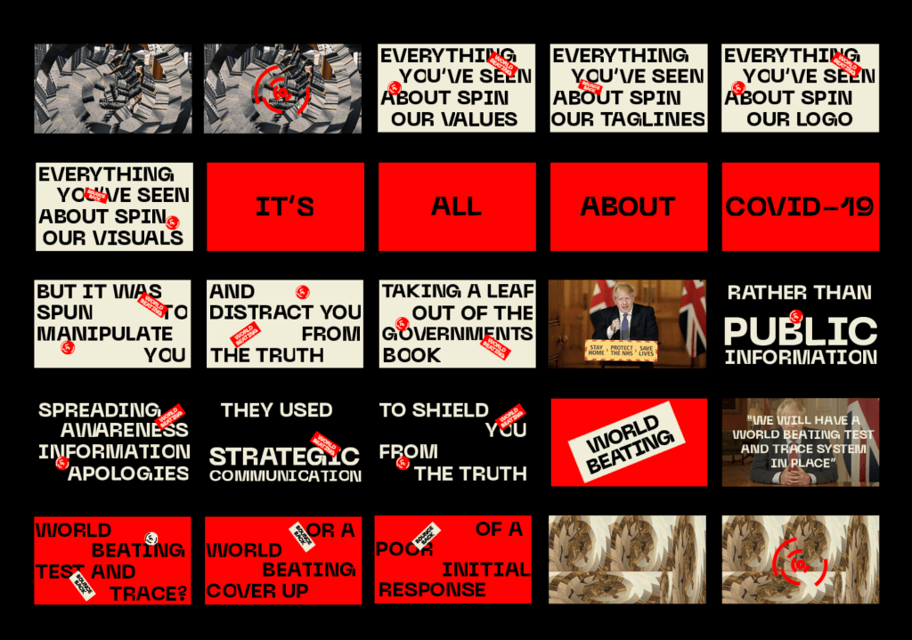
The video contains information about the propaganda side of the brand initially to explain the whole idea behind the brand being about covid and not actually about sports, followed by some other explanation about the governments response and how that has affected the branding. The idea was to create a short and punchy video explaining some of the main parts, specifically the propaganda and reason for the spin of the brand, to be followed by the rest of the website which would look further into each aspect of the response and give more information.
FEEDBACK –
After showing David, there was some things we discussed which needed changing in the video. The main issue was that the video was a bit cryptic and some comments such as ‘distract you from the truth’ could’ve been about anti-vaxxers or conspiracy theorists and not about the propaganda and government response. Thats an issue because although its only an initial video to catch the attention and explain initial points, it still needed to be clear exactly what it was about.
Main points –
‘It’s all about Covid’ needed to be more about the governments response to covid and not just covid as a whole
Public Communications and Strategic communications could be explained a little bit more to talk about what is actually meant by that. Talk about the use of patriotism and other aspects of the propaganda specifically so its clearer.
There were also a few other smaller parts such as a voiceover and backing track, the video seems too flat and dull, a voiceover also allows me to explain some parts of the video slightly more. We also discussed adding examples from the government of what i’m talking about to show it in real life. Finally, I decided that the explanations at the end don’t need to be a part of the initial video and can come later on within the website, the video is all about explaining the initial points and then the website can show the rest of the information and reasoning behind the visual language.
Final Video
I changed the wording of the video to be less cryptic and more informative and I think it works much better at giving a quick rundown of why the brand is spun and some of the information surrounding that. I think it is much more effective than the first draft, and the music and voiceover also feels much more effective overall.
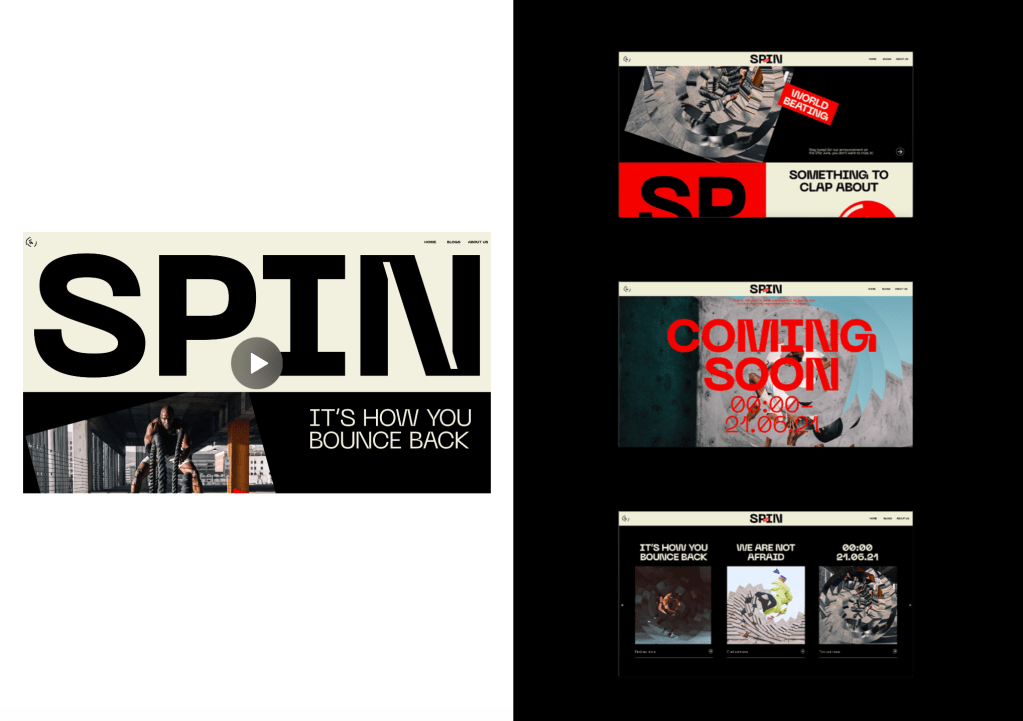
After the initial release video, drawing the viewer in, the rest of the website allows them to read more deeply into the design decisions and find out more about what the brand really stands for. Keeping the same designs, however changing the information and imagery to purely Covid and government related visuals. The website gives a run down of everything the brand stands for and therefor stands as the most important aspect of the whole project.
I also added an example of what one of the billboard would look like containing the new information after the release, the idea is the billboard would all be viewable through AR via the app and would all change to reveal the same information as the website.
Overall I am happy with the final outcomes for the release and I thin ultimately they all give a good rundown of what the brand really stand for and the main reasoning behind the visual identity itself and the reason for the whole idea of spinning the brand. It took the longest to complete purely down to the wording of much of it, however I think in the end the work does the idea justice and explains what I was looking to explain. It gives information about the governments propaganda and how that was influenced by their poor response, as well as specific details about that response and provides a benchmark for the audience to form their own opinions and hopefully find out more about both the government and their handling of the pandemic, as well as the way in which the government use propaganda in times like these.
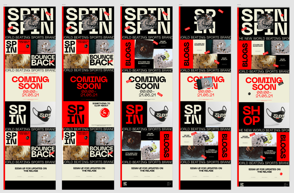
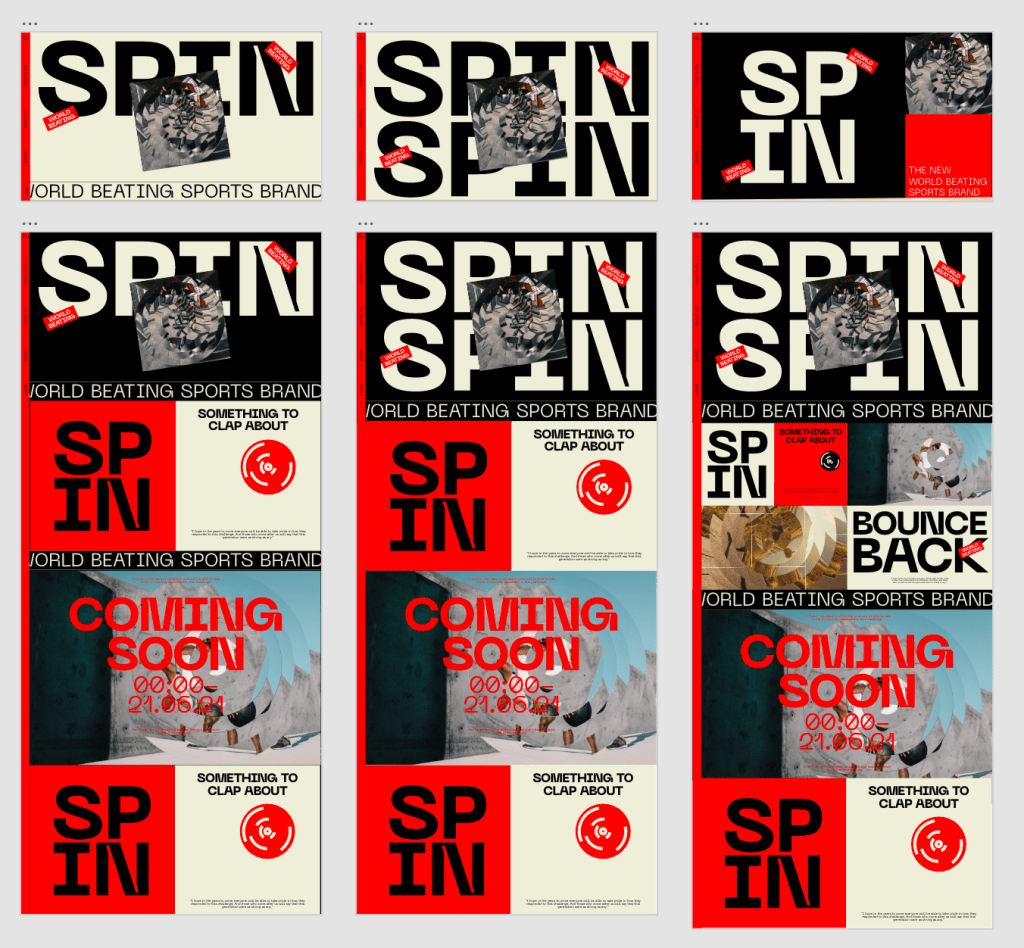
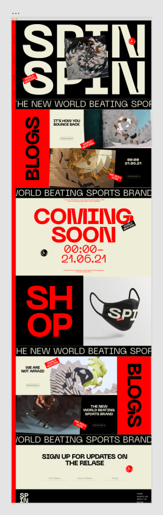
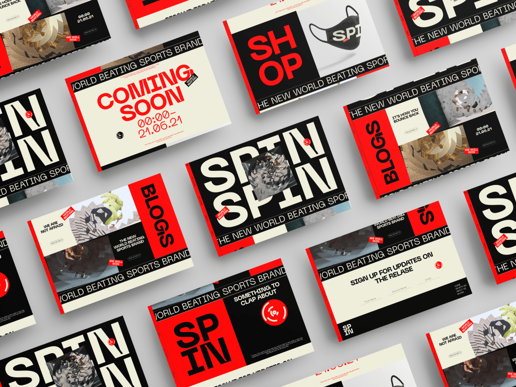
As much as I was pleased Wirth the initial drafts of the website and app, they needed a bit of development to get them to the level I was looking for. Unfortunately they just didn’t feel as striking as I wanted them to be. They are, at first glance, digital touchpoints for a sports brand so the whole thing had to feel much more dynamic and conspicuous so I wanted to revamp them to feel slightly stronger than they were previously.
First iterations First iterations Final Iteration
I also wanted to give the app the same treatment to ensure it keeps up with the same style, I had to tweak the layout of course but I wanted them to feel like one and the same, design wise.
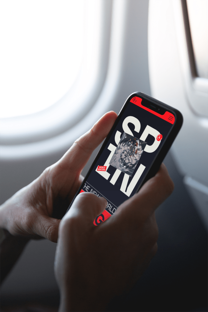
Overall I’m much more happy with the final iterations of the website and app. They take a very similar direction to the promotional material, using the branding and taking it further to a digital touchpoint. Due to the target audience being 20-30 year olds who may not be as informed as some of the older generation and using digital touchpoints will allow that age range to engage with the brand the most.
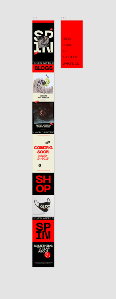
The design of the website uses blog and shop features which would be constantly updated until the date of the release in order to keep the user engaged with the brand up until the 21st, composed of government updates which have been spun to fit in with the brands aesthetic and tone of voice, and items for sale such as masks which are all Covid related.
Social Media
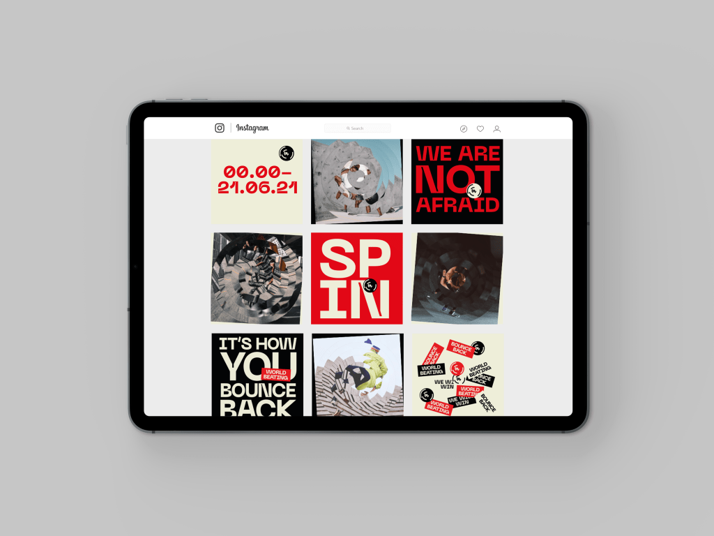
Similar to the website and app, the age of the target audience means social media is the perfect place to attract users attention and draw them into the brand using the same impactful imagery as the rest of the identity.
Similar to the website, the social media sites would also constantly be updated with new blogs and imagery in order to keep users engaged with the brand.
Gif
The final digital touchpoint I wanted to add was a gif. Something which encapsulates all of the visual language in one place all at the same time, to be used on social media, website, app etc and give a sense of the brand, but more importantly hint at the real reason behind the brand by having everything significant in the same place. I also added a few hidden hints within the gif just to play around a little, images of Boris Johnson and some cryptic facts/figures for eagle eyes viewers.
Overall Im happy with all of the visual touchpoints, as I said previously the visual identity was the most important part, ensuring that the government and propaganda side of the brand was met right, so after that the digital touchpoints allowed me to just get stuck in with the overall brand design.
Although I was happy with the overall visual identity and the elements that make it up, there were some aspects of the brand overall which waste sitting right with me. Maybe it was me being too much of a perfectionist or coming to revisit it after a bit of a break over easter, but I thought there was a bit of opportunity to develop each touchpoint a little bit more. I also hadn’t done as much initial development as usual purely due to the fact I was happy with the designs at quite an early stage, so I wanted to experiment slightly more and hopefully take it to the next level.
After the initial designs seemed like they were lacking something, I went back to the drawing board and looked to create a slightly different system which would incorporate more of the visual identity within each touchpoint. It was important that as much information about Covid and the governments response was being put across as possible so I designed a new layout which would allow me to add more onto each poster, billboard, social media post etc.
Ultimately I think all of the posters could work as they all follow a similar system of breaking the information up into multiple sections and I think the direction is much stronger than it was initially.
I think the new direction is much stronger and has allowed me to create more space for the identity and visual language to be shown on each piece. I also think the visual aesthetic is much stronger and more dynamic.
As well as improving the posters and billboards, I also wanted to take the time to develop a few other examples of printed media used for both promotional material and just extra information to make it a more complete brand rather than just the more traditional touchpoints. it was all based off there poster and billboard designs, but just shows how the brand can be taken further in showing editorial designs, as well as showing what business cards and other handouts might look like, as well as examples of the stickers, bringing them to life as real stickers rather than just elements on the page. The touchpoints I felt were important for the larger sense of the brand but also allowed me to do a bit of work on things like editorial design which I don’t often get the chance to.
Whilst not essential, as I said it was important for the brand to feel like a full brand and it was great to be able to design more of the sort of things a normal branding project would have.
I was lucky enough to see Jack before in the 4 designers conference in London during our first year trip, however for whatever reason the impact it has this year was much more. First off, the personality she had is infectious and made me sit up in my seat and listen, it’s such a great thing hearing someone speak to passionately but also having the personality to be funny and motivational even through the laptop. She really shows the importance of being yourself and not changing for anyone, stay true to yourself and your beliefs and what comes along will always be what’s best for you. But the thing that really sticks out to me when I think about the work the studio does is the level of story telling which goes into her work, it really encompasses what it means to work in branding and how important it is to stay personal, she goes far further than just making shit look good and creates work which makes you feel so much more than just making you see. It was so inspirational to see someone sum up exactly what it is to work in graphic design, specifically branding, and how important it is to pour your heart and should into everything you do, it’s something I’d never thought about to the extent at which I do now but it was really motivational for me.
Michael C Place – Studio Build
The inspiring this about the lecture was that for me I took more on board about being a designer and what that means, not only to me but to everyone, no one should feel as though they should be at a certain place in their life, that they should be doing more or less than anyone else. I’m very self assured for the most part, however I often struggle when thinking about where I should be and what I should be doing in terms of graphics. Should I be doing more work experience, should I be looking for a full time job or freelancing? The lecture and Michael himself taught me that more than anything, everyone is in their own place and don’t worry about what other designers are doing, work for yourself and the success will follow. I also loved that the way he got into his career was fairly unconventional and didn’t seem as though it was the plan all along to start start his own agency, it just shows that you need to keep your mind open because you never know what’s around the corner.
James Greenfield – Studio Koto
James Greenfield seemed as though he had moved through a more similar progression to most of us on the course having done a design course and then moving on to work afterwards, so It was great to hear about him and how he felt along the way. It was great and so reassuring to hear that someone of his skillset who is clearly a very talented designer still had doubts and to this day still has times when he struggles, it makes you realise that no one is that perfect and everyone has days when they may struggle, but its how you push through that, shown by the fact that James has come out the other side as a successful designer with his own studio. The way James talks about branding is also so inspirational, similar to Jack Renwick, he talks about the fact that whilst aesthetic and looking great is important, the work needs to instil a certain feeling in the viewer and if it doesn’t do that then ultimately it is useless. Whilst it puts on the pressure, it also acts as a constant reminder that no matter how good you are at making something look good, you still need to continue to learn about the other side of branding and that is motivational to me, no matter how much you know you can always know more.
Similar to Michael C Place, James Greenfield also spoke briefly about not putting too much pressure on yourself and giving yourself a break, don’t worry about other people/designers and what they’re doing, don’t stress yourself and beat yourself up about something because there is always something that can be done. Just another reminder that there is never a situation you can’t learn from. This part of the talk actually resonated with me not just from a design perspective but just overall, the best thing about a person is not how they make mistakes, but how they react to them.
Maris Latham – Cowshed
It was great to hear form a recent graduate of the course, not just to see a familiar face of someone you have seen and heard about, but also because it’s nice to know that it really is possible to go out and get a job once we leave. I had so many questions to ask but fortunately it seemed everyone else had the same questions. A big thing I took from the chat was about FMP and the way to go about it, of course take it seriously and treat it as the most important project yet, but make sure you have fun with it, use it to express yourself and create something you’re really proud of. It’s important to create something new and expressive because that’s the best way to ensure the project will be the best it can be. She also spoke so well about getting a job and how it feels to get a job after uni. I’m as confident as the next person but it is of course still worrying to think about getting a new job and having to do something I’ve never done before, so it was great to listen to Maris and gain a bit of confidence that it’s not as scary as it seems and it can happen.
Gavin Leisfield – Friendly Giants
Gavin’s talk was again very branding heavy and looked specifically into the branding of Go Ape. The most interesting part was the sheer amount of work needed, specifically in the initial stages. Early iterations, research, doing everything it takes until you realise the best design. I loved how it showed that realising a brand design isn’t something which just happens and isn’t something which comes easy, its long, hard work and it motivates me to always ensure I reach the most perfect outcome I can, regardless of how long it takes. I also love the challenge and I love making sure I am always the best I can be and seeing the way the studio did the same within the project is really motivational for me. Some of the brand decisions made within the go ape project were also inspirational in the fact that they had to improvise and adapt to end up with he best possible outcome, it really shows that when the right amount of work goes into it, anything is possible.
Paul Felton & Alex Woolley –Common Curiosity
The studio in itself is a very small one and the majority of the work done is completed by the two themselves, which before even discussing and going over work is extremely inspirational that 2 people can pull that off largely by themselves. One of the most important parts about their talk was the need to listen to their clients and understand the briefs, to build an understanding of the problem and in turn allowing them to realise the solution. This clearly within their work allows them to create work which makes a difference and really answer the brief rather than just look good. You can really tell even from first glance that their heart and soul goes into every project they do.
They also brushed over the fact that you need to be realistic and honest about what you can and can’t do. As I said previously I’ve always been family confident but that also causes me to be very hard on myself, particularly in design I tend to be too critical of my work when sometimes I shouldn’t be. They said that sometimes it isn’t you and your ability, its just that it isn’t the right project for you or you might not be able to do it and that’s okay, it isn’t an excuse, however it definitely made me realise that sometimes the project just isn’t for me and that’s nothing to be afraid of.
Gareth Dunt
The first thing to stand out to me after the talk was the idea of design for good. It’s something every designer says, they want to design for good and not for purely commercial project, however some people don’t have a choice and get stuck designing for the wrong causes. Gareth was someone honest enough to admit that he was stuck in the wrong sector of design and put up with the wrong things for too long and now he’s made a decision to change that and is thriving. This is something which makes you realise that you shouldn’t have to suffer for anything less than what you are worth, whether in design or in everyday life. I’m aware that being able to design for good causes 100% of the time is very hard to do, but you shouldn’t settle for the wrong attitude and the wrong type of work especially if you don’t believe in it.
Another inspirational part of the talk was the way in which he discussed how he views graphic design and that there is much more to it than digital design, much of his work is in installation design and it just makes you realise that design is all about ideas and finding solutions to problems, not making things look pretty on a laptop, whether It be physical installations, ideas, metaphorical meanings etc, a designer needs to be able to find and understand the most effective way of solving the problem, whatever that may be. It makes me think of my public display within my D&AD project and how I used the problem to inform that idea, but Gareth takes that to a whole new level which is really inspirational to see.
After feedback from the last tutorial, I improved the identity by changing some of the imagery to stay away from group sporting events etc. I also added the date, the 21st of July to some of the posters and billboards as well as the website and app after conversations with David about using it as a release and I think it fits in well with the identity but also works better as one release.
I was happy with the billboards and posters designs so I didn’t change them too much other than adding the release date and tweaking some smaller aspects. Overall I think they work well at doing what they need to do, being bold and drawing the viewer in whilst also ensuring as much information about Covid and the response is relayed to the viewer in a subtle way.
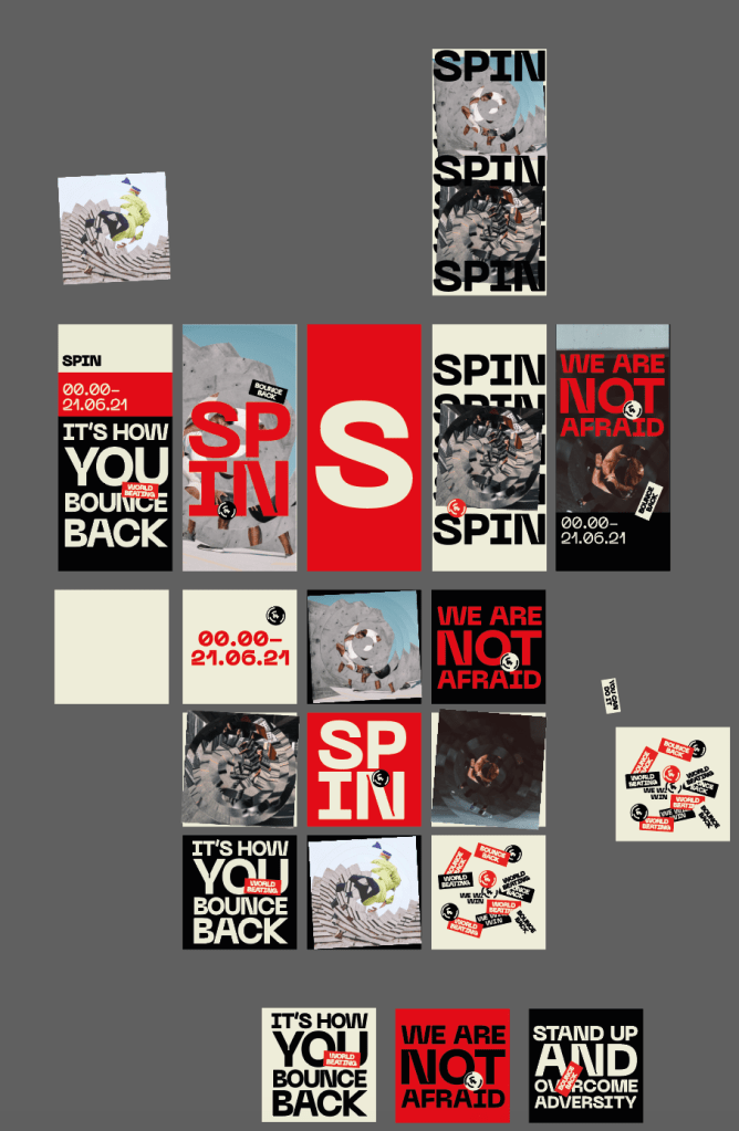
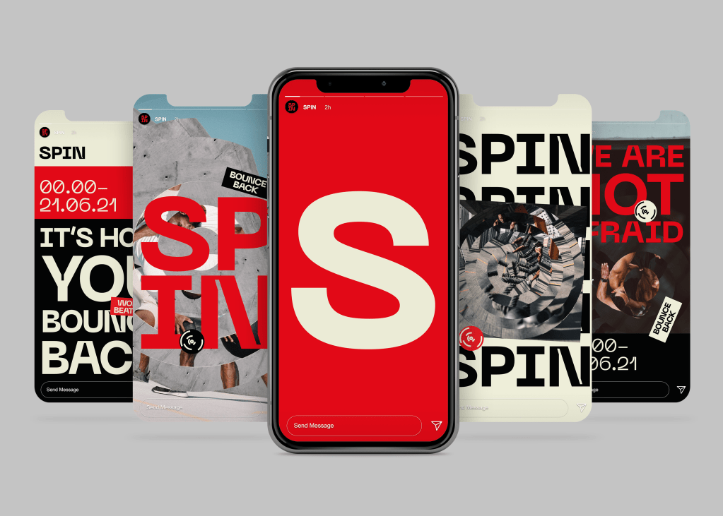
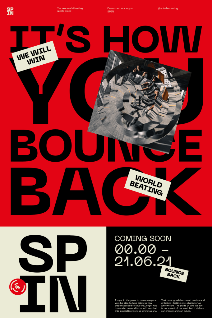
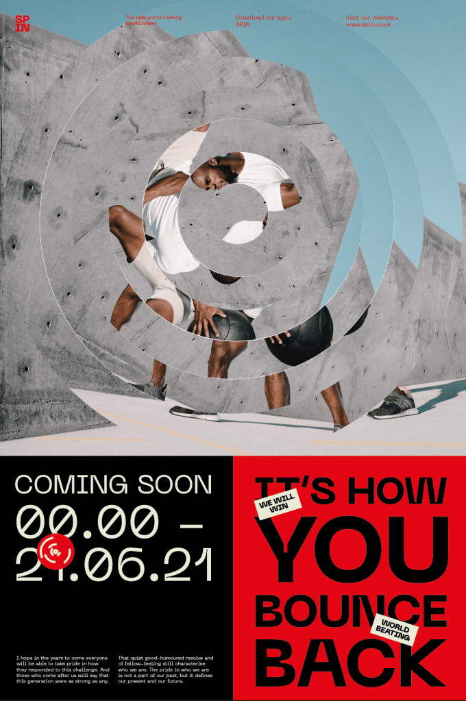
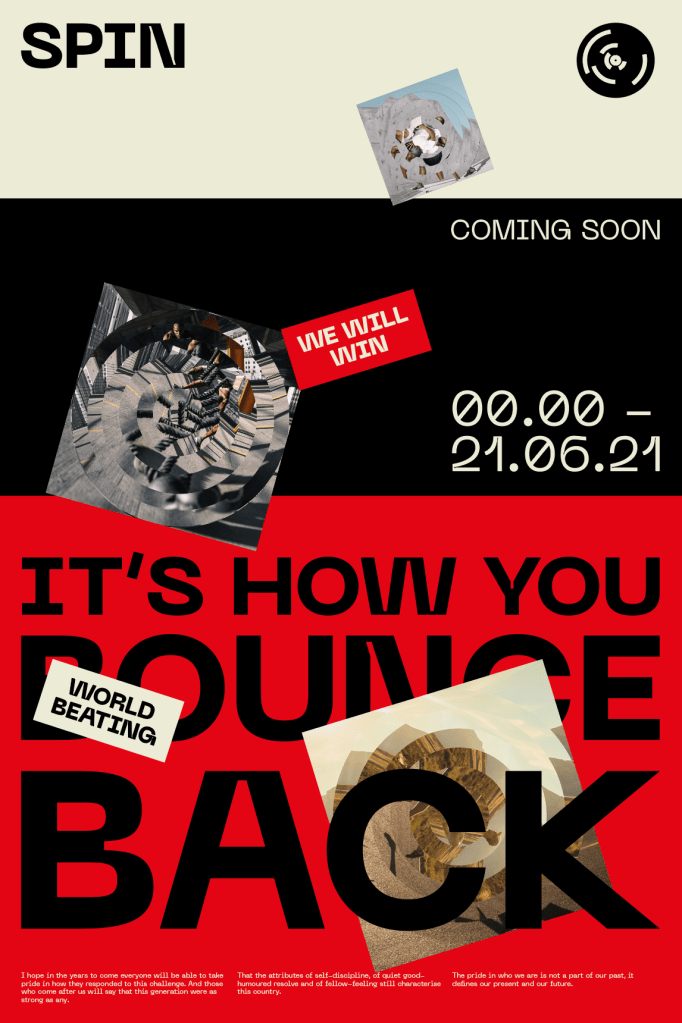
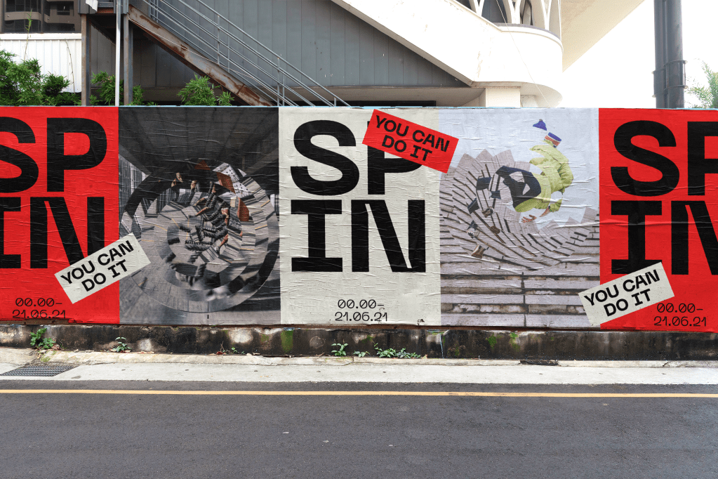
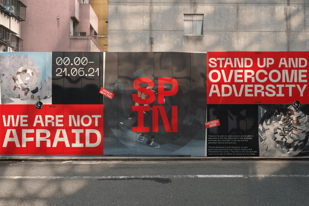
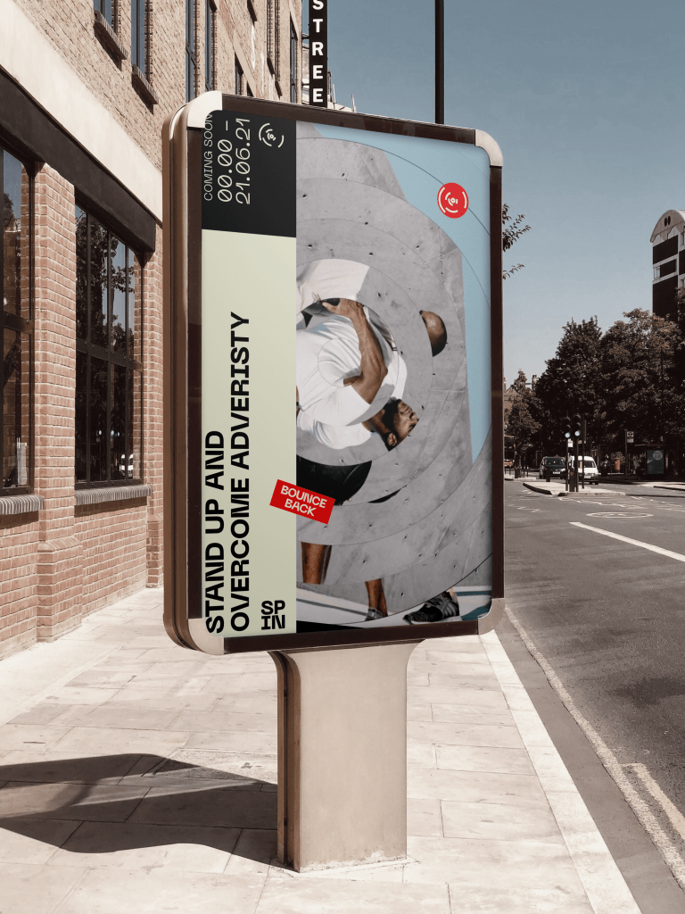
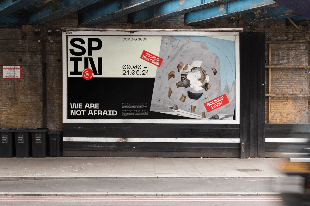
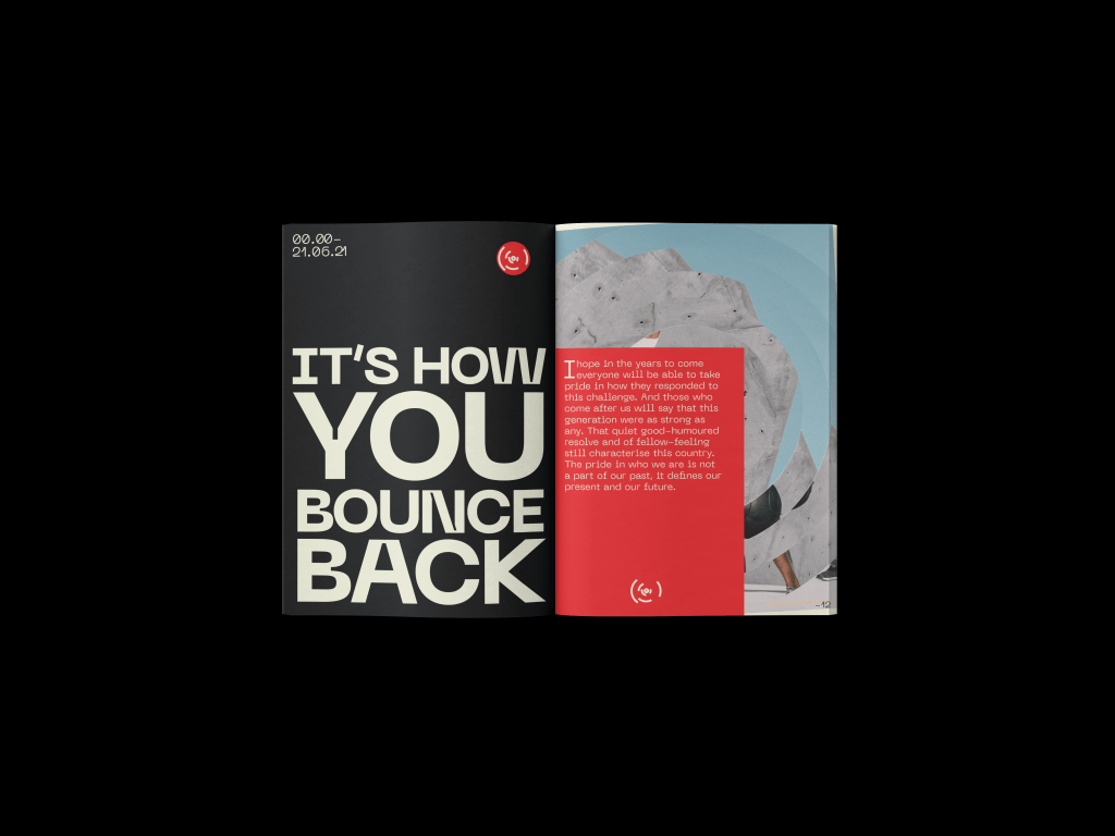
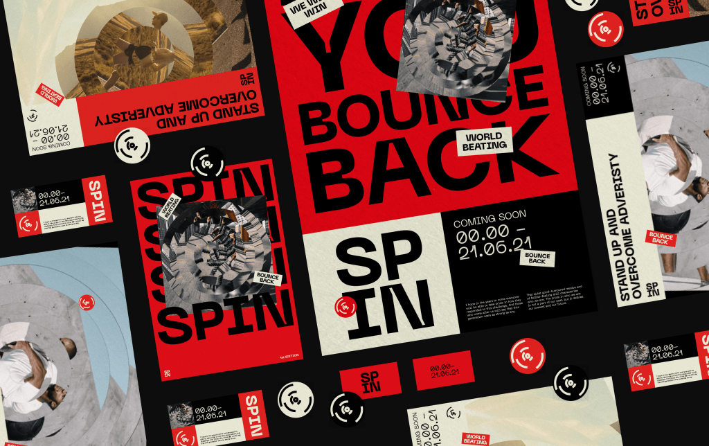
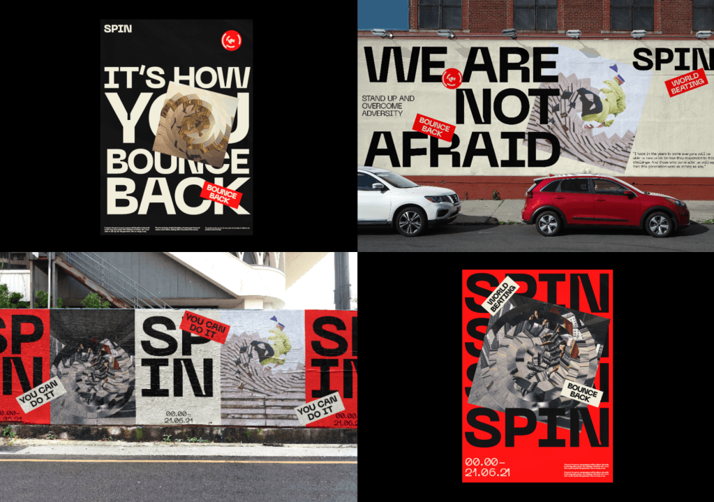
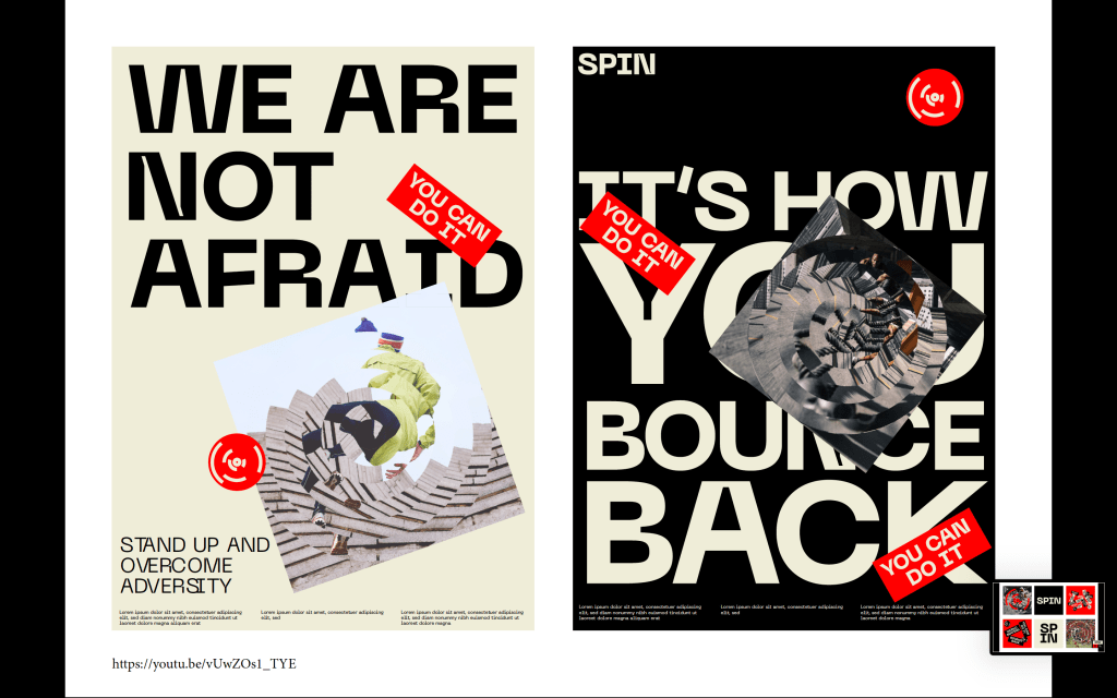
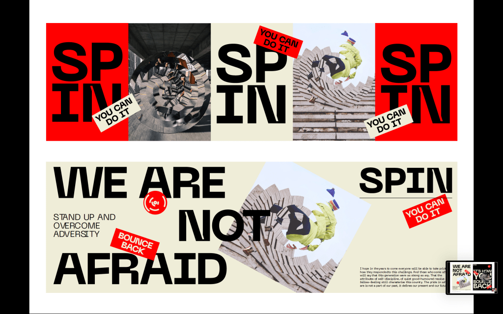
The aim of the promotional material was to use all of the touchpoints of the brands, from stickers to imagery and colours in order to create bold and standout material with the aim of catching the public eye and drawing them in to the brand, ultimately leading them to download the app and keep in touch with SPIN until the release date. Alongside all the Covid related aspects to the designs, I also added a variety of taglines used by Boris within his announcements, such as ‘We are not afraid’ and ‘stand up and overcome adversity’ which, similar to the stickers, act alongside the motivation sports identity and also hint to Covid and the governments propaganda during the course of the pandemic
The Website and app takes a very similar direction to the promotional material, using the branding and taking it further to a digital touchpoint. Due to the target audience being 20-30 year olds who may not be as informed as some of the older generation and using digital touchpoints will allow that age range to engage with the brand the most.
The design of the website uses blog and shop features which would be constantly updated until the date of the release in order to keep the user engaged with the brand up until the 21st, composed of government updates which have been spun to fit in with the brands aesthetic and tone of voice, and items for sale such as masks which are, again, all Covid related.
Although I didn’t have enough time to create the release video before the formative tutorial, I created a storyboard composed of what the video would look like. I wanted a video which explains the idea of the brand the viewer all in one place, discussing all of the visual identity, the governments response and the propaganda side of the brand.
FEEDBACK–
Again, David was happy with the progress and liked the way the brand looked and was happy with the links to Covid and the response etc. The main things David had to say were regarding the release video, essentially it was to complete it and I was almost there. We also discussed having other touchpoints involved in the release other than just the video. I thought the video could appear on the website when opened, with more information down below in the same style as before, just different information. We also discussed the way AR could be used so that ll the billboards would change through AR on and after the releaser date which again I though was a really strong idea.
I then took the research from the previous post and used it all to start designing an initial identity for the brand.
The identity had to be a culmination of the rhetoric of the government response as well as the visual style of a sports brand. This was about combining colours, typographic elements, imagery, tone of voice and so much more to ensure the visual language not only looks prominent and captivating at first glance, but also contained meaning within each element.
The idea behind making the brand itself a sports brand stemmed from the fact that the majority of the motivational phrases used by the government throughout the pandemic are strong and motivational which fits in with the rhetoric of a sports lifestyle brand, and the need for the visual style to be bold and striking also aligns perfectly with sports.
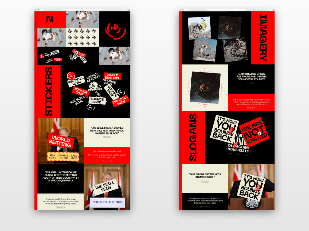
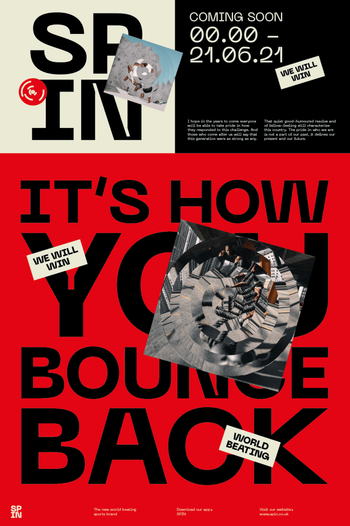
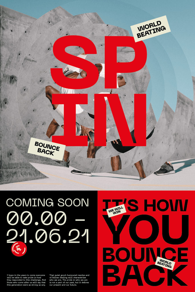
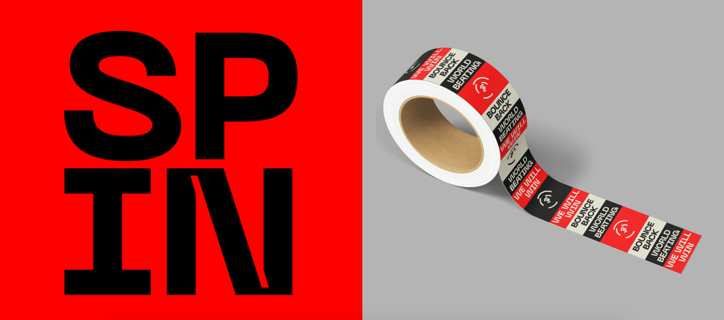
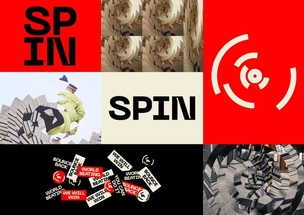
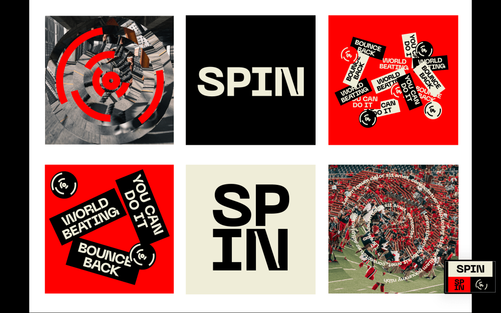
Typography – The most important aspect of the typographic side of the brand was to fit in with the idea of the sports brand, which after research I found tended to be saturated with very strong, bold typefaces. The typeface fits in with the colours, imagery and other aspects of the brand in being very captivating and noticeable, enabling it not only to stand out from all the other advertising noise, but also to fit in with the dynamic sports lifestyle brand cover. The typeface also has standout ink traps located on various letters. The ink traps create a beautiful and unique typeface, but also create something very different from everything else and isn’t what you’d expect from a normal sans serif typeface, which goes along with the notion of the brand that none of it is quite as it seems, none of it is ‘normal’ in any sense of the word.
I developed some of the brands initial parts lf the identity, the logo mark, logo type, imagery etc.
Colours – Whilst the project is based around all aspects of the governments response to Covid, a vital part of the issue is the propaganda. The idea that the government used propaganda to distract the public from many of their mistakes and flawed responses using patriotism and slogans in order to push the public forward and away from the problem instead of confronting it head on. The thing which stood out to me when researching propaganda was the taglines alongside the colours, which even from just thinking about wartime propaganda really stuck out in my head. The off white colour usually coming from the paper used but still being a very prominent part of the colours scheme, with the red and black being used within propaganda to not only make it stand out but also to link it back to being British, particularly the red. As well as being very prominent within popular propaganda posters and advertisements, the red and black in particular are also the types of colours seen very often in the likes of sports advertisements, with the aim of being bold and striking, so the colour scheme linked perfectly with the both ‘sides’ of the brand.
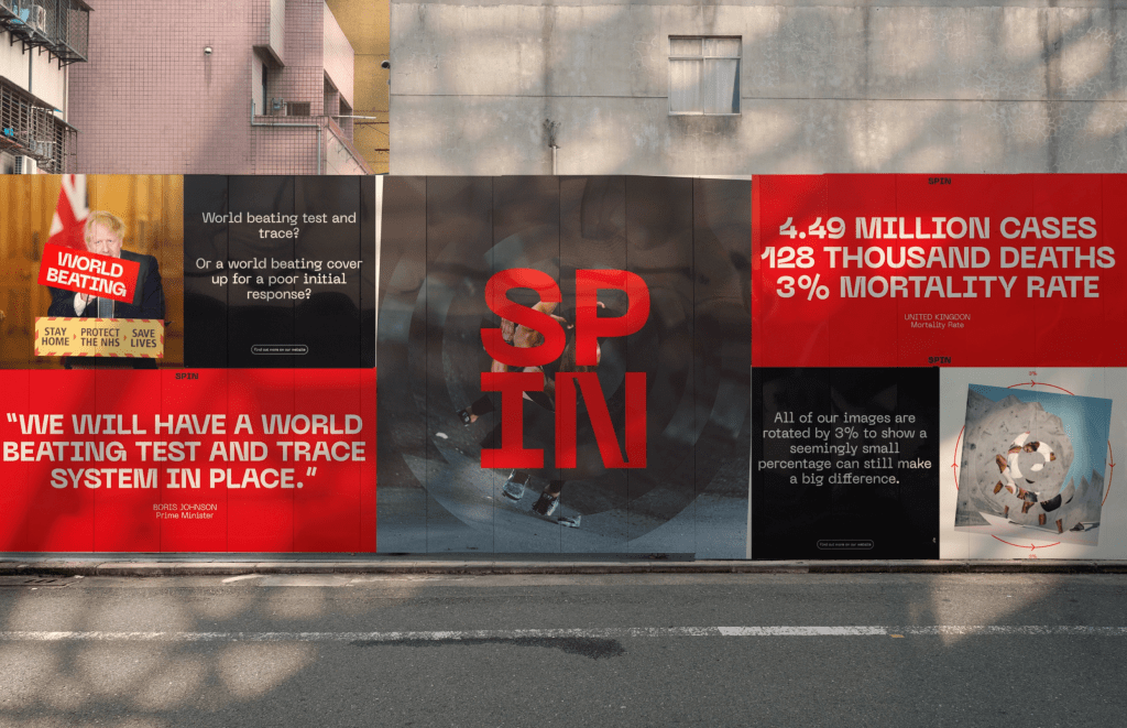
Logo – The logo is derived from my research into some of the countries in the world with the highest dearth rates, of which we are involved. The Logo mark is a simplified version of a world map, with the lines showing the top 7 mortality rates by countries, to illustrate again that the UK is unfortunately very high up in terms of that statistic. At first glance, the logo boasts a dynamic design with movement and energy as its main aim, fitting in well with the athleticism of sports and also the name ‘SPIN’ itself. The real reason for the logo design, however, is all about 7 of the countries deaths from Covid, USA, Brazil, UK, Italy, France, Germany and India. The logo design, as well as the other aspects of the branding illustrates the propaganda side of the brand, that not everything should be taken at face value and further illustrates the idea of the governments strategic communications, but is also critical of the governments Covid response by questioning the deaths in the UK as it sits as one of the worst worldwide for deaths and mortality rate.
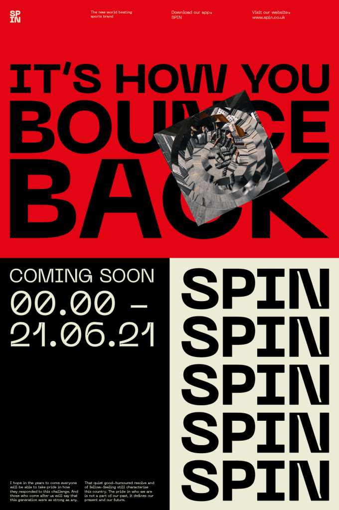
Stickers – One of the aspects of propaganda which I found out through research was to use phrases and slogans which stick in the viewers heads, allowing the government to use them relentlessly. An example from the pandemic would be ‘STAY HOME, PROTECT THE NHS, SAVE LIVES’. Whilst the sentiment is there, the irony is the governments response didn’t always adhere to their own taglines, did they protect the NHS? Did they save lives? The best way to create phrases which stick in peoples heads was simple, to create stickers themselves. The stickers were comprised of important sayings from Boris in his Covid-19 announcements. ‘World beating’ test and trace which has proven to be far from world beating. The UK will ‘Bounce back’ from the pandemic, using patriotism to convince the public to look forwards rather than backwards at their mistakes. ‘We will win’ because of our NHS, which ironically the Government have refused to fund and protect throughout the pandemic.
Imagery – I also changed the imagery to fit in with the sports brand, ensuring it all fits in and feels as though it is all about sports even when the imagery is edited and spun. I also added text on the inside of the imagery within the spin, this could be used as a way to reveal what the brand is all about through AR or just animation.
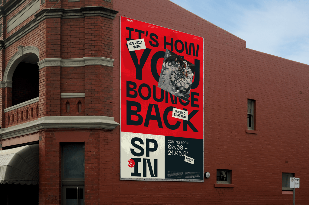
A created a few poster and billboard designs just to get a sense of what the identity would look like on real outcomes rather than just isolated elements. I used more of the motivational phrases stated by Boris and other officials within the government alongside the imagery and stickers. I think they work well in order to keep to the sports brand, they are definitely bold and dynamic enough, whilst also ensuring every element on the page links back to the governments Covid response.
FEEDBACK –
The feedback from David was positive and I think it has taken a massive step forward from the previous tutorial, however David did have a few ideas of how to take it further. One of those was to change some of the imagery (specifically the one of the sports fans Ibn the stadium) to ensure all the images are people by themselves doing workouts, not with anyone else, as was the case during the pandemic therefor hinting at lockdowns, social distancing etc. Whilst not being critical of the government, it is just another thing which alludes to the pandemic very subtly.
David also had another idea when discussing the text on the imagery, the idea initially was to reveal the real reasoning for the brand through AR when viewers walk past, or animations on social media. However David proposed the idea of having a date when everything is released, as a way to draw the viewer in and keep them interested and then all of a sudden given them all the information at the same time. We also discussed how the date could be the 21st of June, the date restrictions are supposed to be lifted.