
The release video for the brand was the most important part and the one which had to be perfect, even more so than everything else. The other outcomes, as long as the government response based visual language I created were in there, had some license to play around a bit and create design which was striking and captivating with the soul aim of looking great and encouraging viewers to engage. The release video, whilst it still needed to be all of those things, also needed to sum up the project and what the brand stands for in one place so it was important I got it right.
The brand builds up to the 21st of June 2021, the date of an ‘upcoming release’ for the brand, which is in-fact the date of the end of lock-down in the UK, another Covid reference hidden away within the branding. The day of the 21st is actually a release date for the real reason behind the branding and where it all came from.
The idea is that on the 21st, the website and app, as well as promotional material through augmented reality will change completely in their design to reveal the real reasons for each of the aspects of the visual identity with facts and explanations for each design choice. The release video is at the forefront of this, giving the initial explanation when the website or app is opened.
I kept the initial video short and snappy, giving few facts and figures and instead relying more on strong visuals and the most important, captivating pieces of information to draw the viewer in and convincing them to want to find out more.
1st Iteration
The video contains information about the propaganda side of the brand initially to explain the whole idea behind the brand being about covid and not actually about sports, followed by some other explanation about the governments response and how that has affected the branding. The idea was to create a short and punchy video explaining some of the main parts, specifically the propaganda and reason for the spin of the brand, to be followed by the rest of the website which would look further into each aspect of the response and give more information.
FEEDBACK –
After showing David, there was some things we discussed which needed changing in the video. The main issue was that the video was a bit cryptic and some comments such as ‘distract you from the truth’ could’ve been about anti-vaxxers or conspiracy theorists and not about the propaganda and government response. Thats an issue because although its only an initial video to catch the attention and explain initial points, it still needed to be clear exactly what it was about.
Main points –
‘It’s all about Covid’ needed to be more about the governments response to covid and not just covid as a whole
Public Communications and Strategic communications could be explained a little bit more to talk about what is actually meant by that. Talk about the use of patriotism and other aspects of the propaganda specifically so its clearer.
There were also a few other smaller parts such as a voiceover and backing track, the video seems too flat and dull, a voiceover also allows me to explain some parts of the video slightly more. We also discussed adding examples from the government of what i’m talking about to show it in real life. Finally, I decided that the explanations at the end don’t need to be a part of the initial video and can come later on within the website, the video is all about explaining the initial points and then the website can show the rest of the information and reasoning behind the visual language.
Final Video
I changed the wording of the video to be less cryptic and more informative and I think it works much better at giving a quick rundown of why the brand is spun and some of the information surrounding that. I think it is much more effective than the first draft, and the music and voiceover also feels much more effective overall.
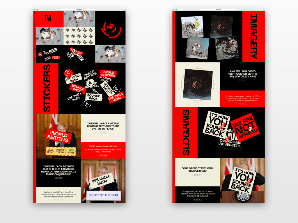
After the initial release video, drawing the viewer in, the rest of the website allows them to read more deeply into the design decisions and find out more about what the brand really stands for. Keeping the same designs, however changing the information and imagery to purely Covid and government related visuals. The website gives a run down of everything the brand stands for and therefor stands as the most important aspect of the whole project.
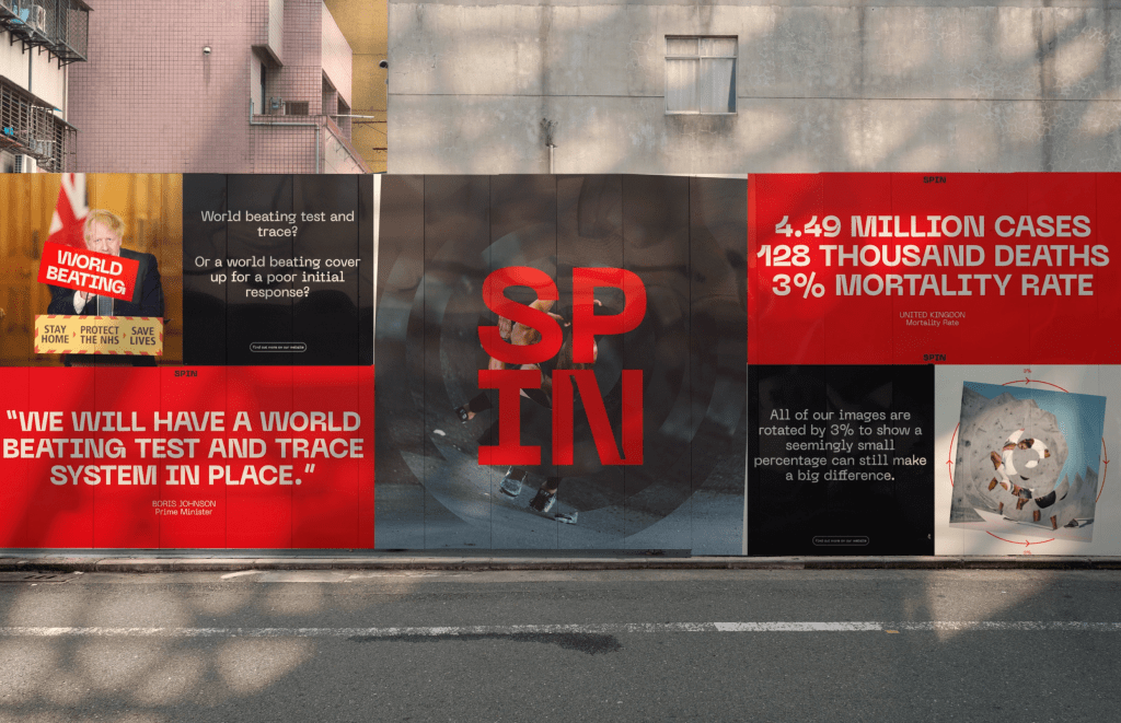
I also added an example of what one of the billboard would look like containing the new information after the release, the idea is the billboard would all be viewable through AR via the app and would all change to reveal the same information as the website.
Overall I am happy with the final outcomes for the release and I thin ultimately they all give a good rundown of what the brand really stand for and the main reasoning behind the visual identity itself and the reason for the whole idea of spinning the brand. It took the longest to complete purely down to the wording of much of it, however I think in the end the work does the idea justice and explains what I was looking to explain. It gives information about the governments propaganda and how that was influenced by their poor response, as well as specific details about that response and provides a benchmark for the audience to form their own opinions and hopefully find out more about both the government and their handling of the pandemic, as well as the way in which the government use propaganda in times like these.
