
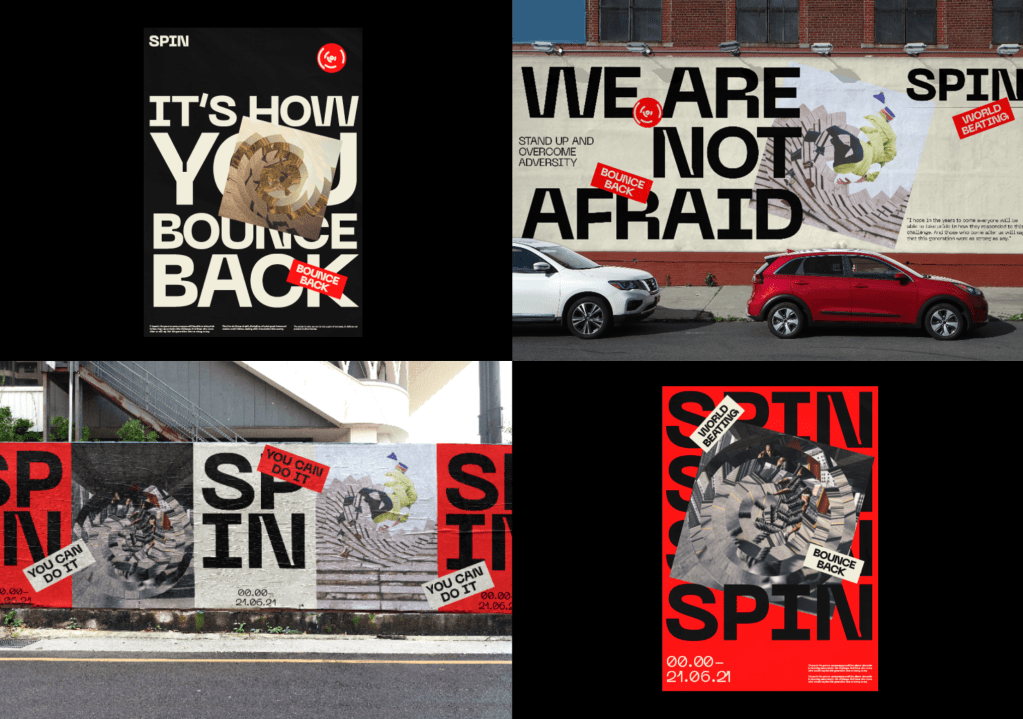
After feedback from the last tutorial, I improved the identity by changing some of the imagery to stay away from group sporting events etc. I also added the date, the 21st of July to some of the posters and billboards as well as the website and app after conversations with David about using it as a release and I think it fits in well with the identity but also works better as one release.
I was happy with the billboards and posters designs so I didn’t change them too much other than adding the release date and tweaking some smaller aspects. Overall I think they work well at doing what they need to do, being bold and drawing the viewer in whilst also ensuring as much information about Covid and the response is relayed to the viewer in a subtle way.
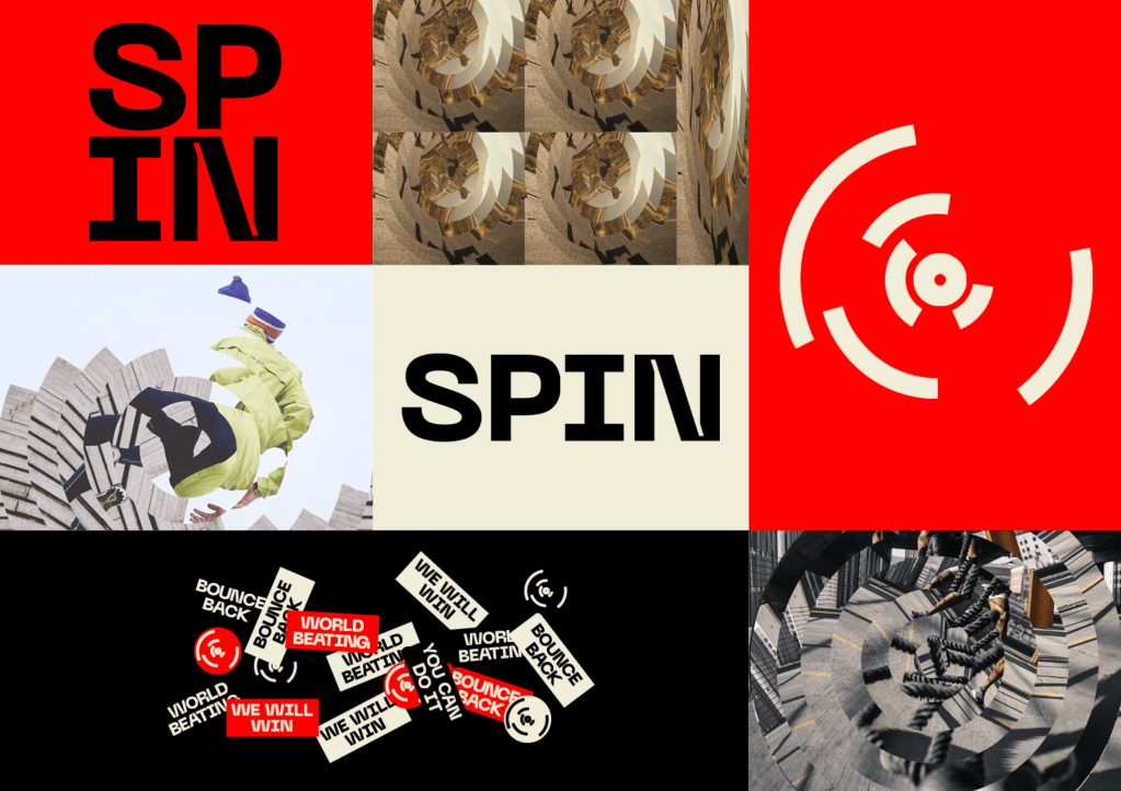
The aim of the promotional material was to use all of the touchpoints of the brands, from stickers to imagery and colours in order to create bold and standout material with the aim of catching the public eye and drawing them in to the brand, ultimately leading them to download the app and keep in touch with SPIN until the release date. Alongside all the Covid related aspects to the designs, I also added a variety of taglines used by Boris within his announcements, such as ‘We are not afraid’ and ‘stand up and overcome adversity’ which, similar to the stickers, act alongside the motivation sports identity and also hint to Covid and the governments propaganda during the course of the pandemic
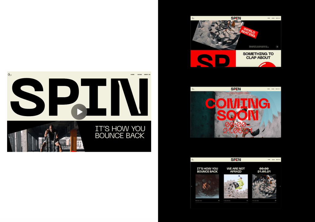
The Website and app takes a very similar direction to the promotional material, using the branding and taking it further to a digital touchpoint. Due to the target audience being 20-30 year olds who may not be as informed as some of the older generation and using digital touchpoints will allow that age range to engage with the brand the most.
The design of the website uses blog and shop features which would be constantly updated until the date of the release in order to keep the user engaged with the brand up until the 21st, composed of government updates which have been spun to fit in with the brands aesthetic and tone of voice, and items for sale such as masks which are, again, all Covid related.

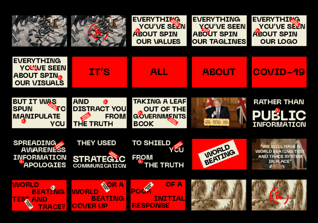
Although I didn’t have enough time to create the release video before the formative tutorial, I created a storyboard composed of what the video would look like. I wanted a video which explains the idea of the brand the viewer all in one place, discussing all of the visual identity, the governments response and the propaganda side of the brand.
FEEDBACK–
Again, David was happy with the progress and liked the way the brand looked and was happy with the links to Covid and the response etc. The main things David had to say were regarding the release video, essentially it was to complete it and I was almost there. We also discussed having other touchpoints involved in the release other than just the video. I thought the video could appear on the website when opened, with more information down below in the same style as before, just different information. We also discussed the way AR could be used so that ll the billboards would change through AR on and after the releaser date which again I though was a really strong idea.
