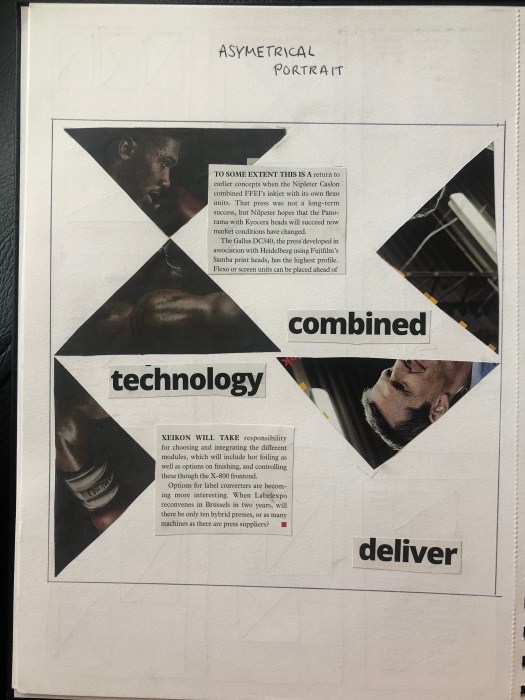
One thing that fascinates me about design and especially editorial design is the use of symmetry and asymmetry. The way you can use the same grid to create two different outcomes with different feels to both fascinates me. Both convey ideas in very different ways. While looking at the two different styles, we cut out text, images and headings from magazines and newspapers and used them to create rough design layouts.
An symmetric design tends to be used to create a much calmer and classic feel and usually doesn’t stand out as much, it is often easier to read the text. I think my design works well as the whole design is completely symmetrical and each body of text is easy to read. There is also a good sense of hierarchy and the path for the eye is clear and runs from the title and image through all the text. However the design isn’t as interesting to look at and is much more functional as a newspaper article than a page of eye catching design.
On the other hand, an asymmetric design has less boundaries so tends to be much more playful and lively which usually creates much more eye catching designs, but can sometimes be much harder to read, especially when type is involved. Overall I think it works well to convey an asymmetric theme and is much more pleasing to look at. It’s much more lively and interesting, however the title being split into 3 separate parts could make it harder to read, therefor it wouldn’t be suitable for a novel or newspaper design.