Looking at editorial design gave me a lot of insight into all the ways a magazine or book can be designed to make it easy to read and make it look great. The most useful thing i learnt was how to design something using balance and contrast to make a clear path for the eye and to add hierarchy to the piece, using an image or title.
I also learnt how to use typeset within my work to make it suit the type of work I’m designing. For example using centred text alongside larger typography to look classic and elegant, or using justified text to make it easier for the eye to follow it and read. This was useful as it means when designing in the future I’ll have an idea as to which is the best for different types of work, depending on the target audience and what the use will be for the work.
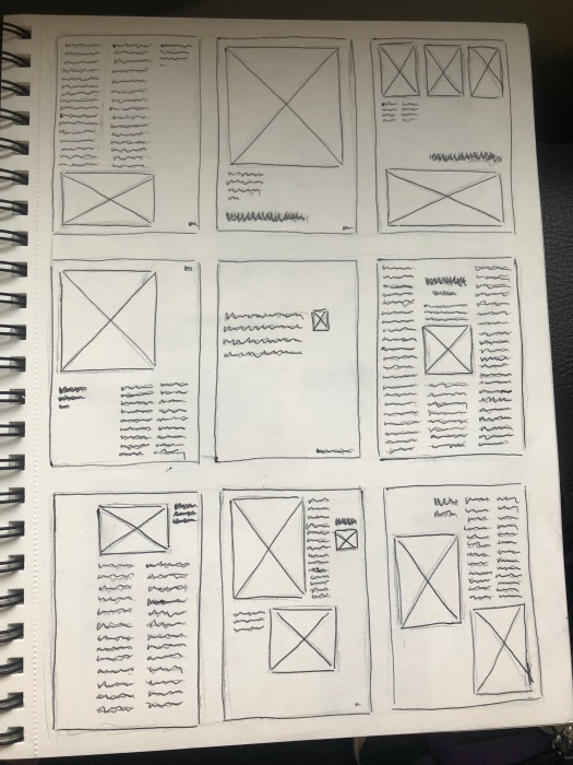
The grid system was another useful principle and learning how to use it showed me how to make the most out of a design, and how to use columns and hanglines within the grid make it functional giving the work a clear path for the eye.
Following this we looked at design magazines and analysed them, looking for the ways they use all these features to create well designed work. I took sketches of the layouts so i could document them and identify everything we had learnt about.