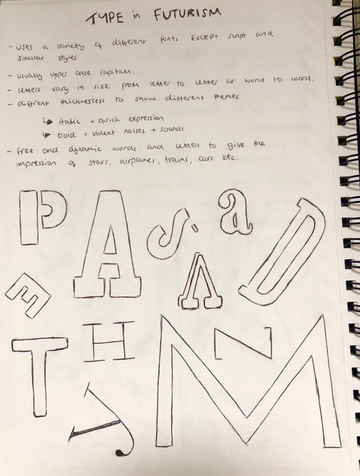
I researched into the type of typography used within the Futurism art movement for inspiration for my poster. After looking through previous designs I noticed that all of them use a variety of fonts within each word, other than script or similar styles. They usually only contain upper case letters for the main headers, however lower case letterforms are also used. Each word has a range of different sized letters as well as different thicknesses. Designers within the Futurism movement abandoned traditional uses of grammar and punctuation.
All of these features within Futurist designs create images with the typography and focus more on design than functionality. The free words and letters give the impression of trains, cars and movement. I noticed that no words had a baseline so were not in a line, each letter is placed on different lines and appears to be random. This random placement breaks the symmetrical page and the grid system and makes the design look as if theres no real structure. Futurism was also the first ‘hand made’ looking art form so the text doesn’t look properly in line. The scattered effect has connotations with noise and which is one of the main themes of Futurism, it also has connotations with movement as it looks like the letters are moving across the page as they get larger.
As well as looking into individual letterforms, I also looked into the shapes created by the words as a whole. As seen below in my sketchbook the word goes from small to large as it moves across the page. This gives a sense of movement and speed within the design.