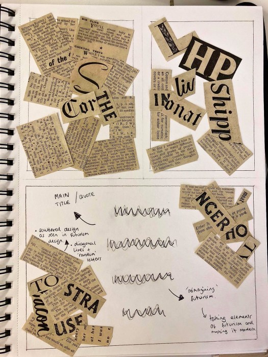
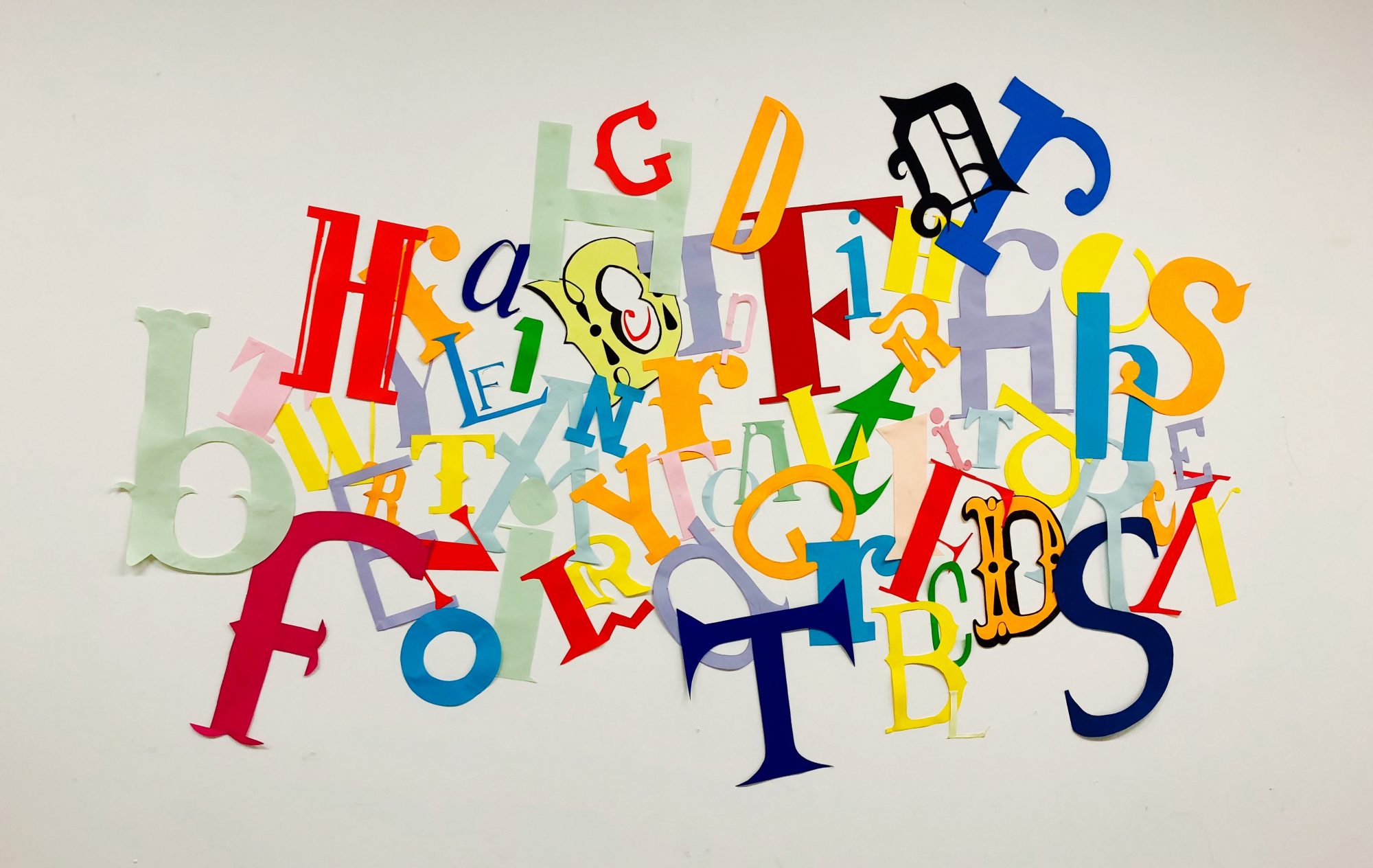
I tried to generate some ideas in my head using a magazine to make 2 collages, as i noticed that a large number of Futurism designs seem to contain features very similar to collage work. I cut out bodies of text alongside titles and larger letterforms and stuck them over the top of each other so I could pick out aspects of the design i like and use it to influence my work. I tried to make a background filled with lots of text and layer larger titles and letters over the top, as seen in lots of Futurist designs, including Marinetti’s. I made everything sit diagonally on the page to give the general idea of an asymmetric design.
The top 2 collages gave me a good starting point which I could take aspects of and use within my final poster. However, as the brief is about Reimagining Design History I tried to use only aspects of these designs. Due to this, I sketched out an initial design for a poster, using a large title across the middle of the page, with the elements of Futurism in the top right and bottom left corners. I think it works well to make the design more modern and contemporary, using negative space around the main title, with the more asymmetric, less structures design around the outside.
Overall it gives me a good base to start off with, as well as lots of ideas as to how I want each part of the poster to look.

