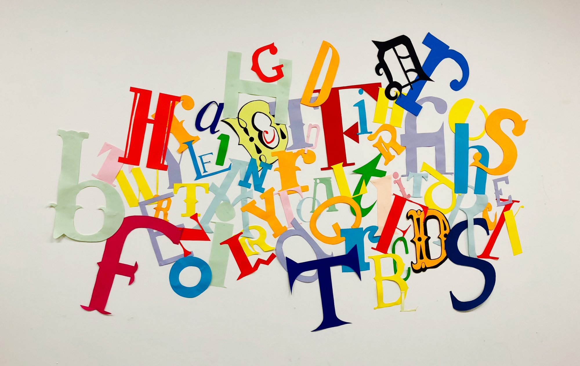
I added my title to the centre of the page so the eye would be immediately drawn to it. I then used adobe illustrator to design several images using typography. I tried to make shapes with the type, making circles and swirls to create the feeling of movement and speed within the images.

I layered these on top of each other like a collage, along with letters of different fonts and sizes, to add around the edge of my poster. This created negative space in the centre of the page which I feel kept a modern style to the poster, but also contains the Futurism aspects around the title. I also added red details within the image to create contrast and make it more visible for the viewer to see. This creates a good path for the eye as its the second thing the viewer will look at after the poster.
I then added the text around the main title, I didn’t want them to be too close to the images around the edges to ensure the text is still easy to read. I also tilted them on diagonals to keep with the Futurist, asymmetric feel and make it feel less structure, as horizontal text would be too symmetrical and wouldn’t fit with the style of Futurism.


