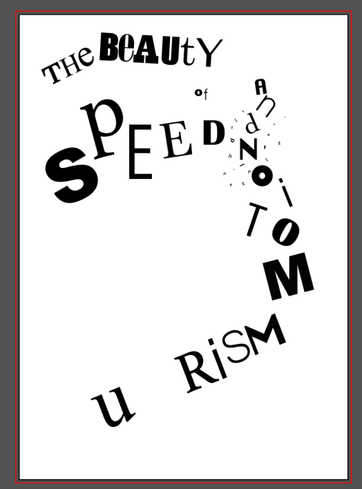
Using sketches as influence, I drew a rough sketch of the design I was looking to create and added in the text so i knew where each letter would fit on the page and how it would look.
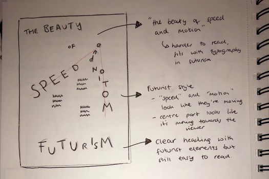
I then used adobe illustrator to generate each word using different typefaces for each letter. I placed each letter in similar places to my sketch . ‘Futurism’ is the main header at the bottom of the page and I left the general design of the word relatively untouched so it’s still easy to read and understand. I then used more of a futurist style for the quote “the beauty of speed and motion”. This makes it harder to read and understands but is starting to give a feel of what Futurism is and what it looks like. I also started to add a few small letters around the main design in the middle around ‘and’ to fill the space and make it look more like a Futurism design. It makes the design much more unstructured and asymmetric.