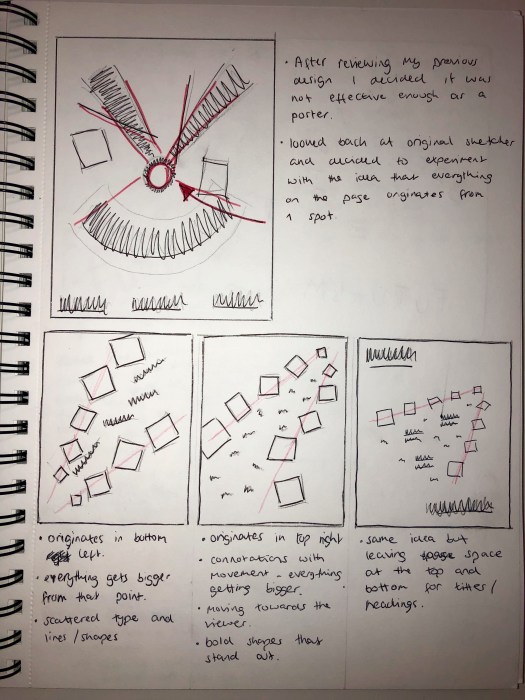
After deciding to redesign my poster I looked back at my original sketches of existing Futurism designs to take influence from features within them. As shown in red, one of the most prominent features I noticed was that all of the designs have one area of the design which the rest of it seems to originate and enlarge from. It creates a sense of movement from that point. Lots of the shapes made by the text are large and take up most of the space, with smaller bits of text sitting behind in the background. This creates a good sense of hierarchy and a good balance between the main headings and the text.

I sketched a few ideas in my sketchbook, using the idea of the design originating in the corner of the page and expanding from that point. I think the idea of it starting in the top right and getting larger from there works as it feels like its moving towards the viewer and almost seems 3D, so it gives a good sense of movement. It also has bold shapes and text around the main focus so the feeling of enlargement and movement is emphasised. Furthermore, I then added headings on the top left and bottom right of the page with negative space, surrounding it, this gives a good balance between the Futurism design and the more modern part of the design.