Leading on from the previous design, I added some of the images I generated from my last poster design and added a few a them to this one. I changed the opacity so they wouldn’t interfere and get confusing with the rest of the text. I also added the text to it. I used a grid system to place the text in columns to ensure they fit in with the rest of the design and don’t look out of place. I think it all works well but more elements need to be added to make it more reminiscent of Futurism, such as more letters in between the text and heading, as well as more images.

I added more of the images from my original design to make it look more like a collage and less structured to fit with the Futurism era. I think they work well to add a background and fill the space more so the general idea of Futurism is easier to understand when looking at it. I then added more letters in and around the text, with the letters getting bigger, looking like they’re moving from one side of the poster to the other. This makes the design look slightly more chaotic and could show noise within the piece.

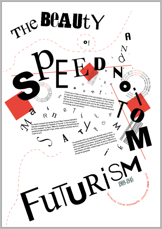
I then took my design and started to add the finer details and add some colour. I used red because it’s a colour used widely in the Futurism movement. It also makes the central design pop out of the page and draws the eye using hierarchy. I then used red lines over the top to point the viewer in the direction of the design. I placed them diagonally to create a sense of asymmetry and movement.
I then chose where i wanted to place my shapes and lines based on the way they sit within the design. I chose the thin red lines so they don’t take attention away from the text, and as they add an asymmetric feel to the design using diagonal lines. I used red squares to create hierarchy and draw the eye to the header as well as to create more overlaps within the work.


I experimented with changing the colours, using orange, red and blue. I think all of the outcomes look effective, however I think the bright and bold colours take away from the futurism design and draws more attention towards the colour and away from the typography.
I used all the experiments I have carried out and added all the most effective parts to my final piece. As a whole, I used a sense of movement to influence my piece, with the main part of my design starting smaller and growing larger from there, as well as using diagonal lines to create asymmetry, and curved lines to create a sense of speed and motion. As a whole I wanted to create a sense of Futurism in the centre art of the design, but still keep the modern and contemporary feel through in the top and bottom, using the negative space to create contract between the top, bottom and middle.