
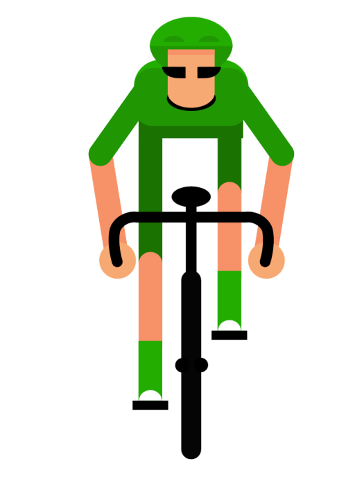
Using illustrator again, I created a simple cyclist design fitting with the design of the rest of my animations, and added all the different body parts to a separate layer. This was so i could move all the parts in different directions to give an over exaggerated style. The main animation consists of the legs moving up and down and the bike moving side to side, which ultimately means the arms move up and down slightly as the bike moves, and the upper torso along with the head rotates slightly with the arms. I then jus repeated this movement throughout the 10 seconds. This created a simple yet slightly over the top animation which fits well with the motion graphic style.
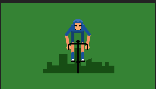
I then added a background with a shadow of a cityscape in the background as the image looked very static with the plain colour backdrop, so adding a cityscape which slightly decreased in size over time gave the sense that the cyclist was moving forwards. I also knew I wanted to add tress to the animation but didn’t want too many colours in the background so I changed the background colour to green and the cyclist to blue so it would stick out on the screen.
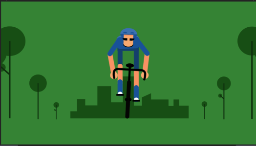
I added some simple and minimal looking trees to the background around the edges to give the impression the trees are following the road that cyclist is travelling down. I changed the anchor point on the tree layers so as they got smaller and smaller they disappear just at the corners of the cityscape and looped this over for the duration of the 10 seconds to look like he’s constantly travelling.
Overall i think the cyclist was the most challenging animation to get every part of the body to move, and although i could’ve possibly made it look slightly more lifelike or make it move slightly more, i think it goes with the simple style of the rest of the animations.
