Before starting my animation I looked into the different styles of animation and the way they show movement in different ways. I thought about the most common forms of animation such as traditional drawn animation, stop motion animation, 3D animation and 2D vector animation. I decided stop motion animation as well as 3D animation were not achievable in the time frame for what i wanted to achieve, and based around my ideas of a colourful, vibrant animation I didn’t think they ware suitable.
This led me down the road of 2D vector animation, in which there are many different styles. The main two that came to mind were realistic styles and motion graphic styles, both have unique and different styles. To help visualise them I drew sketches of both and used the sketches to create short animations so I could see what they looked like. I used my idea of a skydiver for the animation.
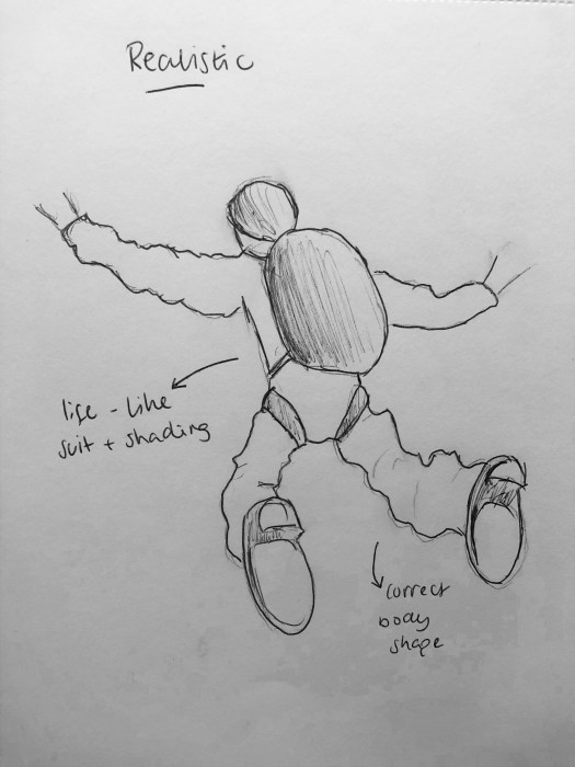
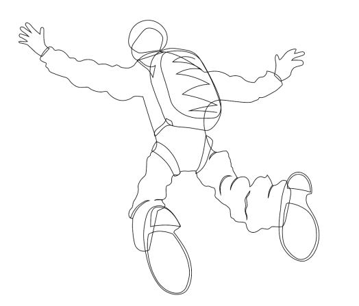
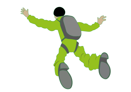
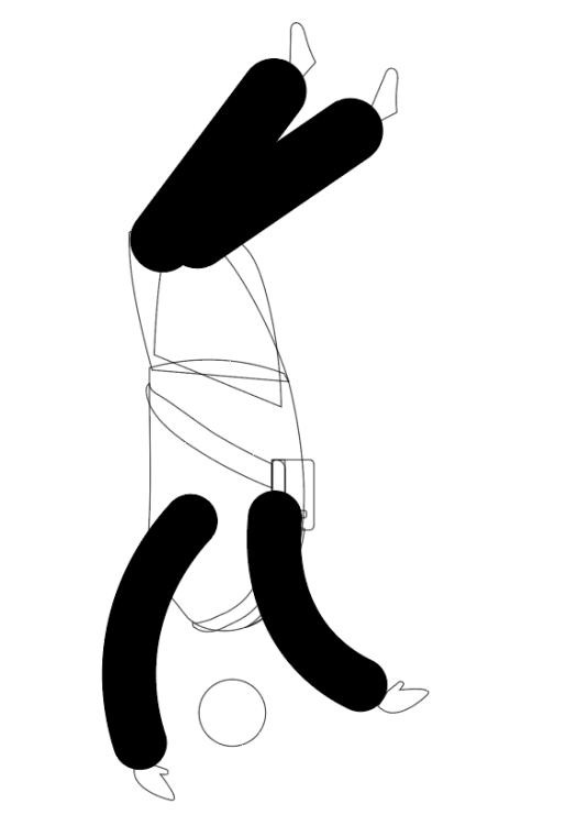
I scanned there sketch into the computer and designed it in illustrator using the pen tool. I tried to make it look realistic by keeping the clothing and body shape regular and in scale.
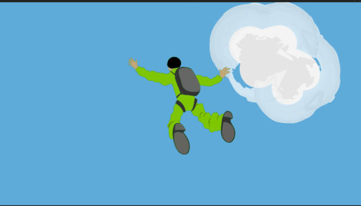
I then added the illustration to after effects to create my animation. I created clouds on illustrator and added a paintbrush effect to the outside to make it more see through and give a more realistic feel to it. I kept it simple by just reducing the size of the skydiver throughout the 10 seconds while increasing the size of the clouds to give the impression of him getting smaller as he falls from the sky.
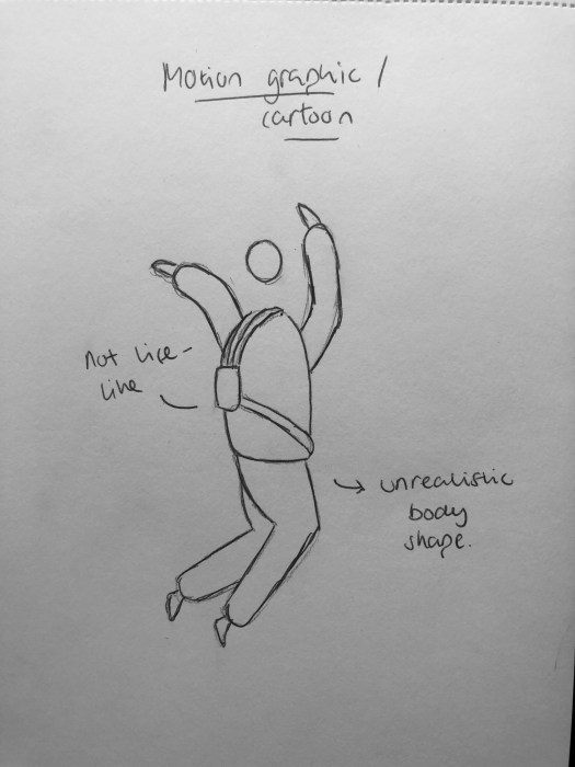
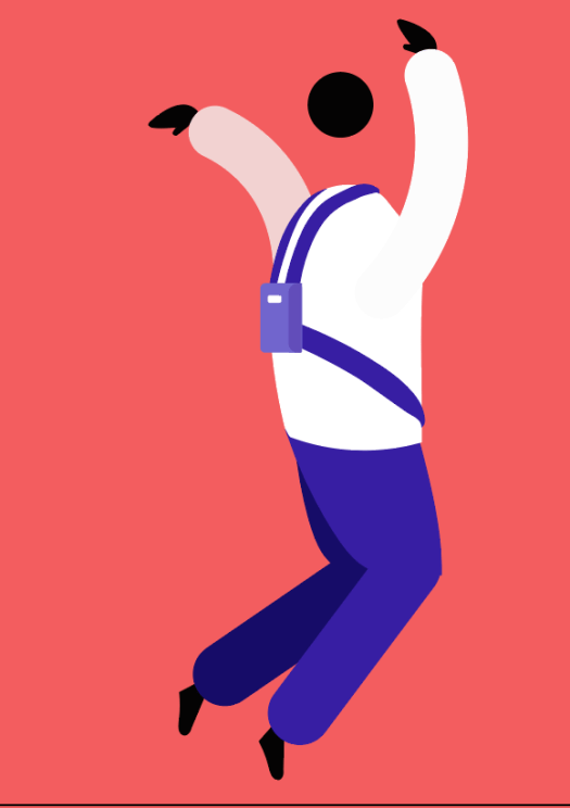
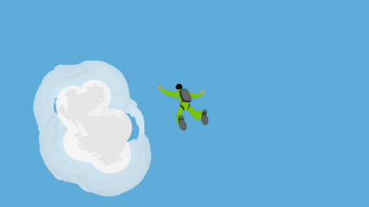
I then idea the same idea to create another animation using a more cartoon approach, taking influence from motion graphic and gif style animations. I made the body proportions and clothing very unrealistic.
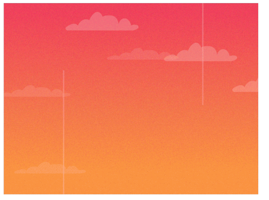
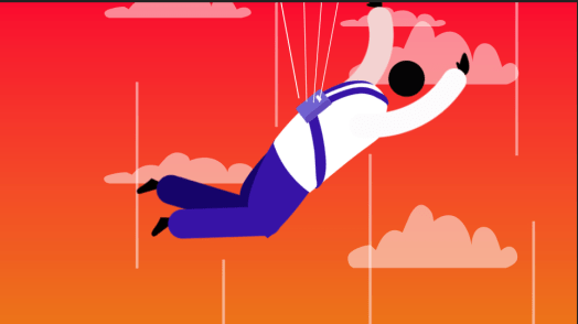
I then created the background using a gradient to give a sense of falling downwards towards the light. I used the bright colours to keep with the non-realistic theme and keep it relatively cartoony.
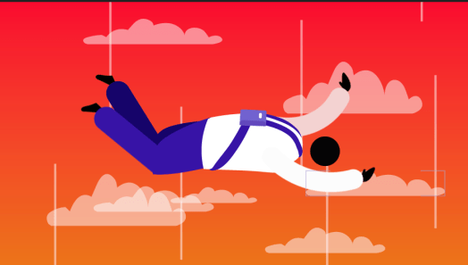
I animated the legs, arm and head with a wiggle effect on after effects which simply shook them up and down, it was simple but looked effective and over the top and gave the impression his arms and legs were blowing in the wind. I also added clouds in the background along with white lines, both on a loop which moved from the top of the page to the bottom, again a simple movement which gave the impression of falling.
Overall I thought both animations were effective in showing the idea of falling from the sky, however the motion graphic approach using over exaggerated movements and bright colours created a much more simple approach to the animation, using small movements like the wiggle effect and clouds moving down to create a moving image and I think it looks much more simplistic and pleasing to the eye. After deciding to use this approach, i went back and sped up the movement of the clouds to show the speed he is falling at, and I added a parachute at the end of the animation, using 3 white lines which extend out of the bag, pulling the character off the page to give the impression of him slowing down.