
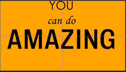
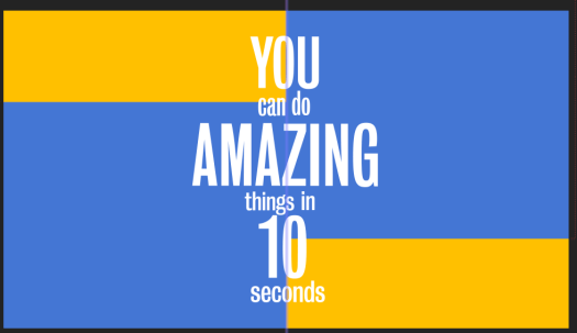
Finally I had to add two more scenes which both consist of just text. The first says ‘you can do amazing things in 10 seconds’ I have looked at lots of examples of kinetic typography where the camera follows the text as it’s typed on the page as I think it looks very playful and can be done with different effects and colours. The example shown above was a test to see how it works and looks with different layouts.
During our expressive type workshop with David previously, we heard phrases said in different accents and we had to write or draw the phrases in the way they are said, using different scales and fonts to create it. I used a similar idea for this, the words like ‘you’ and ‘amazing’ were said much louder and sharper than the rest of the phrase, so i’ve made them bigger and bolder. I used sans serif typefaces for both to keep it simple, just using different thicknesses.
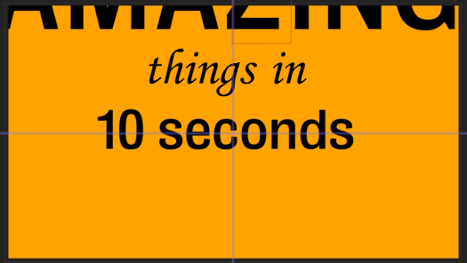
I then tried to lay it out, using the voiceover to make each word appear as it’s said in the voiceover. I used the same idea of kinetic typography where it zooms in on each word as it’s said in the voiceover.
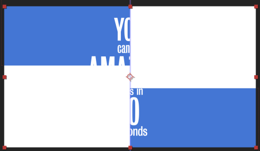
The next scene after this has an all white background, so I tried using blue and then white boxes moving across the page to transition between the two scenes. I think it works well to lead from the first scene into the second, however i don’t like the way the text is played out.
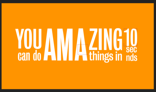
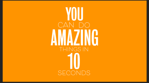
I changed the format of the words so it reflects how each word is said, for example the ‘AMA’ is much louder then ‘ZING’ and was the loudest work said so I’ve had it central and very large. ‘YOU’ and ’10’ were also said loudly so are in a thicker font and are much larger on the page, this meant the 3 most important words stand out the most. ‘can do’ and ‘things in’ were both said slightly quieter, hence why they’re smaller and ‘seconds’ was said very quickly after 10 almost in one motion, so I’ve added them directly below it.
Although at first glance is can be hard to read the words, because of the voiceover I don’t think it’s essential to be able to read it as it is said very clearly, the kinetic typography just gives a fun style to the typography.
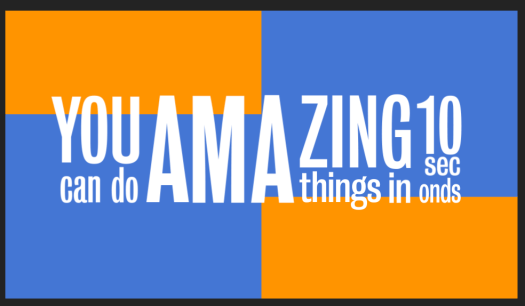
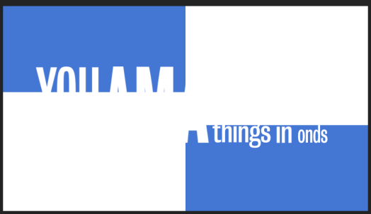
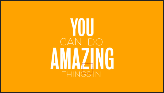
I then used the same idea as I showed previously of the boxes to transition between scenes.
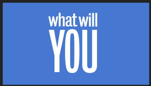
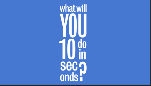
I then used the same idea to create another scene which says ‘what will you do in 10 seconds’. The ‘YOU’ is the loudest and sharpest word in the voiceover so I made it the largest word on the screen, and again similar to the last one ‘seconds’ is said very quickly after 10, so they are put together.
Although in the first scene I have transitioned it into the second, I haven’t done that in this one. Thats because the next scene on is the scene with the frozen computer, so I wanted a blunt transition between the two and I didn’t want it to be seamlessly transitioned.
