
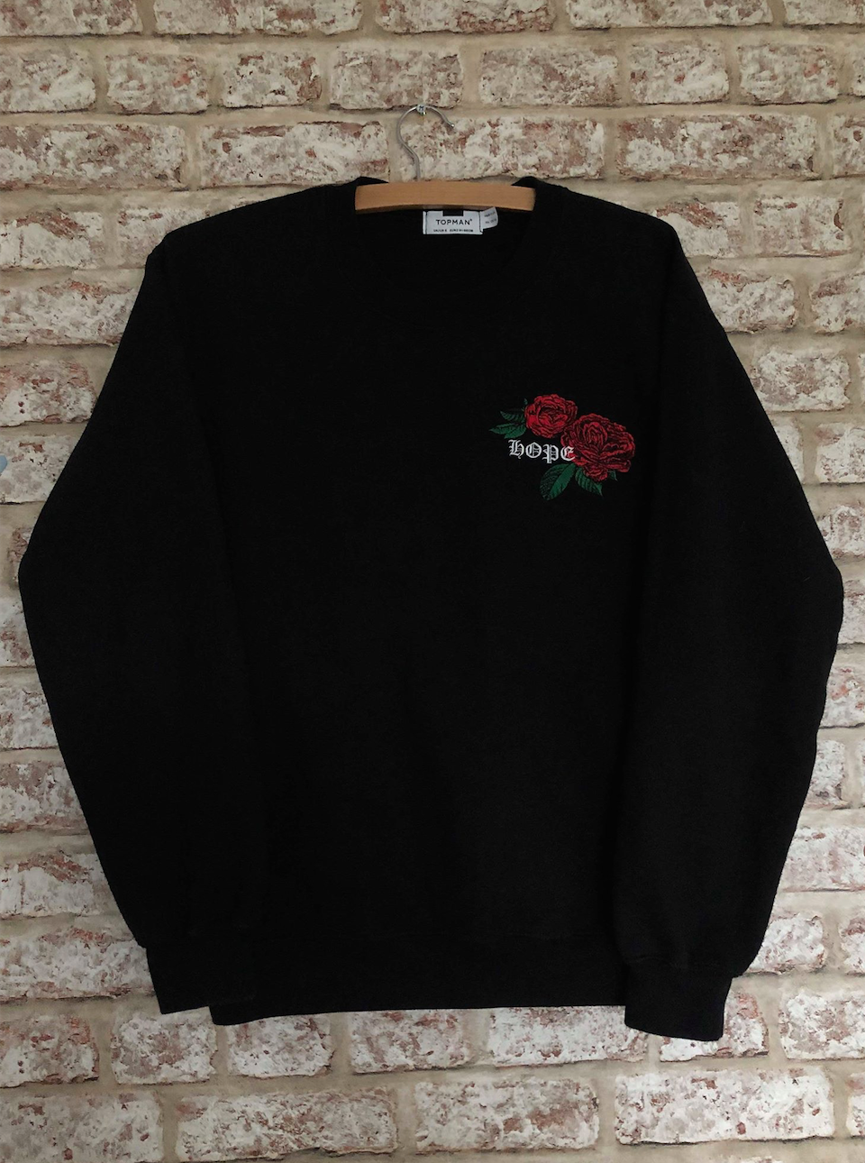
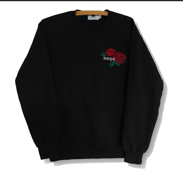
Firstly I took photos of an array of clothes, making sure I had two items of clothing that looked very similar. I used photoshop to cut them out, edit the colours slightly and add a shadow behind. I did this for a range of different items of clothing, jumpers, t shirts, shirt, coats etc.
Before starting the video I drew a few rough sketches of possible ideas for the overall aesthetic of the video. As I stated in a previous post, I wanted to keep it simple and minimal as I think that will add a contemporary feel to it. I kept the background white and wanted all the text to be either black or white.
Taking influence from my sketches I then used illustrator to create mock ups using the images of the clothes.
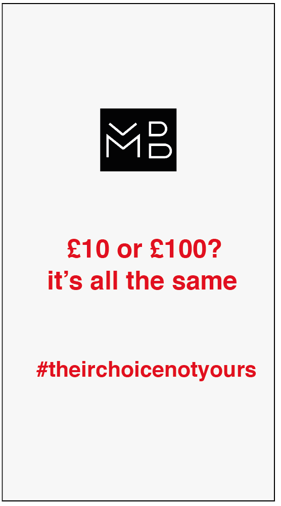
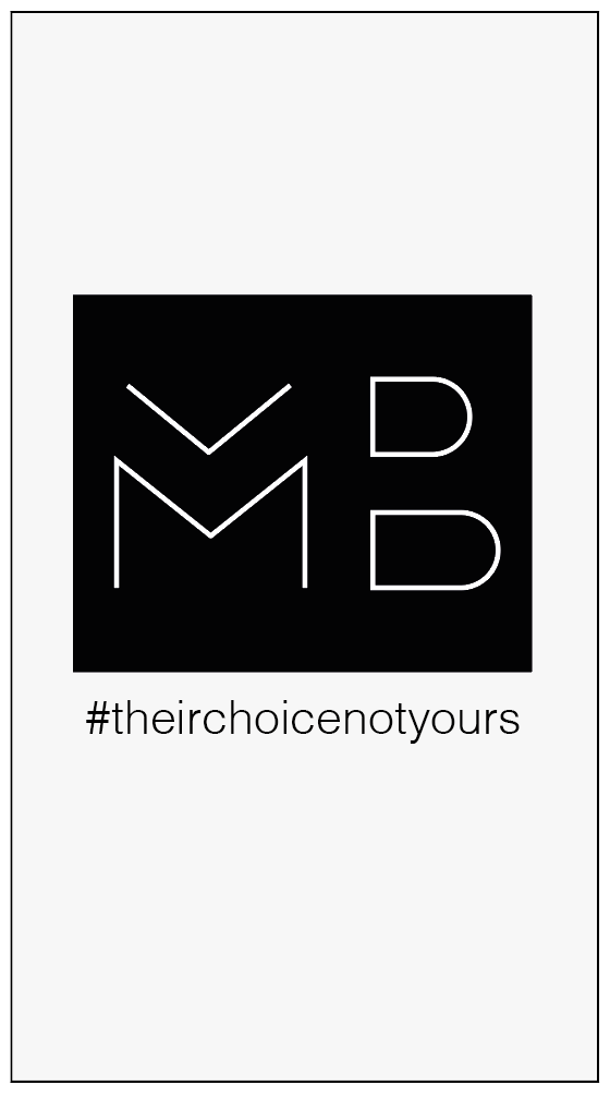
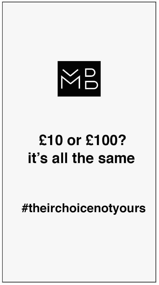
The first design I wanted to look at was the end of the video as I think this is the time when people will realise what the video and the whole campaign is about so it has to show the message very clearly. Although the image in the middle is very minimal and fits the style I am looking for, it doesn’t have a strong message conveyed like the other two so still doesn’t really explain the video. The other two have a strong punchline at the end of ‘£10 or £100? It’s all the same’ which I think sums up the entire video and hopefully is a way to make people realise and think that all the clothes they’ve just seen are actually very similar in the way they look. Both are strong and although I want to incorporate some red into it I think the black looks more contemporary in this instance.
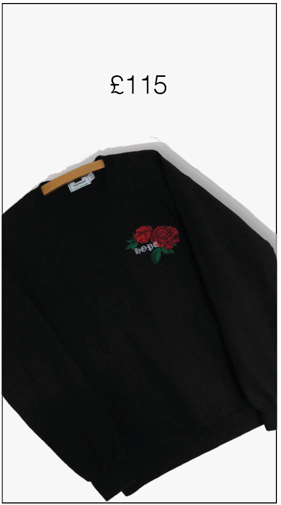
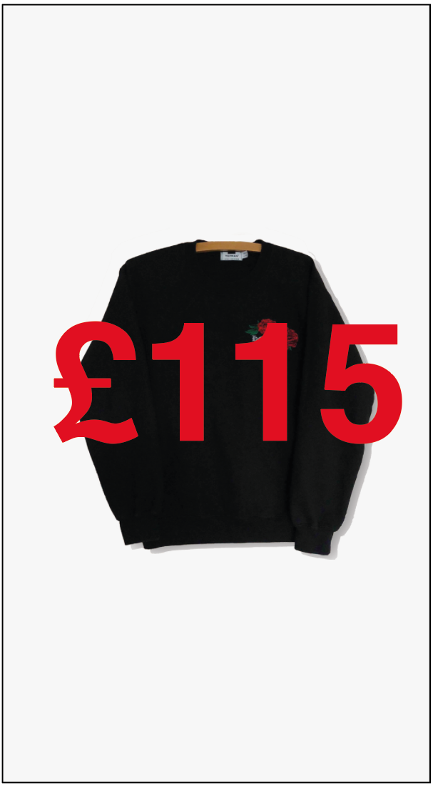
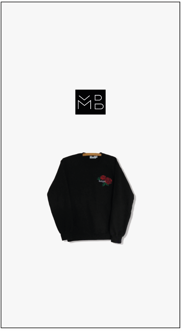
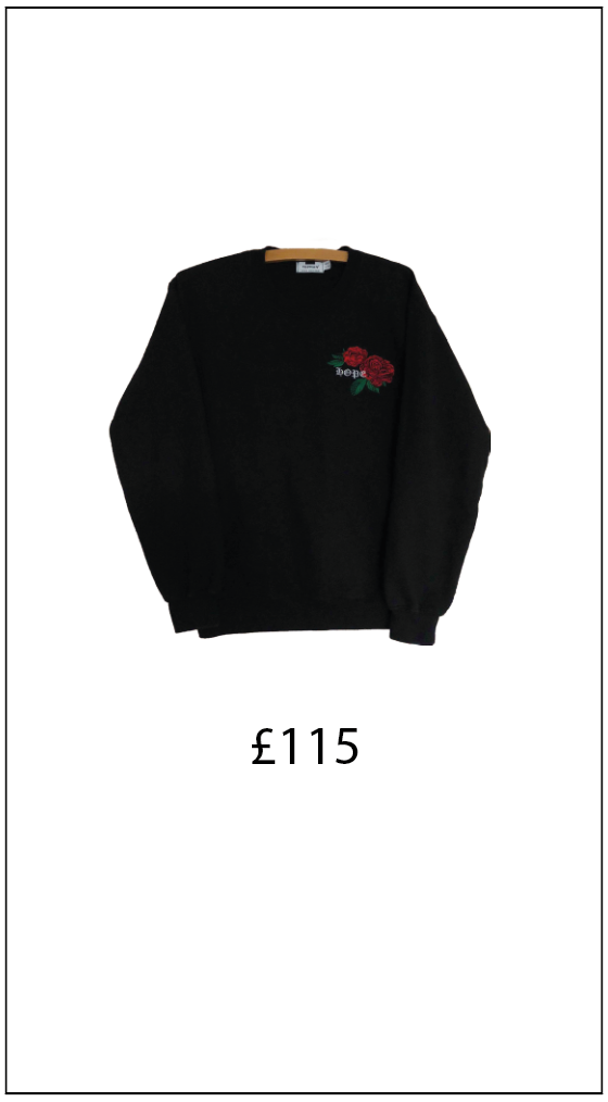
I then did the same for the middle portion of the video which displays all the clothes. I wanted to keep the same theme of it being simple with the clothes being displayed in the centre of the video and a price on screen. Although I like all of the outcomes, I think the most effective is the larger mock up. It’s simple but effective and does everything it needs to do, each item of clothing will only pop up on the page for about a second so I don’t want to overcomplicate it by adding anything other than the price. I also like how everything is centred and looks clean and minimal, the price is also in black to match with the black logo and black text at the end of the video.
