
My role in the group was to create a video to advertise our campaign. I wanted it to be a short clip which briefly summed up our campaign and would make people want to read more about it. Firstly I researched into what social media platform is most viewed as the more people viewing it the better. I found out that among teens and young adults, 76% of them use Instagram whereas only 66% use Facebook. Because of this I decided to make a sponsored video which would pop up as the viewer is scrolling through their ‘stories’ on Instagram.
I then looked at existing sponsored videos on Instagram to see how they’re structured and designed.

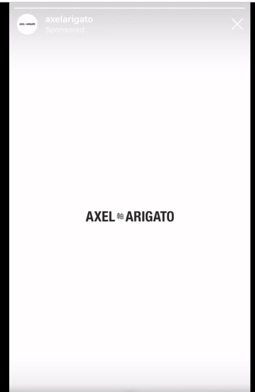
Firstly I looked at an advert for a clothing brand to see the way they style the advert, as well as how they show the clothes. The advert is kept very simple, with a plain white background and black text. Each item of clothing pops up on the screen for about a second before moving on to the next, it gives the viewer enough time to see it but not too much time that the viewer will stop looking. The clothes are then followed by a plain frame with just the logo in the centre, keeping the minimal and contemporary look. The videos are only about 20 seconds long so the content comes and goes very quickly, not giving the viewer much time to see each frame. The text generally appears on the screen and disappears at the speed the viewer would read it.
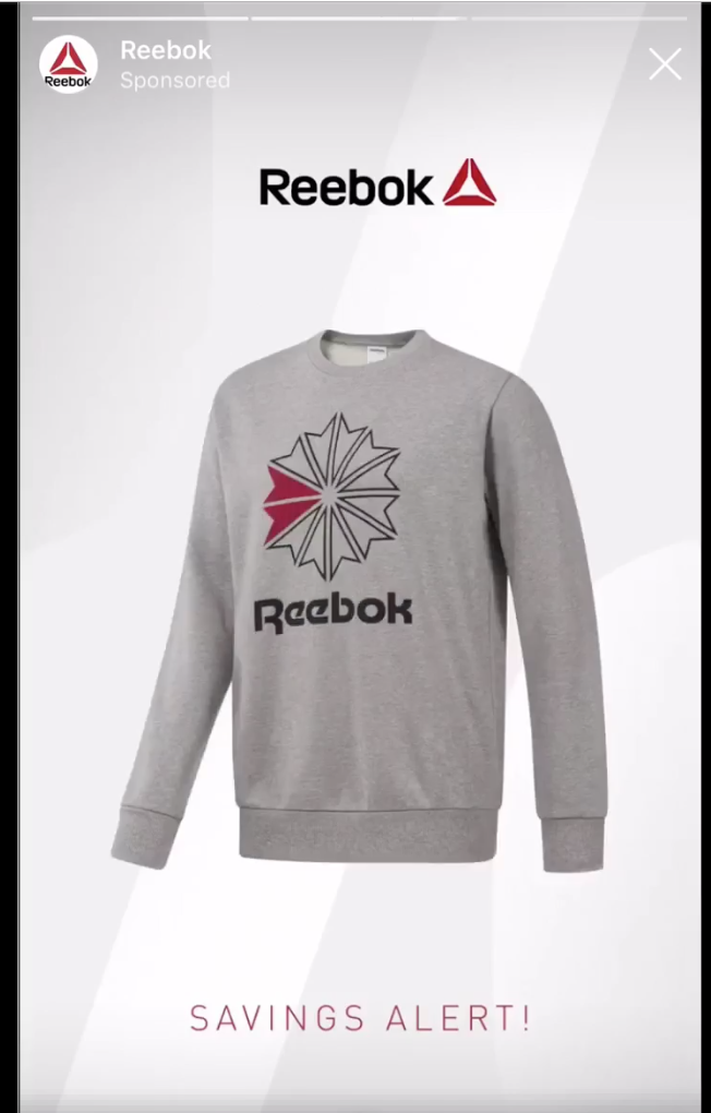
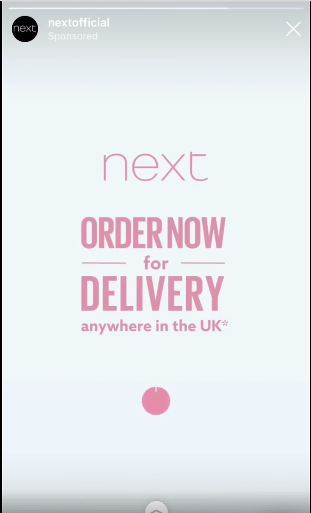
The next adverts I looked at were also for clothing brands, both had a very similar style to the previous advert, with a very light background. The clothes pop up on the screen in the same way, not staying in frame for longer than a second. Just like the previous advert, after hr clothes are all shown a relatively plain screen appears with the logo with a small amount of information. I also noticed each advert has a ‘swipe up’ icon which bobs up and down slightly towards the end of the video.
Overall I took lots of inspiration from all of them, especially the ideas of light colours and a limited colour palette to keep it modern and contemporary. I wanted the first and last frame to be simple and minimal, consisting of only the logo and possibly our slogan.
