
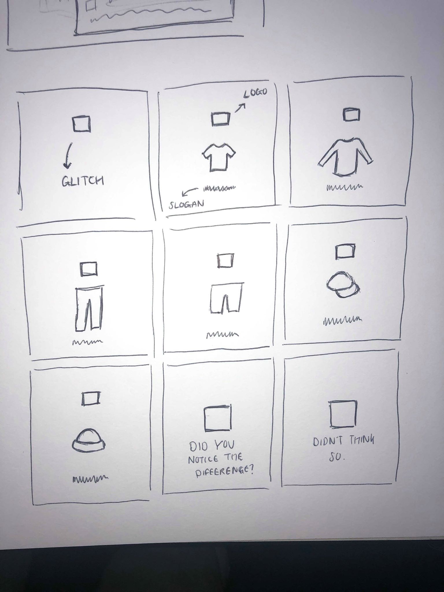
Before creating the video I looked back at a sketch of a storyboard which i drew at the beginning of the project to give me a rough idea of how I wanted it to look. Although some areas of it I don’t think are effective, for example now we have chosen to stick with the idea of a clothing brand, the last 2 frames aren’t effective in showing off the clothes. I wanted to experiment more with what the text would say at the end as well as what would be on the screen at each frame, whether it be just the item of clothing, or with a logo/slogan. I also wanted to add a few other elements to it to possibly incorporate some red into it to make it stand out a bit more.
Following on from my research into existing adverts, I thought more about the overall composition and thought about any changed I wanted to make. I made the decision that after the logo fades away, the clothes should start popping up on screen instantly to make the most of the time. I wanted the clothes to change relatively quickly alongside their prices. My first thought was that my initial storyboard starts and finishes with the logo and a small amount of text which, from my research, I gathered was the most effective way to make it look. However, the sketch looks to boring as it is and needs something to make it more exciting to look at.
