
After deciding the base of the video, what I wanted the beginning, middle and end to look like I then worked on adding some stylistic elements to make the video more exciting to look at and draw the eye of the viewers.
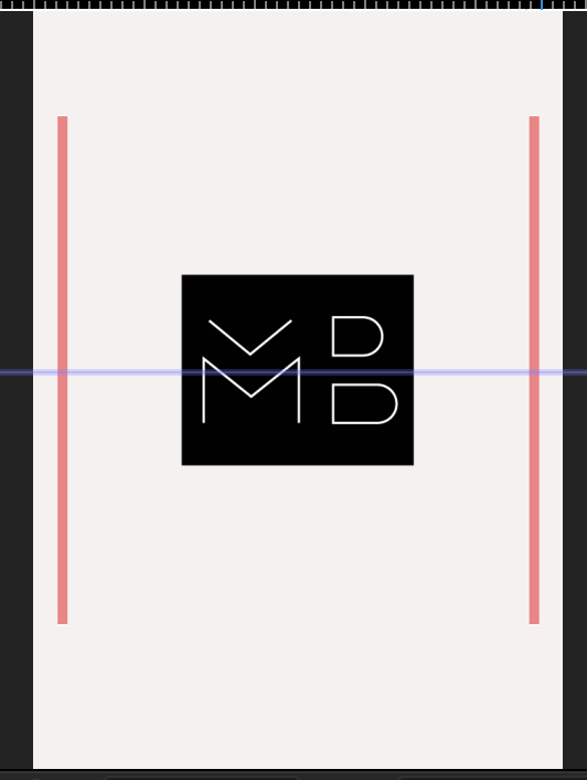
The first element I added was right at the beginning of a video, I wanted to add 2 lines which start in the centre of te page and extend upwards, almost opening up the video when the viewer clicks on it, I think it’s effective in drawing the viewers eye. I tried it in black and red and decided to go with the red, as the whole purpose of it is to catch the viewers eye, I decided making it red will do this more effectively.
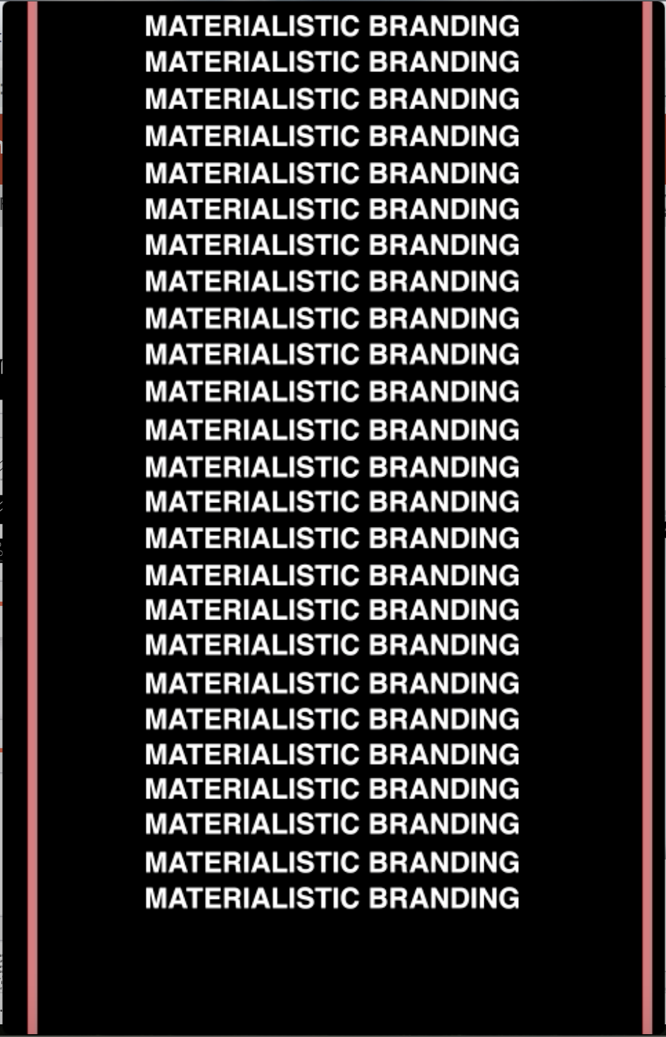
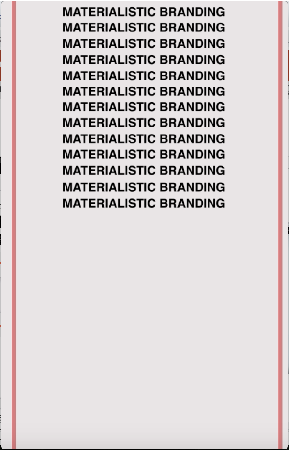
I then wanted to add another feature of the name of the campaign almost swiping up the page before changing colours and coming back down the page. I added it in just after the logo at the beginning and just before the logo at the end just to add a visual in to keep the viewer interested and stop them from clicking off the video.
I think both of these elements are effective for their purpose, they don’t have any hidden meanings about the campaign but as I noticed in my research into Instagram adverts, they often just add elements in like these which just give the viewer something ‘nice’ to look at which keeps them interested and stops them clicking off.
