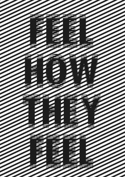
Overall i think the piece is a good cover for our manifesto, giving a slight insight into our manifesto using imagery and a small amount of text. The illusion visual was to reiterate the idea how confusing mental health illnesses can be, and it isn’t until you get closer to someone with a mental illness that you start to realise and understand whats going on. The confusing background could also be used to explain how someone with a mental health issue might feel, they might not be able to explain it, or may even be scared to and so it gets covered up, or hidden, just like the text.
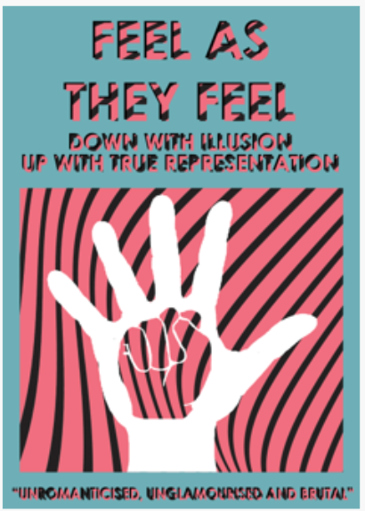
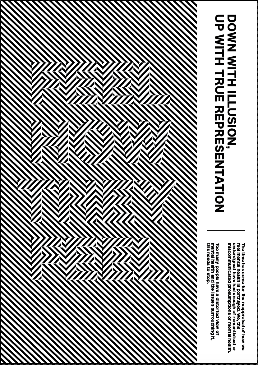
“Down with illusion, up with true representation” is the subheading for our design and is based around the idea that there is an illusion around mental health and lots of people struggle to understand it or see the picture, therefor the aim of our manifesto is to raise awareness of this and represent the ‘true representation’. The next text is just a brief description of our manifesto and is as follows, “The time has come for the reappraisal of how we feel mental health is portrayed. We, the undersigned have had enough of romanticised or miscommunicated presumptions of mental health. To many people have a distorted view of mental health and the issues surrounding it, this needs to stop.”
Although we used my design for the final outcome, the work that I created was a combination of everyones work throughout the process which contributed to the piece. Shannon and I worked very closely to create the effect of an illusion, using the same techniques and lots of critiquing each others work to create a visual design which is the main focus of our piece. I also took inspiration from Jack and Sophie who created designs incorporating text into the outcome which we did for our final design.