
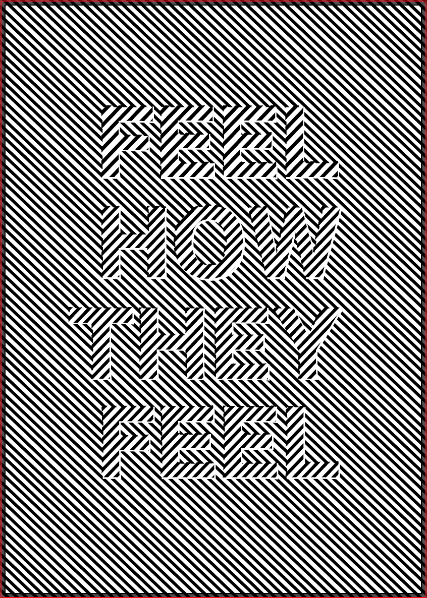
i met up with the rest of the group to show them the work I had come up with and we all agreed this was the most effective of them all. We agreed that it was the piece which stuck to our theme and idea the best, it’s very simple yet it stands out and the words draw the eye instantly, drawing the viewer in to see what the manifesto is and what it stands for. The idea of the illusion is portrayed well and gives a distorted feel which we think stands as a strong visual metaphor for the ‘distorted view’ many people have on mental health. The idea of the text being incorporated into the background using the same style also works well as a metaphor for metal health, that you have to look further than how someone looks or acts as the inside can be a very different story. The use of the illusion background was to reiterate the fact that some outsiders to mental health issues don’t fully understand an individuals condition, they need to be closer to that person to fully understand.
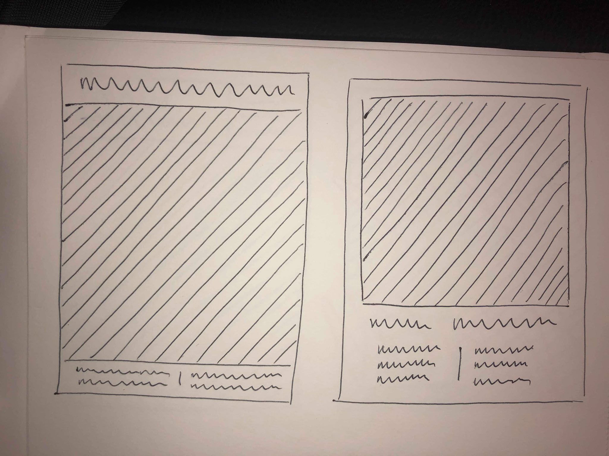
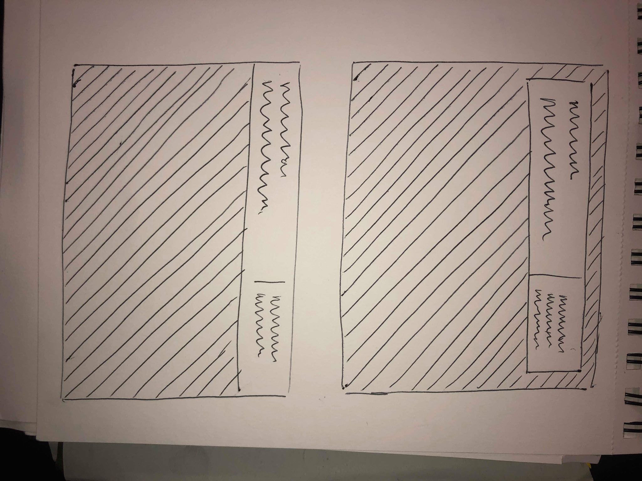
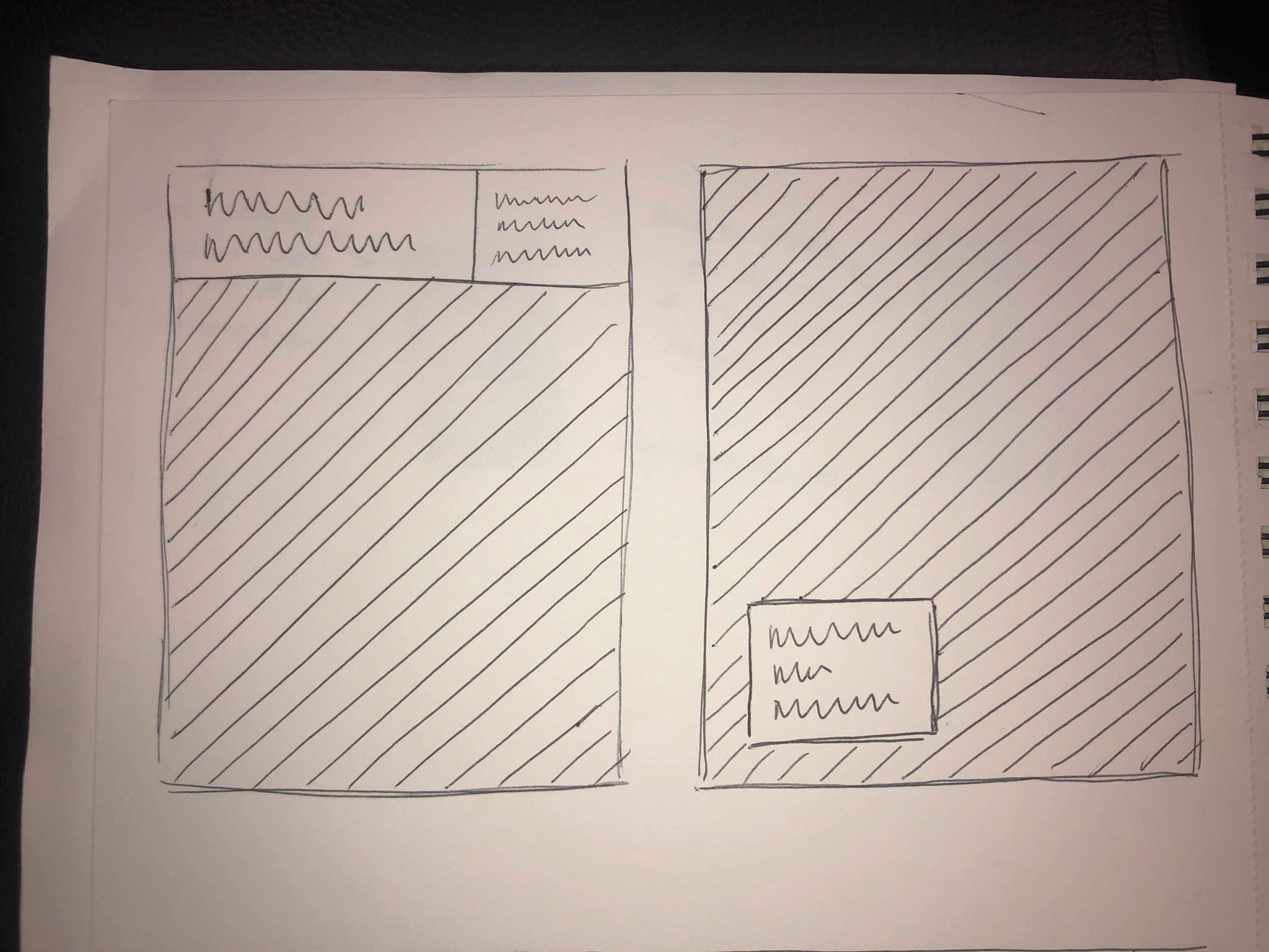
Although the piece portrays our idea well, we discussed that you would be unable to tell it was for a mental health protest from from just looking at it. Because of this we wanted to make it more of a poster with a subtitle and some information. I drew out a few sketches of possible ways we could do this. I wanted to keep the design as the main focal point for the piece so mainly used simple boxes around the edges to keep the design at the centre.
I then took to InDesign and created some final designs, taking inspiration from my sketches and adding white and black boxes to the work to create some negative space where I could add text.
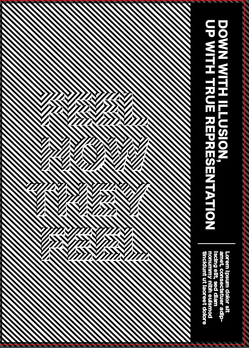
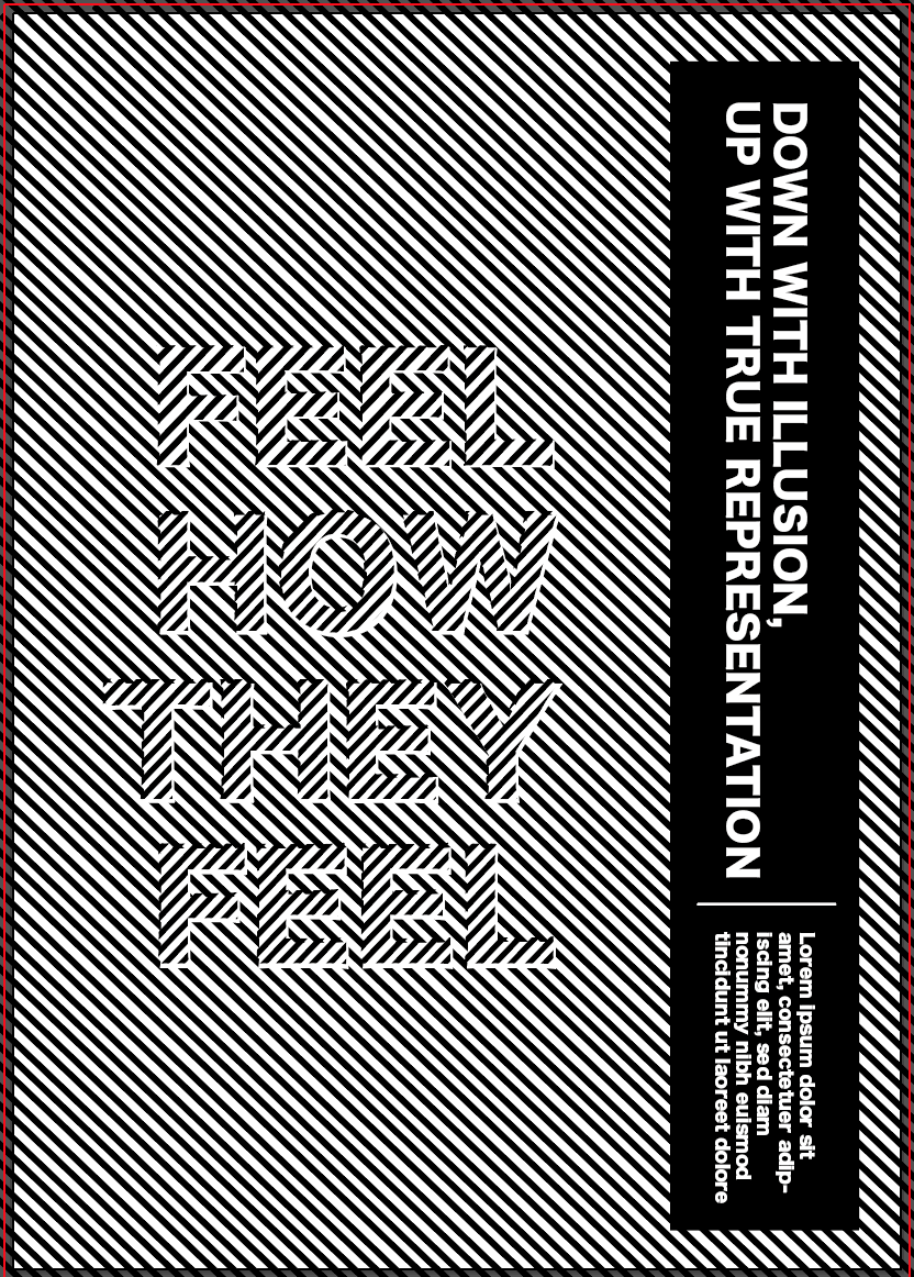
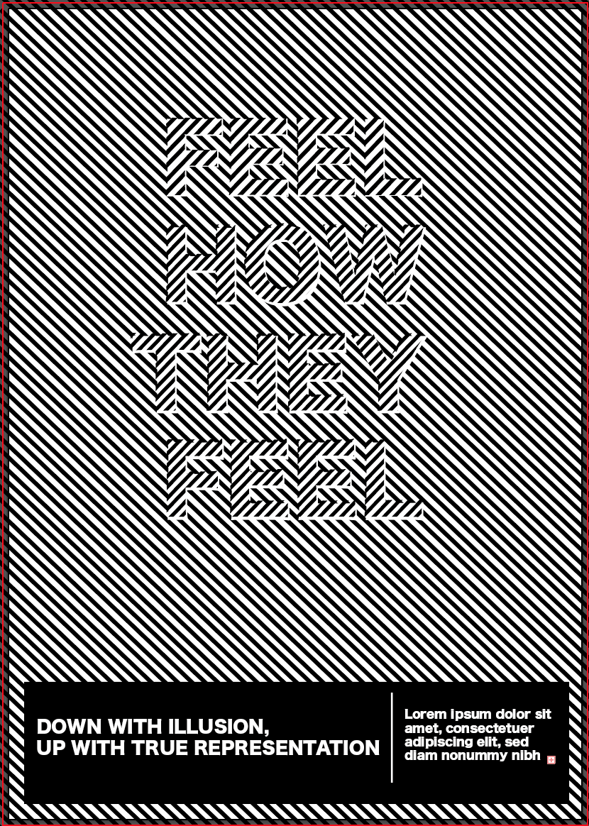
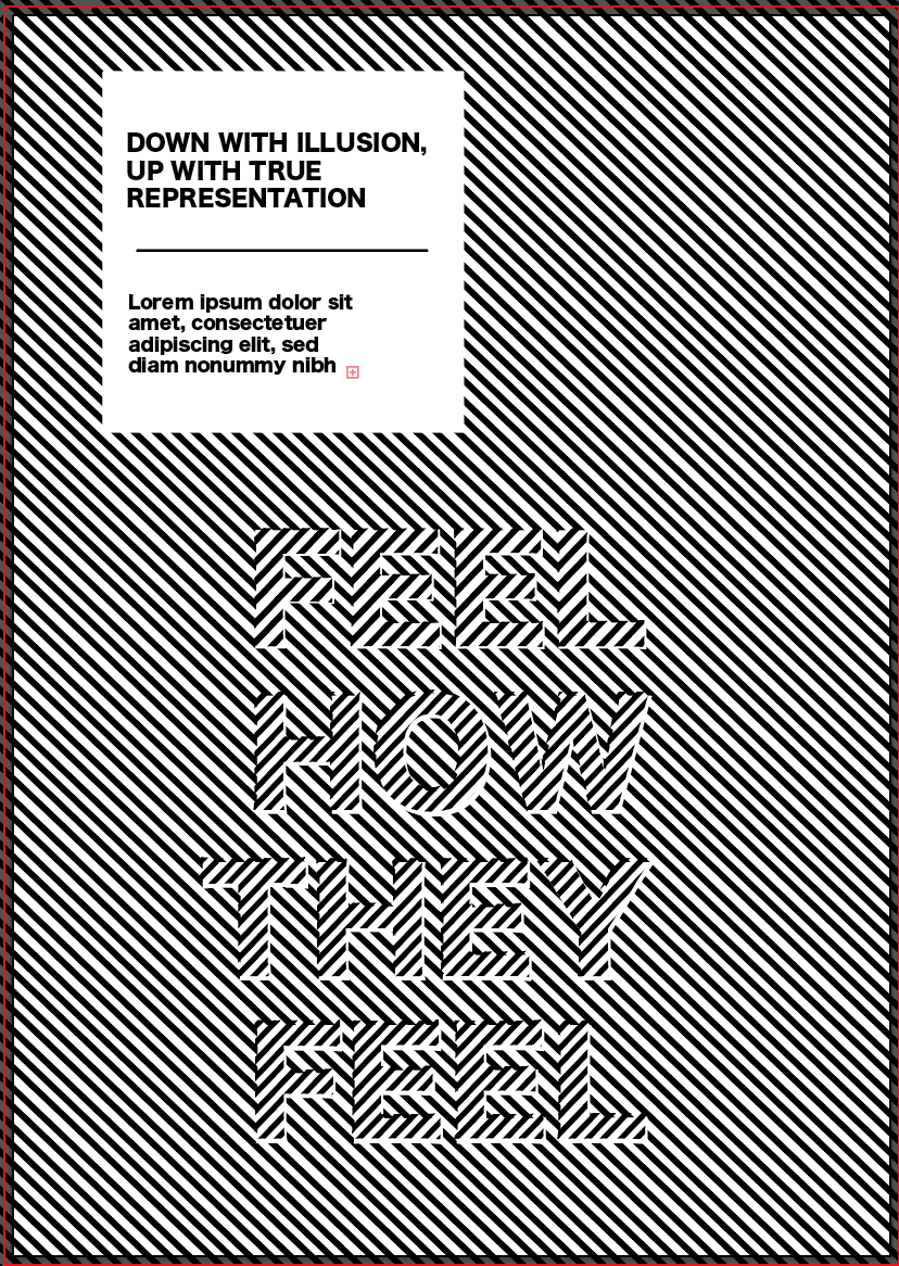
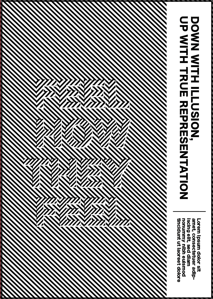
I experimented with a variety of different styles to create an outcome which looks sophisticated but doesn’t take up too much space in order for the design to be the main feature. I think instantly each design takes it from just being an illusion to a poster and gives more information about our manifesto. Overall as a group we decided the two with rectangles running down the right side of the page were the most effective due to the fact they make the most use of the space and leave space in the middle of the page for the illusion and title to be showcased. The text also flows well from the title to read the rest of the text.
