
We were introduced to the brief for our last week which was to create placards to use during out protest. They could be printed, hand drawn or painted, sculpted etc and one had to be in the style of Stanley Green’s ‘Protein Man’ which was made using only tape and paint.
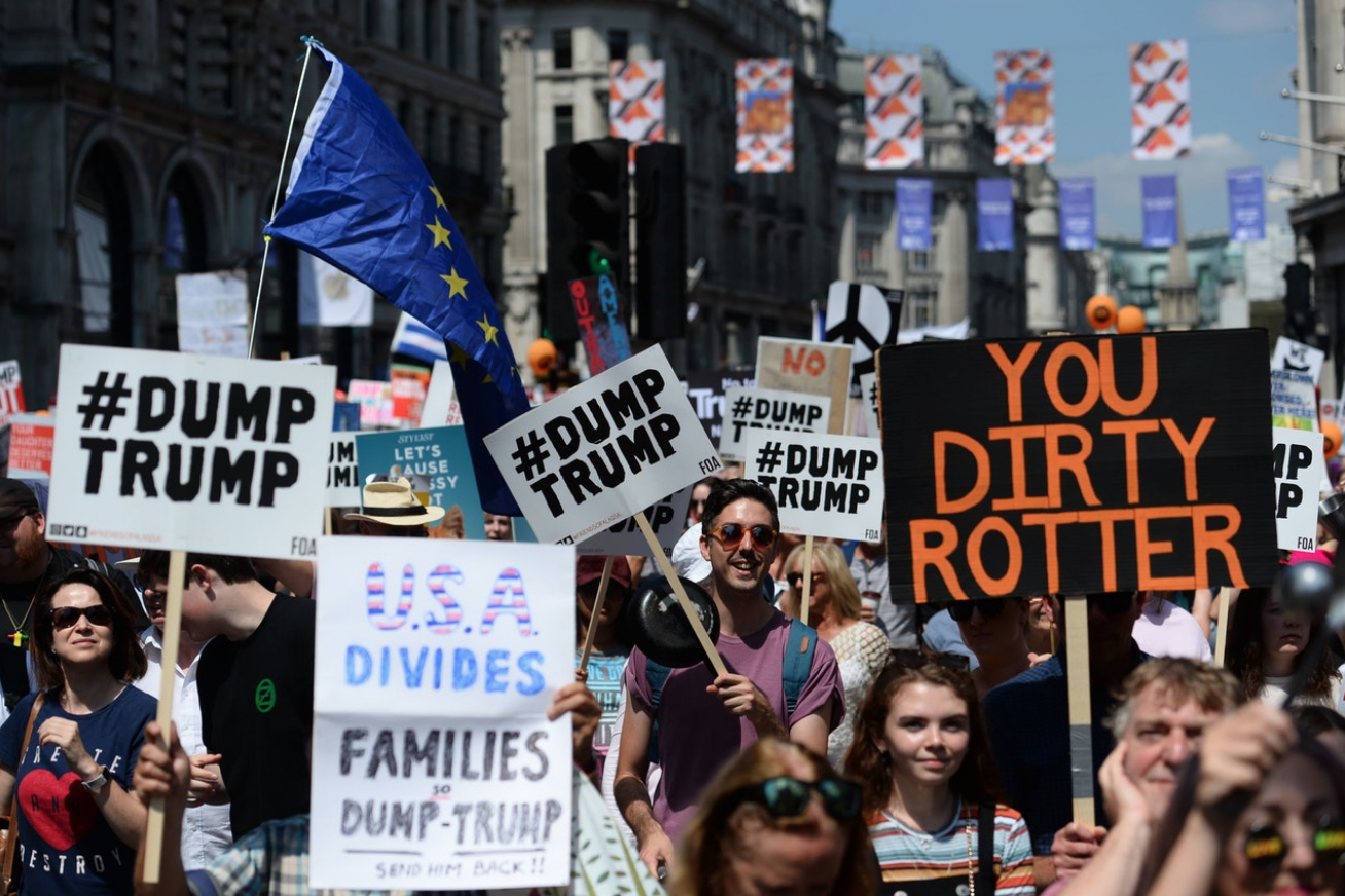
Our initial research was to look into protests and the sort of placards they use. One of the main taking points in our group was the the majority of the posters were hand made or hand drawn, and although they may not look as perfect and as ‘slick’ as a digitally made placard, they feel much more personal and moving, and for me it makes me think that the fact they are willing to put time and effort into hand painting it shows that it’s something which effects them personally, which is a very moving thought for the person viewing the protest. For me, the most effective placards feature a plain white or black background with a phrase or quote written on them. The fonts used are often very important, and the majority of the placards, as seen above, are in sans serif which I think gives a much more authoritative feel to it, it feels much more like they are demanding something as opposed to asking politely. The colours are also very important, often they relate to what the protest is about, but they all use bold, bright colours which stand out on the page and draw the eye of everyone watching.

One other thing I noticed is the phrases written on the placards are all aimed at someone, they are messages or statements directed at someone at something, as opposed to just quotes or meaningless phrases.
http://www.bbc.co.uk/newsbeat/article/34386451/junior-doctors-protest-explained-in-placards
