
I decided I wanted my placard to be hand made to make it more personal and to give it a sort of rough look. I screen printed the main text onto the poster and then used a red pen to write over the top of it. Although I didn’t use my digital placards I used them as a guide for how i wanted my final outcome to look.
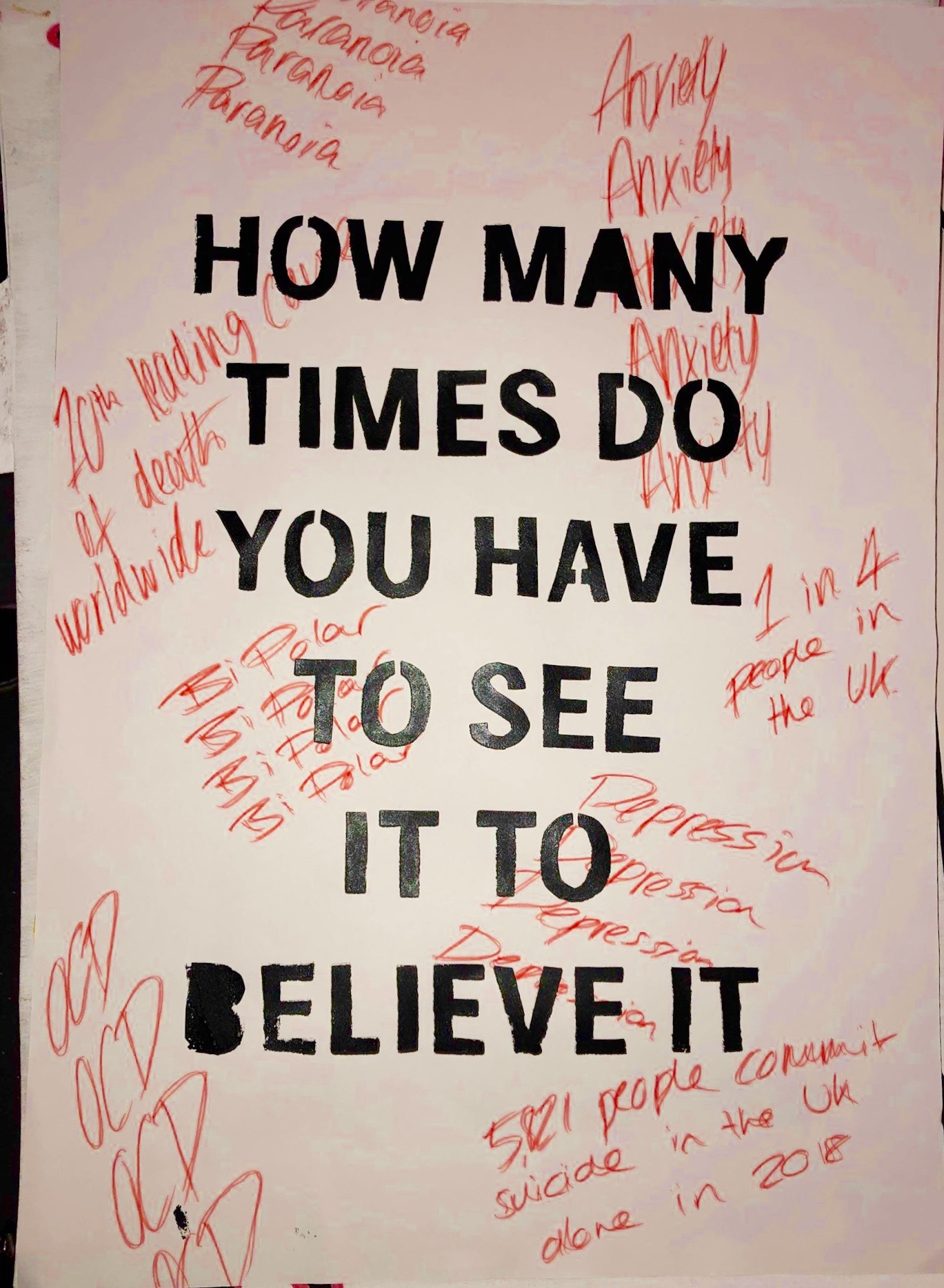
I went with the white background because I wanted to red to stand out and pop off the page and felt like it wasn’t as bright and vibrant when on the black background. I kept the main text in sans serif as I wanted it to be bold and stand out in the centre of the page and be easy to read. I also kept the black text above the red writing as I thought it was a way to show that mental illnesses can be beaten and overcome. I then used the previous digital placard I made as a guide for the font and what to write in the text, using sort of scribbly and rough writing in seemingly random places on the page. I think it gives an essence of how rough and messy a mental illness can be.
Overall the placard is not as visually pleasing as some the digital placards I have made, however i think the message behind this one is the strongest of them all and explains our protest better than the others. Our whole protest is about making people aware that mental health is a real thing and should be taken seriously and I think the placard says that. The handmade nature of it, although again may not look as clean, makes it feel more personal and bold and as if someone actually cares enough to make it and not just type on a computer.
