
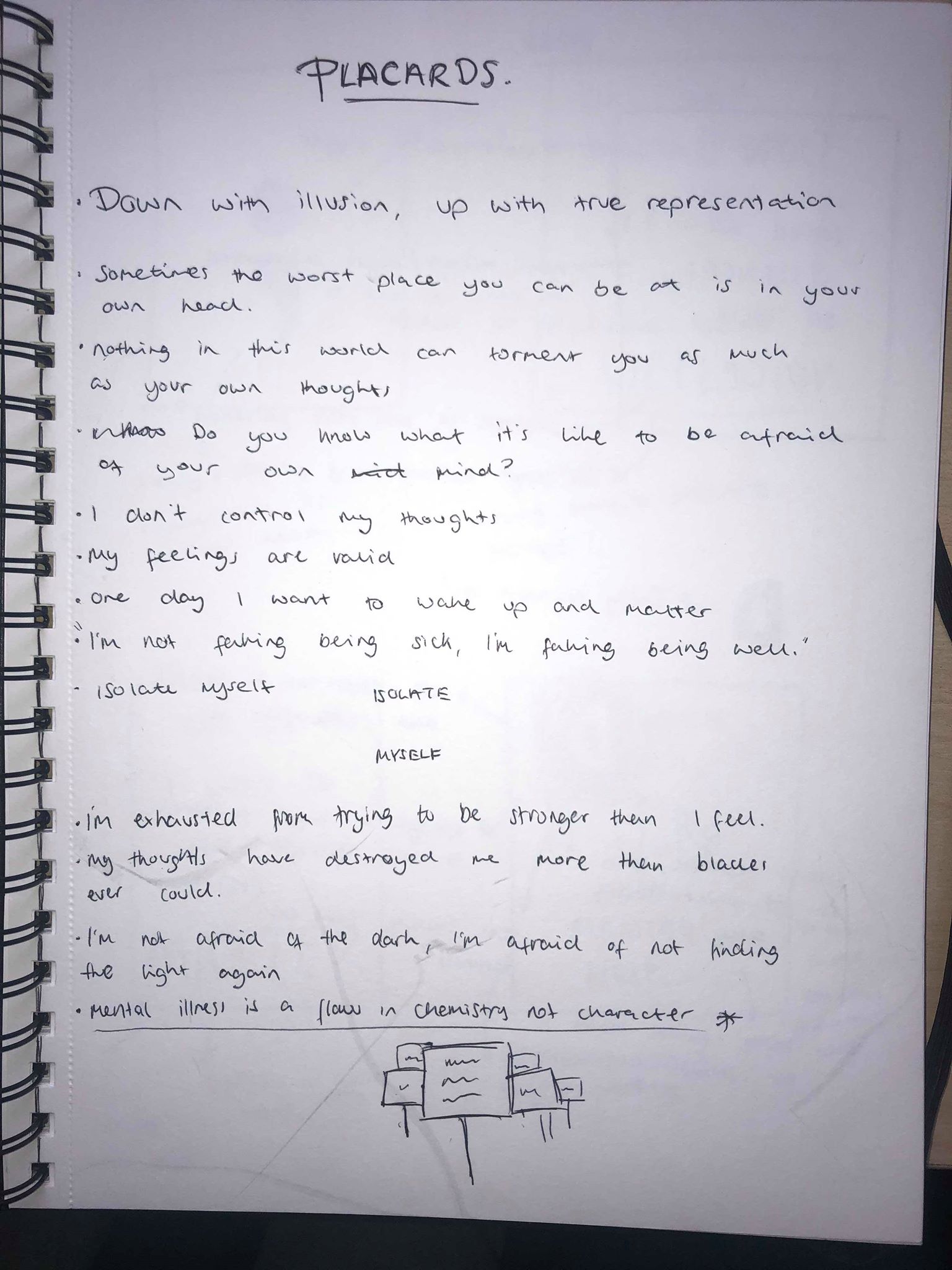
I started off by thinking about phrases i wanted to use on my placard. Initially I was open to any ideas, I thought using a statement about mental health such as “Mental illness is a flaw in chemistry not character” as I think it’s effective to make people think more about it and understand what our protest is about. I also thought about using quotes from people with mental illnesses, such as “I’m not faking being sick, I’m faking being well” as I think quotes from the point of view of the people with the illnesses will be moving and thought provoking to the viewers.
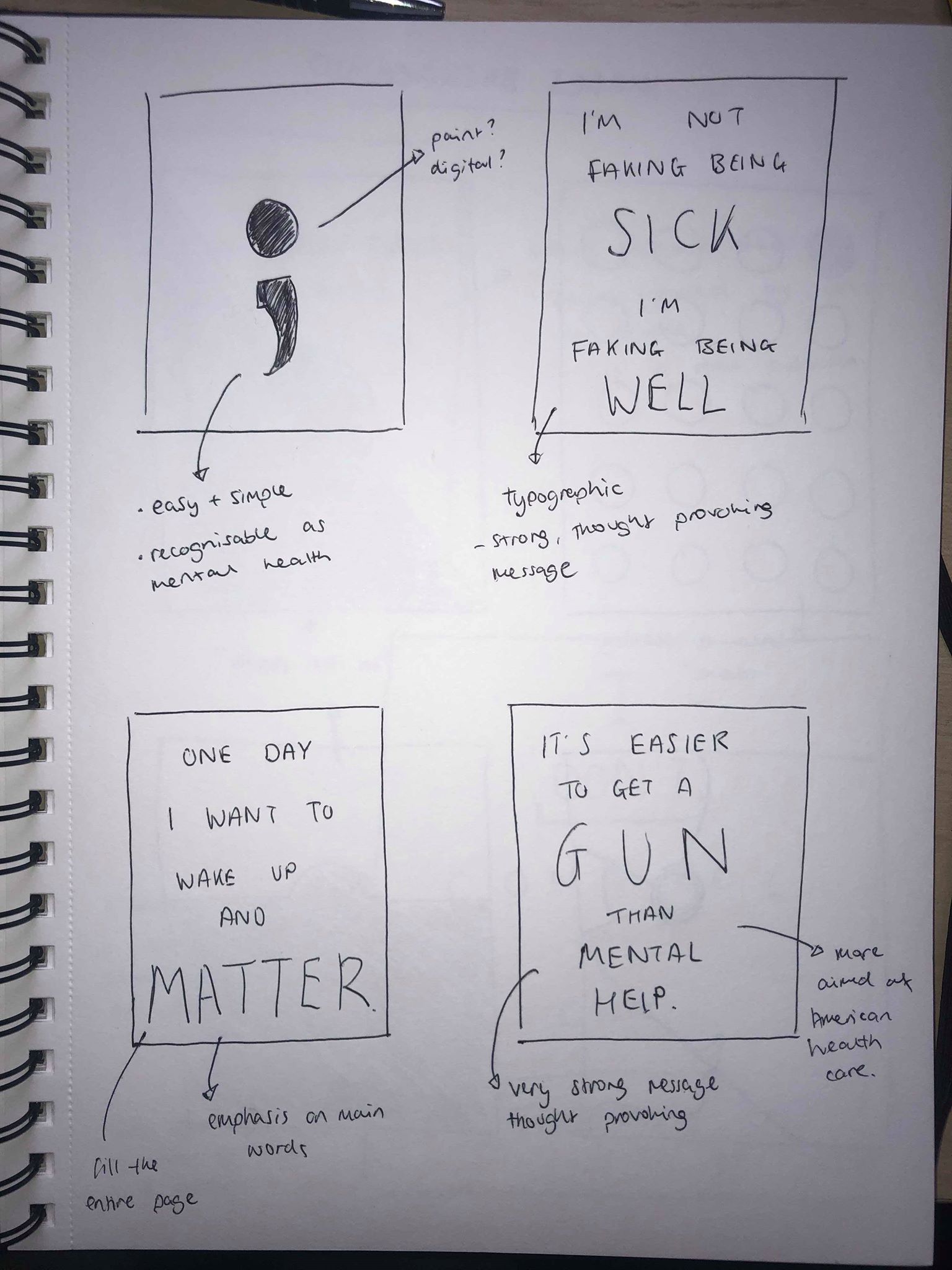
I sketched out some ideas for possible placards. Within my group we spoke about using the semi-colon as a symbol for mental health awareness. I also wanted to sketch out some purely typographic ideas using hierarchy by making the important words larger than the rest. I used phrases which had a strong message and would be very thought provoking to the audience.
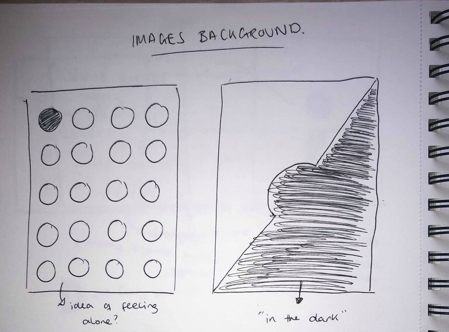
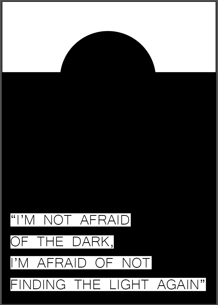
I then looked into using imagery to convey a message, I wanted to keep it simple so it would be easy for the viewer to see and understand what the message is.
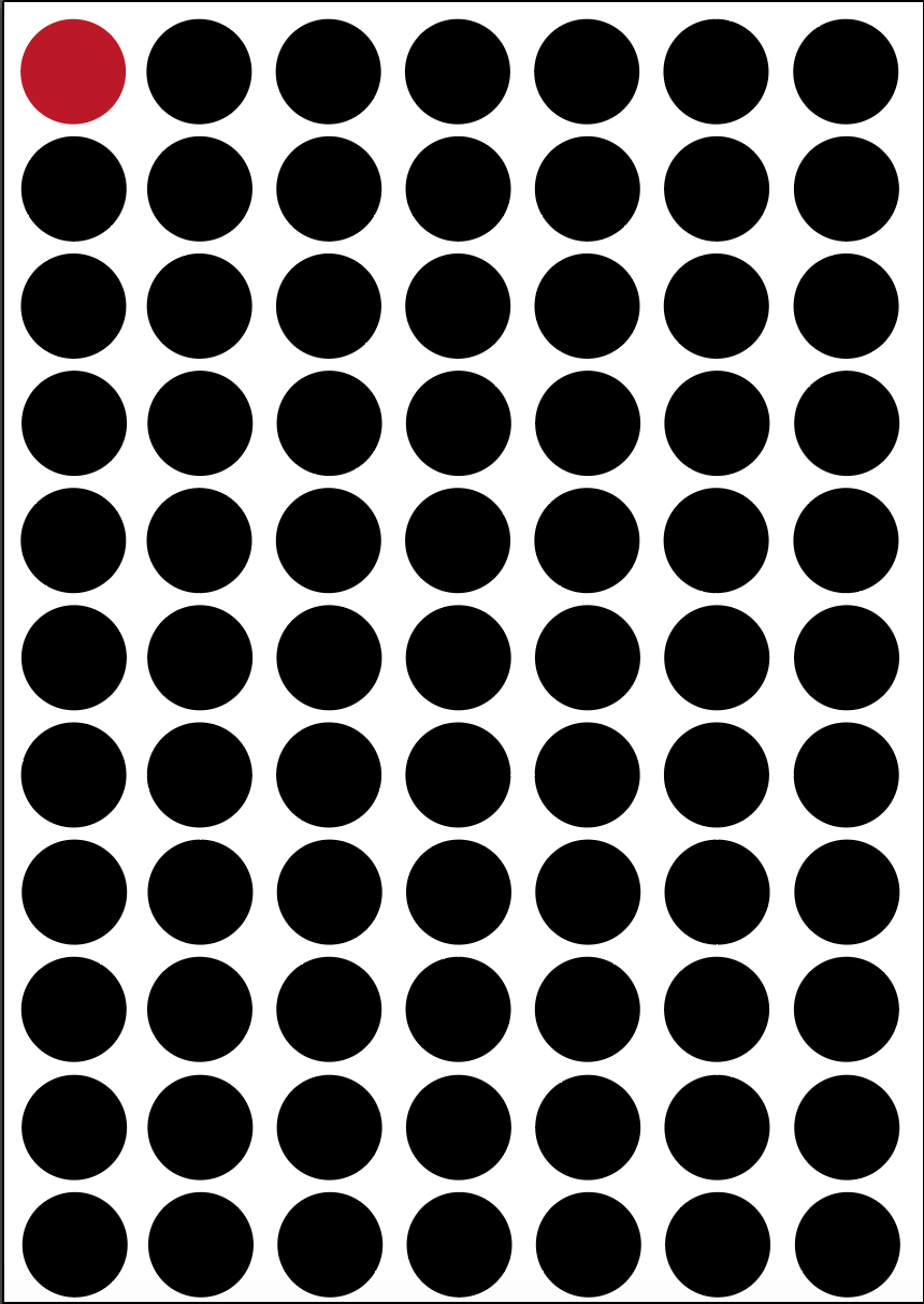
Overall I think the visuals in both placards work really well, however to me they just look too much like posters and are the kind of things you would expect to find in a protest. The idea on the right has a good message behind it, but the text is far too small for a placard. The image of the right again has a strong message behind the visual which i think works well, however I struggled to figure out a way to add text to it without it behind hidden away underneath the image, which meant the text would still be too small.
I then used my illustrations which I created last week to use as a base for a placard, and added text over the top of it. I made the text slightly transparent so you can see the image underneath, and I gave the text a thick, brush outline to make it look hand drawn.
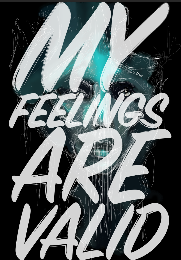
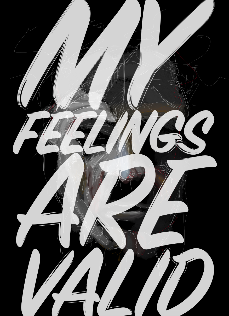
Overall I think they both work well and are visually appealing, however although the text is large enough for the audience to see, I now don’t think the illustrations are overly visible underneath the text. I decided not to use either of these for my final placard because of these reasons, but I do like the way the text looks hand drawn and think it looks much more personal.
