
In todays lecture we were given our brief for our editorial project and were given a short lecture on layouts and grid systems, hierarchy, type elements and detailing within an editorial piece as well as the use of pace throughout an article or magazine.
For our short workshop task, we were split into groups and had to create a double page spread each using a given topic. My grouped picked out the topic of ‘Coachella’ and had to crete an article all about the festival. We each designed a page each but had to use all the elements taught to us in the morning to make the article look professional and as if they had all been made by the same person, for the same article. We decided that we first needed to come up with a visual identity that would be similar across the whole article but would also not look exactly the same to create a sense of pace. We decided on things like the colours we wanted to use, the type, layout (grid system), and how we wanted our paragraphs to be laid out.
As a group we spoke about the things we discussed with David in our tutorial about how we wanted the article to make the reader feel, and after discussing this and carrying out some research into the festival we we ultimately decided that Coachella has had criticism recently for being more about the ‘vibes’ it creates and less about the actual music. We wanted our article to show this and so decided that the images within our article would be the most prominent aspect and would take up the majority of the page. Coachella is always at the very peak of what is currently going on, with the music, fashion and style of the festival all being very modern, we wanted to convey this in our article using a very modern and contemporary feel.
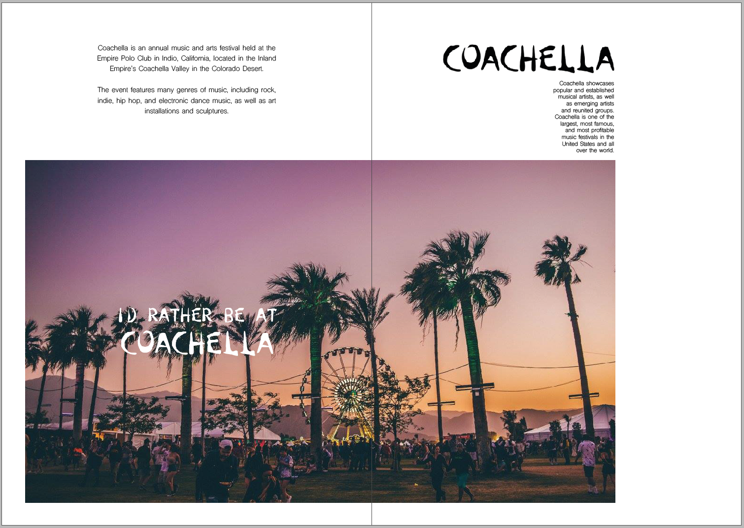
I wanted to use the image as the first thing that draws the eye to create a sense of hierarchy, followed by the ‘Coachella’ heading, then the body text, then the caption. I didn’t want the article to be too informative as as I said previously the festival has become more about the idea of going to the festival and less about the music and the actual festival itself, therefor I wanted to portray this within the article. Overall after only having a short amount of time to create it, I think it works well and uses a lot of the elements we spoke about in the tutorial to create a strong double page spread.
