After speaking with David he agreed that the idea of the black hole showing falling and fear, as well as using the style of illusions and expressive typography to do this. He advised me to continue looking into my ideas and carry out some research into similar styles, looking at the feelings they bring about and how they do this through their style and colours.
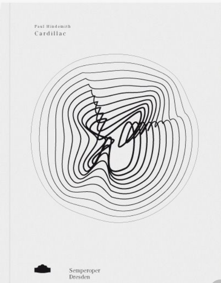
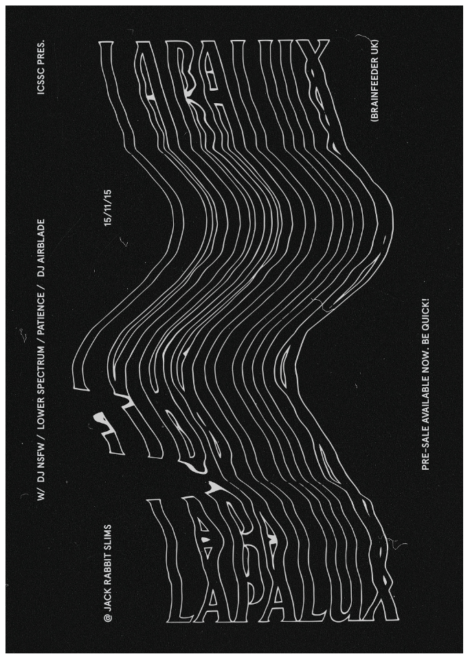
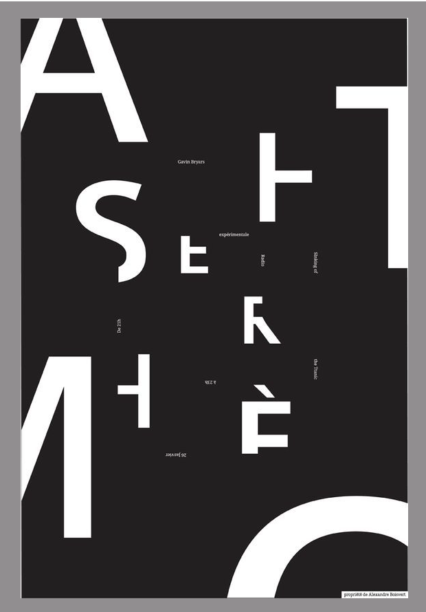
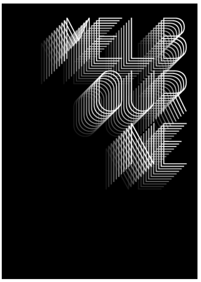
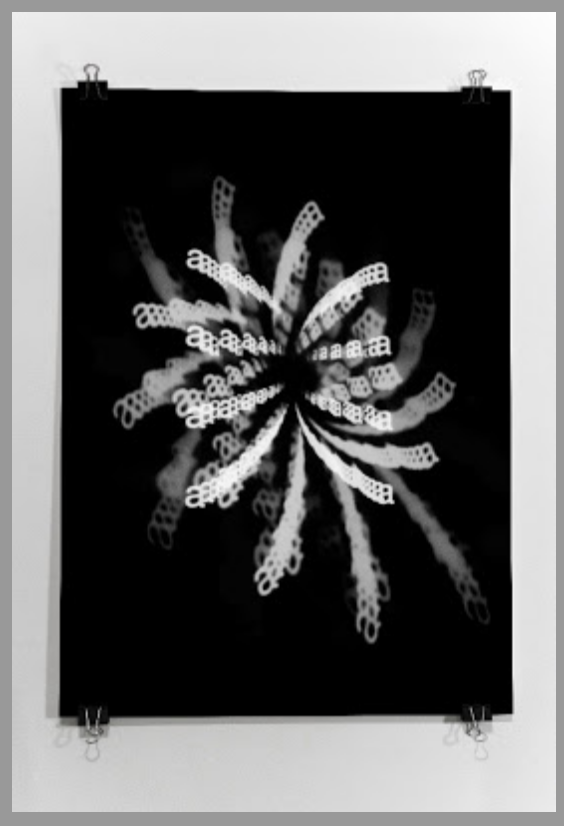
First off I carried out some research to gain some influence on how to design my images. All the images I chose below are the style of work I am looking for and all portray similar feelings. Each of the images I found gave some sense of falling, whether it’s falling from the top of the page to the bottom, or falling and fading into the centre of the page. Not only does it give a sense of falling but also the thoughts and feelings one my have when falling from thousands of feet in the air. They all have a feeling of movement which is brought about by either just changing the scale or in some cases changing the opacity to give the feeling of fading away. The majority of the examples I could find were in black and white which gives them all a very clean modern aesthetic, it also gives it a feel or darkness or fear which I want to portray in the article. I noticed that lots of examples I could find use text as the images as opposed to lines or shapes, not only does this illustrate the point but it also means I can easily add text from important words or quotes from the article.
I decided to design a series of images taking influence from my research, creating one large image to be the centre piece of each page. I reviewed the article and looked at the paragraph in which I took the influence for my layout to take the most important quotes to sum up “yes, fear and no”.
Dave McDonnell, an English friend of Le Gallou’s, said that before he quit base jumping, he used to hear three distinct internal voices at the exit point, which he called “Yes,” “Fear” and “No.” “If you’re all tuned in, there’s ‘Yes,’ ” he said. “On the mediocre days, there are two other voices. One’s ‘Fear.’ Your body is screaming out at you, ‘Don’t do this,’ because it’s dangerous, unnatural. You’re there to conquer your fear. But there’s another voice that hangs around every now and again, and that’s called ‘No.’ Something’s not right. You can never put your finger on it — it could be something in your pack job, or the weather, or the people you’re jumping with, or your mind-set. It’s just, ‘Walk away, don’t go jumping today.’ The difficulty is trying to discern between ‘Fear’ and ‘No,’ because they’re both telling you the same thing. ‘No’ is your sixth sense that’s trying to save your life.” Whatever voice Le Gallou heard that morning, he jumped.
I chose a phrase for each page which I thought encapsulated the feeling i wanted to convey within each page an each image. I thought i could use the phrase or words from the phrase within the image and could therefor also use the images and headers for each spread.
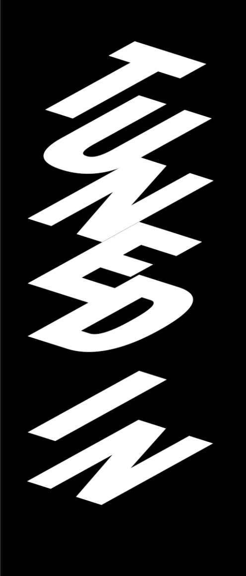
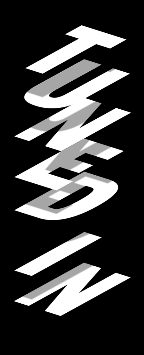
Image 1 – “If you’re all tuned in, there’s ‘Yes,’ “
The first spread is all about “YES”. What I took away from this in the article was that YES is the day when everything goes perfectly and runs smoothly, although the fear of jumping and the actual jump is scary and full of fear. I wanted to show the fear in the image and the maintain the aspect of La Gallou falling or being sucked in, but keep it clean and organised at the same time.
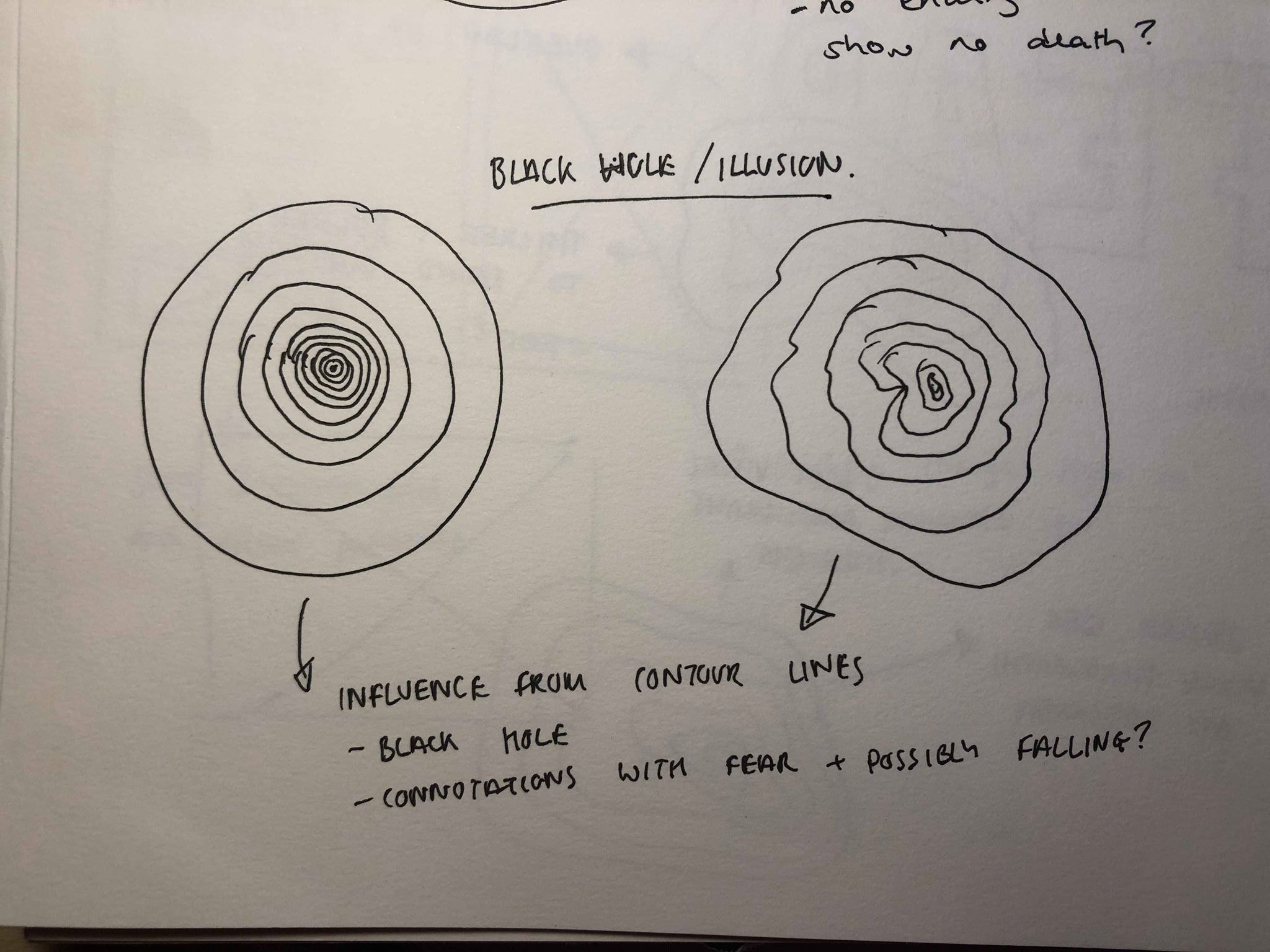
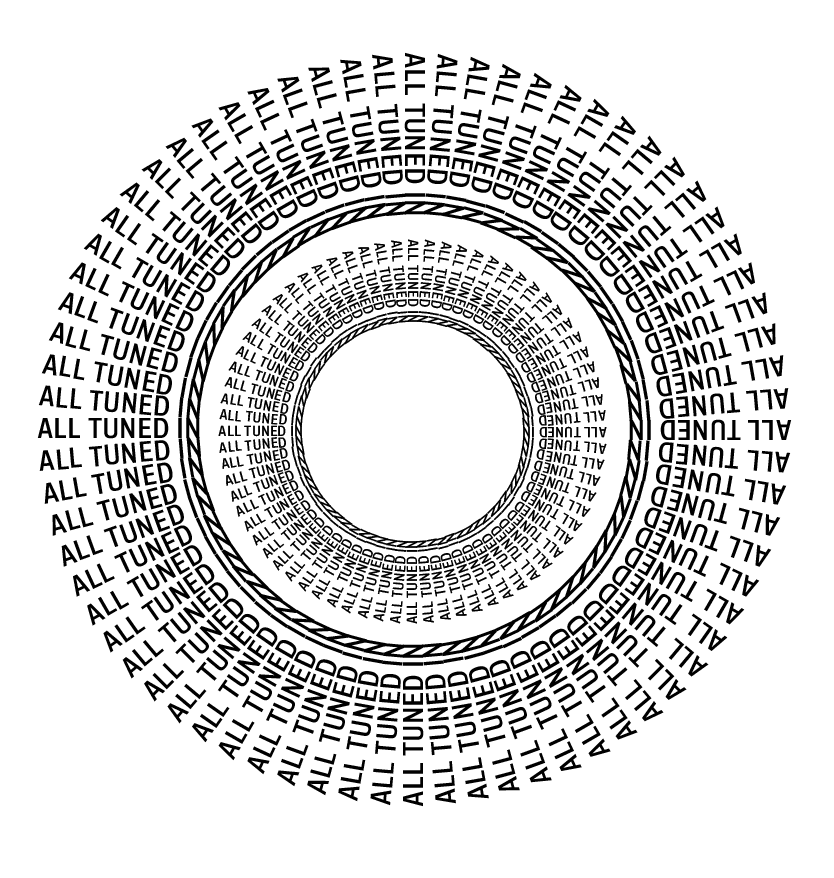
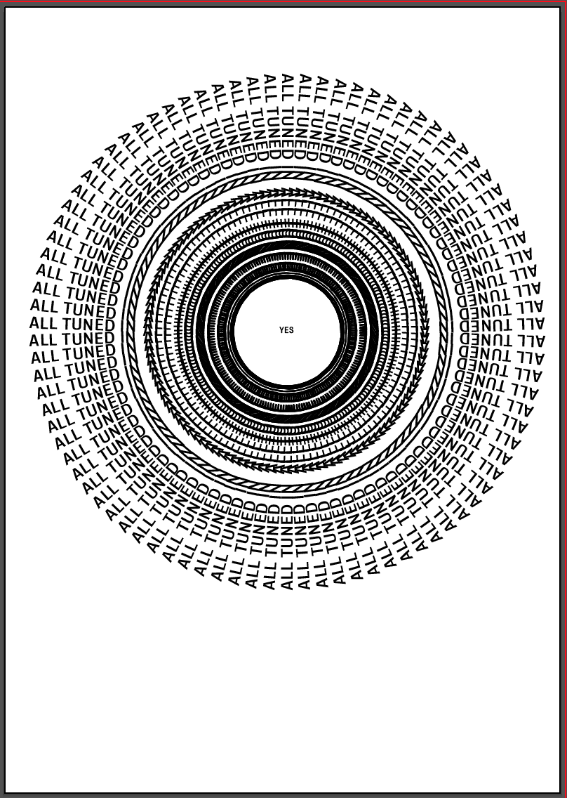
My first idea stemmed from looking into map contour lines and optical illusions. Both of which use lines of different thicknesses to create the illusion of height, whether it’s something raising off the ground or being sucked into it. I wanted to create this illusion of being sucked into a ‘black hole’. Instead of using lines used the quote “all tuned in” as I thought I could use the image as a heading for the spread, it would illustrate the message as well as describe it to the audience. I wanted the image to be clean and structured to illustrate the idea of “YES” being when everything goes to plan, or in this case when “all tuned in”. Although both work well, I think the idea on the left is too simple and doesn’t illustrate the idea of a black hole well enough, whereas I think the idea on the right looks too messy and may be better suited to
My first idea was simple, I rotated each letter and placed them all on top of each other to give the effect of each letter being piled on top of the other. I later added the shadows as it reiterates the idea of them being on top of each other, almost looking like they are falling on top of each other. The black background fits in with the monochrome theme and keeps to the idea of fear and darkness in the background. Again, I kept it looking clean and structured.
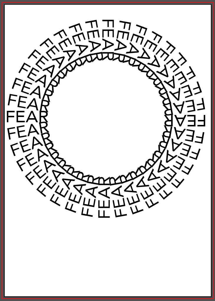
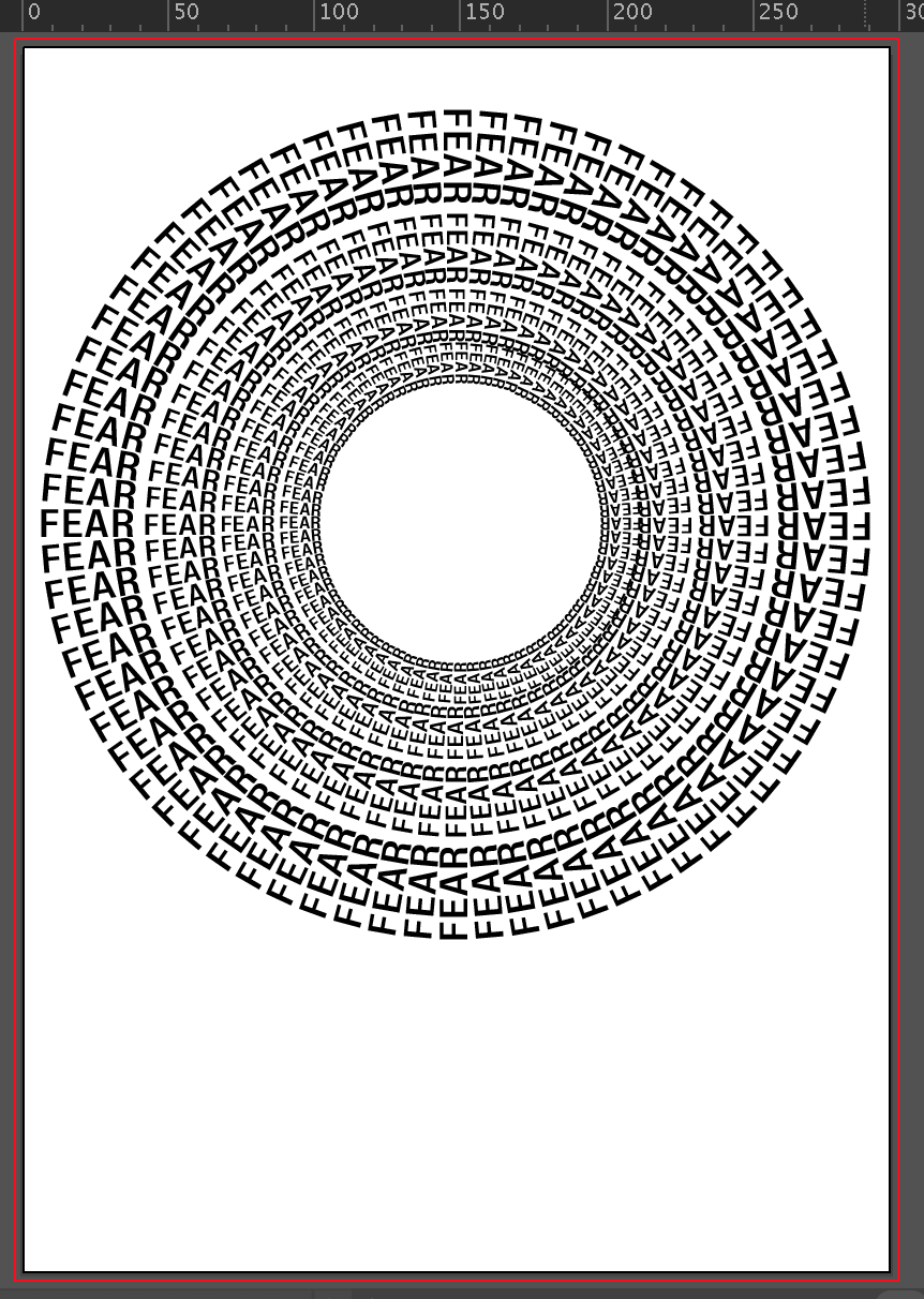
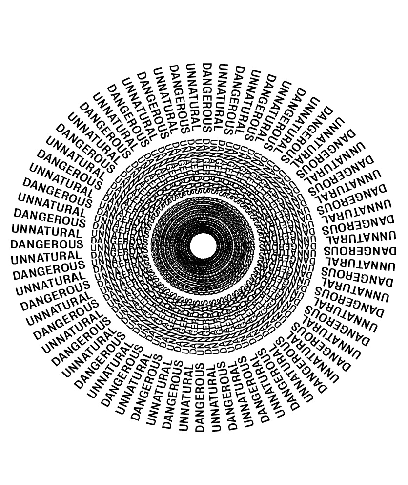
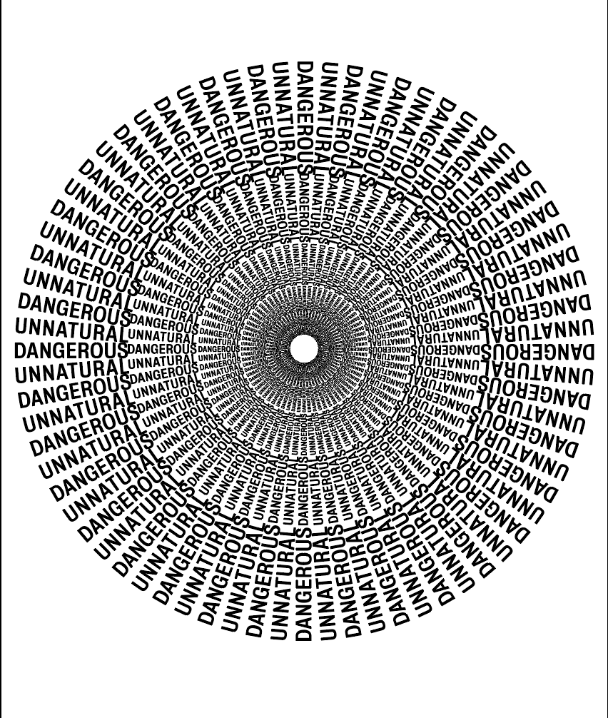
Image 2 – “Don’t do this. It’s dangerous, unnatural. You’re there to conquer your ‘FEAR’.”
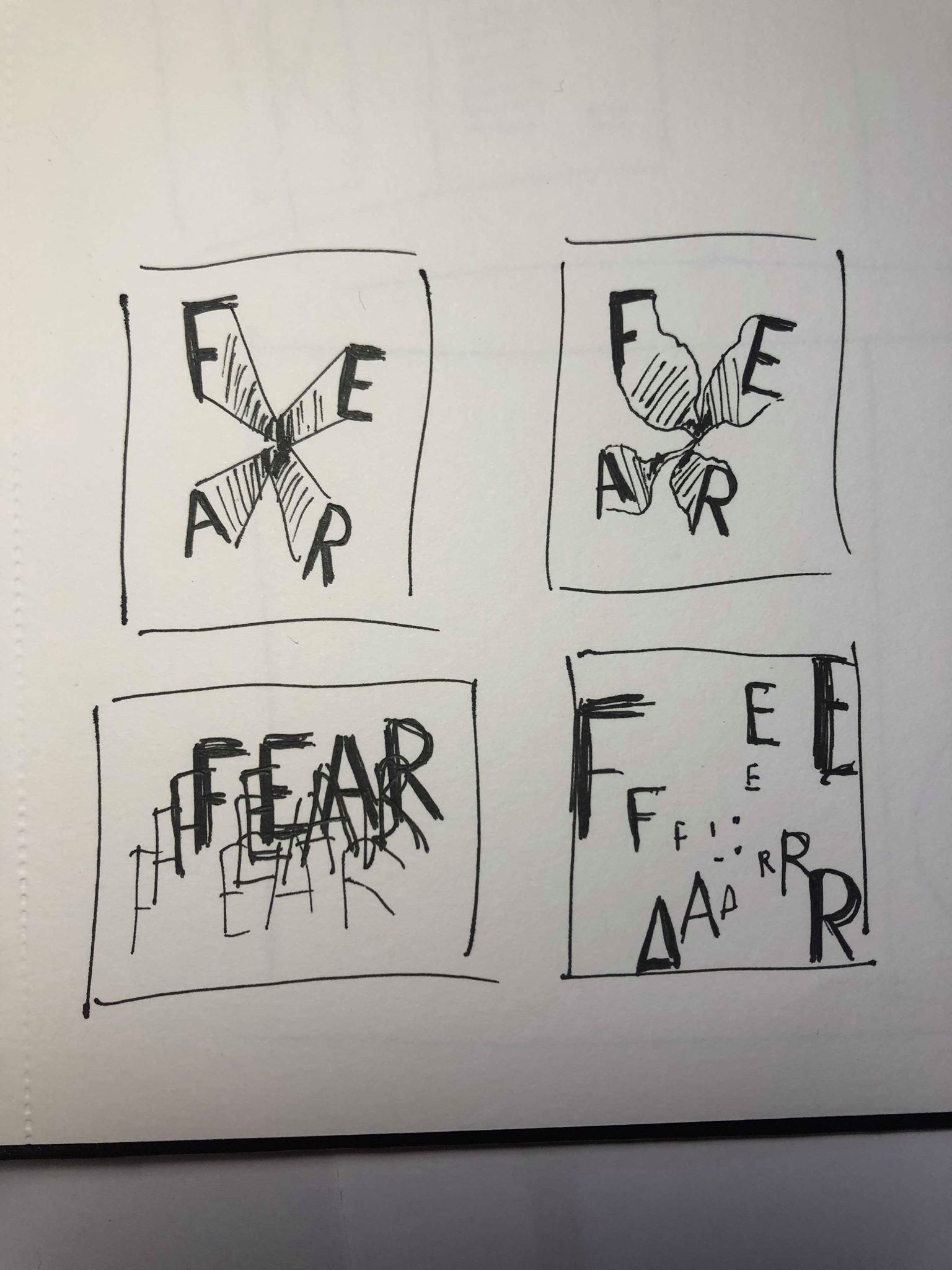
For my image for my “FEAR” spread I chose to use the same idea I first looked at for the previous page, I decided not to use it for “YES” because I decided it looked a bit messy and did not fit in with the idea of that spread, however I think it would be much more suited to this page where I want my image to be styled more like that.
I used the same process as before to create some more examples of this idea, using the words ‘FEAR’ as this is the standout word used to describe jumping with fear in the article. As I did before I wanted to give the feel of an illusion which would make the reader feel like they’re falling or being sucked into the screen. The influence was taken from an earlier idea I had of a black hole of which is never ending and also has connotations with fear and falling.
After a few experiments trying out different styles and methods I decided the concept was strong but my 2 initial trials were not effective enough. I liked the idea for each but a little more work was needed to complete it. First off, using ‘FEAR’ in the image was too obvious so I decided to use the words “UNNATURAL” and “DANGEROUS” as I think both of them are such strong powerful words which are used to describe fear in the article, and will leave more the the imagination. The second trial I carried out was much stronger and created much more of a sense of depth as each ring was getting smaller so was a concept I wanted to take forward in my layout experiments
The last image especially gives the feeling of movement even though it’s a still image which I think is strong in itself. As the page was all about fear I wanted the image not just to act as a heading but all so really make the viewer feel like they’re being sucked in and give the impression of a never ending tunnel. This idea was all about giving the viewer a sense of falling just as Le Gallou would have, as well as giving an insight into the feelings and thoughts that could be going through his head, like fear and adrenaline. I think the design works well to capture this feeling.
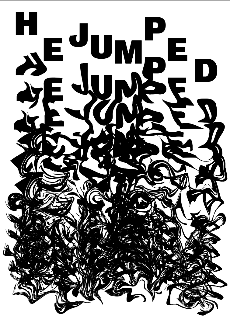
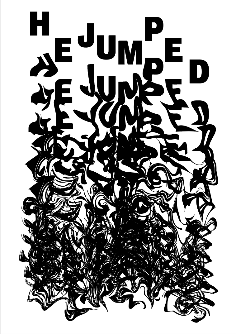
Image 3 – “No, something’s not right. ‘No’ is your sixth sense trying to save your life. Whatever voice Le Hallou heard that morning, he jumped.”
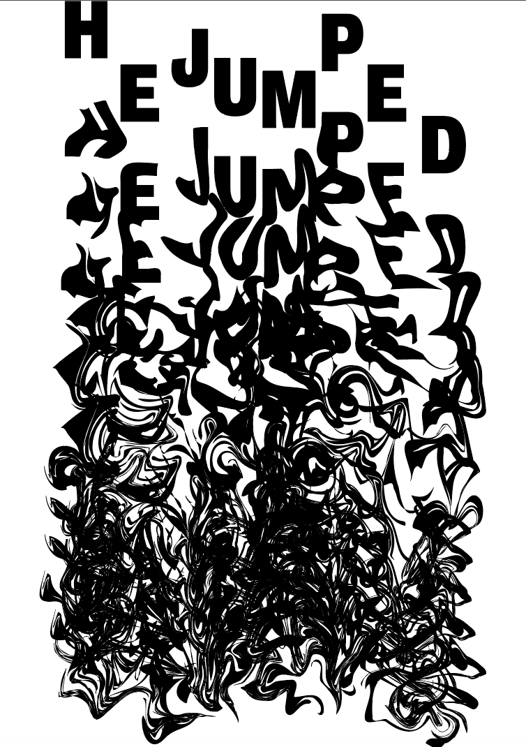
The next page was all about “NO” which is about when somethings wrong and you shouldn’t go jumping, it was the page I wanted to use to describe his death, therefor I wanted the image to be quite dark and not particularly pleasant. As the idea behind the previous 2 images decreased in structure I wanted the last image to be even more messy and unstructured, to show how his final jump went wrong, and also to illustrate the idea of “something not being right”.
I used the liquify and warp tools both on illustrator and photoshop to change the structure of the words “HE JUMPED” as I thought those 2 words were strong and would instantly provoke a feeling when the viewer see’s it. I wanted the image to start off well and end up unstructured and out of control, much like Le Gallou’s final jump. I duplicated the words and placed each one under the other, and warped each line more and more each time so the bottom line would be unreadable.
My first attempt with just the outline of the words it aesthetically pleasing but isn’t bold enough and I don’t think it works well enough to capture the viewers attention. The idea behind it is strong, there is still a strong sense of movement and falling with it moving from the top of the page to the bottom, and the way it’s warped almost looks like it’s flowing, and the way it spreads and warps really gives a feeling of being out of control. However, I think it needs to be a slightly thicker font and possibly a larger size to really make it stand out and be moving to the viewer.
After changing the font to a thicker/bolder style and enlarging it slightly I think it still keeps the same idea and is strong, and also stands out much more and almost pops off the page. Initially it was too wide so I narrowed it slightly. I think leaving a slight border on the sides but touching the top and bottom of the page really emphasises the idea of it falling from the top of the page to the bottom instead of it being in the middle of the page. I also trailed it in white which worked but I think the thick mass of black at the bottom adds a depth to it which you don’t get with the white.
Overall I think the image works really well to convey the meaning. It contains easy to read text so can be used as a header as well as keeping with the theme of each image becoming more and more out of control.
http://www.showusyourtype.com/public/index.php/postcards/melbourne
https://www.inspirationde.com/image/71672/
http://www.worthydesign.space/design
https://www.neuegoods.com/journal/2016/1/18/darren-oorloff
http://balladora.blogspot.co.nz/2011/12/susannste-fanizen-coverentwurfe.html
