
After choosing my layout and deciding what text to use on each page, I looked into the visuals and images I could use within the double page spreads.
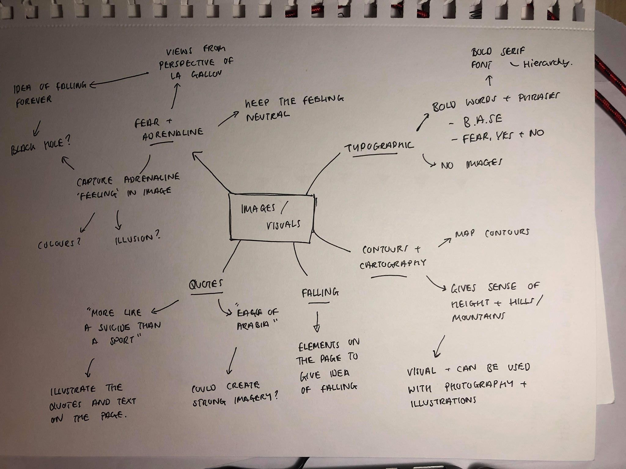
The first idea I had was to use photographs of mountains or tall buildings, depending on which page, as the images on each page, using 2/3 on each spread. Although I have access to photos of both of these things, I felt this would be far too cliche and would illustrate exactly what was being said in the article too much, it would lead nothing to the imagination of the reader, especially as the brief is to design the article for young designers. There was also a large amount of quotes containing metaphors and amazing visuals which I felt would be much more effective.

The first idea I looked into was the idea of using typography instead of images to illustrate the article. There are some standout quotes and words within the article which I decided I could use to good effect such as BASE, and “YES, FEAR, NO” which are used in one of the quotes within the article. I wanted the words to be large on the page and take up as much space as a photo or other image would, they would also be used as a header on each spread.
I then looked into the idea of contour lines and cartography on a map. I was interested with the way maps use contour lines to show the height of hills or mountains and think it would be a good way to show mountains or cliffs without having to include photographs. It would also be a good visual to add and could overlay with other images or photographs to create more visuals. After looking at a variety of examples of contour lines, I noticed that although they look like a raised surface, it could also be seen as the opposite, which links in with my idea of a black hole or illusion of something being sucked into or falling into the page.
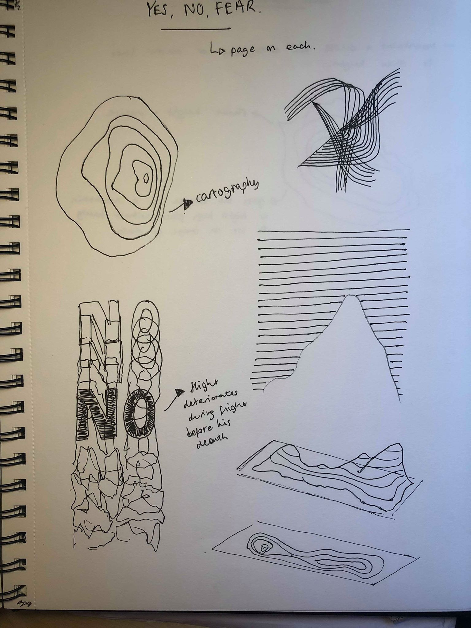
I then took influence from the idea of the contour lines as well as the illustration to give a sense of the viewer being sucked into the page, or into the ‘black hole’. I wanted to give the viewer a sense how La Gallou would feel when jumping off a cliff or building, in terms of giving a feeling of falling as well as the feeling and adrenaline going on inside his head. I wanted to experiment with this idea using illusions and expressive typography.
The plan was to create 3 images, 1 for each page using ideas from above, which all give a sense of falling that will make the viewer feel as if they’re falling or being sucked into the page.
Following on from my idea to use “YES, FEAR, AND NO” as my 3 spreads, I wanted to create an image for each spread which give a feeling of each of the emotions. “YES” was described as “when you’re all tuned in”, therefor I want the image for it to be clean and all in proportion, whilst still giving a sense of illusion and a sense of falling. “FEAR” was described in the article as “Don’t do this. It’s dangerous, unnatural. You’re there to conquer your ‘FEAR’.”, so I wanted the image on the ‘fear’ page to have a strong sense of fear using the idea of being sucked into a black hole and falling into the page, I want it to make the viewer to understand and feel how La Gallou would feel. As opposed to “YES” I don’t want the image to be as clean and in proportion, I think it would be more effective with a slightly distorted look as it gives a feel of the FEAR and shows how skydiving can be scary and unpredictable. Finally, in the article when describing “NO”, it says “No, something’s not right. ‘No’ is your sixth sense trying to save your life. Whatever voice Le Hallou heard that morning, he jumped.” For this image I want it to be the most moving of all and really illustrate La Gallou’s last jump going from an amazing morning and amazing views to a disastrous jump.
