
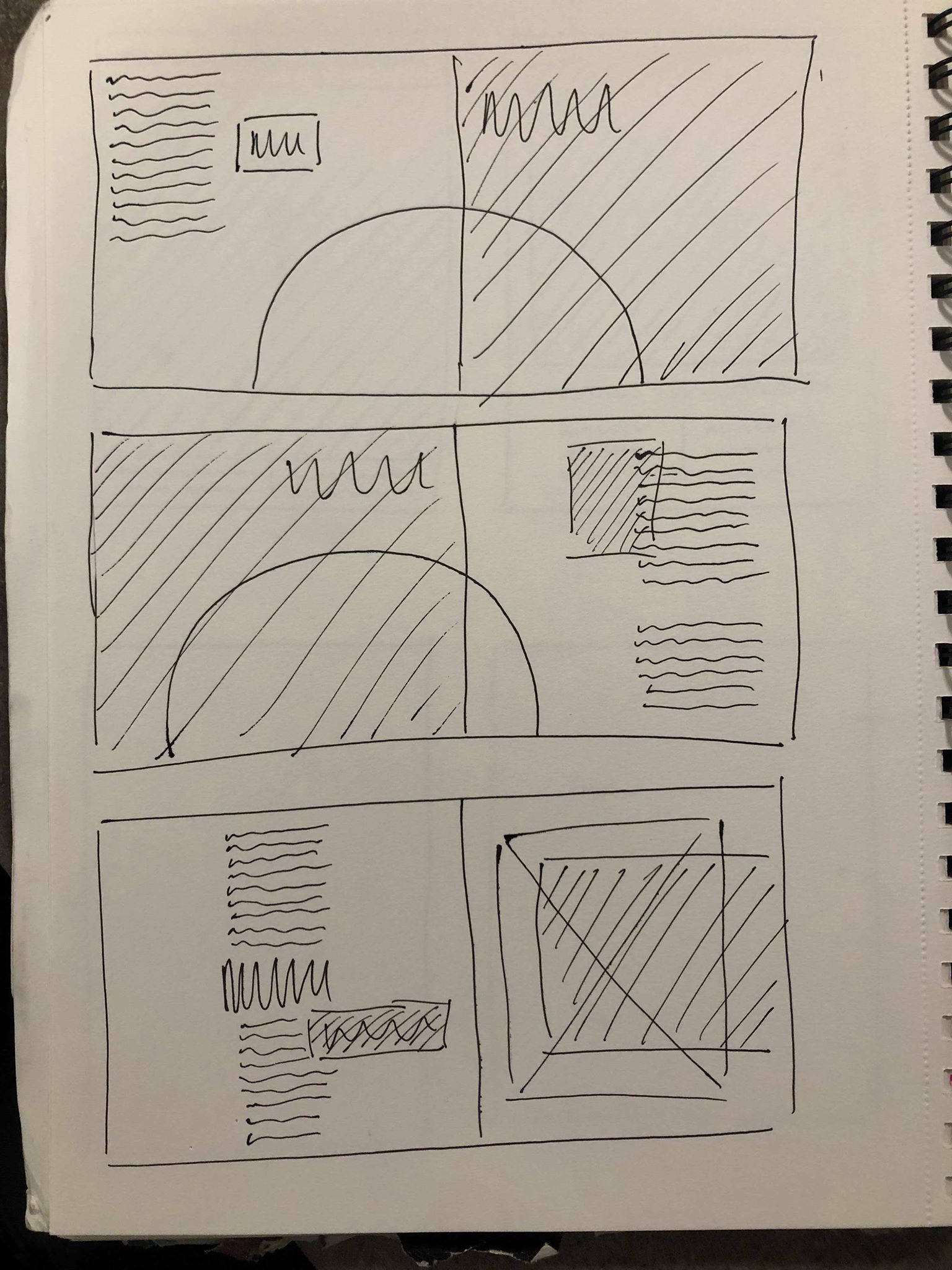
I took influence from my research into editorial design and sketched out a variety of different designs onto paper to get a better understanding of the look I wanted to go for.
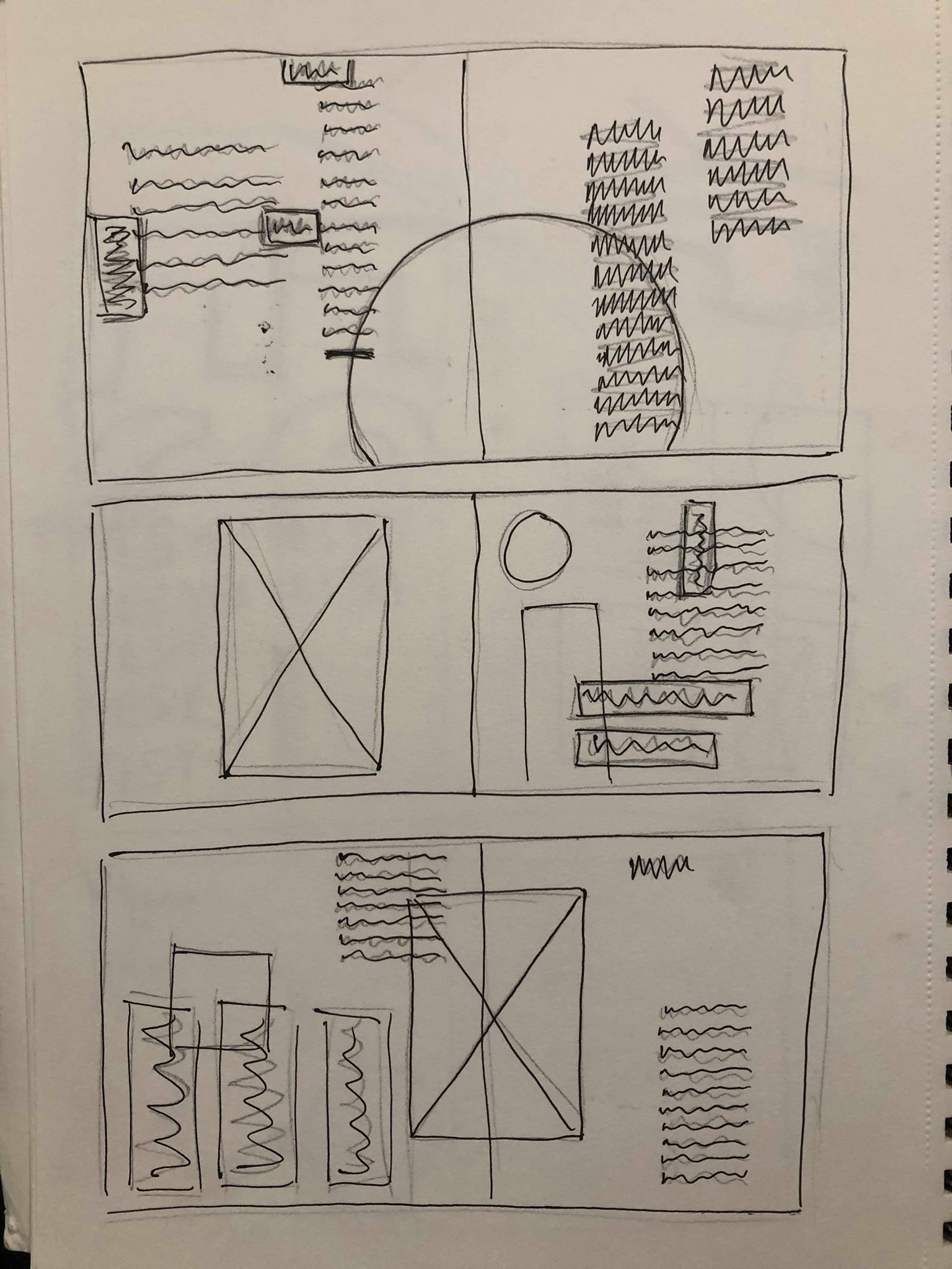
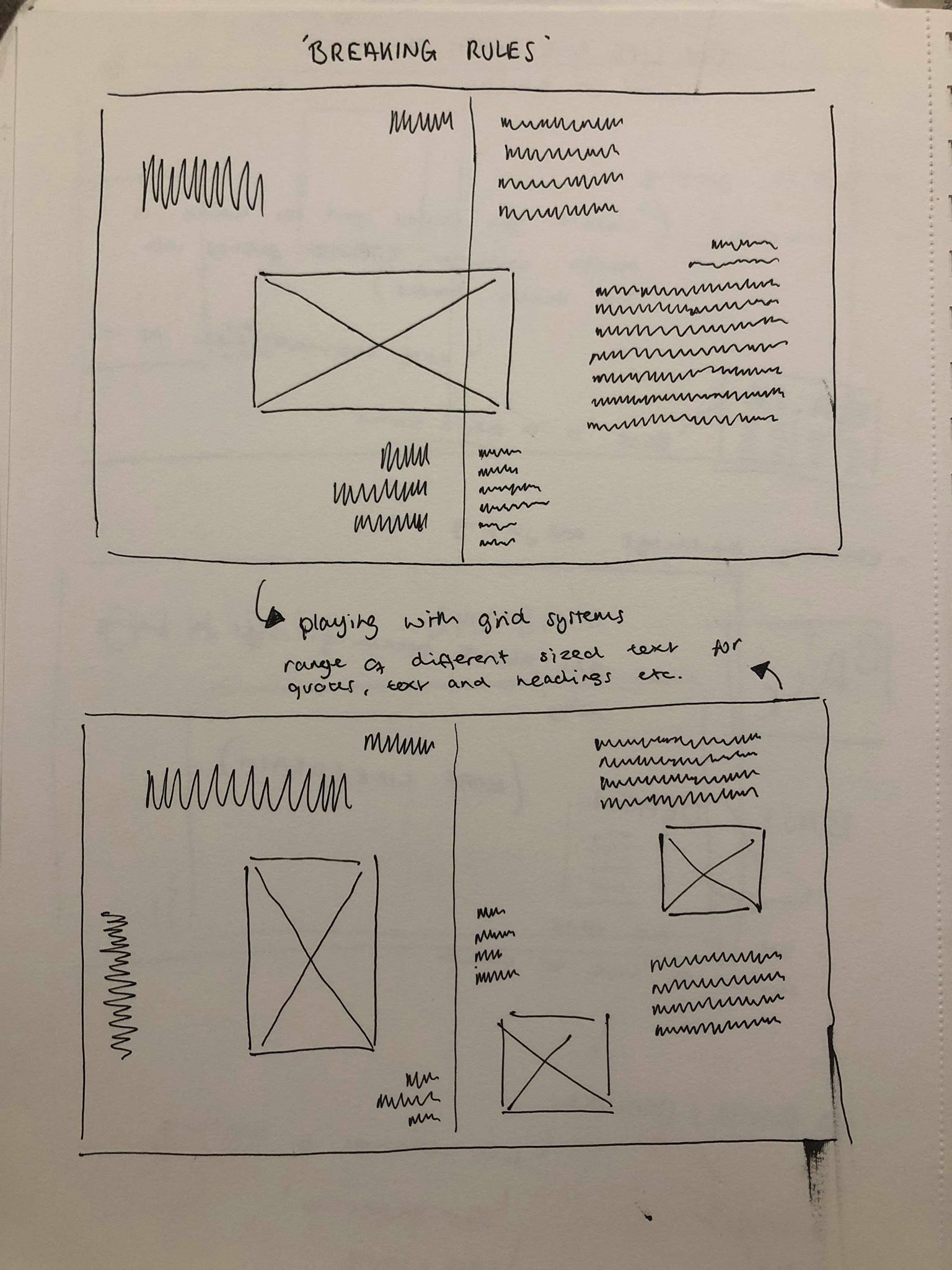
Overall I decided none of these designs were suited to the tone I was looking to create within the spreads, but was a good exercise to get all of my ideas on to paper to make it easier to determine which ideas I liked and don’t like. I noticed many of them with too much text or too many images over complicated the page too much, especially as my images are text based so I wouldn’t be able to overlap them with any text. I also decided I wanted to stick to keeping one image on each page to keep a strong sense of hierarchy with that image and not draw any attention away from it. The others were then on the opposite end of the spectrum with not enough going on. I don’t want to overcrowd the page but also think with the images being slightly illusion based there needs to be some a few extra added details like some simple lines or colour overlays which will go with the images. I attempted to make a few of them quite experimental and playful. However, while I still wanted to keep a sense of this to show how the sport of base jumping is still enjoyable and full of adrenaline, there is a lot in the article about how jumpers do have to be very controlled in the way they do things, from packing the parachute to the actual jump. It is said in the article that base jumping appeals to “control freaks” because of the nature of it, so I wanted the layout to reflect this whilst still keeping a slightly experimental layout.
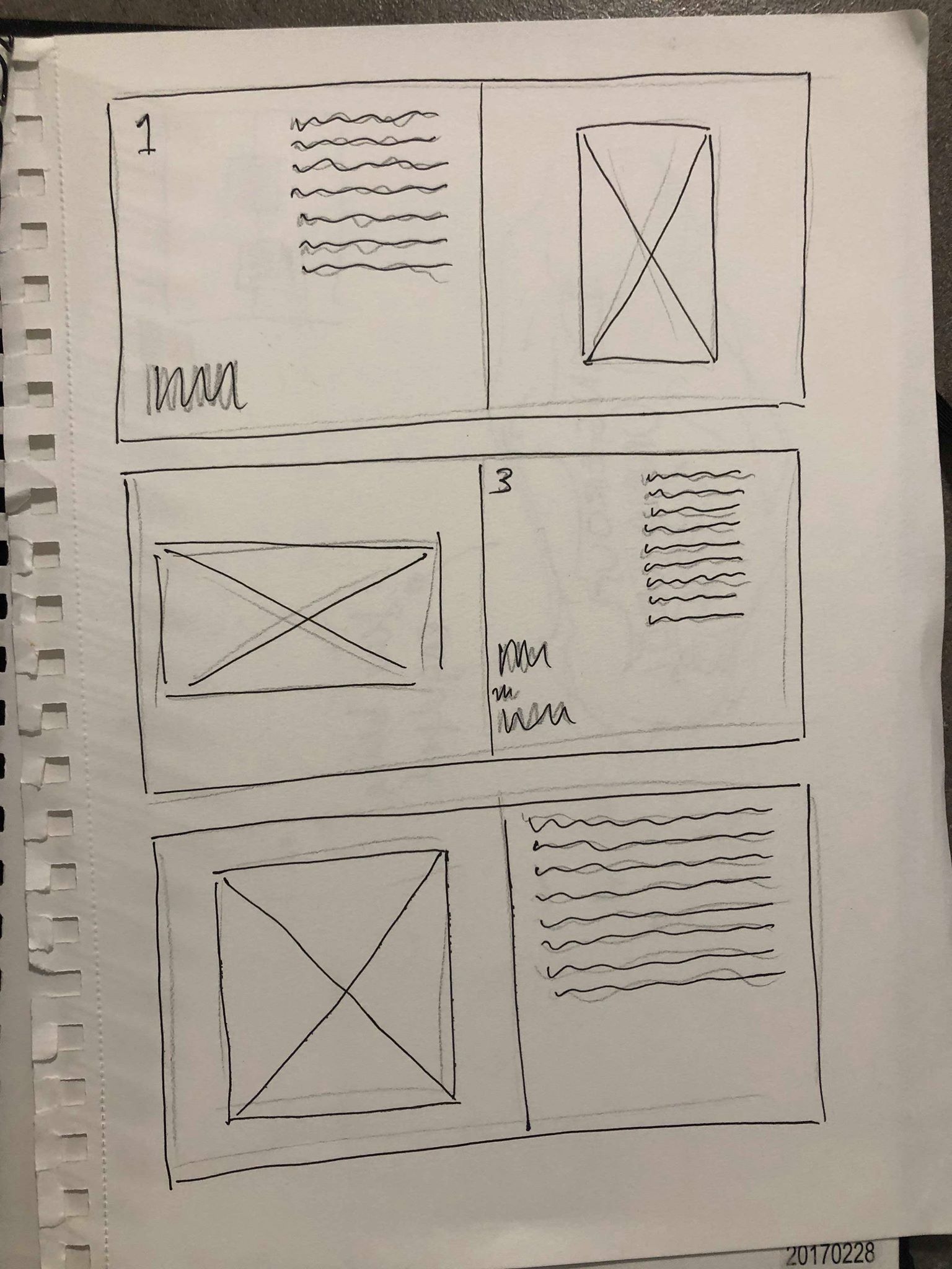
After rough sketches of a variety of designs I narrowed it down to a handful of designs which I felt were the strongest and conveyed the idea I was going for the most. Although on both ideas I wanted to play around more with the text, they gave me a good overall view of the general aesthetic.
My first design took influence from my research into using boxes of colour. I wanted to use red to give the idea of danger to go with the theme of the fear and scariness of skydiving and base-jumping. As I decided each image would act as a header for the spread, I think the red boxes will frame the images on each page to draw the eye to them so they will be the first thing the viewer see’s on the page. I also thought I could use some smaller coloured shapes to around the body text and pull out quotes to draw the eye to them and to create a clear path for the eye by outlining where the text starts.
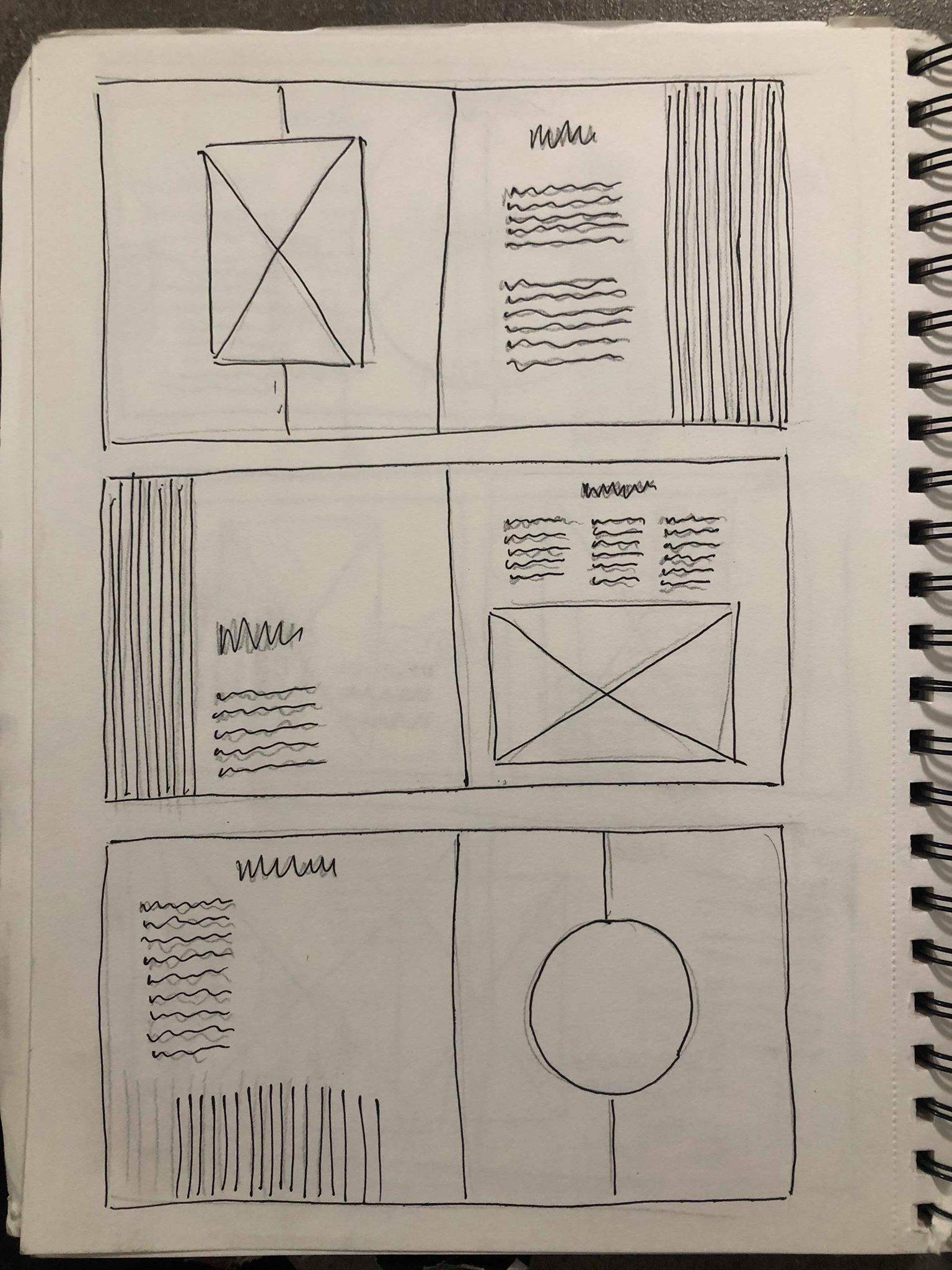
My second idea was sticking more to the black and white theme. I think keeping the images by themselves with nothing over the top of them will make them stand out more and give a sense of hierarchy, I also had the idea to create a half white, half black background for the first and last page to go with the theme of the illusions. I wanted to experiment with adding black and white striped lines down the side of the pages, the idea behind this was to create a sense of falling by having them vertical on the first 2 and flat on the final page to show he has stopped falling. I think they might compliment the images by having them on the opposite page.
