
After choosing my images I carried out some more research into editorial designs, looking at both minimalist designs as well some experimental. I looked on a variety of different sites to find examples of a variety of different magazine designs, because although I had an idea in my head of what path I wanted to explore, I was also keen to look down other avenues to see what I could find.
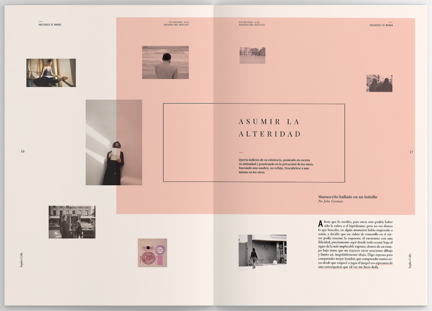
The thing that interest me about the images above is the way they use a box of colour over the top of the page. It hasn’t been used as a border or outline for an image, but it could be used to to create emotion in an otherwise black and white page. For example if the box was red it could give an essence of danger or death which could be useful in my work. It also makes the page stand out to the eye, instantly when you see colour on a page it makes you look at it and has a strong sense of hierarchy. For this reason I think it could also be a good way to add a border to an image, if the colour is bright and stand out enough it would draw the viewers eye towards the image.
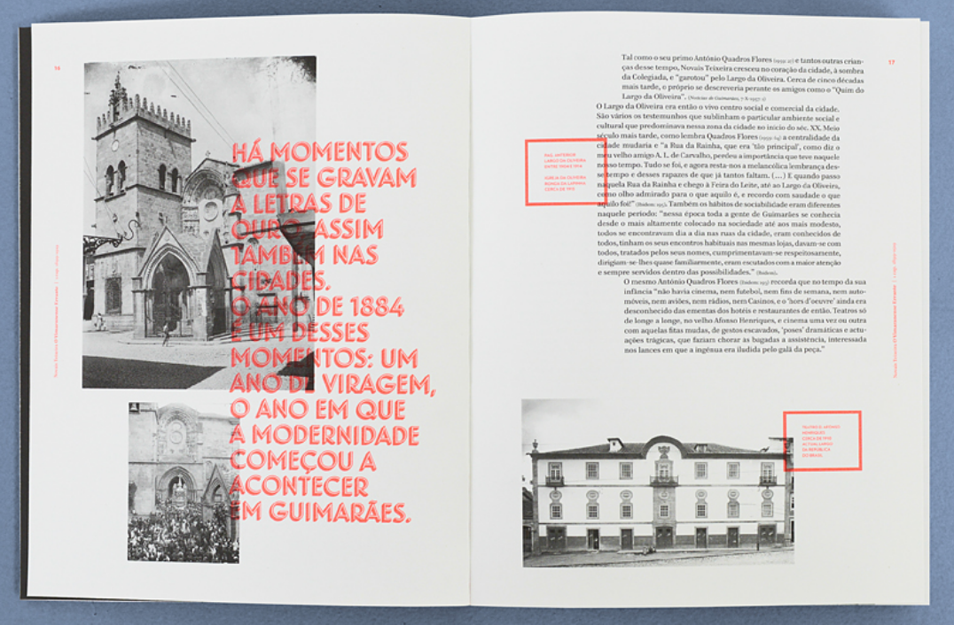
I then found 2 examples which both have a similar contemporary layout. They are both slightly different but I like the way the images and text have been placed on the page to give it a more minimal and almost playful look, instead of all being symmetrical. I think it gives it a very modern, contemporary feel to it without losing the clean, minimal feel. I think this idea could pair nicely with my idea of each of my images being symmetrical but with touches or playfulness, just like these designs have a very clean base with some more playful elements. I also like the way the text on the right spread is much bolder and stands out through the use of colour, I think this could work well with a pull out quote to give a sense of hierarchy and make it stand out to the viewer.
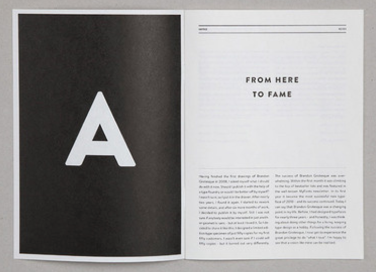
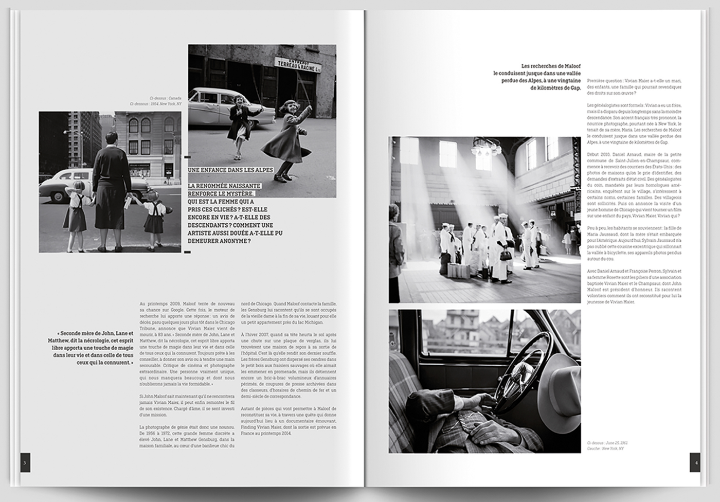
The final images I looked at were examples of black and white designs, both with simple but very effective layouts. I love how both examples use the black pages the frame the imagery and make it instantly stand out. The black and white also adds a very contemporary feel which i’m going for and fits well with the colours of my images as well as the tone of the majority of the article
Overall it’s all given me a lot of ideas and inspiration into how to design my spreads to make the most out of my images, as well as the text and pull out quotes. It’s showed me how different layouts can add a different feel and tone to the design which will help me when designing my spreads.
