
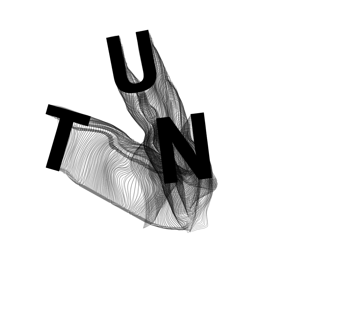
After feedback from David, the first changes I wanted to make were to the images, the first change being to the image on the first spread. I didn’t think the “TUNED IN” image was strong enough and gave the tone I was looking for so I wanted to change it to something which matched more with the theme of the other 2 images, something which draws the viewer in and gives a sense of movement and falling.
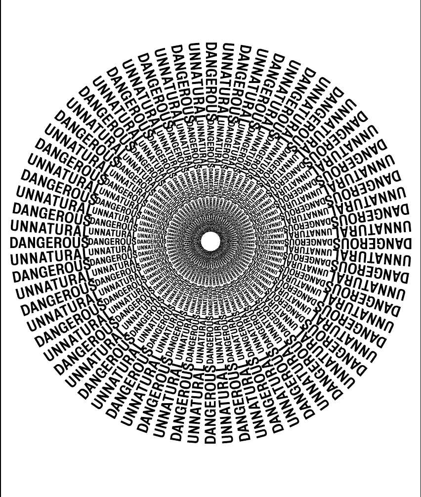
Something which was so strong about the second image is how it has one point on the page which everything seems to originate from and come out of which is what give the feeling of being sucked into it. I wanted to experiment with this to give the same effect.
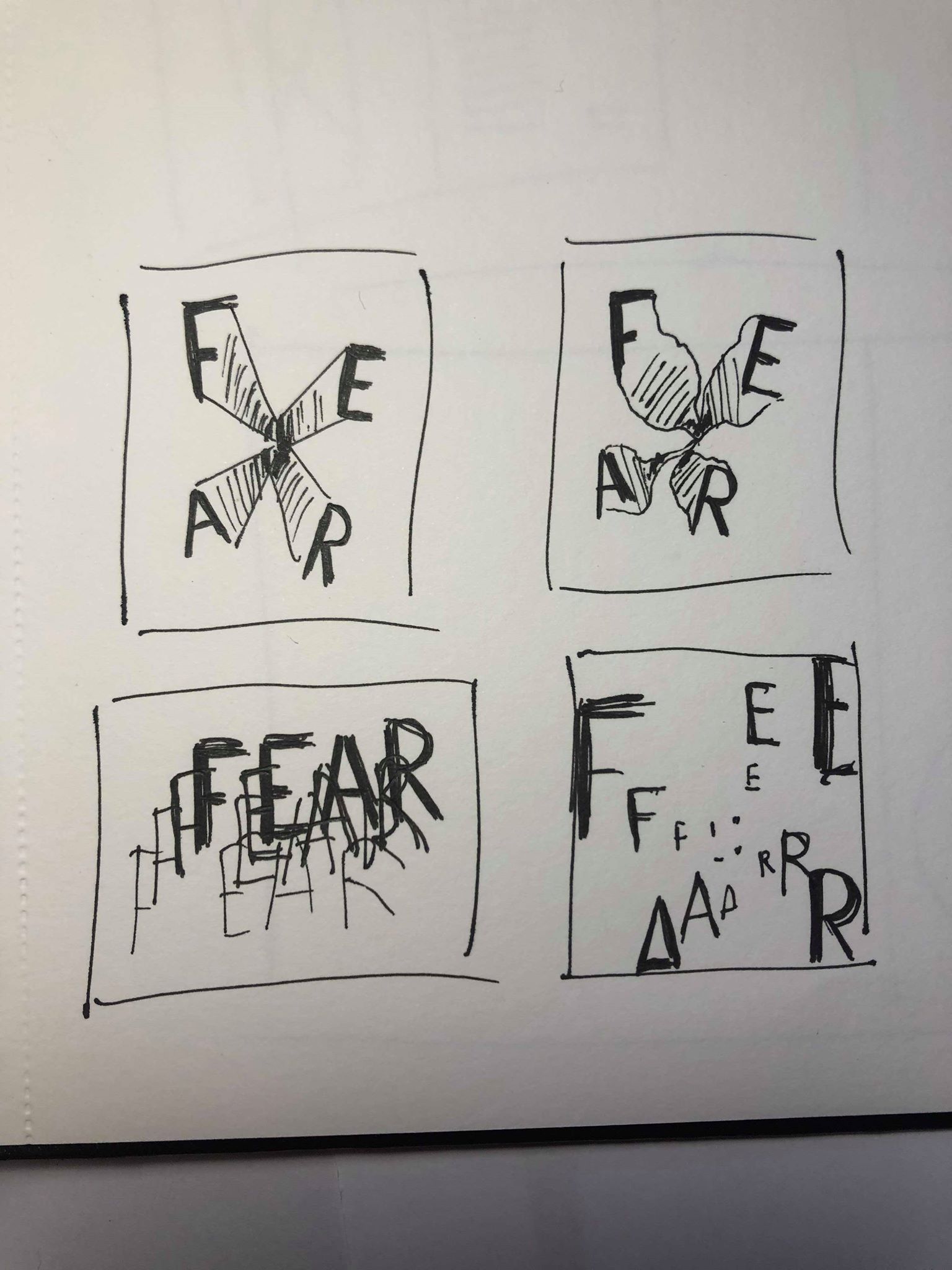
I referred back to my initial sketches and although I initially thought I could use them for the second image, I decided it could still work with any of the images as they all follow the same sort of idea. I think the top 2 sketches are the strongest in showing the essence of falling, especially giving a trail behind them helps to show the movement.
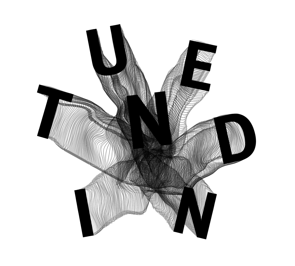
I used tuned in to spell out “TUNED IN”, using the same font as the other two images. I wanted each letter to be a slightly different size and rotated them all slightly. I then duplicated each latter a number of times with no fill, just a black outline to make it look like a trail leading from the centre of the image to each letter. After doing so I then used the warp tool to slightly warp each of the ‘trails’ so they weren’t all straight lines. Even though I wanted this image to be fairly clean and structured, I thought about how someone skydiving and how their trail would be unpredictable and all over the place, so I wanted to capture this within the image.
Overall I think the image works well and gives a much better idea about the tone of the article, personally I think there is a strong sense of movement and distortion whilst also keeping the image clean and structured. I think the words are easy to read and the trails definitely add to the overall aesthetic and clearly shows movement and falling. I think the centre of the image where the lines cross over the most to create a black mass definitely give a sense of fear.
Next, I decided the image below also needed a little more work. I really like how it is currently and the way it sucks you in, it definitely gives a sense or falling into the unknown. However, I see 3 distinct rings within in which don’t give the feeling of ‘falling forever’ which i was hoping for. I also think it looks too structured for something which is supposed to show fear, I want it to be slightly more warped and distorted to add to the scary tone of it.
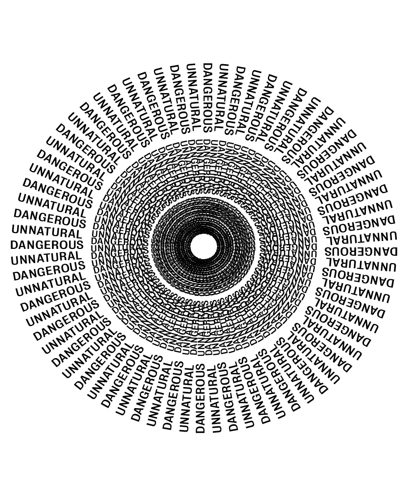
I used the same image as shown above, but simply just took the outside ring and decreased the size of it multiple times. I think it gives more of a tunnel effect and definitely sucks you in more and instantly feels more like ‘falling forever’.
However, the way the text overlaps between each layer and creates shapes between each word looks too perfect and creates a pattern which looks too structured. I want the image to be more disjointed and warped to give it a more ‘scary’ look. Because of this, I used a few different warp tools on illustrator as well as the liquify tool on photoshop to add different looks to it until I got the desired effect.
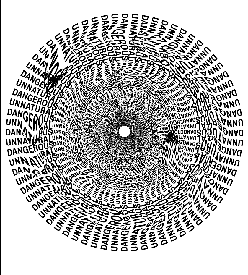
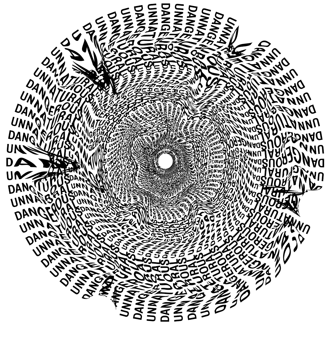
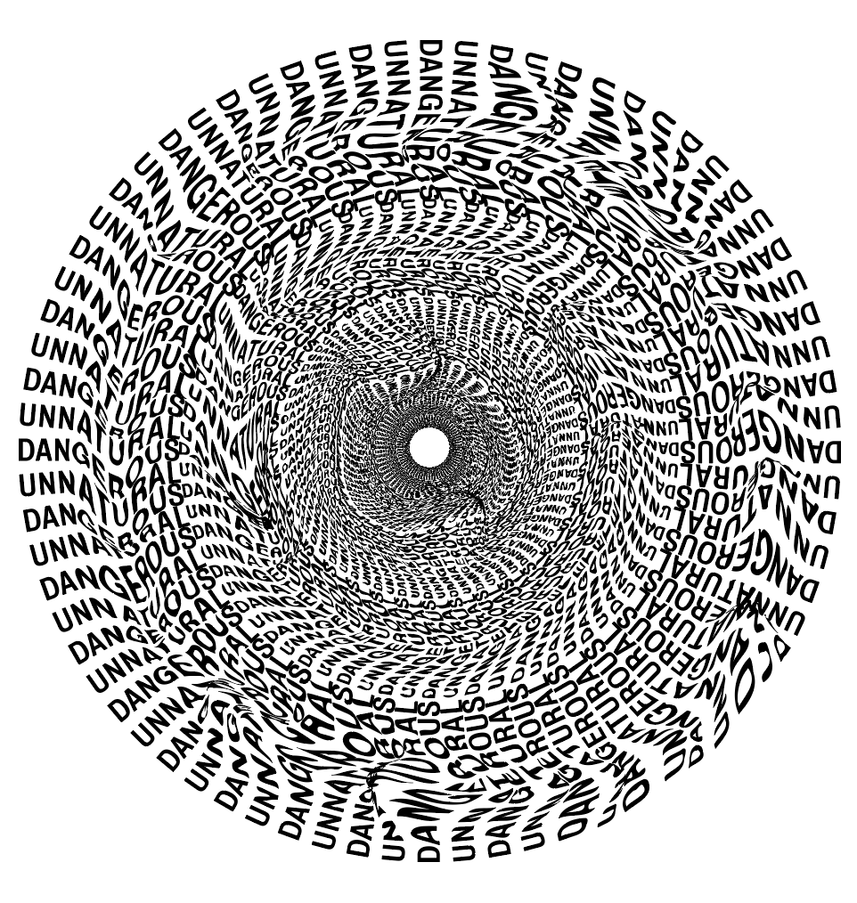
Although the first 2 definitely do what I was looking for, they add extra character and make it look distorted, however I decided in this case less was more, I wanted it to look warped but only slightly, I only added a slight distortion to each layer which just makes it look much more ‘flowy’ and almost adds swirls in each layer, which in turn makes it look much more scary and more what I would imagine a black hole would be like.
