
After sketching out some possible ideas I took to InDesign to make some rough layouts to get an idea of what they look like digitally.
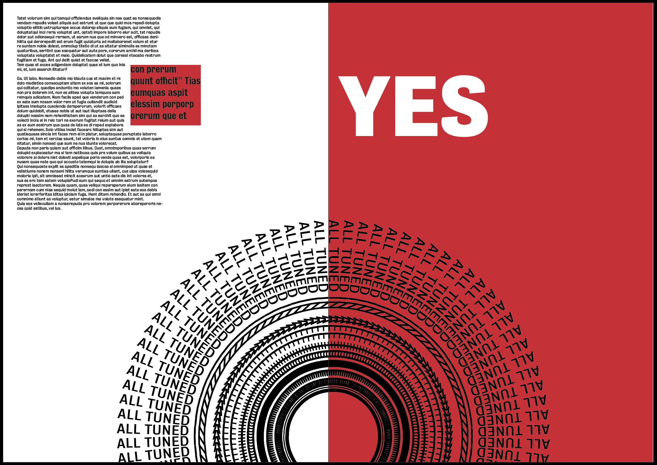
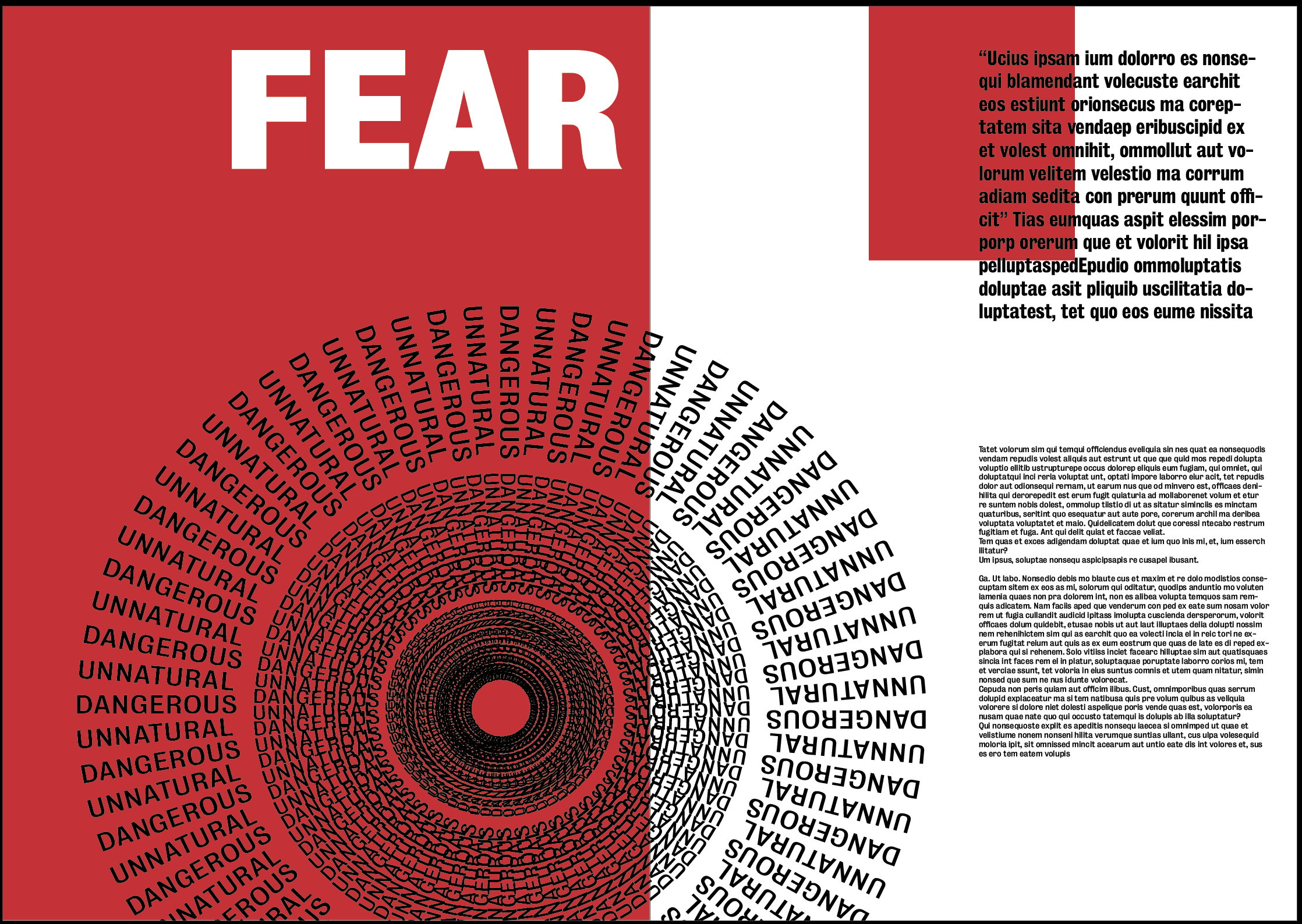
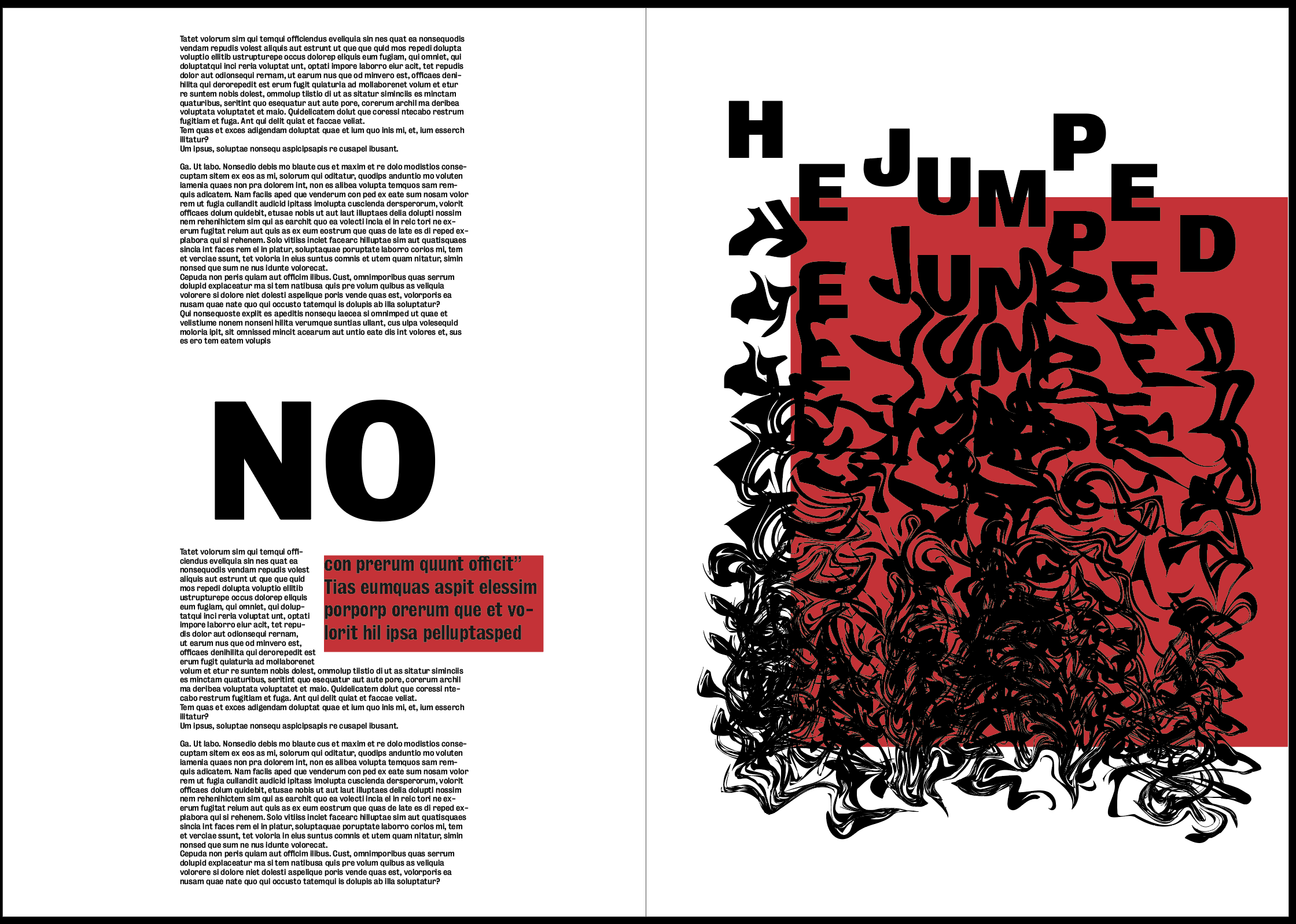
This was the first layout I attempted, the text would still need a lot of work but was added in just to get a feel of how the layout as a whole would look. Instantly I noticed my initial image for the first page wouldn’t be suitable and would stand out far too much in comparison to the other two spreads so I replaced it with another image, again just to get a feel for the design. Although it has lots of the elements I was looking for when i sketched it out, I still don’t think the overall tone is what I’m looking for. The red does work well to frame the image on the last spread it really draws the viewers eye to it. However, I think in terms of the text and the first 2 images the red almost drowns out the text and makes it much harder to see so does the opposite of what I had hoped. I also think there is too much negative space on the pages and does not feel contemporary enough. Overall I don’t think it gives the feel I’m looking for, the images individually give a strong sense of the fear as well as falling that I’m looking for, however when placed into this design I think the feeling is taken away.
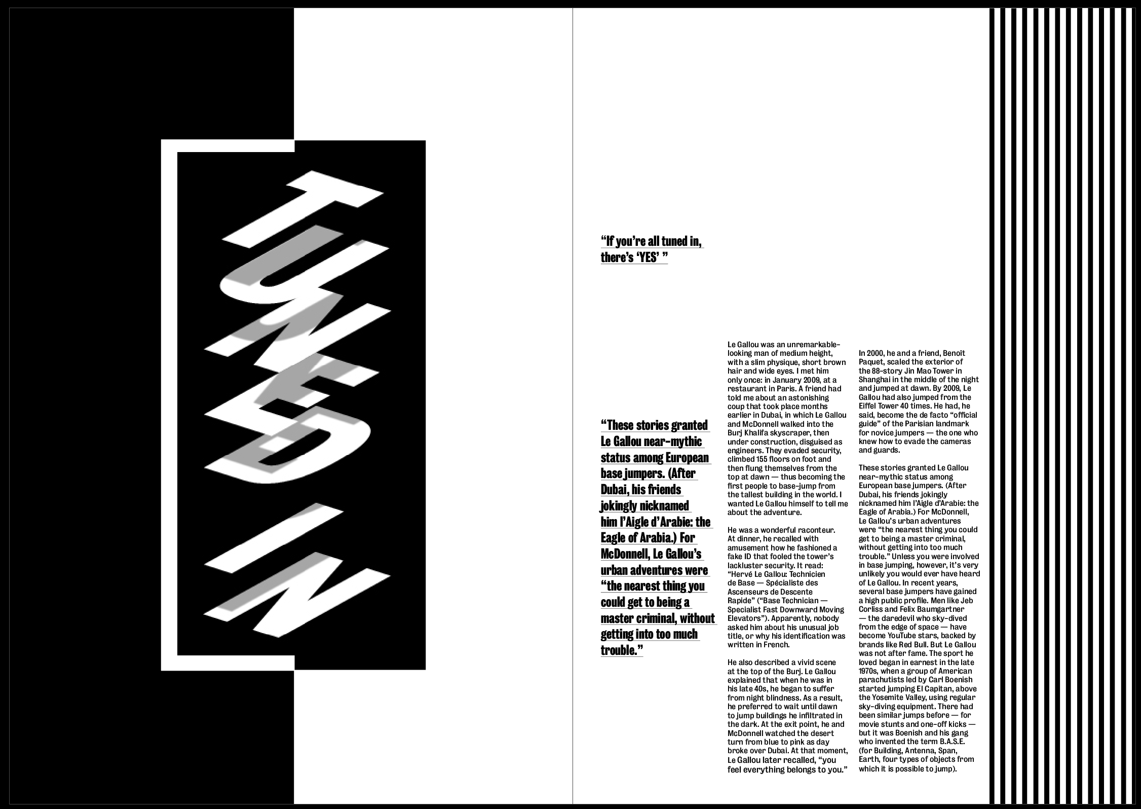
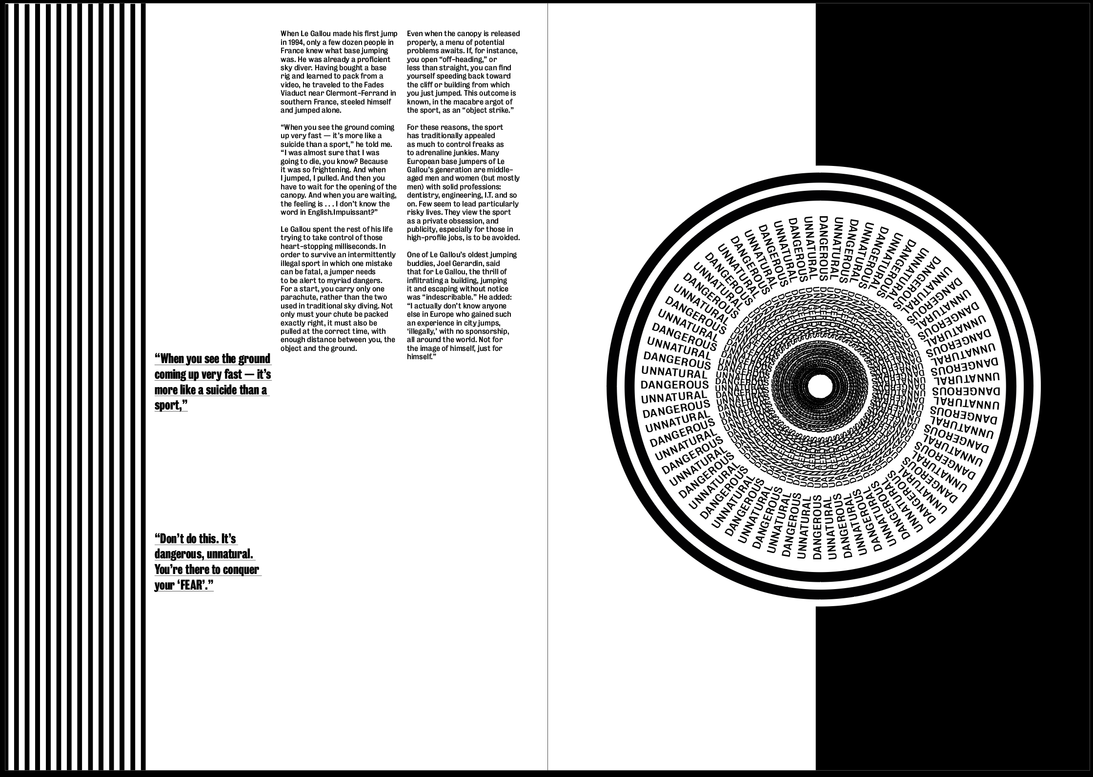
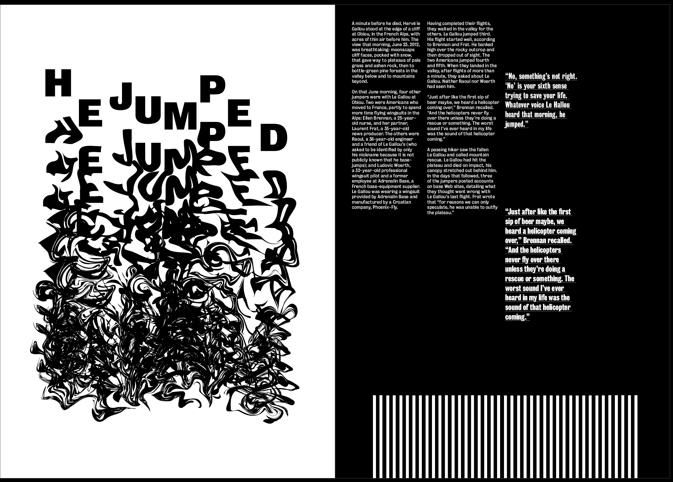
For my next idea I went more down the illusion route. I used all black and white to contrast with my previous idea to see which I thought was more effective. All my images are very experimental and have elements of movement and I wanted to show this through the design. I wanted to have a large amount of vertical lines going down the page using the text and stripes on the side of the page to give a sense of falling from the top of the page to the bottom. I also added a few added features such as the split white and black page and border around the image on my second spread, I think this helps to draw the eye towards the page well and focus in on the image, as well as keeping with the theme of illusions.
Overall I think the style of the layout all fits relatively well with the theme and the black and white compliments the images and tone of the article quite well. I have decided not to use any colour in the layout after the previous experiment showed that the colour could take away from the images because they are all text based. It still needs some extra experimentation as there is too much negative space on the page, but the over all aesthetic is a strong base to take forward.
