
I showed David my first draft to get some feedback from him into what works well and what doesn’t. The most important feedback I received was that the individual elements such as images and the overall tone, for the most part, was good and just needed some tweaks and changes to the layout.
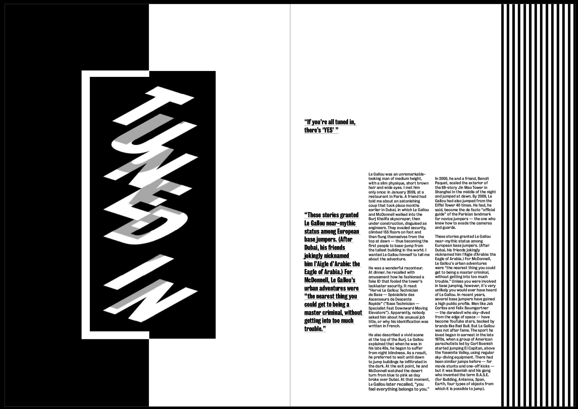
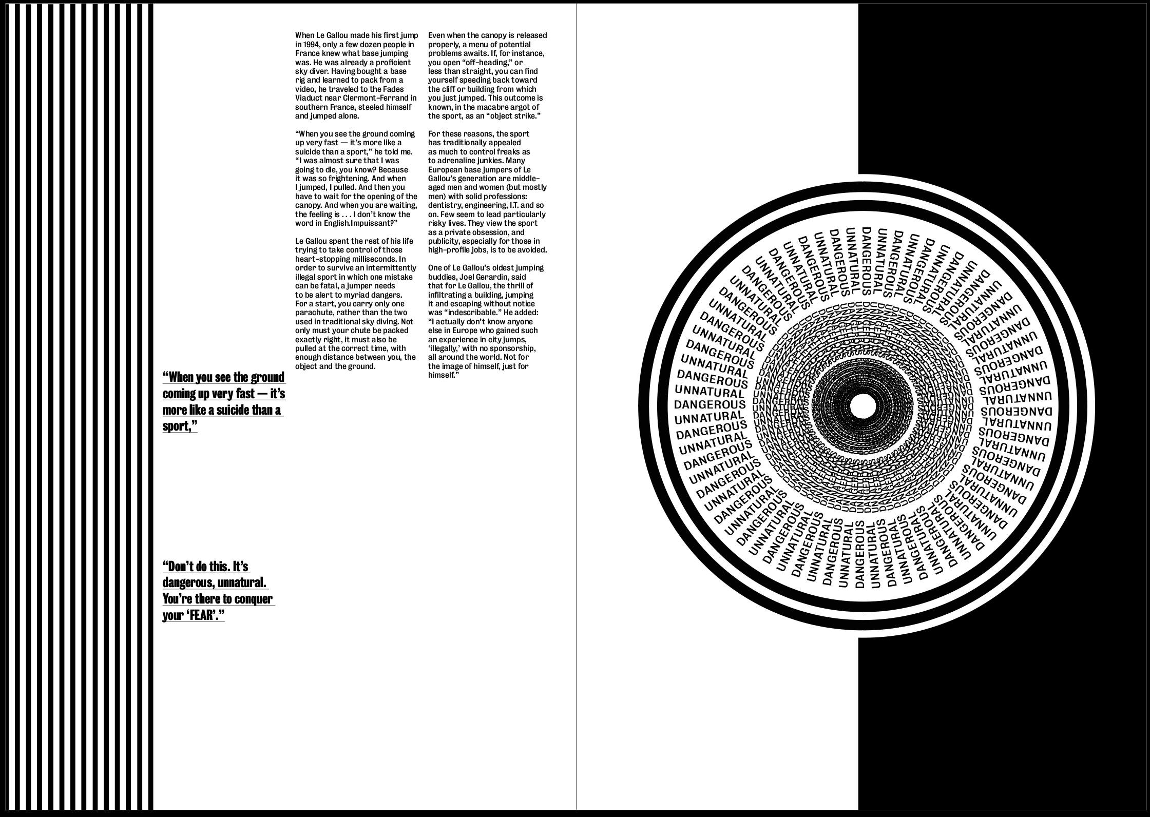
We agreed that the image on the first spread was not strong enough, although it looks ‘nice’ it doesn’t fit in with the article or other 2 images in giving a sense of the perspective of Le Gallou. This was something I wanted to experiment with to find a more fitting image. I also realised I needed to add the heading for the article on this page somewhere so this also needed some work. After discussing the idea that I wanted each image to be less and less structured as each page goes on, I also decided I wanted to play around with the second image more to distort it slightly so it doesn’t look as clean.
I decided I wanted to be slightly more experimental with the layout, particularly with the images and where they are placed. Because I decided I wanted the images to act as the headers for each page, I thought it would be more fitting to have them much larger on the page to be much more stand out. I could also play around with where on the page I placed them, especially on the second spread where the image is circular, it might be interesting to enlarge it and have it in the middle of the page, or just much larger on a single page.
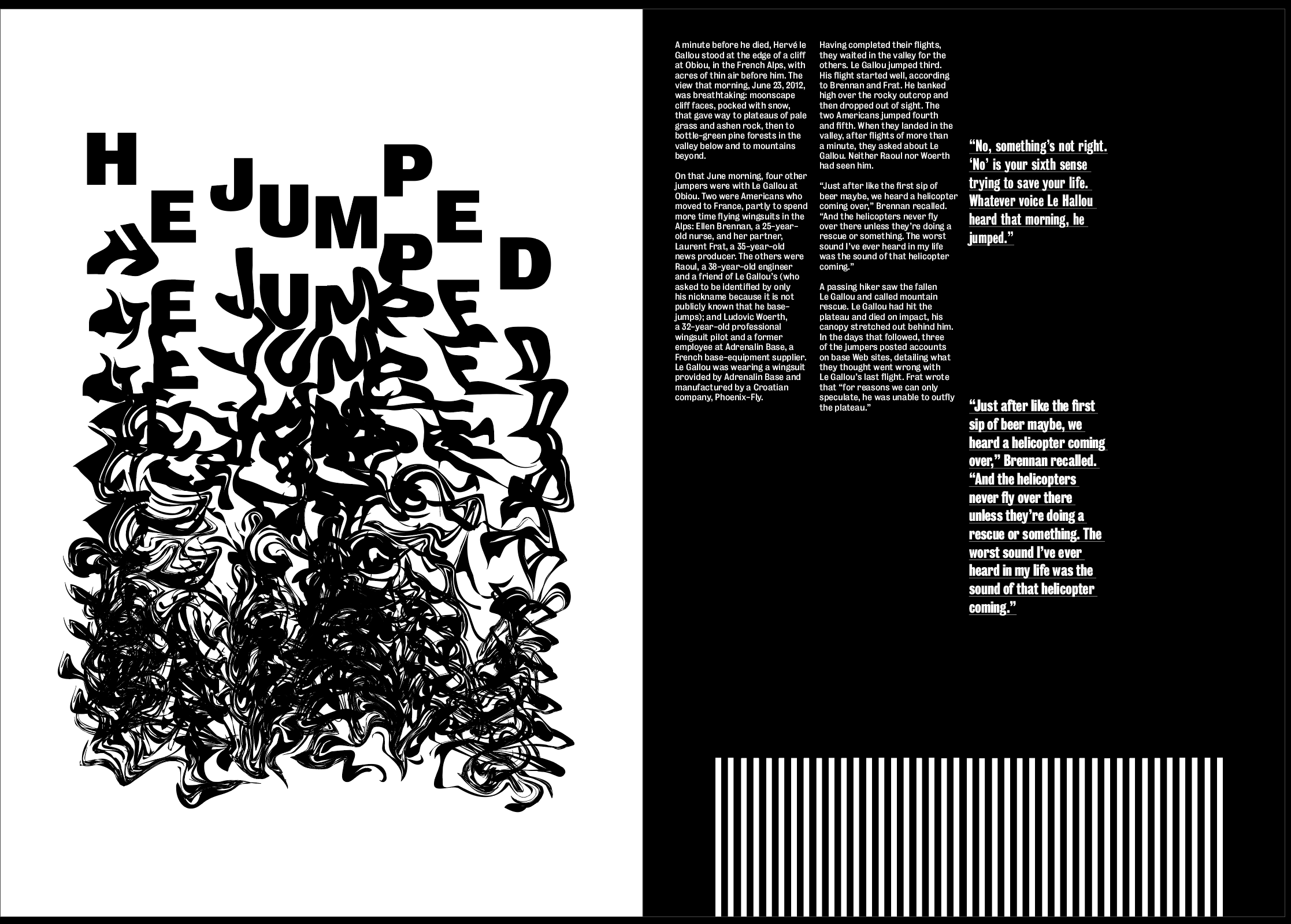
Although the striped lines on the side and bottom of the pages were a feature which I wanted to keep, David advised me that I should play around more with distorting them to fit in more with the images, and I also decided that having the lines at the bottom of the page in the final spread, although it has a meaning, is not necessary and almost makes it stand out too much from the other spreads, the idea behind it is strong enough to keep it running down the side of the page, not at the bottom. We also decided that the split white and black pages on the first and second spread gives the viewer too much to look at and takes away from the images on the pages. Splitting the pages into black and white ‘sections’ is still an idea I’d like to continue to experiment with, I just need to ensure they don’t interfere with the images.
I also decided there is no sense of hierarchy, everything seems to be a similar size so there is no path for the eye. I think enlarging the images and adding larger pullout quotes will help to aid with this.
