I wanted to print the article out in full so I could see it all laid out in front of me and not on a computer screen. I thought this would give me a better sense of whether the text or images are too small, if each spread fits in with each other nicely and if there is anything lined up wrong which I hadn’t noticed on the computer.
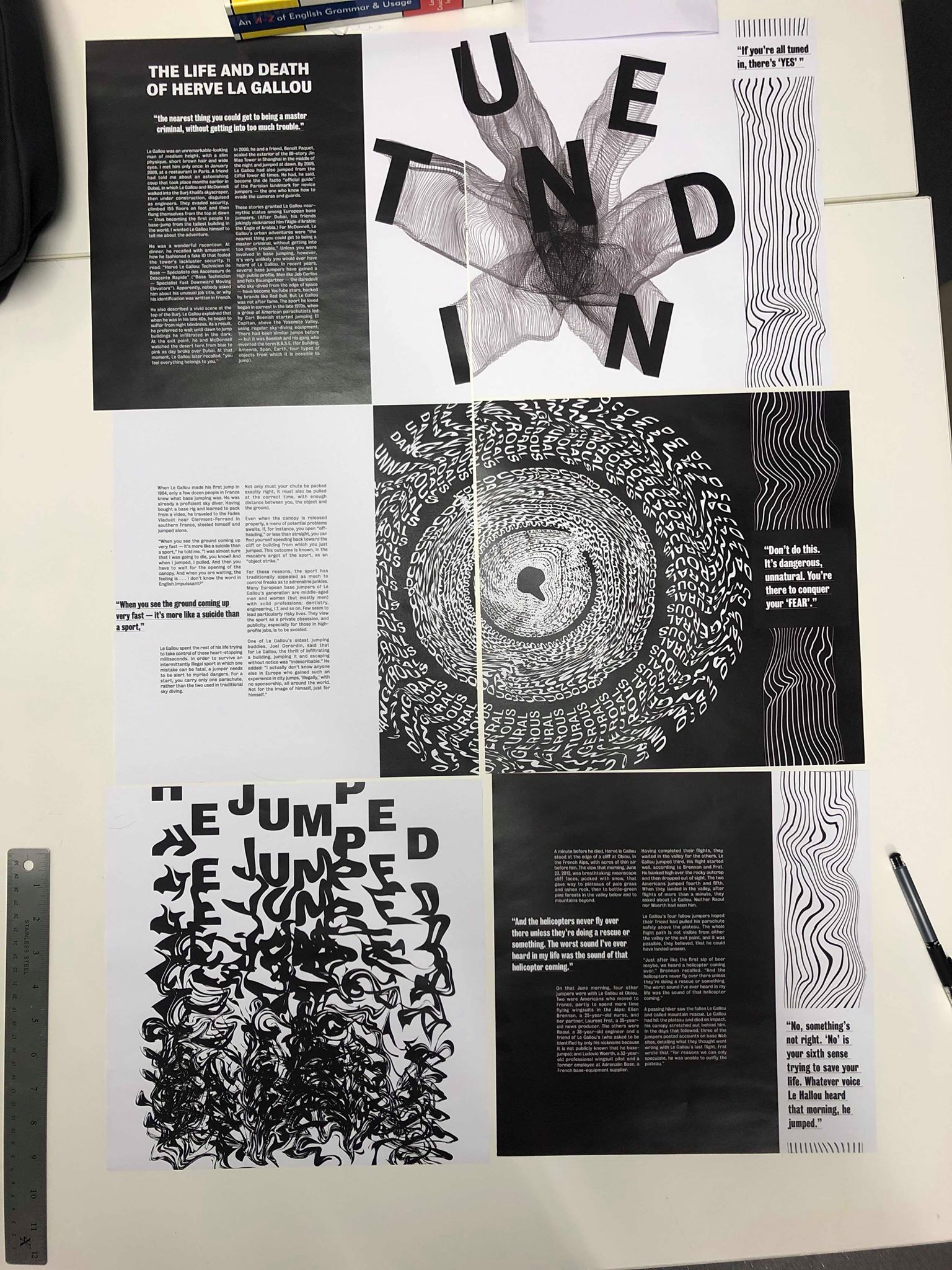
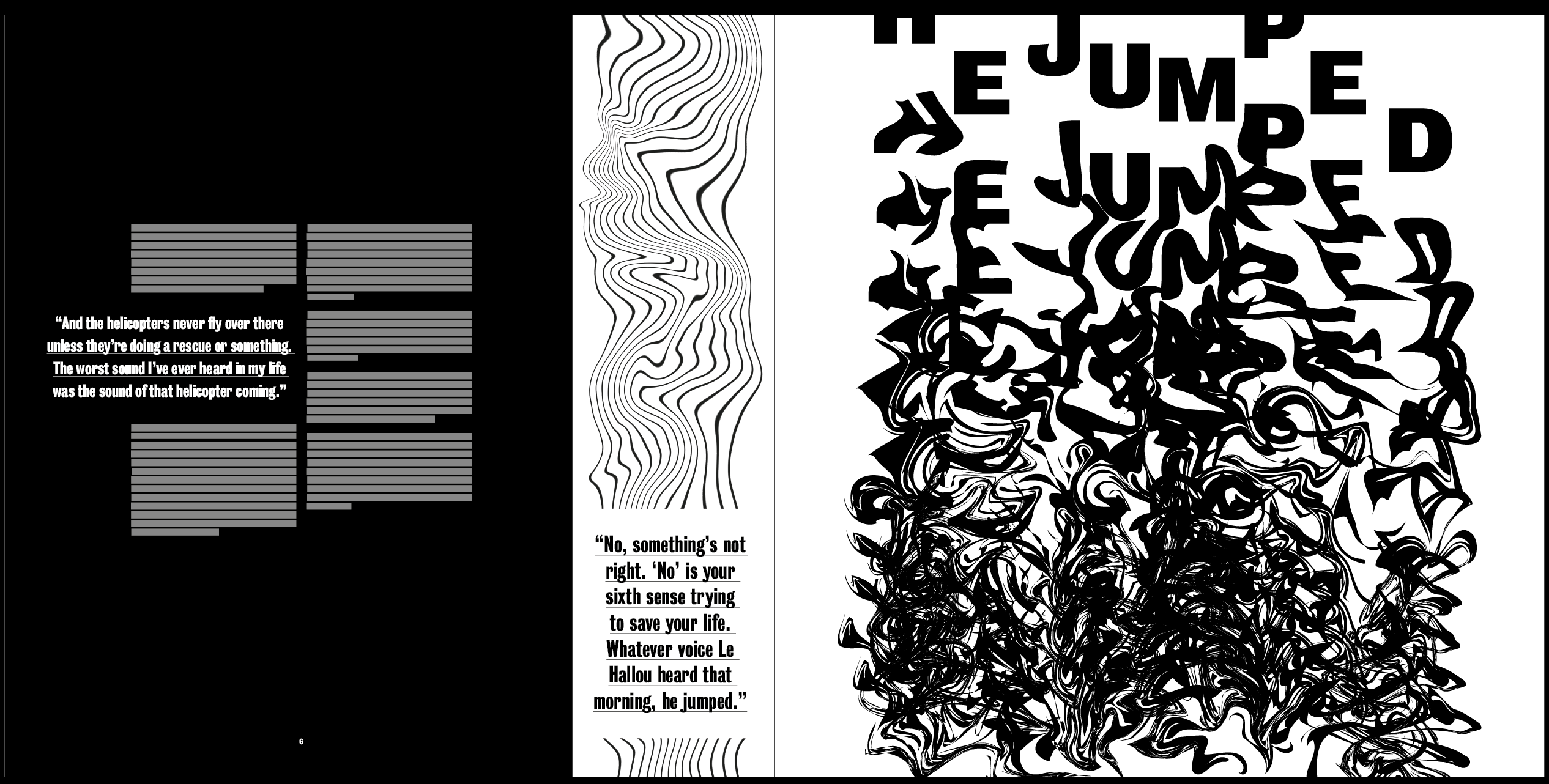
Overall, I think the design was strong and definitely stood out and had the effect I wanted it to have. I think all of the images are the perfect size, they don’t overpower anything else on the page but they definitely stand out enough to be the standout pieces on each page. I think the distorted lines down the side work well and pair with the images nicely, however I think there needs to be a stronger sense of distortion from the first page to the last.
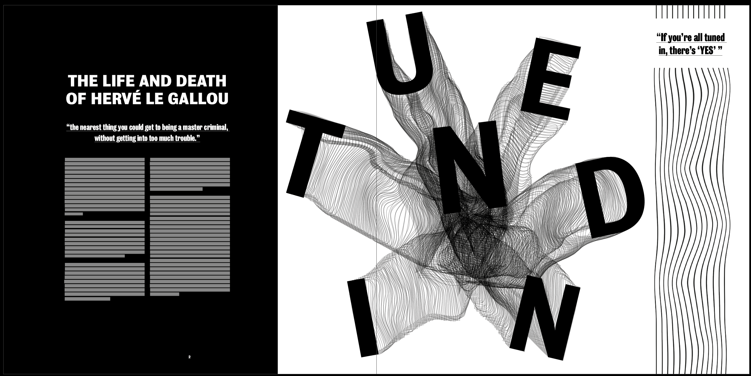
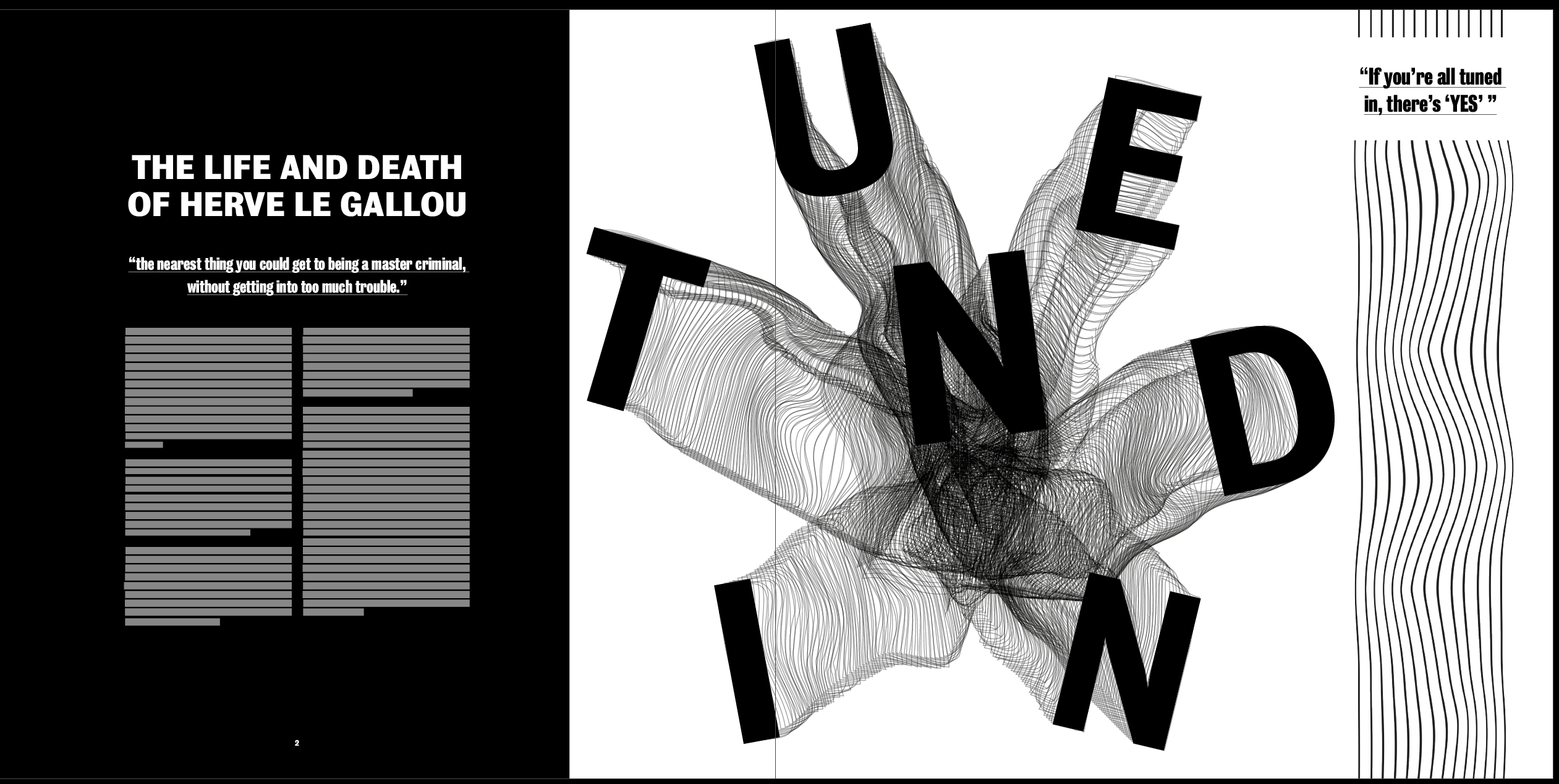
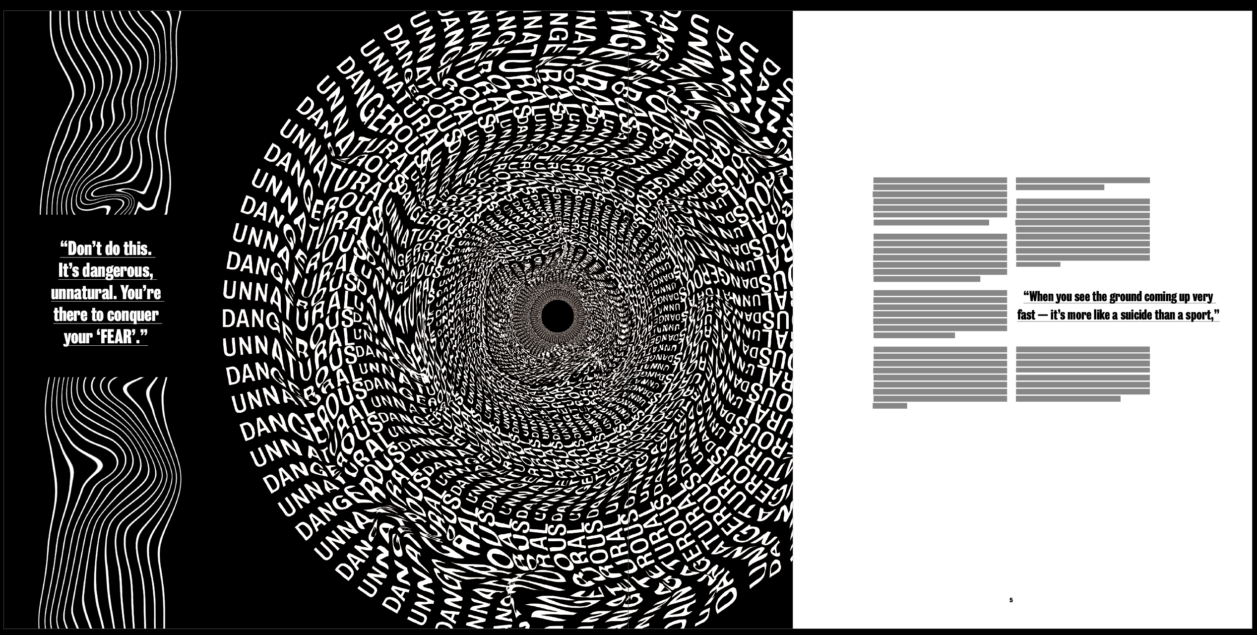
The body text size was too big at 10pt so I changed it to 8pt. I also made the pullout quotes incorporated into the text slightly smaller so it doesn’t overpower the body text. However I kept the pullout quotes in the distorted lines the same size, as I said previously I wanted these to act as a subheading and caption for the image, so I wanted them to be clear and stand out on the page so the viewer reads that before the rest of the text. I also want to change the pullout quotes on the second and third spread to being centre aligned to match with the centre aligned heading and pullout quote on the first spread.
The one thing I did have a problem with was the fact that when each spread was laid out, there was too many similarities on the page. In the photo above the distorted lines all flow straight down on the right side of each page which looks too structured considering the lines were supposed to show the chaos and fear on each page. I also tried switching the bottom two pages to get rid of this but ended up with the same problem where I has 3 pages of text on the far left of each spread. This wasn’t a huge problem but for me it made it too structured.
I used InDesign to move certain elements around the page in order to get rid of the elements which I thought were too structured throughout the page. Although I think this layout works much better without the distorted lines being in a line, and without all the text being in a line, I still don’t like how each of the pages on the left contain black as I think this still looks a bit too similar. However, I like how the text and images are positioned differently on each page, as well as the lines so I think this update is strong. Overall when printed, I don’t think the 3 black pages in a row will be a problem, as the viewer turns the pages they won’t realise this.
I also made a few changes from what I noticed from the printout. I changed all the pullout quotes to centre aligned, not only does this fit better with the heading on the first spread but I think it also suits each page better because of the square size. I added some small page numbers on to each spread, I only added them to the pages with text as I thought it would over complicate the other pages if I add them to that as well. I added them in the centre of the text box down the bottom, I think this sticks to the minimal theme of the body text design and doesn’t take anything away from the rest of the design. Although I know it isn’t central on the page, I wanted it to be central only to the text box, as I think it looks odd and out of place in the centre of the page.