
After my feedback I wanted to make some adjustments to the layout. Firstly I wanted to see what my second image would like like on a black background.
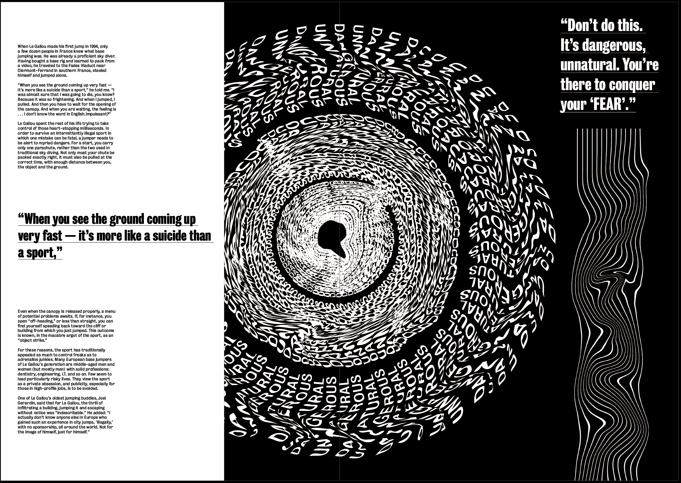
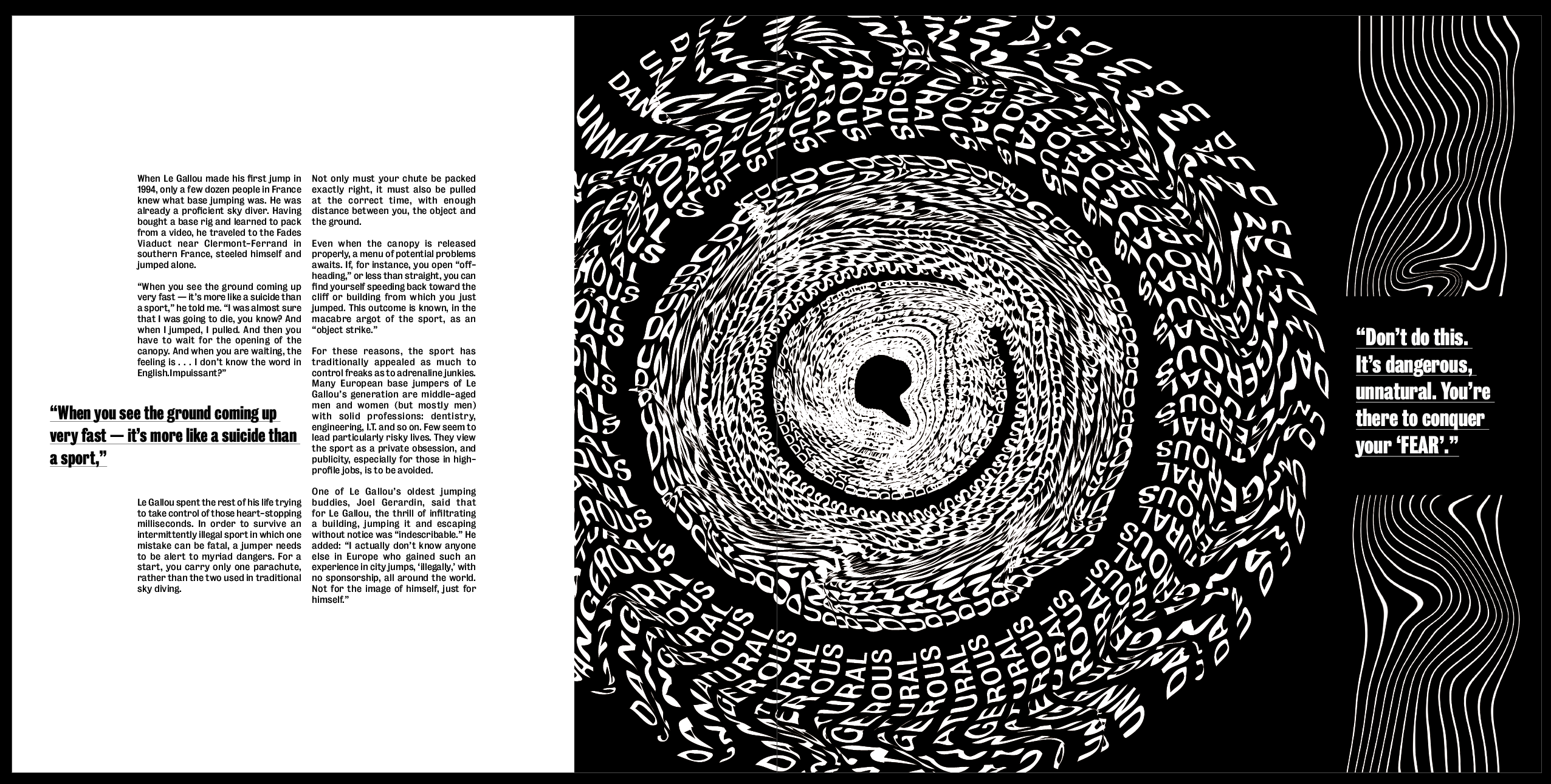
Although the other 2 images both look good on a white background which makes them look bolder, I think this one inverted makes it much more effective and gives more of a sense of a literal black hole. I think the white makes it stand out much more than it did on the black background and makes it look much more effective, it adds a strong sense of hierarchy as it’s the first thing that draws the eye.
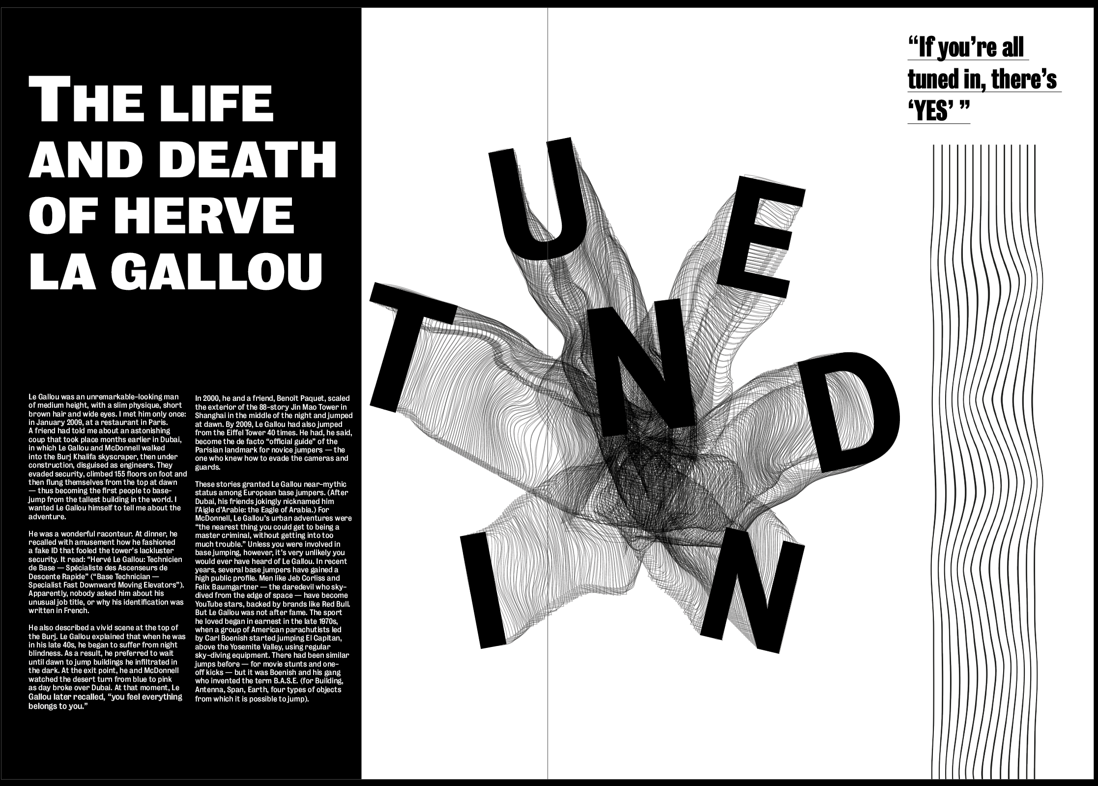
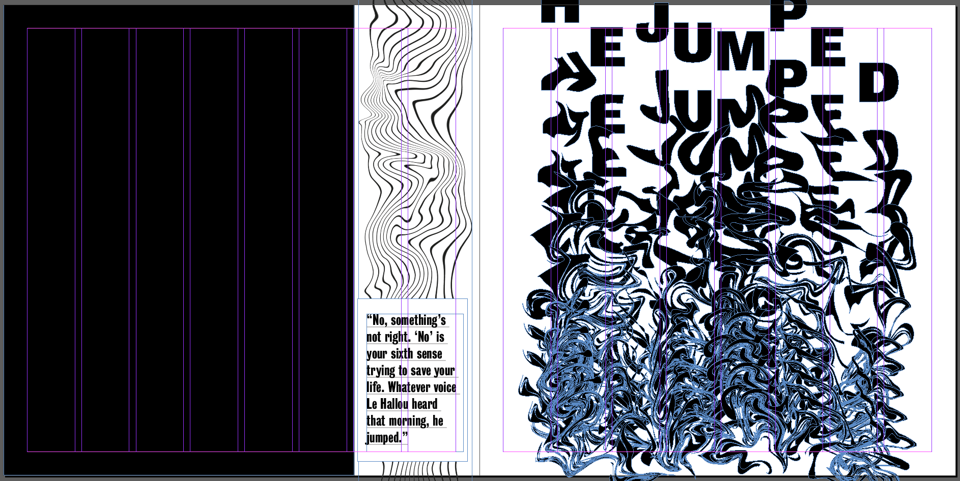
I also took it out of the border and used it by itself but enlarged on the page. I think having it larger gives a much stronger sense of hierarchy and the image will always be the first thing that draws the eye, which is just want I want from the image. As well as adding to this particular page, I think it also changes the pace of the article as a whole and stops each spread from being too similar.
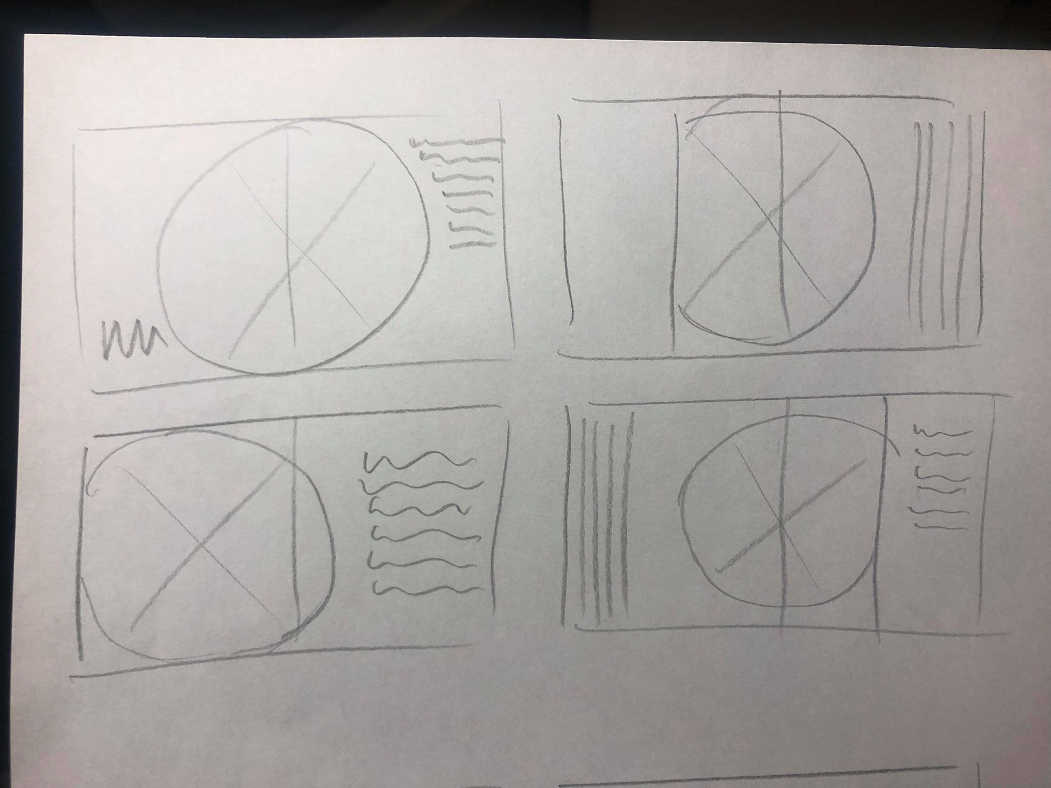
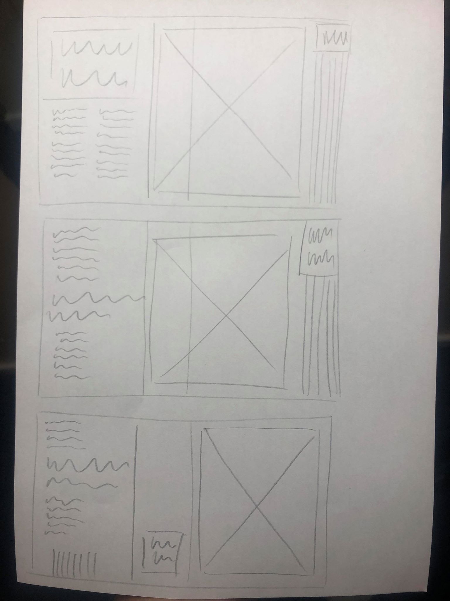
I then went back to my sketchbook to sketch out some new possible ideas. the first page was just some quick initial ideas, moving the images around on the page to be more playful and experimental, placing it in the centre of the spread or larger on one page so it overlaps onto the second. I liked the idea of this more experimental layout but wanted to make sure there was a clear break between the images and the body text to stop any confusion. After getting all of the ideas out my head I chose my favourite and sketched out a rough layout to follow when designing it digitally.
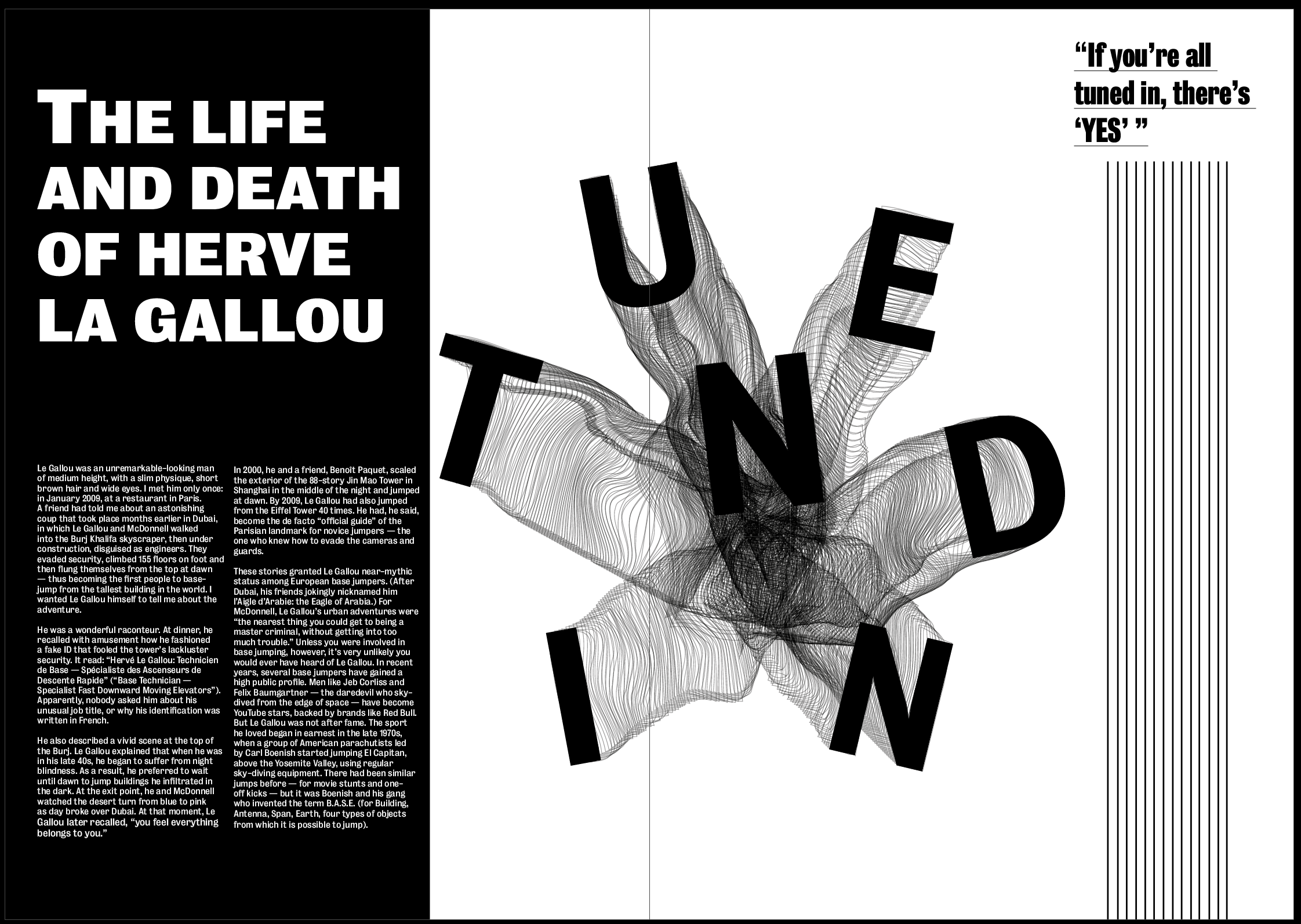
I really like how the image is placed over both pages instead of being limited to one, it makes the page slightly less structured and classic and makes it slightly more contemporary, as well as making it the first thing you’d see when opening the page as it’s closer to the middle. I also think the article title along with the text on the black background makes it pop off the page. I wanted the title to be the most important thing on the page so it had to stand out over the image, and I think using a bold typeface on a black background helps it do that.
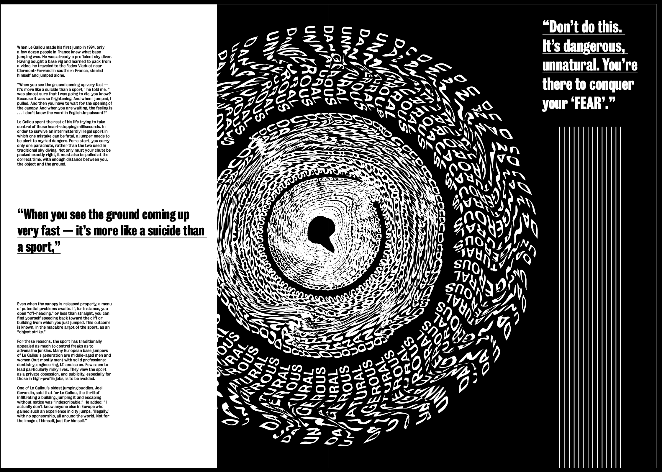
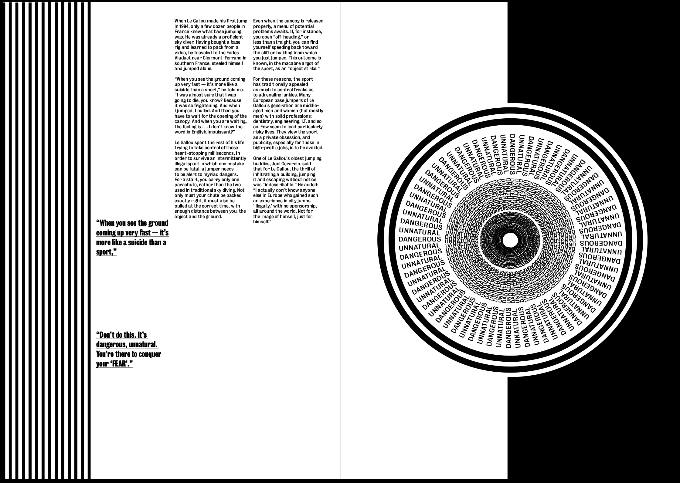
As I said previously I think the white image on a black background is much more effective. I also enlarged it and placed it in the centre of the page so the middle is in the centre of the page and gives a strong sense of ‘falling into it’ as soon as you open the page. I used the white background in contrast to the black to make it stand out, with so much text and so many lines on the page I though white text on a black background would be drowned out by everything else going on.
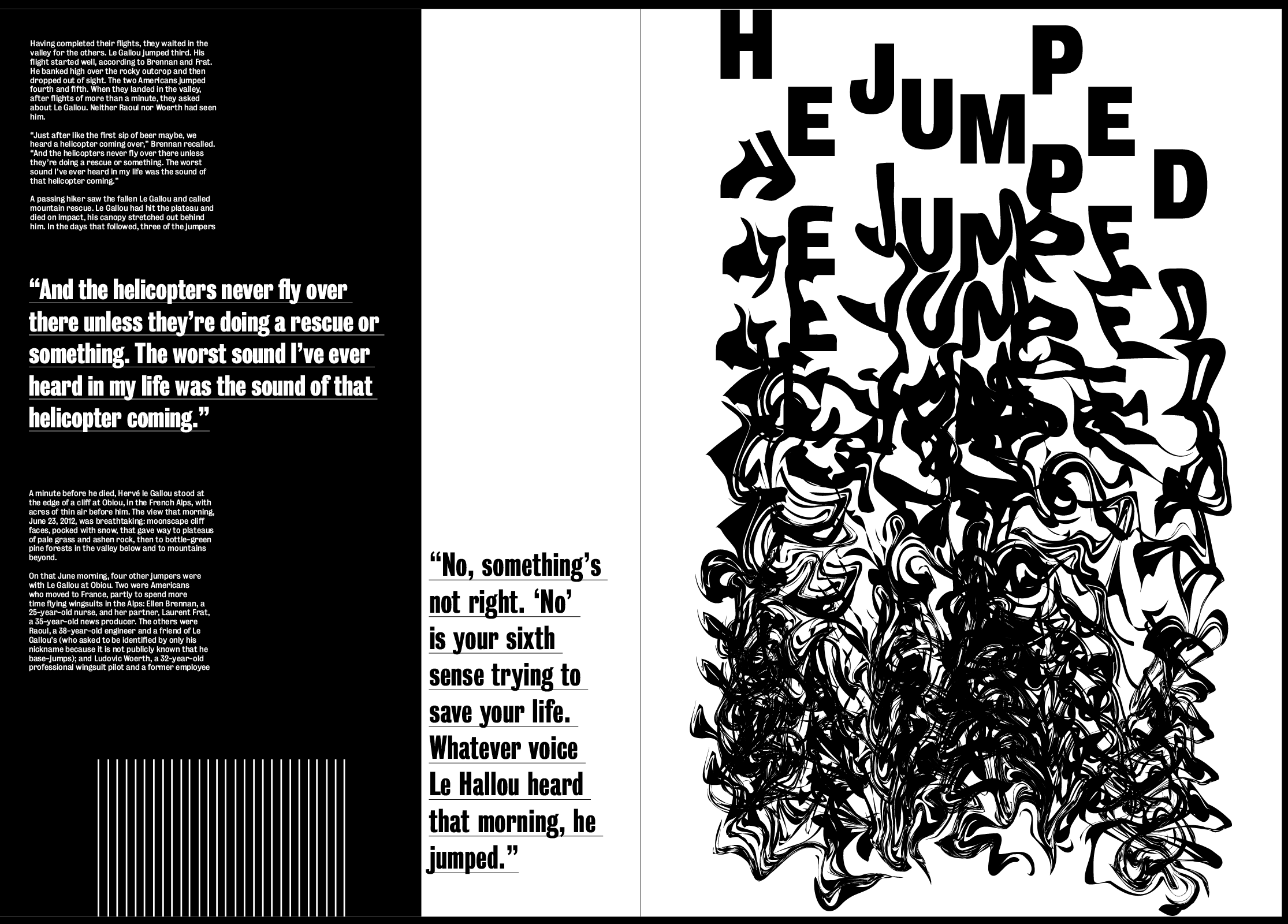
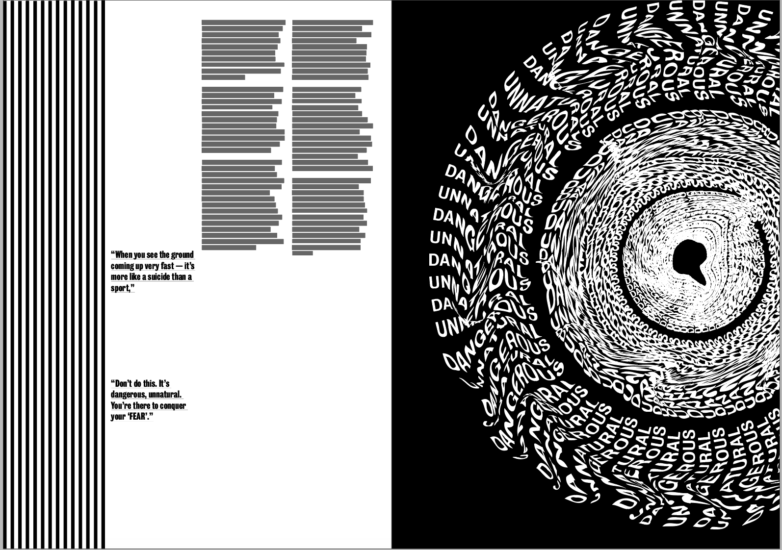
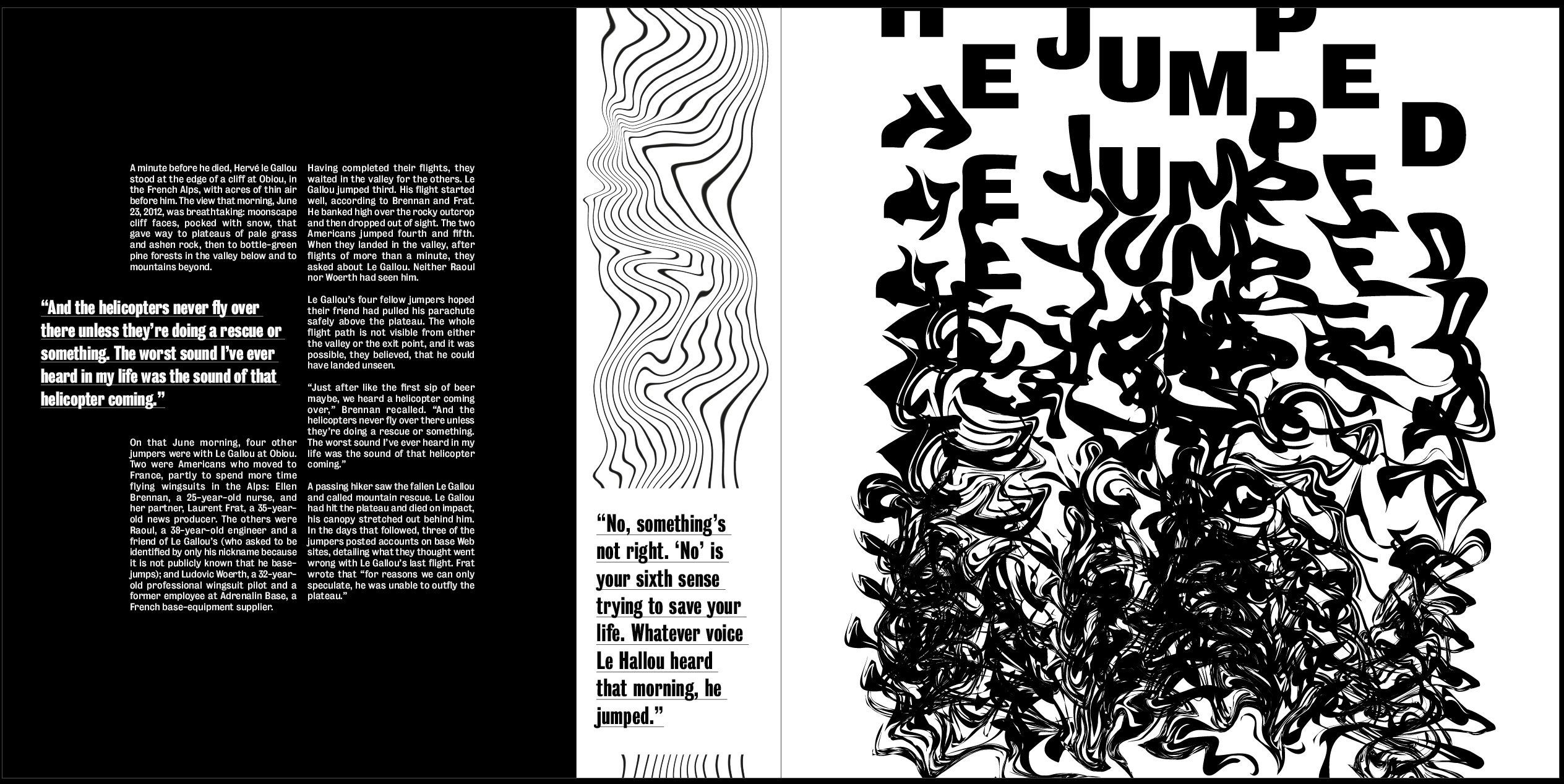
I used a very similar layout to the first spread but kept the image on it’s own page in this spread, I think it makes the two spreads slightly different so it doesn’t all look the same, and I think having it on a page by itself works well because its such a strong image. There is also a lot going on, especially at the bottom of it so I didn’t want it to blend in with the text and the rest of the lines on the page. Although the idea of the lines being at the bottom on this page, I don’t think it fits in with the layout.
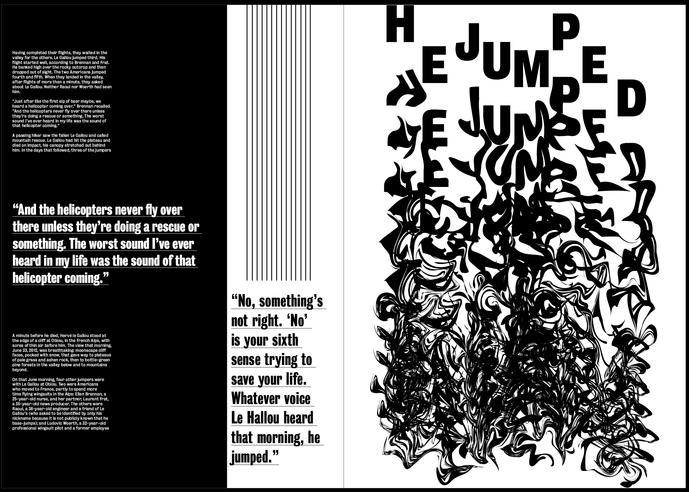
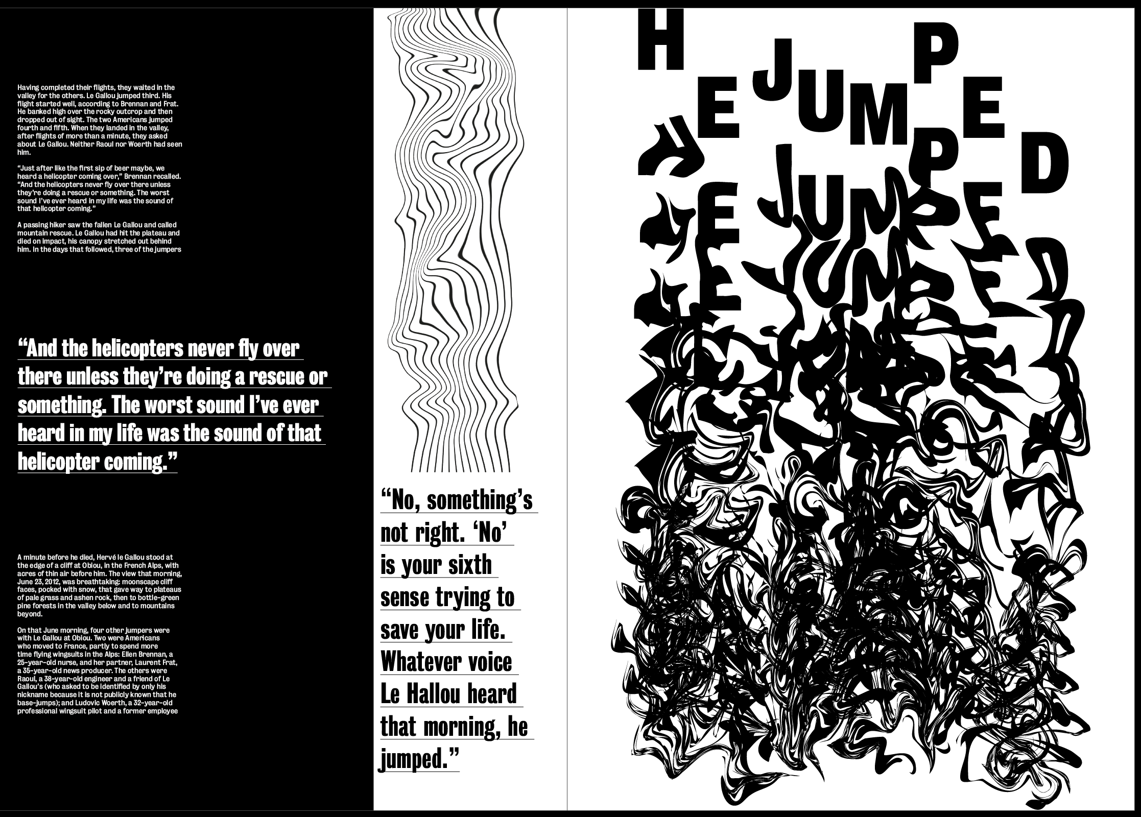
Instantly I think it fits in with the other 2 spreads much more and doesn’t take up unnecessary space around the text.
Overall I think the layout is definitely getting there, it already seems to fill much more of the space and leaves less negative space, it also seems much less structured which fits well with the images. Next to each image I placed the quite from the article next to it which describes the image and the idea of “YES, FEAR AND NO” which works well as a subheading to describe what the image is saying. I wanted this to be slightly larger than the other pullout quote to add a sense of hierarchy above the rest of the text.
The layout and body text both work well but needs work. Although there is an overall sense of everything deteriorating as the article goes on, I don’t think this idea is strong enough. While I don’t want to distort any text or backgrounds, one of the ideas I spoke about with David was to make the striped lines down the side of the page slightly warped and jagged, getting more and more so as the article goes on.
I think this works well and pairs well with the images, while also emphasising the idea even more. I think the warped lines also give a bit of contrast with the text which is all perfectly aligned.
I then spent some time looking at the text on each spreads to try and move it around to get rid of the negative space and just to experiment, but found it hard only having 2 columns to play with. This led me to think of how to find a way to get a 3 column grid which meant I could do more with the layout of the text and type detailing. I liked the overall layout I had and didn’t want to change it or make anything else smaller to accommodate the text, so I decided to change the size of each page from A3 to 297mm by 297mm in order to stay within the minimum size but use a square layout, allowing me to add extra columns in.
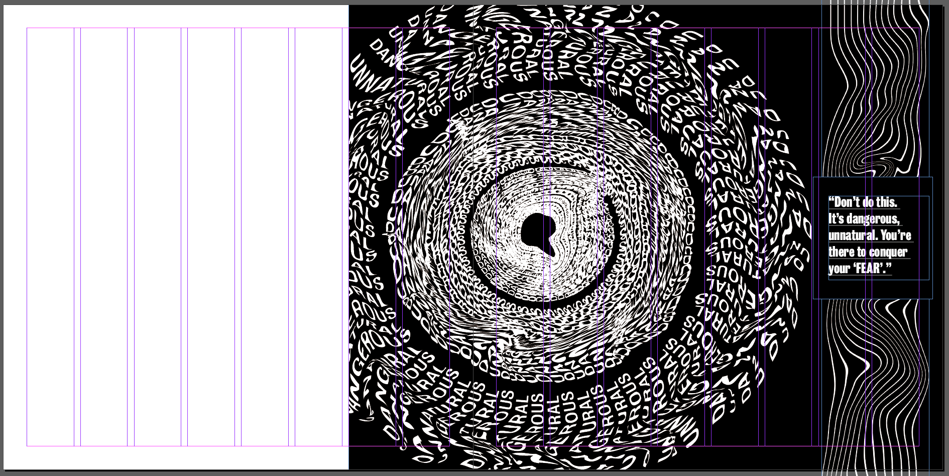
I think changing the size of the paper will work to give me more room to place text and experiment a bit more with it. I also think due to the size of all the images, they all fit better within this size and fill the page a lot more. I think this adds to the hierarchy and means you can’t miss the images when you look at each of the spreads. The wider pages meant I could keep the same style but add the text in using either a 3 or 4 column grid, depending on what I prefer.
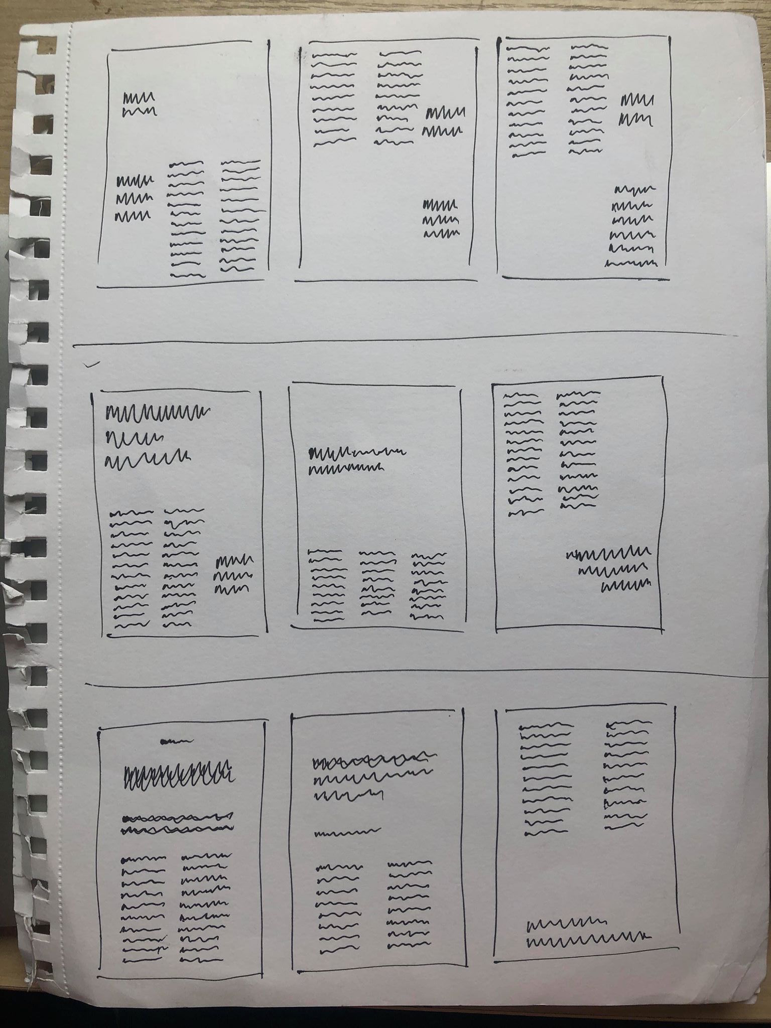
I then sketched out some ideas for the text using a range of different grid systems. I wanted the base of the page, the body text to be in line and uniformed with the pullout quotes and headers complimenting the text by being placed above or to the side. I think this maintains a structured layout but adds some asymmetry and goe’s with the design of the 3 spreads.
After much experimenting I came up with the following layout, using 6 columns along the area where I wanted to fit my text. I wanted to make sure the text was kept to itself and didn’t interfere with any of the images on the page to stop it getting over complicated. I also wanted the text on each page to be slightly different whilst keeping the same idea so it’s still recognisable as the same article. I also tested a few other fonts during my experiments and decided to stick with the same font which is ‘Bureau Grot’ which has a variety of different typefaces to use. The font is sans serif so it all stands out, especially the title which is in the bold version of the font. The sans serif also adds to the contemporary and modern feel to the magazine as I thought a serif wouldn’t fit with the tone and the design of the spreads.
As the pages were all square, I wanted to sort of keep with that style with the text, keeping all the text in the middle columns, in the centre to add to the square feel and give a blank border around the outside of it, making it clearer to read and giving it it’s own section on the page so that the there is a clear sense of hierarchy between the image and the text.
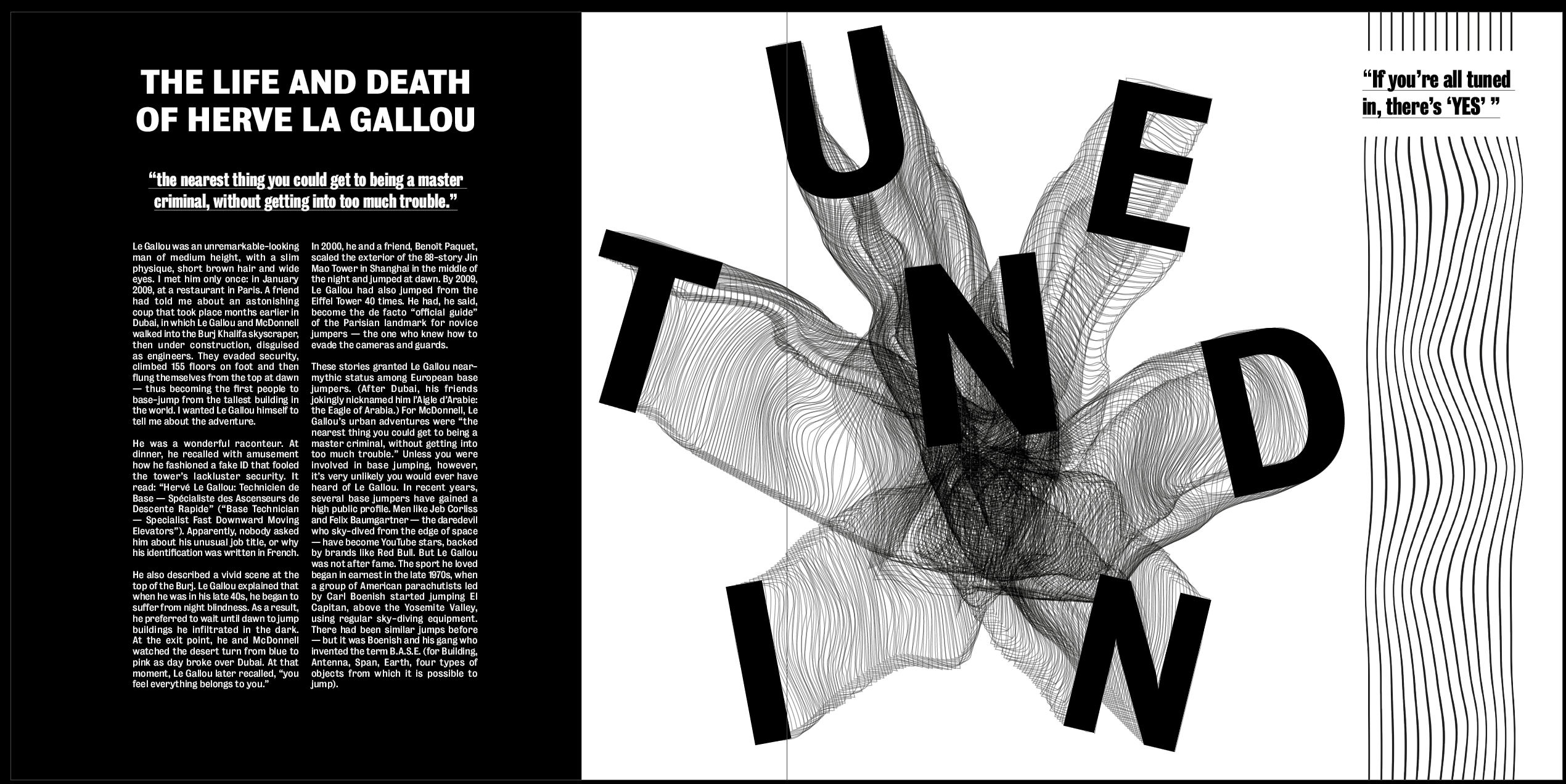
Overall I think it works very well in the layout it’s in, I like how on the first spread there is a clear hierarchy between the title, pullout quote and body text. I think this works well with the rest of the page to create a strong path for the eye, from the image, which I wanted to be the first thing the viewer looks at, to the title of the article, and then on to the body text. I like how the text on each page is layout slightly different, however it is still obvious that the 3 layouts come from the same article.
