
Before looking any further into the design of my app I wanted to do some research into existing app designs, ranging from apps such as mobile banking which would be helpful in the process of designing my app, to examples of modern and contemporary design to get a feel of how I want my app to look.
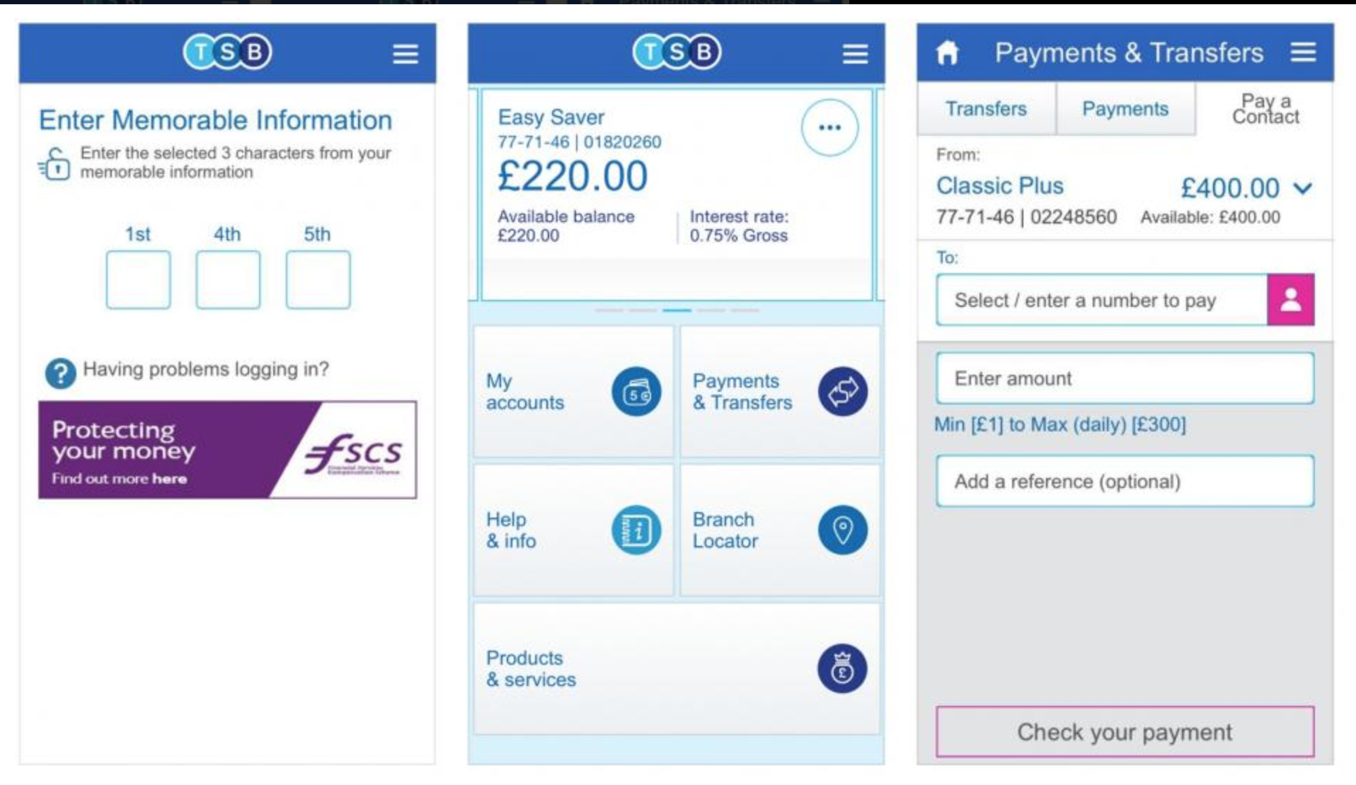
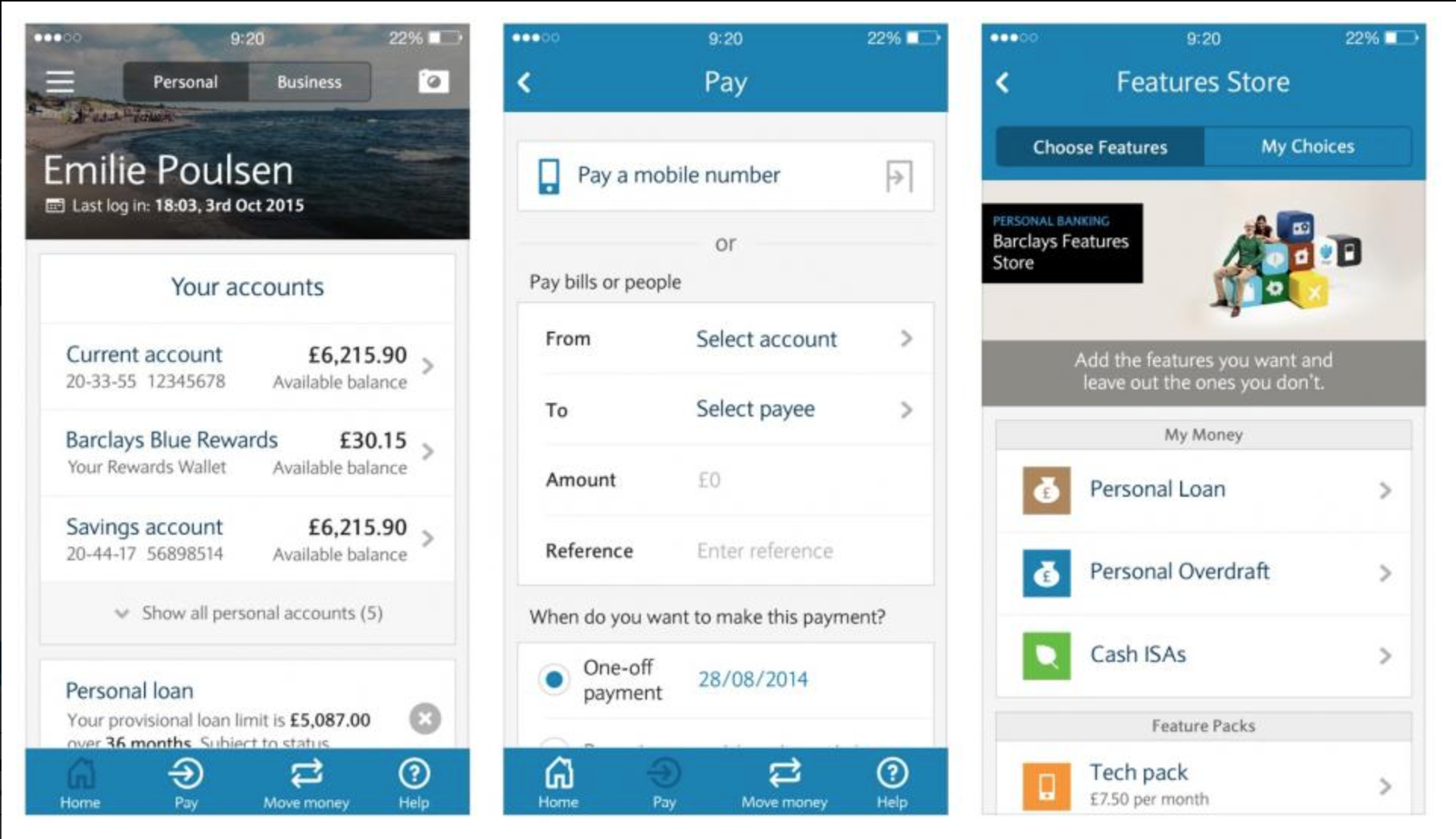
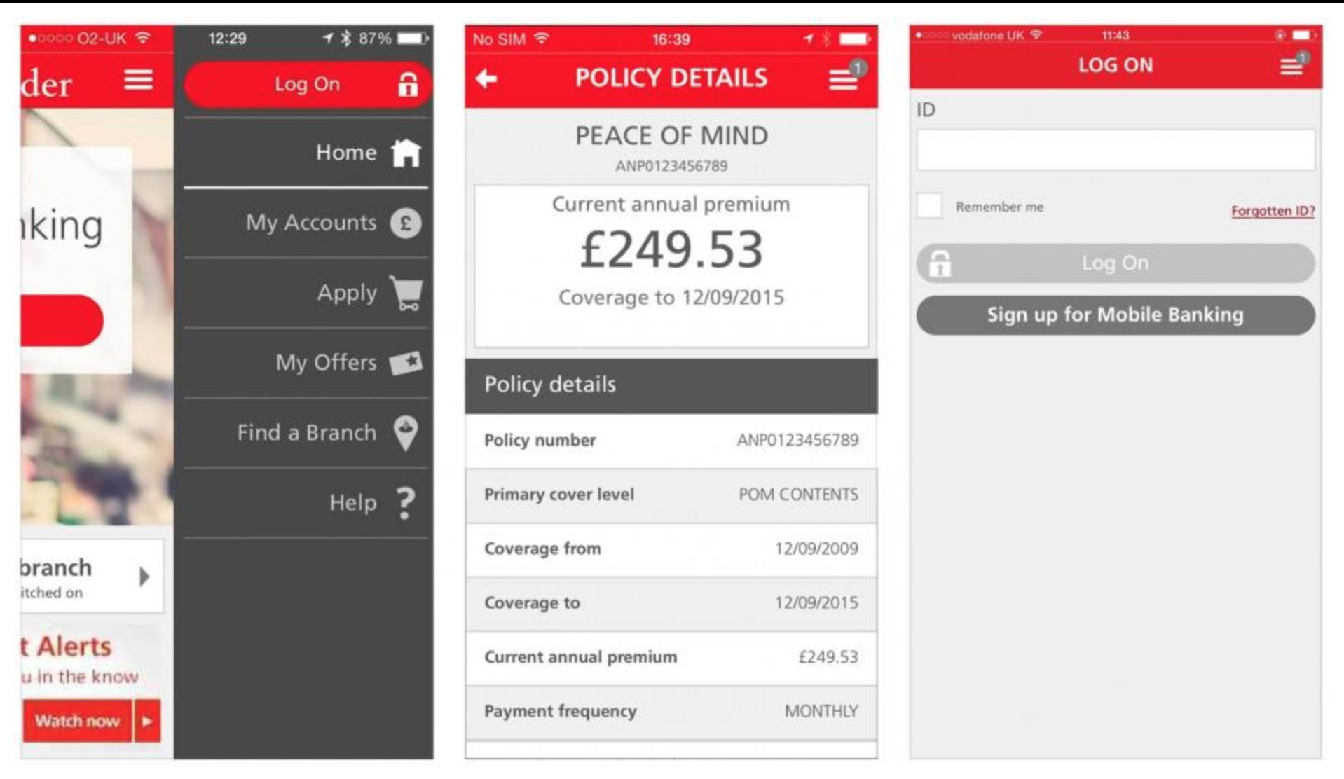
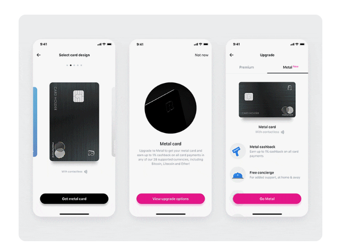
Firstly, I looked into mobile banking apps as I think the base of these apps is fairly similar to how Coin will work. The first thing I noticed was that these apps weren’t exactly easy on the eye and I wanted Coin to be much more of a modern, eye catching aesthetic. However, I did take some positives looking at the apps. One of the main things I noticed was how secure the apps are, as they deal with money and the users credit cards they have to be secure and only accessible by the user, meaning my app will need to include a face ID (or touch ID) sequence to open it up, with a passcode as back up. Although mobile banking apps have a lot of features which won’t be necessary in my app, something which I did notice was that the credit cards were pivotal in the majority of these features as all the money runs through them. This was a feature which would also need to be pivotal in my app, as the user will need to select his card he would be depositing money from, and paying with. This needs to be a feature which is easy to navigate.
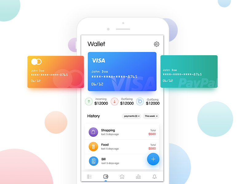
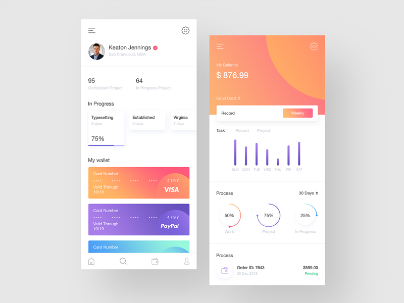

I then looked into some modern examples of budgeting apps, and although they still work in different ways to how my app will, the way they show how to choose cards and navigate between them is my more aesthetically pleasing that the mobile banking apps. They all physically show the cards and have a much nicer looking swipe or scroll to navigate between cards. I also noticed whilst looking at these apps that the majority of them contain a page which the user can view their transactions. This was a feature I was thinking about using, however I decided I wanted Coin to be an app which the user can quickly log into, deposit money and pay without hassle, a transactions page is one which I think most users wouldn’t use.
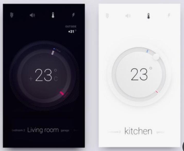
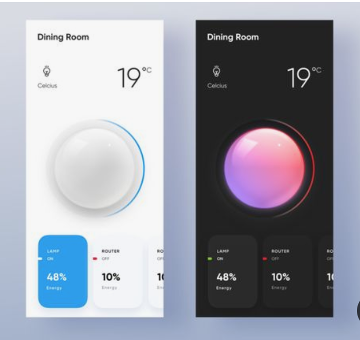
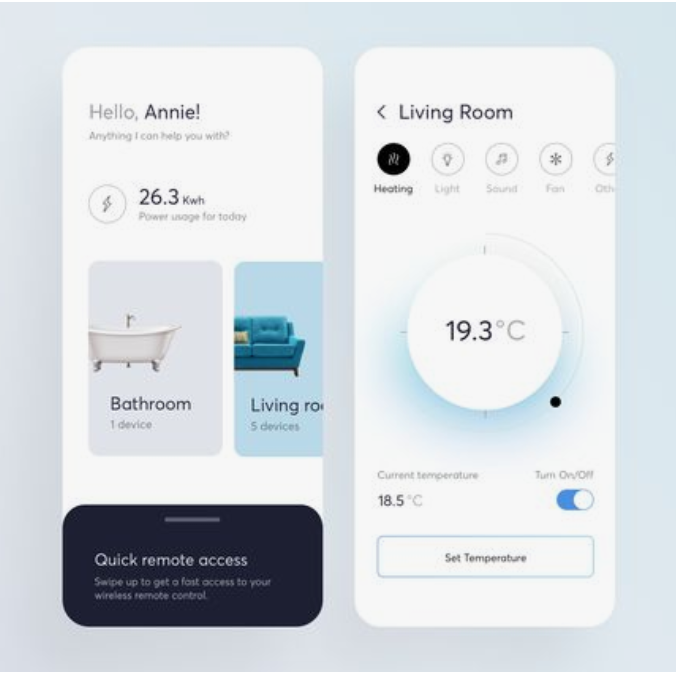
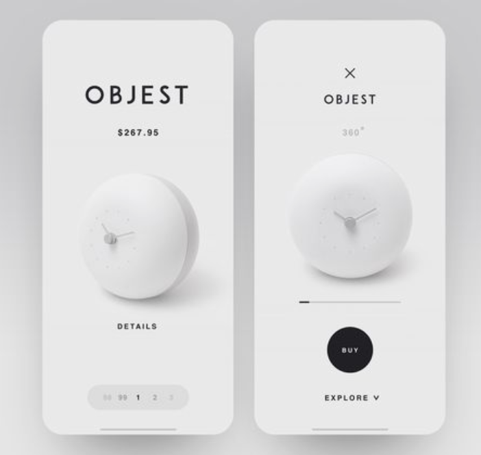
Next, I turned my research to examples of minimal and contemporary app design to take influence from. I found overall that the majority of app designs currently use a plain black or white background, with the source of the colour coming from images or features within the design which make the page pop. Some app designs which are more experimental use other colours and styles, however thinking about the app having to be relatively serious and safe due to dealing with money, I decided not to look down the experimental side.
I also noticed that very few of the apps have thick navigation bars and the top or sides of the screen, like many of the mobile banking apps did, and instead leave the screen very open. They all contain icons to go back and/or go to the home page but they are all very small, minimal icons which don’t interfere with the main design. I think this looks a lot more modern than having a thick, coloured bar on the screen. They also use lots of circles or buttons with rounded edges as opposed to boxes, I think this fits better with the shape of the phone being curved, and keeps the design looking very sleek and modern.
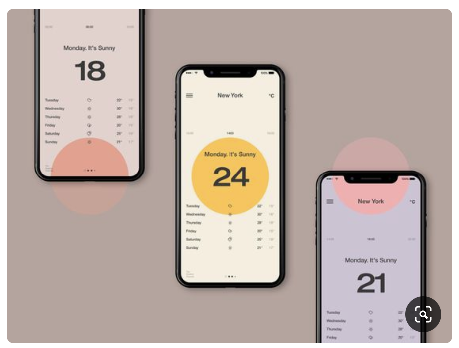
I wanted the main design of my app to be based around the main page which is where the user will deposit ‘COINS’. I wanted this page to stand out and the rest of the app would be based around this page, so I payed particular attention to apps which have round button or icon in the centre of the screen. I noticed that many of them have colour around the outside of them which makes them stand out off the page. They also have very a very minimal amount going on around them to instantly draw the eye to the centre piece and nothing else.
