After designing what the basic plan would be for the layout, I next wanted to focus on the design of the app, starting with the name and a logo to go alongside it. During a discussion with Theo we were talking about possible names for the app and we decided it needed a simple name to go alongside the simple idea. During the numerous times I had described the app to many different people, the one way I kept describing the idea of depositing money was ‘swiping a coin’ into the users wallet. I though ‘COIN’ could work extremely well as a simple name for the app, but also as a way of describing money deposited by tapping or swiping as ‘depositing coins’. Theo agreed that the name worked really well to keep a simplistic feel to the app.
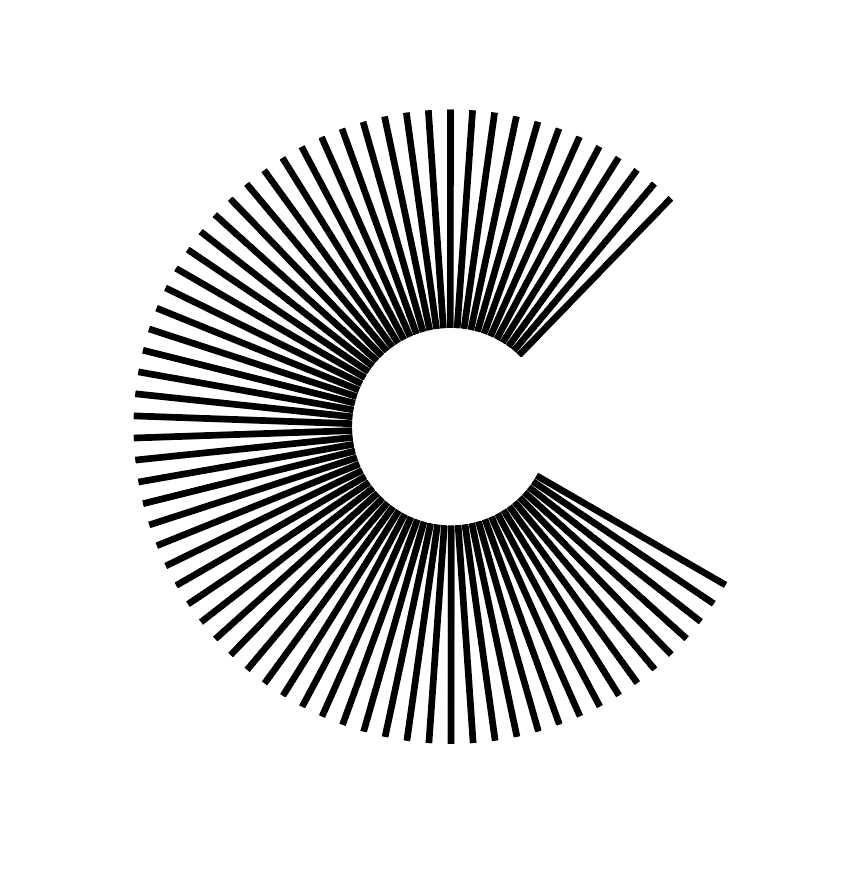
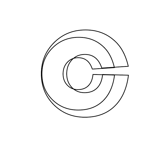
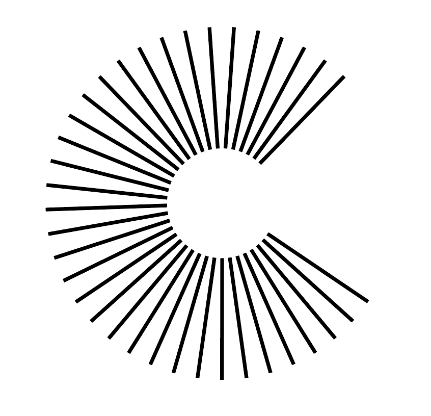
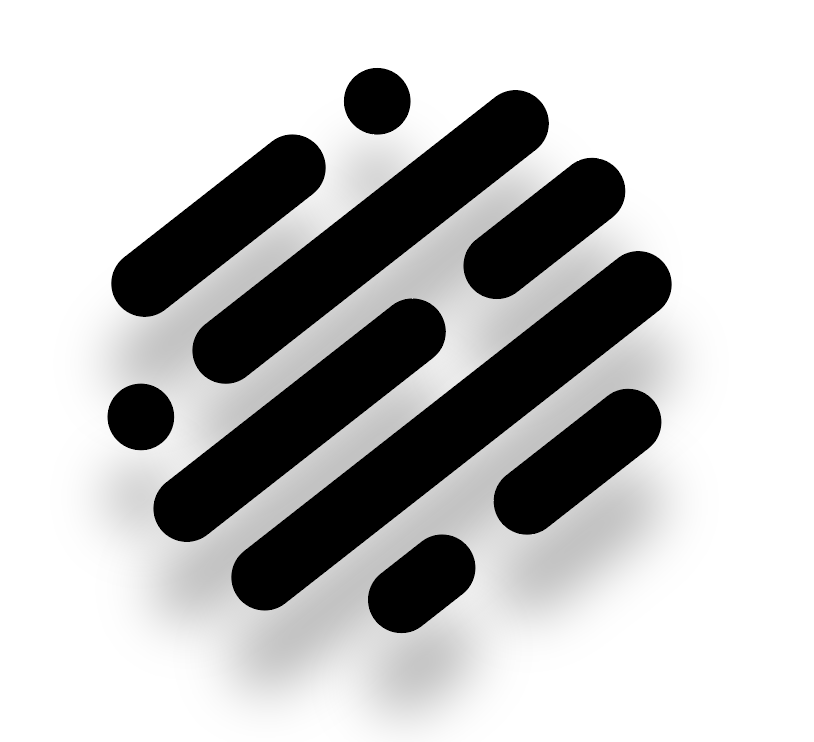
Next I looked into choosing a logo. The initial ideas I had for the logo used the name ‘COIN’ as the basis. I sketched out a variety of different designs, using circles, c’s as well as actual coins as influence.
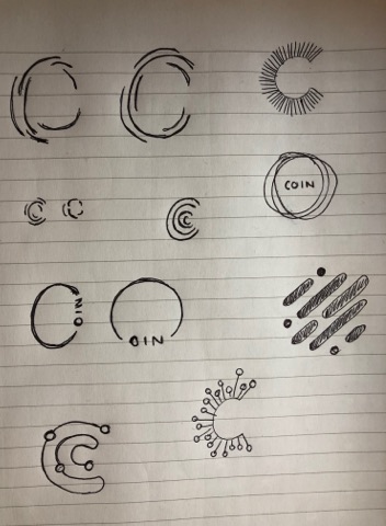
Most of the designs took the shape of a ‘C’ due to the name. I wanted to keep each design simple using only lines, as although I wanted the app to involve colour, I wanted to incorporate the logo into the ‘deposit’ screen and decided using a logo too colourful or too confusing would overcomplicate the page. I also looked at using ‘fingerprint’ design to reiterate the fact that the app is a very personal experience of budgeting and depositing/spending money.
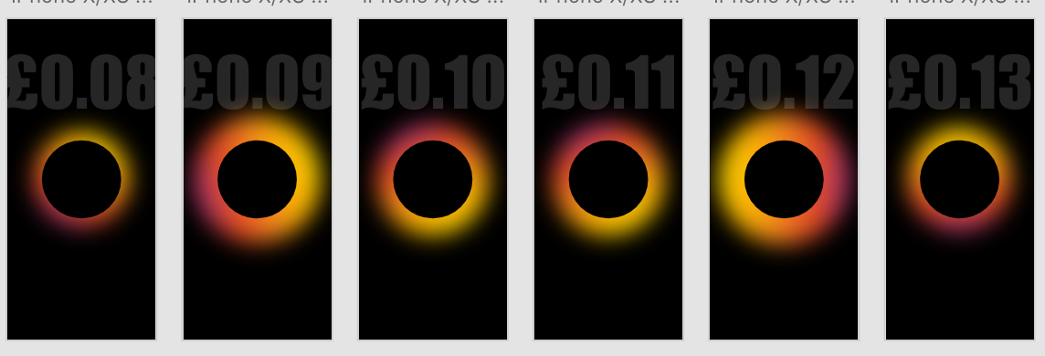
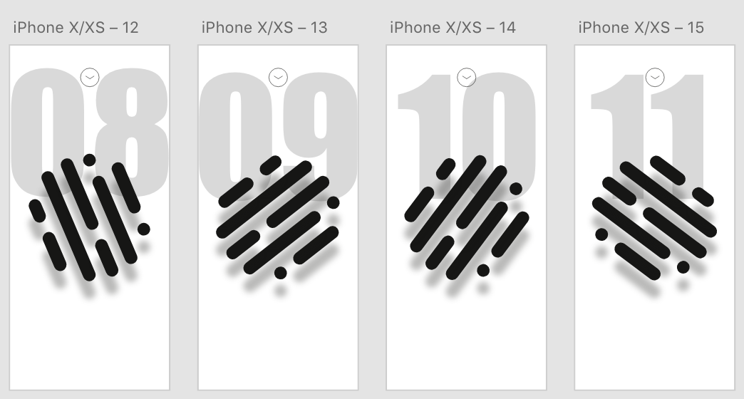
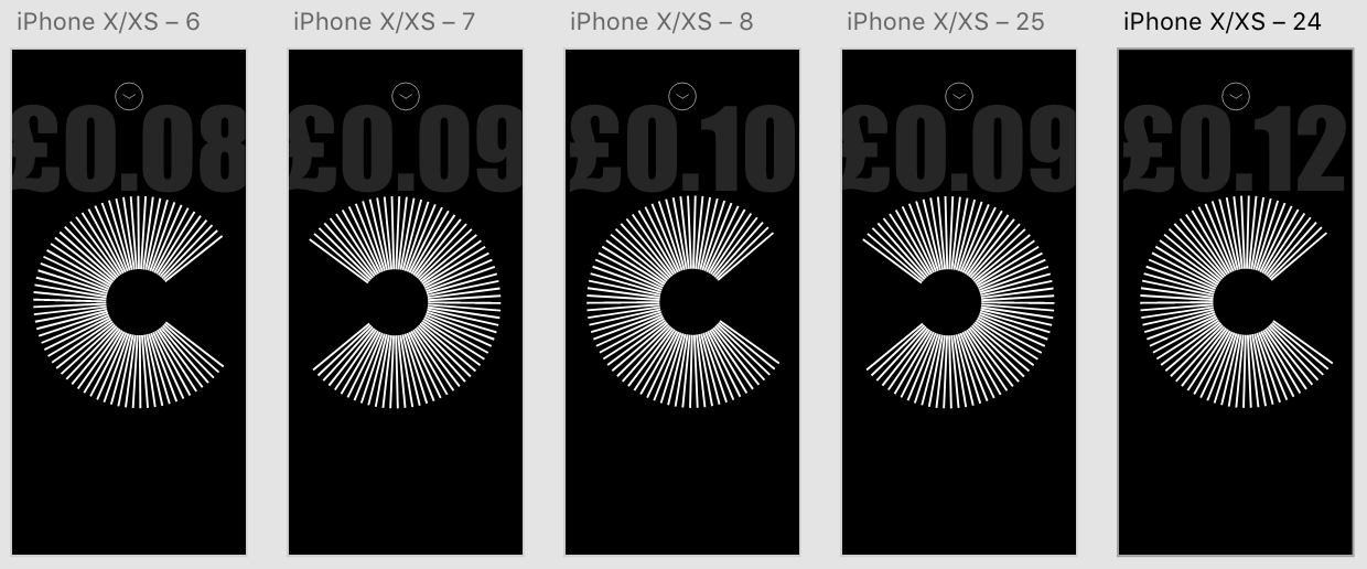
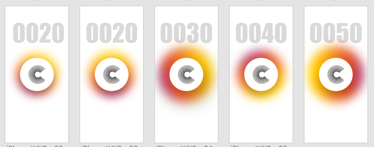
After designing a variety of logos I wanted to test a few of them out within the app design to test out what which would work best, as well as trialling out a variety of different background colours and ‘coin counters’. I thought as the ‘deposit coins’ page is the most important page within the app, this would be the best one to trial to attempt to figure out the visual identity for the rest of the app.
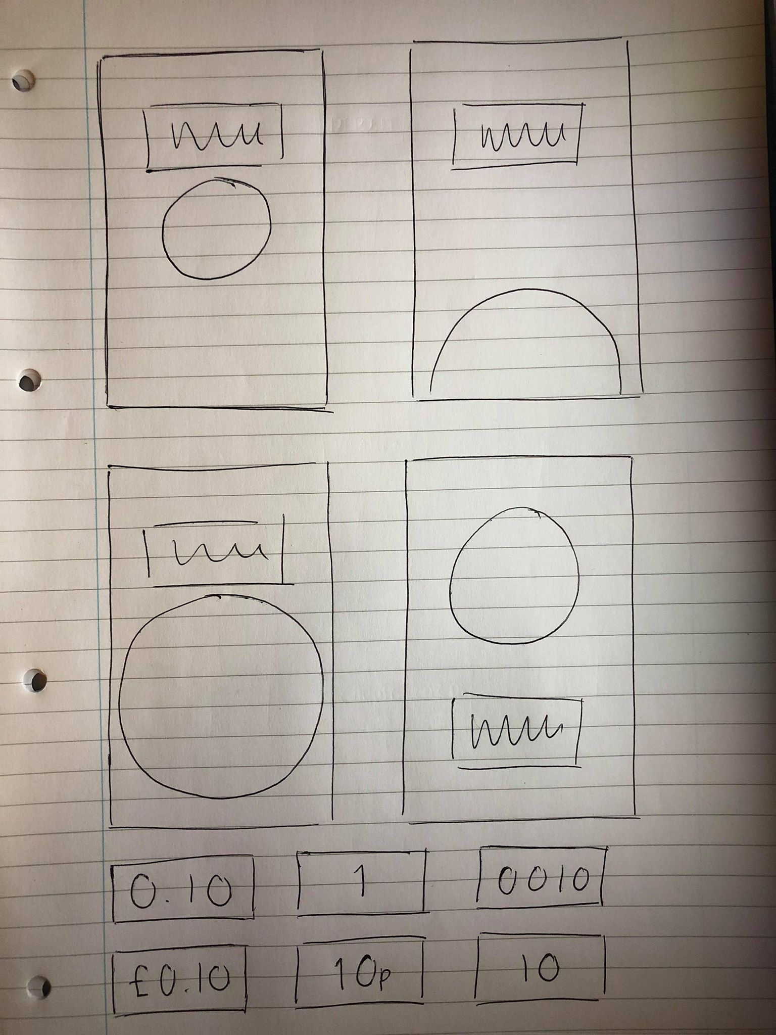
I trialled different logos on white and black backgrounds with 4 different styles of ‘coin counters’. After working on Adobe XD I noticed that using the auto animate transition, the images on the page will animate from one to the other between each artboard, so I also experimented with rotating the logos so they spin with each tap, as well as changing the size of the coloured circles so they get larger and smaller each time. Overall I think the design with the white background and the coloured border works the best and looks the has the most modern and clean aesthetic. Although I still need to experiment with the rest of the design, I think the logo and rest of the screen is very strong and is a good base for the rest of the design.
