
After previously designing the base for my main page, I looked more into the money counter situated above it.
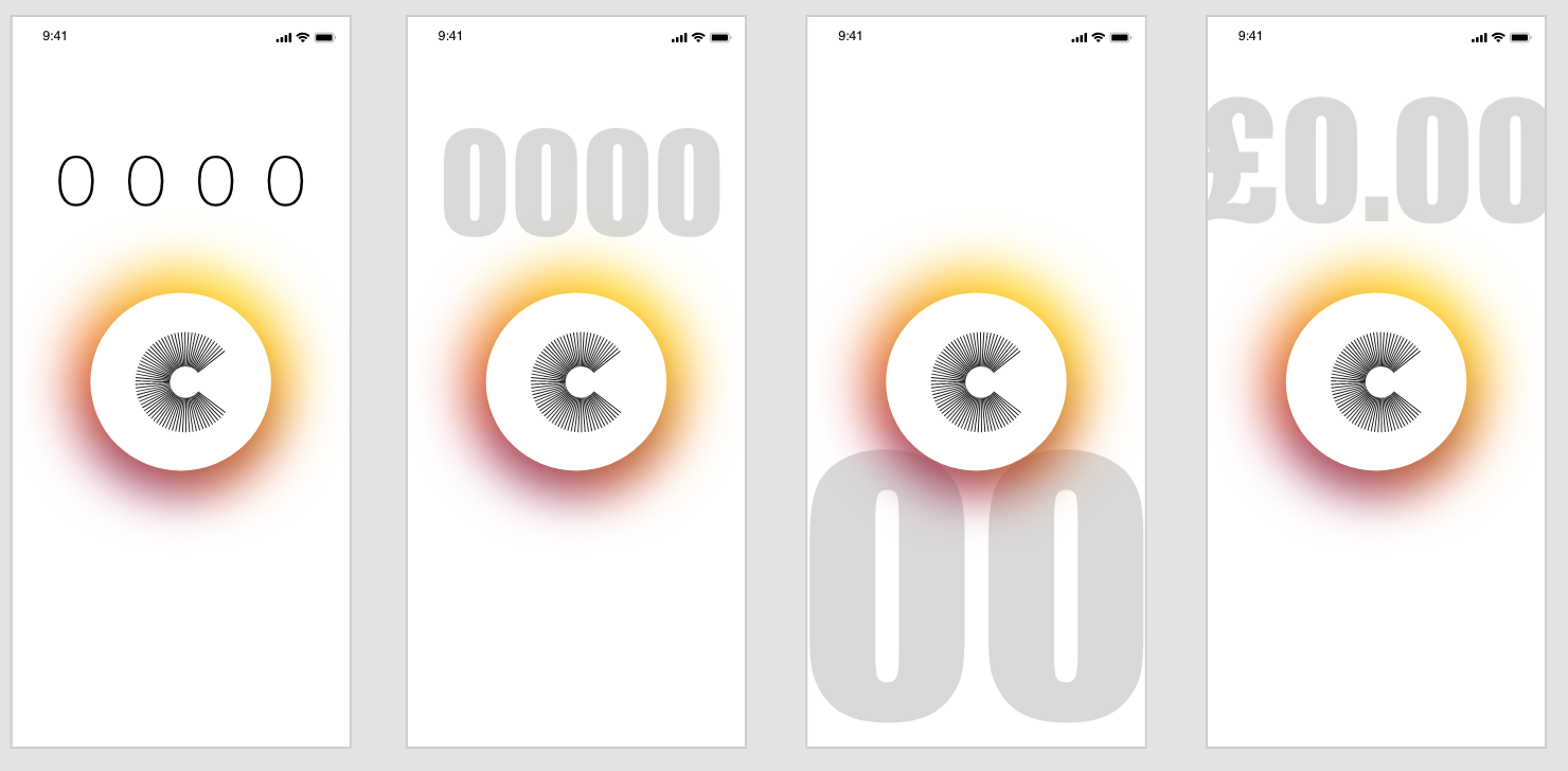
I think overall the money counter above the logo is much stronger and makes it look much more authoritative, whereas it being situated below almost makes it look less important. I was first drawn to the thicker, larger style, however after looking at these I decided the thin, slightly smaller style is more more effective. It is still clear and stand out on the page but looks much more modern and fits more with the aesthetic
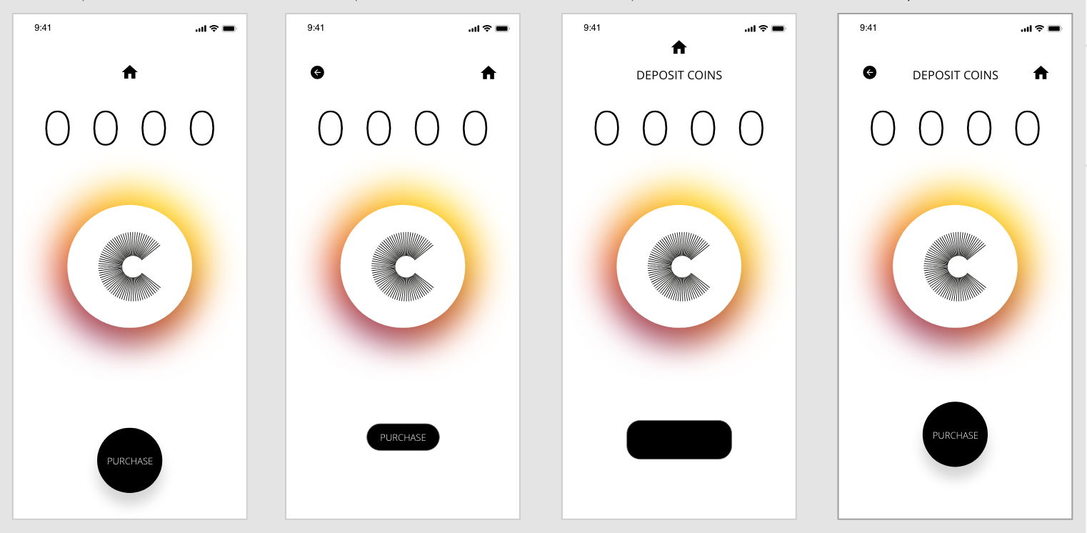
As I stated in my research, I found that the majority of app designs used sleek and minimal icons to navigate throughout the pages and I wanted to take a similar approach. As the app isn’t going to be overly large and complicated I thought back and home icons would suffice. I wanted to keep the page with a minimal feel and have as little on the page as possible. I didn’t want to overcrowd the page and because of this i kept the amount of items on the page to a few. Firstly, although I like the look of the examples with just the central home screen, it would be impractical for the user to only have a home button and not a back button for navigation purposes. I also think overall the far right is the most appealing to me, I think the round ‘purchase’ button really stands out over the rectangular one, partly as it’s larger in size but mostly because I think it goes well with the circular logo and they both compliment each-other well. I also like the ‘Deposit Coins’ header, although I am still unsure if a menu or home screen will feature, I wanted to give the page a name and function.
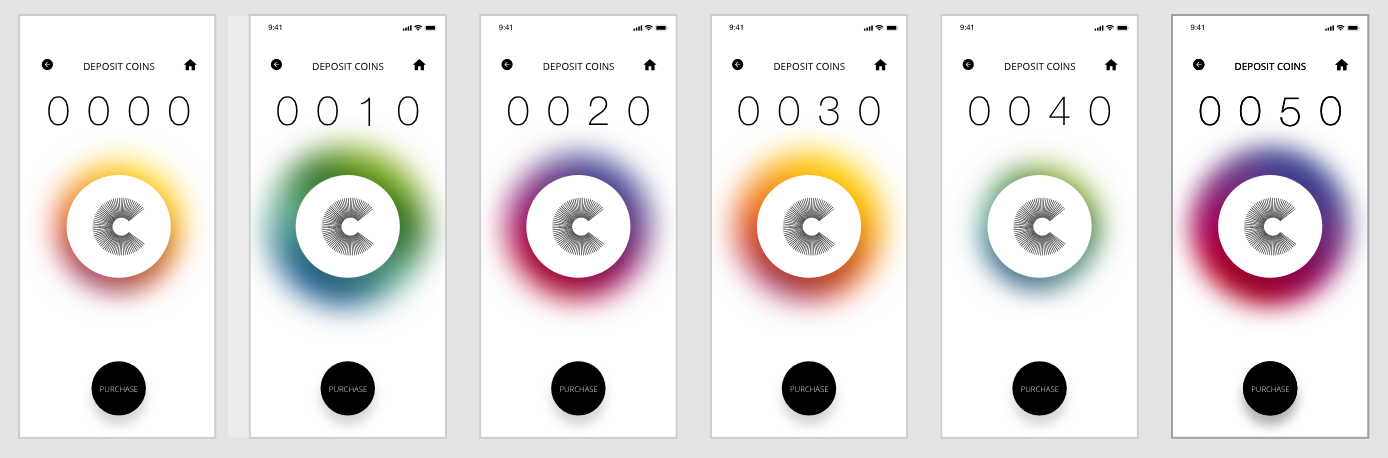
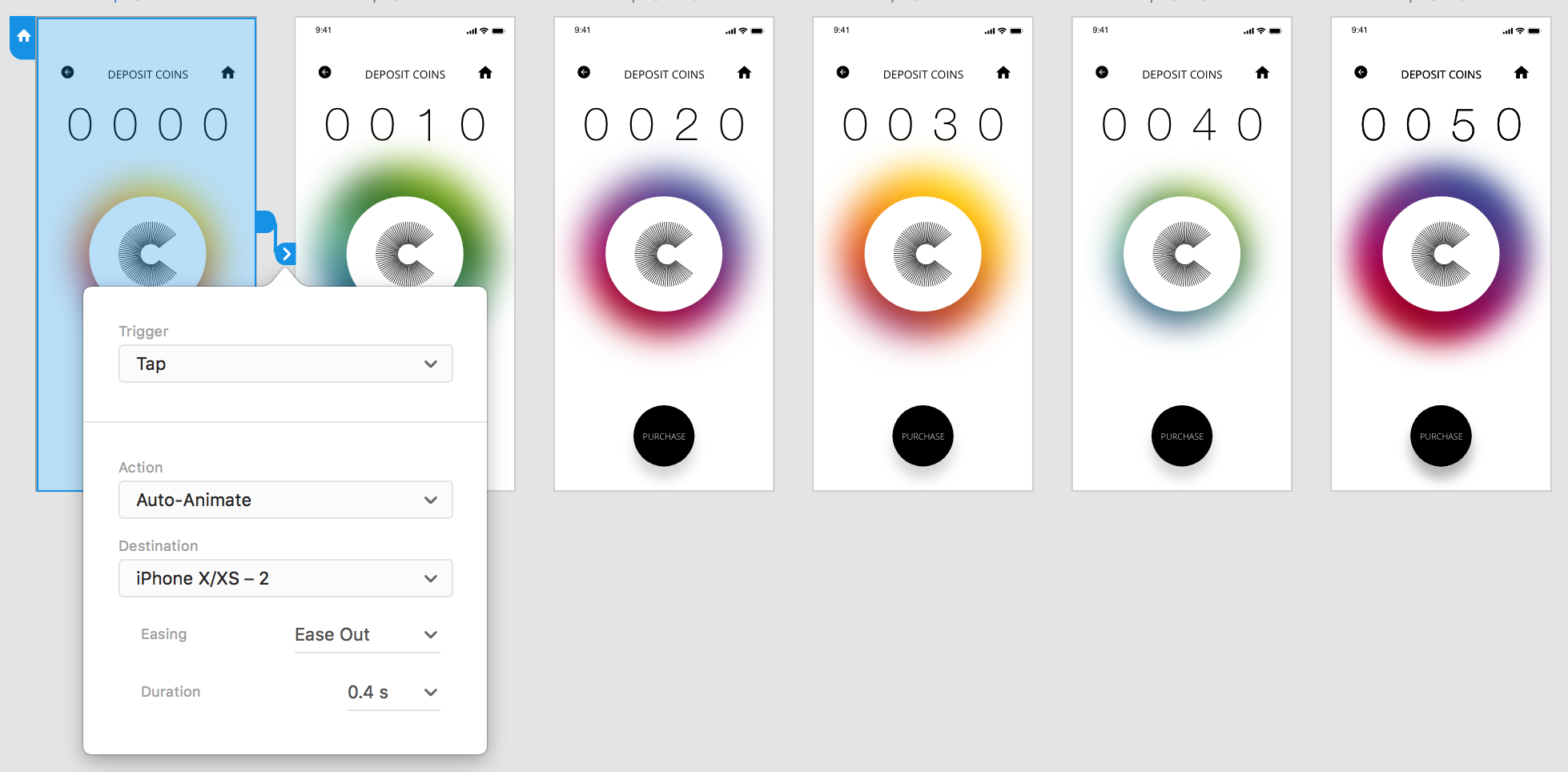
After taking influence from my research to add a coloured ring around the logo, I then extended this and added several colours of different sizes. I also added a ‘tap’ on the logo to trigger auto animate into the next page, meaning each time the ‘COIN’ is tapped to add 10p, the colour ring changes colour and size each time. Not only do I think it adds to the screen and makes it more bright and vibrant, but it also lets the user know that they’ve added 10p to their wallet.
