After my research into other app designs and looking into the way they manage their card settings, I wanted to take a modern approach and show a vector image of a card instead of just the details.
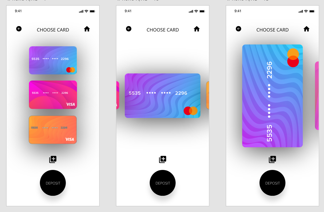
I used the previous page as a bade and used the same page attributes. For example the icons at the top of the page are all the same for easy navigation and ‘Deposit Coins’ has just been changed for ‘Choose Card’. I also kept the button in the same place as on the previous page in all of the designs, however I changed it to ‘Deposit’ because I wanted to give the user the option to go to the Deposit Coins screen as soon as their card is chosen.
Overall I think all the designs work to a certain extend. The far left gives a clear list and shows clearly all the cards which the user could use, however it isn’t obvious which card the user has chosen due to no change in scale. The middle option eradicates this and makes it clear to the user which card they are choosing, however it doesn’t use the space as well as the 3rd option does. I also added another icon to the page to add a new card.
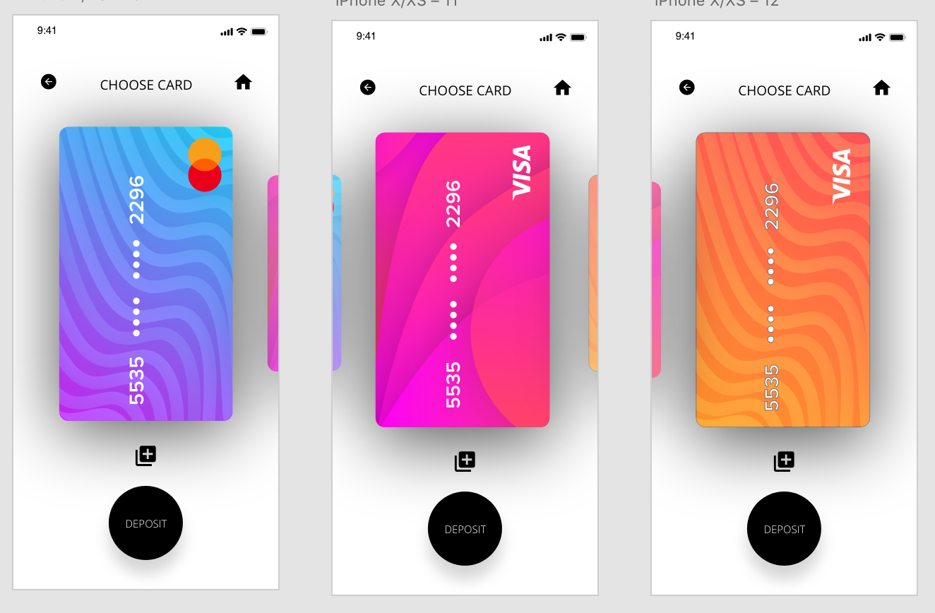
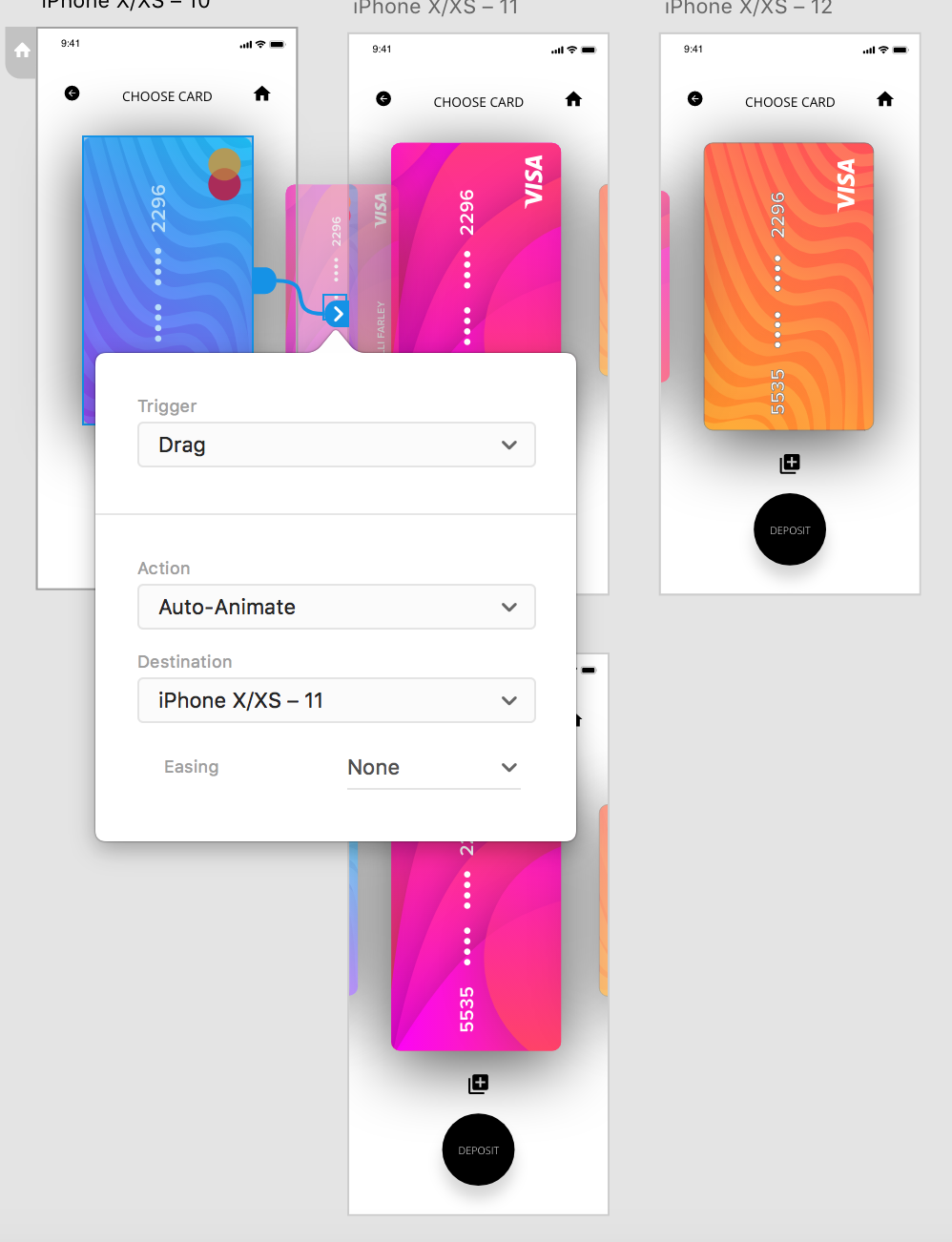
After I had chosen the design, I created 3 screens all with different cards that have been chosen, I added a drag trigger on auto animate again so the user could drag between the cards and each one would expand as it drags accross.
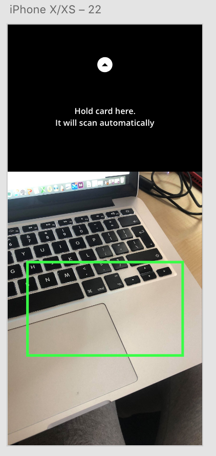
I then added a link from the the icon to add a new card, I opted to add a ‘scan card’ page as this is what most apps use nowadays to take card details.