
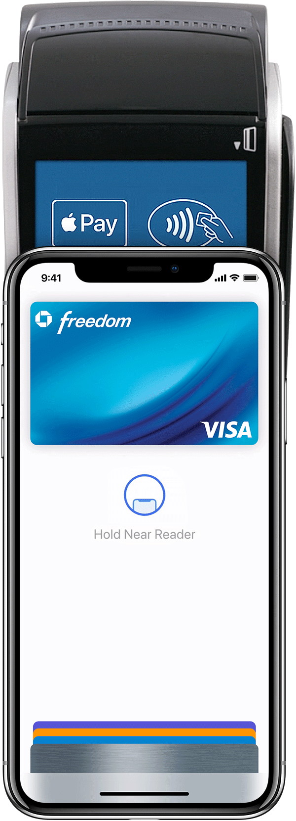
The idea behind the ‘Pay’ part of the app would be that it would use the same system as apple pay on the phone to pay. Because of this, I looked at what the apple pay interaction is like and found that it’s just a simple page which displays the card the user is paying, along with a few icons.
I wanted it to be clear to the user that it works the same way as apple pay does, as apple pay is a function most apple users are aware of. Because of this i kept the design very similar. I used a black background instead of a light one, not only as this slightly contrasts from apple pay, but also from the aesthetic of my app, so it makes it clear to the user that they are on the pay screen.
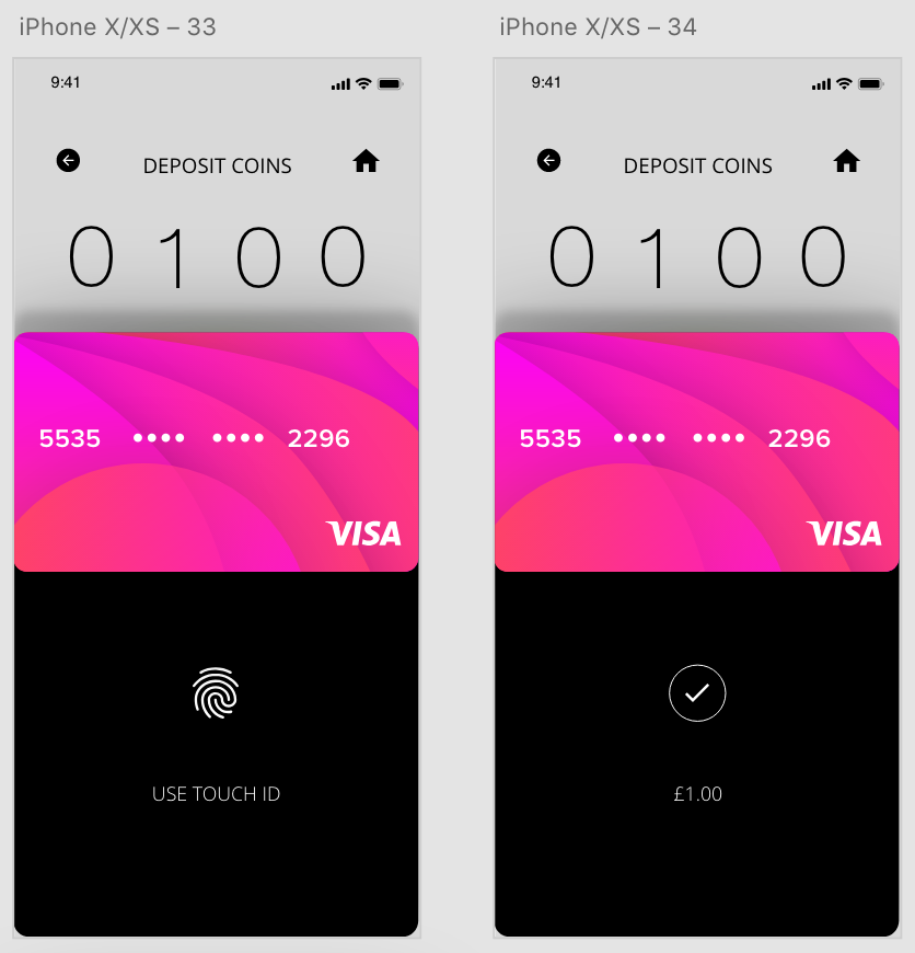

My 2 options when designing this aspect of the app we to create a pop up which moves up from the bottom of the screen to pay, and moves back down after payment, or to create a new page which pops up to pay. Overall I think the top design is much more effective and doesn’t overuse the space as the bottom design does. Using auto animate I could also create a seamless transition where the payment page slides up, the user pays and it can be slid back down again.
