At this stage I carried out some testing with a variety of people, ranging from peers to parents. I showed them the prototype for my app, to get some feedback on wether it’s intuitive and see what else they all though I should add. the feedback I received was mostly positive, with everyone saying the app was easy to use and very intuitive as a whole. A few people pointed out some very minor details to add as folows
Add a menu for navigation – This was something I was already planning to do before some user testing, but it was great to get some feedback regarding what sort of menu would be best.
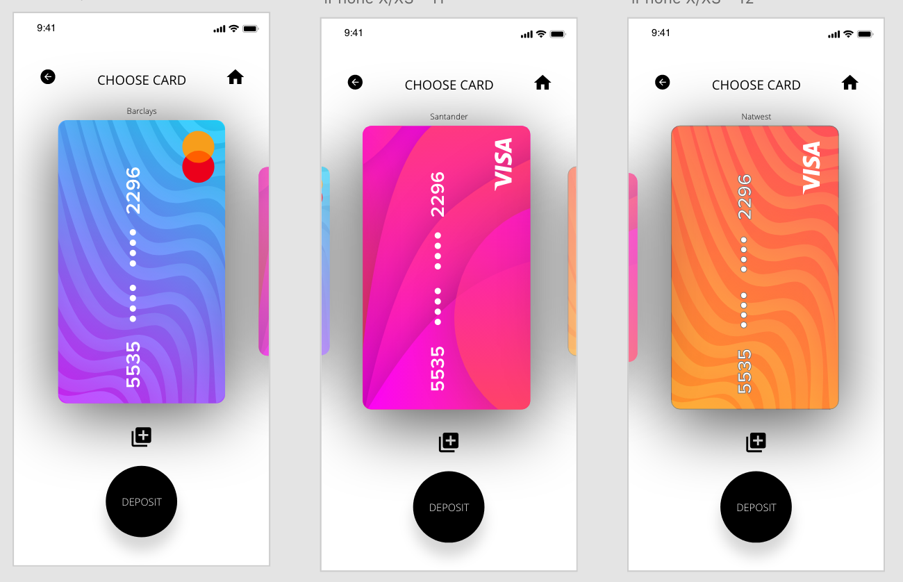
Add name/details of card on the choose card screen – I added the name of each card in small just above each card.
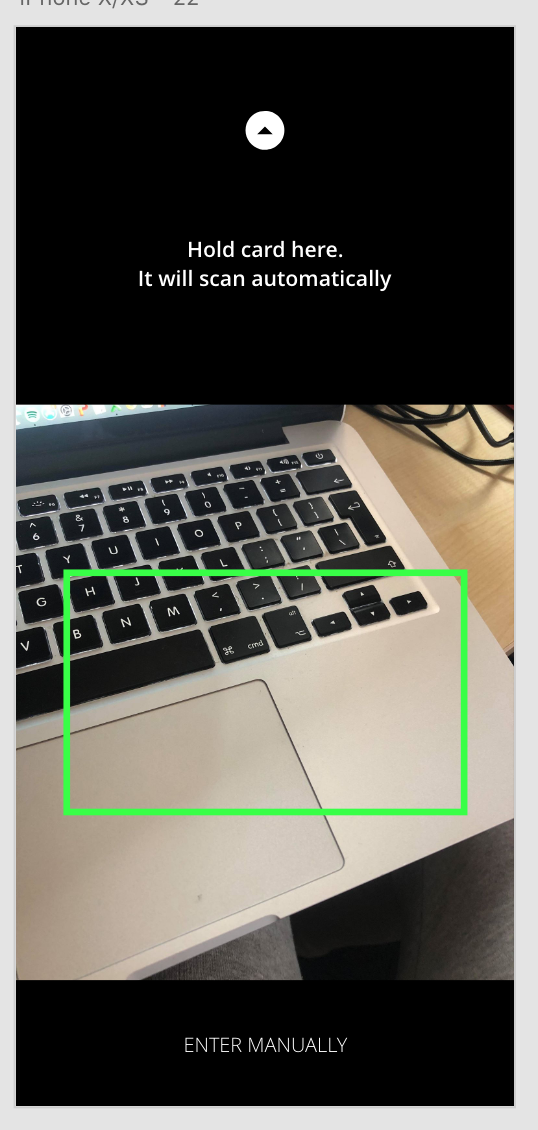
Add an enter manually option when scanning card – Another easy fix in which I just had to add a small bottom at the bottom of the page for the user to enter their card details manually.
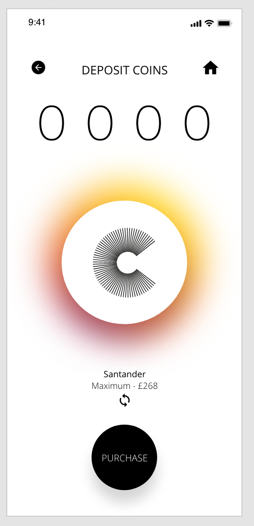
Add card name on the deposit screen so the user is sure of which card they are depositing money with – This was another easy fix, however I wanted to take this one further and add an icon underneath the text so the user could switch between cards on this page instead of having to navigate their way back to the ‘Choose Card’ screen