I carried out research into booklet design and what worked/didn’t work in terms of layout. I decided, as I did with my posters, that I wanted to keep the minimal and experimental design that I had in the posters throughout my booklet to fit in with the style of the rest of my branding.
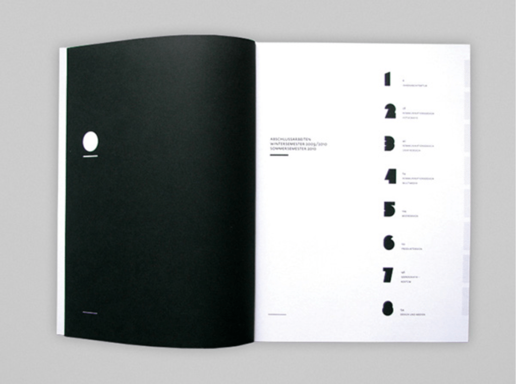
Many of the booklets utilised the grid system very well to portray a minimal style by adding captions and running heads etc alongside the main headers and main body of texts. I think many of the booklets and editorials use these small details, alongside things like page numbers and header/footers to frame the images within the page and add a sense of hierarchy. I noticed when looking specifically into exhibition booklets that many of them didn’t use a large amount of features that would be seen on some editorials such as running heads, pull quotes, sub-heads etc because very often exhibition booklets are much smaller and would become too cluttered. Although I wanted to stick to this to ensure my booklet didn’t become too cluttered, I wanted to make use of many of the facts I found out in my research about the sea within the booklet and therefor decided these could take the place of the full quotes and subheadings.
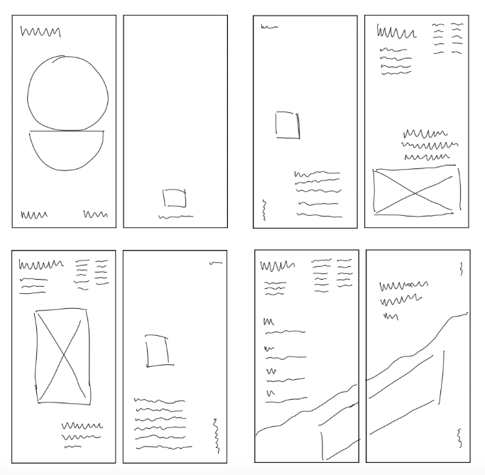
I wanted to play around with grid systems and the way text sits within it, utilising negative space to create a sense of depth and the ABYSS. Although I knew I wanted to use a minimal style, utilising the grid system, I knew this sort of design was one which was difficult to get right with lots of negative space involved, so sketching ideas was really important to get an idea of what it would look like on the page.
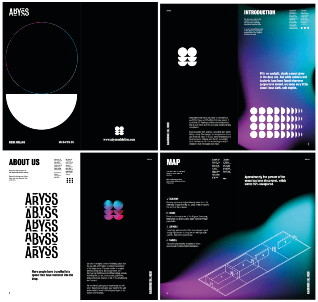
The majority of my designs were initially designed to be very minimal and as it said previously, to keep the negative space and go along with the them of t darkness and the abyss. I wanted to keep the black space and minimal theme whilst also fitting lots of information into the booklet so I decided a long but thin booklet would be a good way of doing this, as I could fit lots of text onto the page whilst still keeping negative space in the middle of the page. I wanted to use a 6 column grid as I knew if I wanted to add small bits of text including information and facts, I wouldn’t want these taking up lots of space and using 6 columns allowed me to use 2 columns for main body text and only one for less important information, keeping a good sense of scale and hierarchy. Again I wanted to keep the logo and my visuals present throughout whilst also adding colour through gradient shapes to keep with the luminous theme. The colour could be implemented throughout the booklet, however I wanted to keep a good sense of pace and not over-do the colour. I did however want the visuals and colours to be a large part on every page and be the first thing the viewer notices, as the visuals and the colour act as a visual metaphor for what the exhibition will be about.
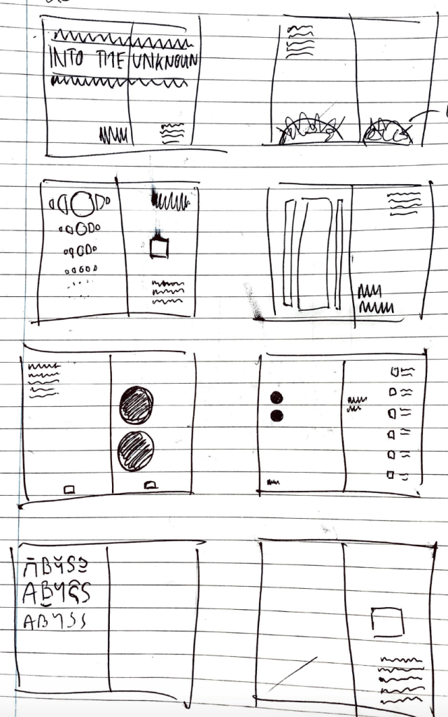
The main thing I took away from my initial sketches is that the tall and thin booklet style to keep a minimal design, as well as the large visuals on the page works well to ensure good pace between the booklet and the posters, so I experimented more and finally sketched out some final designs, taking many aspects from my initial sketches and also adding in some finer details.
Taking influence from my research I created a minimal style booklet design using the grid system to aid it. I wanted to keep the booklet dark with touches of colour to stick with the theme, implementing my visuals while still keeping a good pace throughout the booklet.
I didn’t want either page on each spread to be filled with text or images, and I thought utilising a similar grid system as many booklets and editorials within my research would work well to keep the negative space on the page. I still wanted the dark and minimal theme to create an almost uneasy and ‘unknown’ feeling about the design, similar to my poster and how I envision the rest of my portfolio looking. Overall I’m very happy with the way it came out and think it definitely has a good sense of pace throughout which was one of the things I was most worried about. I kept the minimal bits of text around the page just adding more facts from my research and about the exhibition. I also wanted to make sure although I was being experimental with the designs that they still had a hierarchy within the designs.