
I carried out some research into contemporary branding design to search for a suitable style and also to discover how other companies or exhibitions use visual language throughout their brands. I found the brands that were designed well tend to use very simple visual language with simple logos and a simple colour schemes.
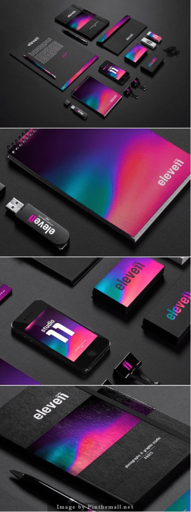
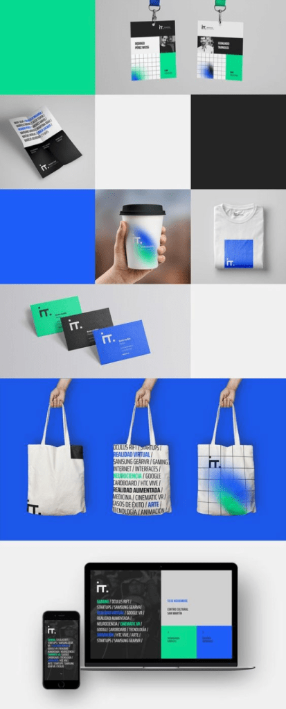
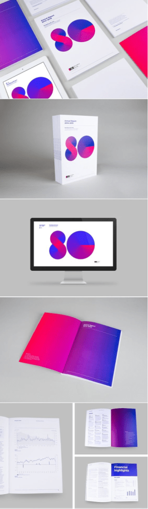
I noticed the most successful brands also have a very good sense of pace running through all of their branding without any of it getting repetitive and I think one of the most important ideas behind this is the way they use the style of all of their work, as well as the visuals within their work. The keep a very similar style, colour palette alongside similar visuals while avoiding repetition which is something I want to carry forward into the branding of my exhibition. Each exhibition has a very set colour palette which is recognisable to it however they don’t overdoing it by using every colour within each piece, and the designs which don’t use the colours so obviously tend to utilise the visuals more. During my research, I noticed the visuals ranged widely from typographic to more vivid imagery, but it was always recognisable due to the typefaces, colours etc that are used.
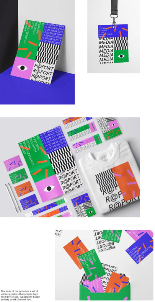
I also noticed many brands, for example Pepsi, have a set logo (red, white and blue logo) but also have the logotype, in this case the word ‘pepsi’ in the particular font. Both are equally as recognisable and don’t need to be placed together to be recognised, this is another idea I want to implement into my exhibition branding.
I wanted to mind map the main ideas for my exhibition branding before I started to design anything. Everything I want the brand to be is encapsulated in the mind map, from the logo ideas to the colour concepts.
