
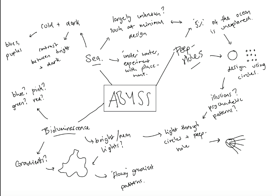
Firstly, I wanted to really emphasise the idea of the unknown in my branding, especially the concept of peep-holes as I think the fact that we only know about 5% of the ocean is one which could act as a strong factor into the design, and the idea of parts of the exhibition being viewed through peepholes within the design is one which could make it really interesting and really make the viewer think.I think the idea of the peepholes could lead onto some interesting designs implementing circles and possibly some patterns. I also think the idea of luminous designs could be used to effect really well to bring a bit of brightness to the designs, using colours and possibly gradients was one I wanted to experiment with. I think the idea of keeping the colours in blocks of colour, or a gradient would be an interesting one, as any gradients within a slightly abstract shape could give the illusion of movement. Although I really wanted to experiment with bright colours, I also wanted to keep the colours quote cold with blues and purples and contrast them against a plan white or black background to fit in with the fact with the sea being a very cold and dark place.
I decided early on that I wanted most of the designs to be minimal using just visuals on the page to bring it to life and I think the ideas of both luminous colours and patterns could fit with this idea well.
I used the guidelines I set out in the mind map to design a logo. I wanted it to look contemporary and professional whilst still being quite playful with the design and possibly colours to fit in with the idea behind the exhibition.
I used the idea of using circles for all my designs mainly to go with the theme of the peep-holes which will be used in my exhibition. The idea of the circles be implemented into a lot of the branding so I wanted it to be noticable within the logo whilst not being too stand out or in your face. I wanted the logo to be bold as well as being very simple as I think anything too much becomes less recognisable as well as too complicated to implement into some designs.
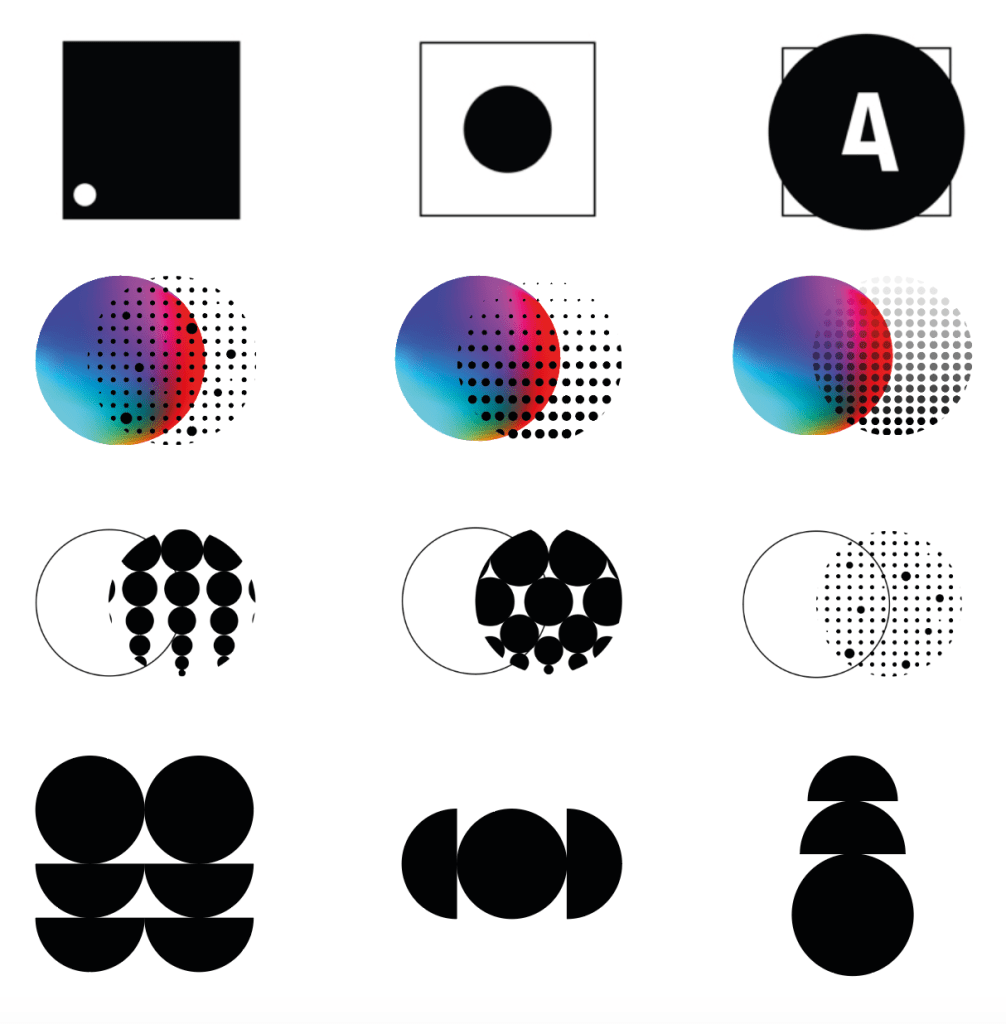
Although I was reasonably happy with a variety of my designs, I think in this case all the more simple designs are much more effective and more aesthetically pleasing. The top 3 ideas, although solid ideas didn’t seem coherent enough with the design for me, however the minimal black and white style of them inspired me for the next logos I created. Although the logos implementing a colour gradient within them are visually pleasing, I think for a logo there’s way too much going on, and I think seeing this within a design which is also using colour would become far too confusing. I also think using colour makes the logos less adaptable and therefor they can’t be used in as many different designs. I decided because of this to stick to purely black and white designs which could be changed in terms of colours. again I think although the next row is much more effective in black and white, I still the the style of them is too confusing for a logo design.
During my research I came across a sunset logo which implemented a circle which was split up to show the sun and sea and it made me think about how using this sort of idea could give a slight hint at the sea. Although very small, I used the semi circles within the logo design to give the idea of the sea, or being ‘under the sea’. The final 3 are all very similar, using the ideas of the circles to create a bold but simple design and I think overall the bottom left design using repetition creates a feeling of pattern much better and will fit in with the visuals much better if I stick to this idea or the patterns.

Overall I aimed for a minimal and simple logo design that would be very adaptable to use in different scenarios for posters, a website, booklet etc.
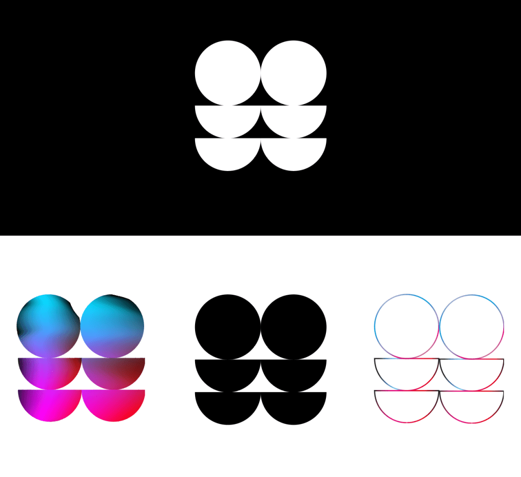
I wanted to see how it would look used in different colours including with the gradient colour theme, and I think overall due to it being very simple, it works very well.
