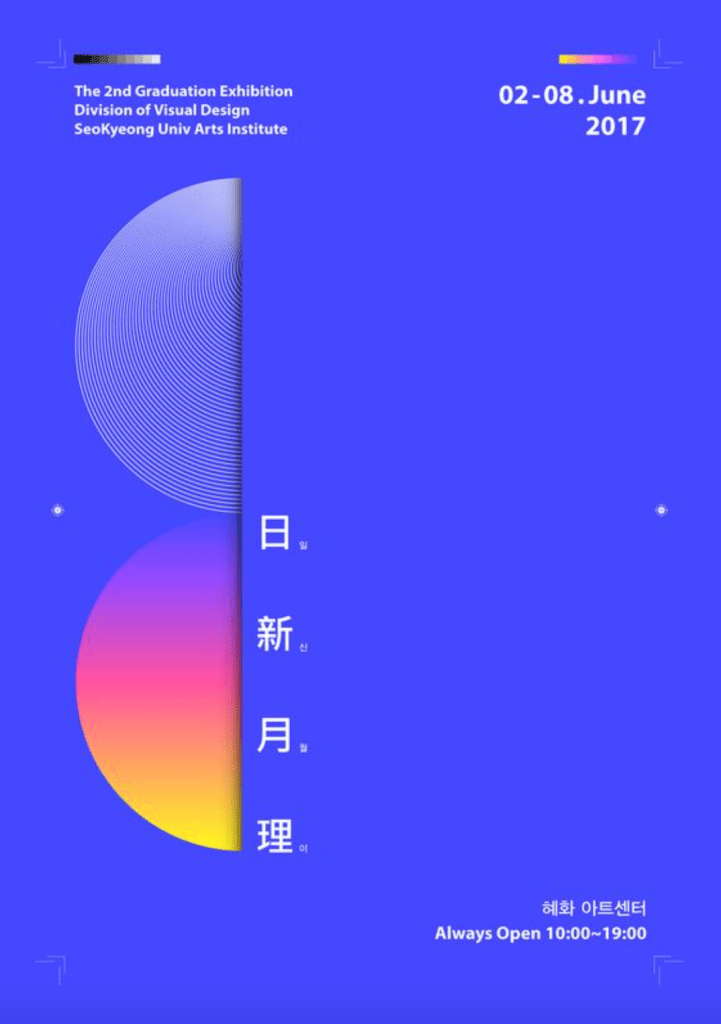
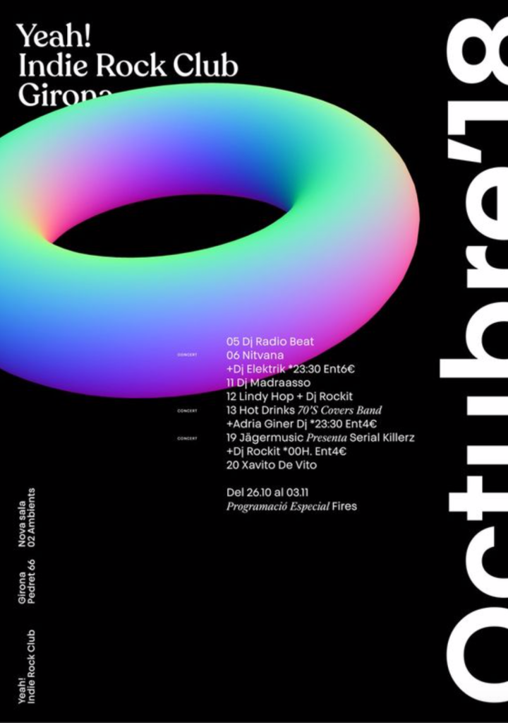
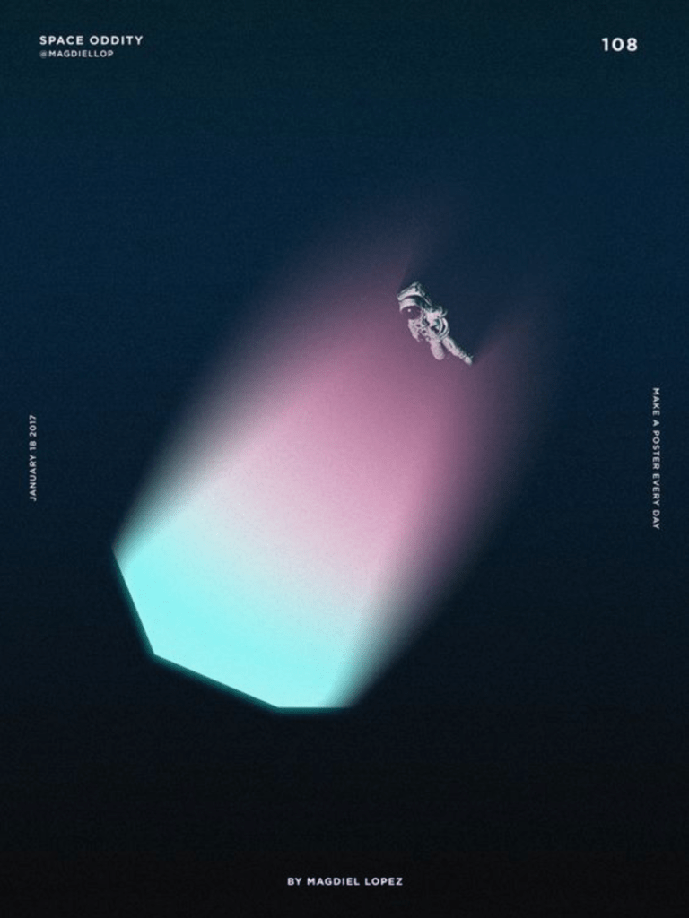
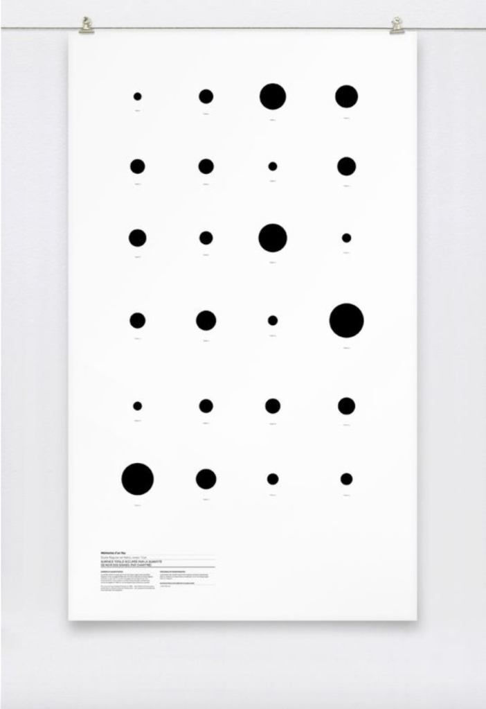
Before designing my posters I carried out some research into minimal poster designs. Overall I want the majority of my work to have a minimal feel to conform with the idea of how little we know about the ocean, as well as the rest of my designs so far. I wanted to keep with the idea and style of my logo, using the circle designs as well as trying to implement the colours into it. I wanted to keep with the ‘cold, dark’ theme by using a mainly black background and cold colours.
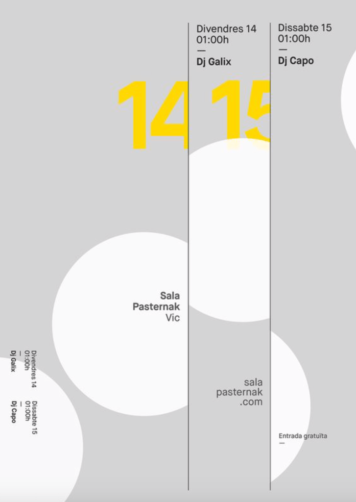
I didn’t want poster with a large typographic image on the page as I just didn’t think it would fit in with the brand design, so I wanted to look into the ways other minimal poster designs place their text. Overall I noticed the most successful minimal posters tend to use small type around the edges, top or bottom of the pages to frame the image in the middle of the screen, which are usually fairly small and leave some negative space on the page. The negative space works well in the posters to draw the eye towards the informative areas of the page and give them space to give them a sense of importance.
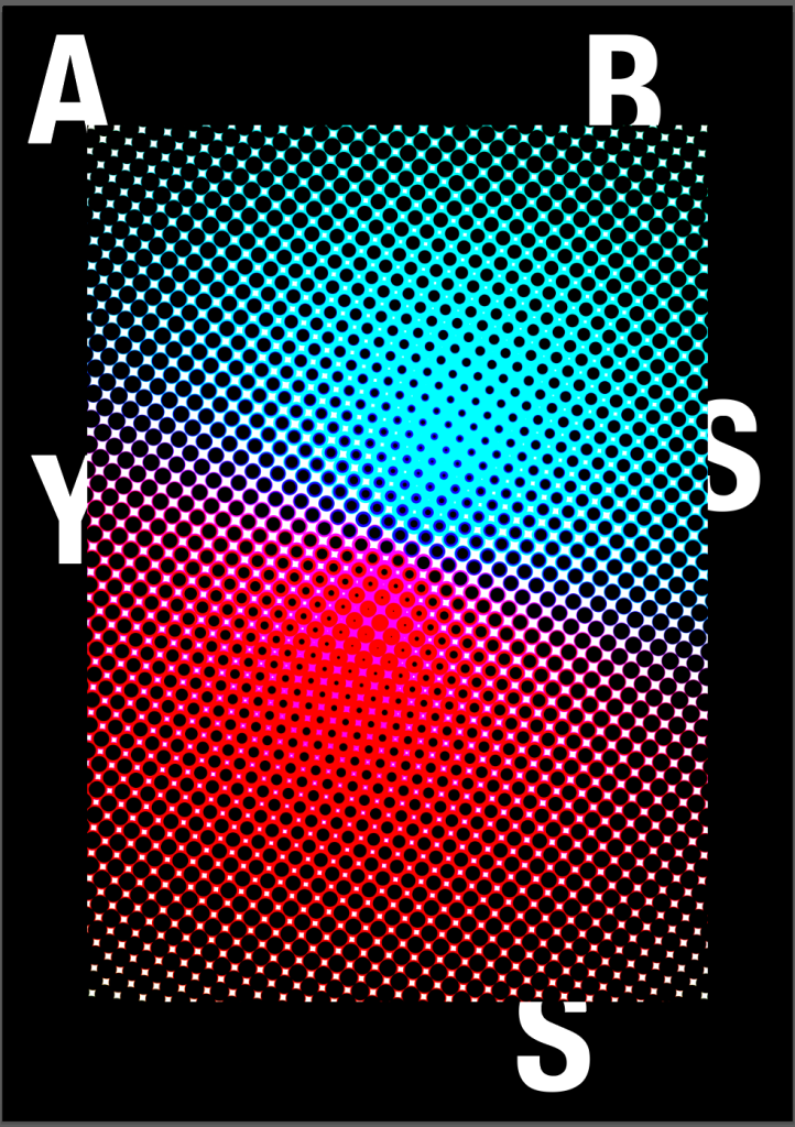
The way the posters use colour is also very interesting, using bright and bold colours on top of ‘plain’ backgrounds to really accentuate the visual on the page. The use of colours and visuals, in particular the gradient styles also give a strong sense of a 3-dimensional image, especially in contrast to a plain white or black background.


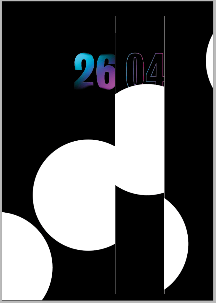
I sketched out a variety of possible designs, taking into account the idea of using colour and black and white visuals collectively within the posters.
I wanted to keep the minimal theme throughout the posters with minimal text and framing.
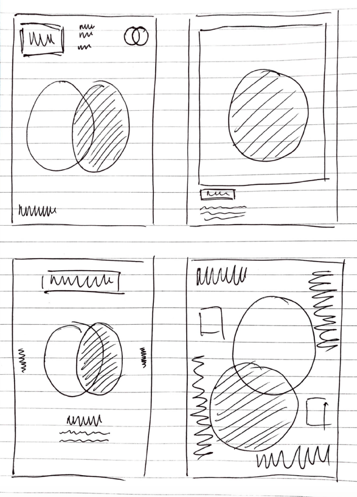
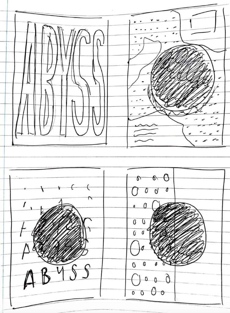
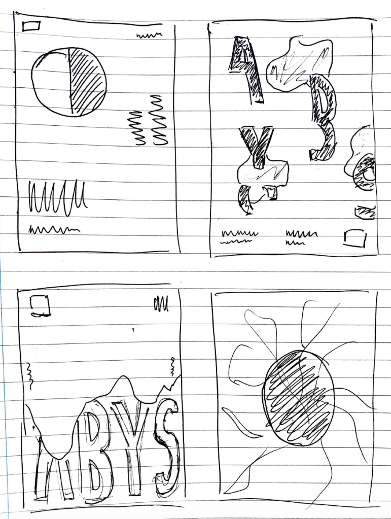
I designed a variety of my sketched out ideas to visualise them in poster form to get a stronger sense of how minimal and contemporary each design is to focus further on which designs are the strongest. I wanted to experiment with the idea of large visuals which fill up the page but kept being drawn back to the minimal style. The most eye catching sketches were the ones which used a variety of visuals and small amounts of text or information around the edges, to frame the image and keep the minimal space around the edges.
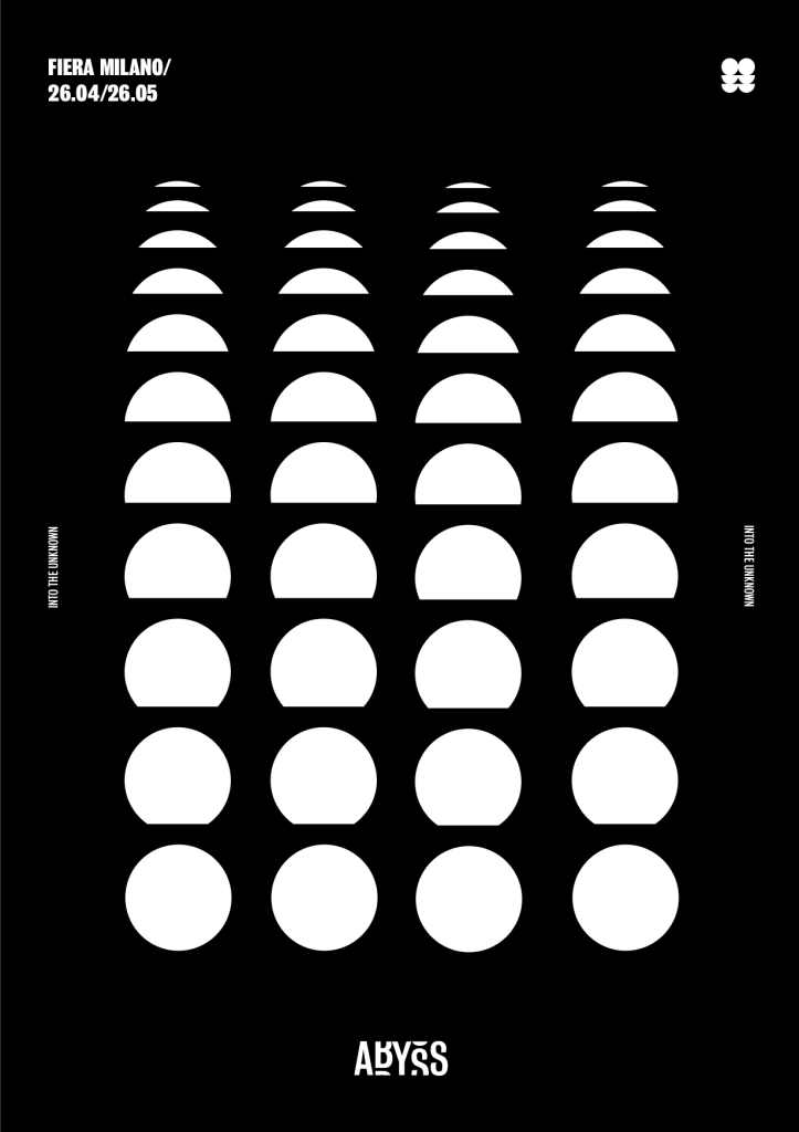
I wanted to keep them all with black backgrounds, using mainly white or gradient colours within the poster. Overall the most effective used a minimal style design and used the style of the logo, as well as the bold typeface to inform the design.
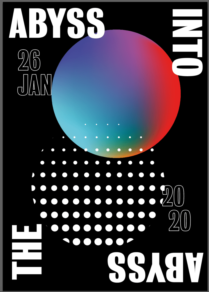

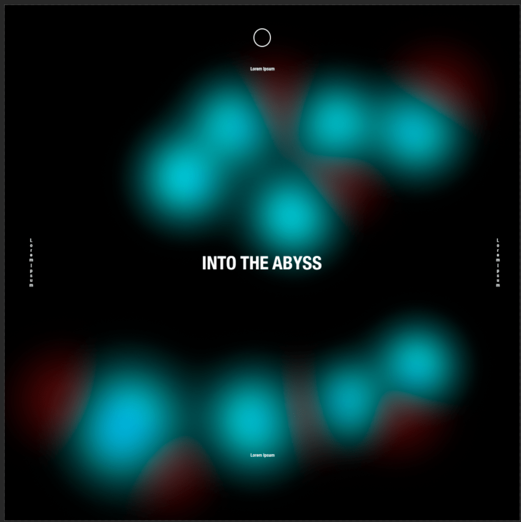
After trial and error with a variety of different designs and taking parts of each different design and moving them around I came up with my final two designs. I think overall they both work very well within the brand and are similar without being too repetitive. I didn’t want to overcomplicate the design with too many colours or too many visuals going on, and I thought the best idea was to I keep with the minimal design I was interested in from the research as I think it frames the images in the page and as I mentioned it leaves a good amount of minimal space which fits in nicely with the them of the abyss and the unknown.
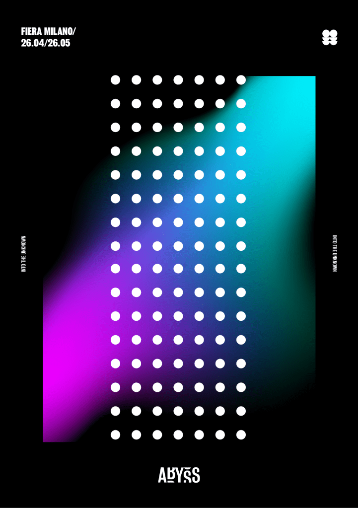
I took the design of my first chosen poster and used it to design a second design. I wanted to add a bit of colour to the second idea to fit in with the gradient colour scheme within the brand, however I decided the poster with the gradient on its own wasn’t enough so I added the pattern over the top to add a bit more to the design. Although I didn’t want both designs to be identical, I think the placement of the information around the outside needed to stay in the same place to keep with the uniformity of the two posters.