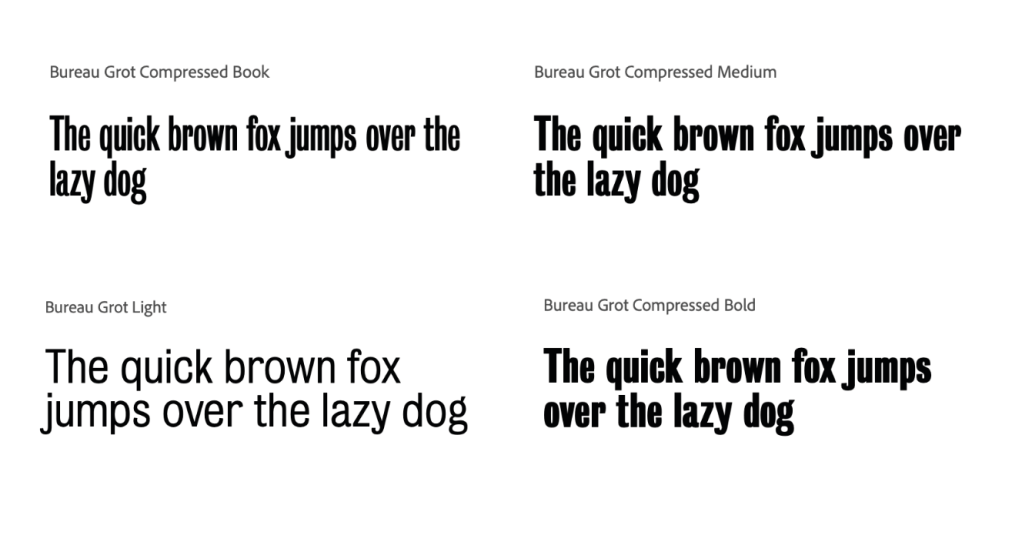
I wanted to choose a typeface which was bold on the page and would fit with the theme of ‘ABYSS’ and darkness or the unknown. I looked into many but liked the style of the condensed and compressed forms of ‘Bureau Grot’, they fit in well with the logo and overall style of the work I was looking for.

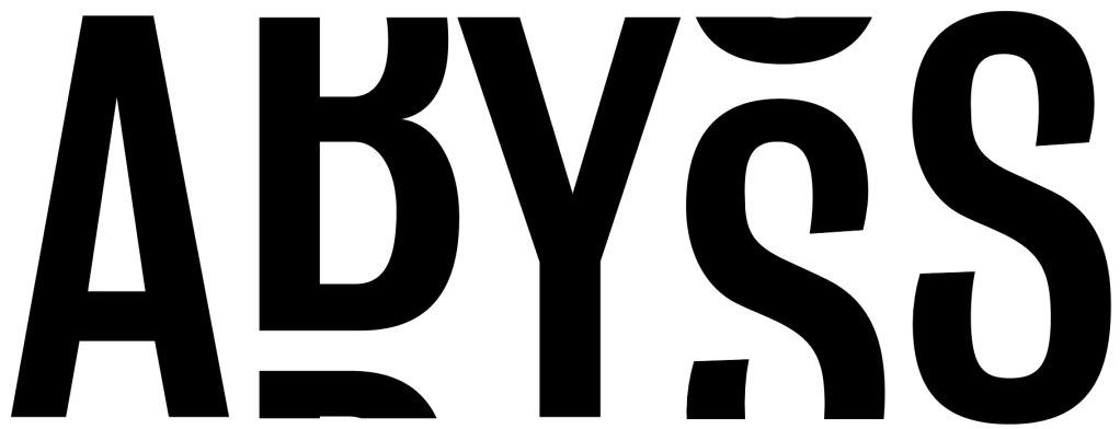
As I stated in my branding research, many brands use the idea of having a logo as well as a logotype which can be used in unison or separately, and I wanted to have the same to have almost two ways of identification. Although both could be present within designs, the idea is that if only one is added to the design, it will be recognisable enough without the logo. Because of this, I attempted to edit the typeface to almost give the illusion of it falling off the page into the ‘unknown’ and to add the impression that something is missing from it, just like the knowledge missing from what we know about the sea.
Overall I think the version leaving out the top or bottom of the text was too confusing and in some cases became much harder to read.
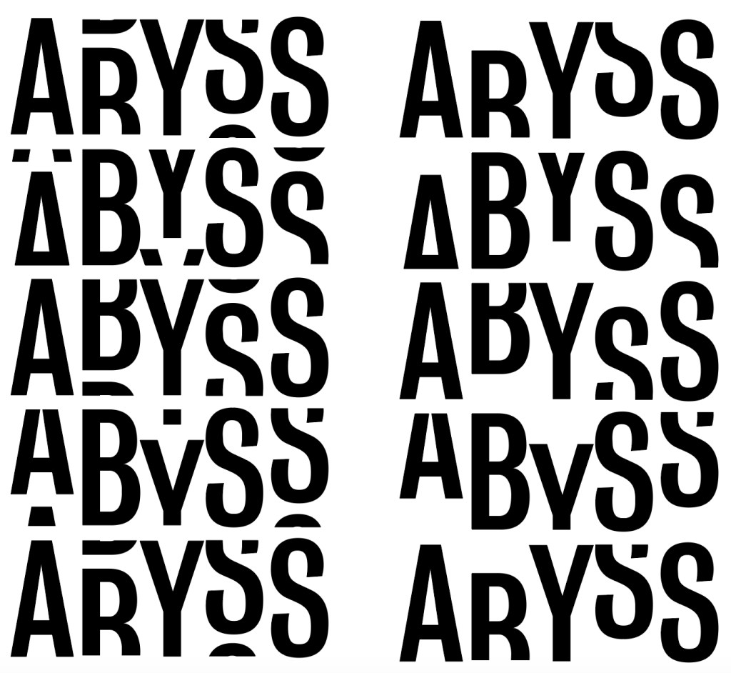
In the end I decided to go with this chosen variation of the above adaptations. Although many of the broken up versions worked well, I think the one below looks great with the curves of the B and the S and look smooth and easy on the eye, whilst also conforming with the rest of my branding designs.