I carried out research into website design before designing a web-page for my exhibition. I wanted to keep the coherent minimal design in the website. I looked into overlapping designs with text overlapping images in order for me to be experimental with my visuals and bold typeface. One of the main things I noticed about the websites in my research was that the menus are all located around the edges of the page anyway, which fits in to the rest of my branding so far so this was definitely a feature I wanted to keep the same. The more effective websites, especially the more experimental designs use large, bold text on the page for the more important text, similar to how an editorial would use hierarchy.
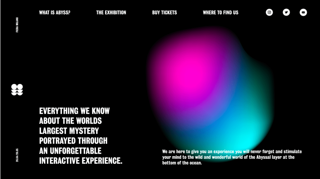
I also want to make sure I keep the minimal them with text placement along the side of the web-page, keeping lots of negative space in the centre of the page.
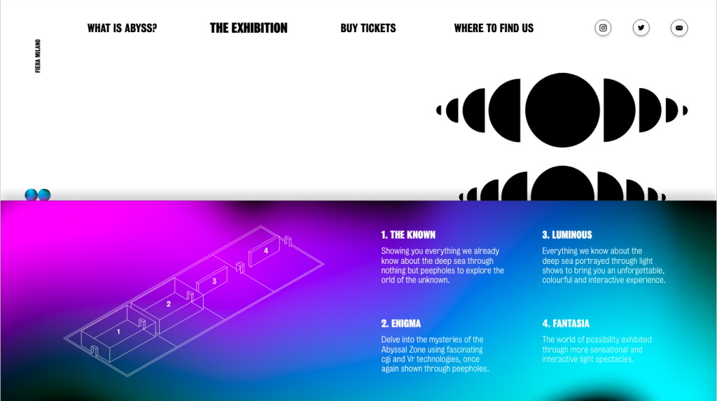
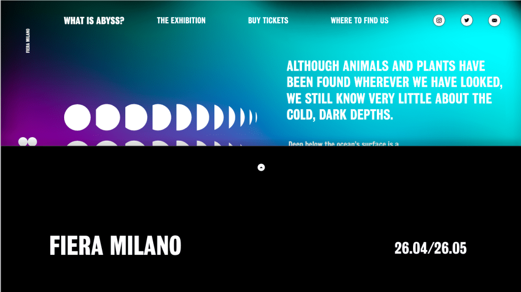
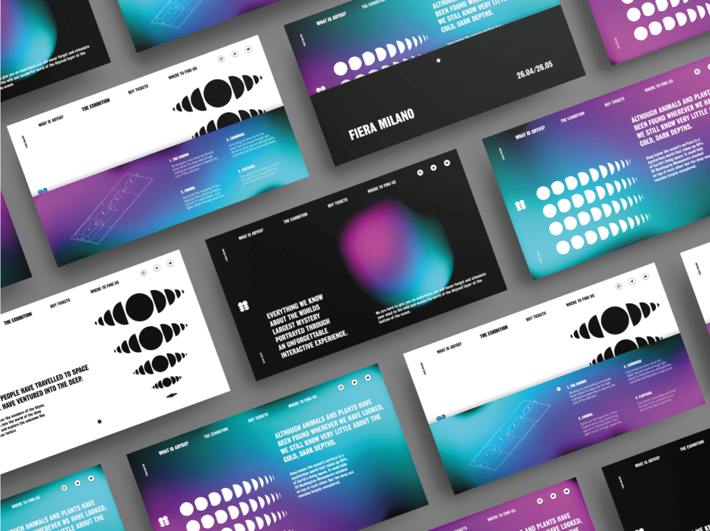
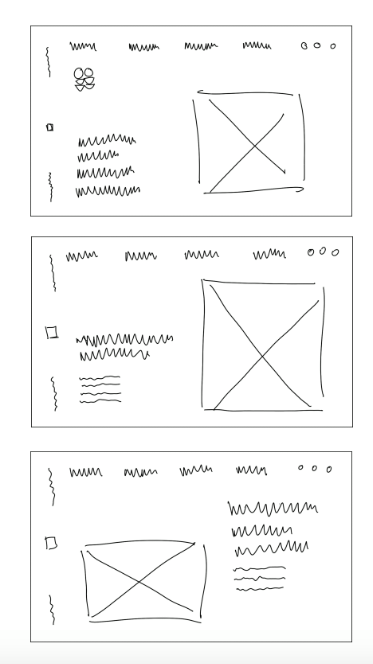
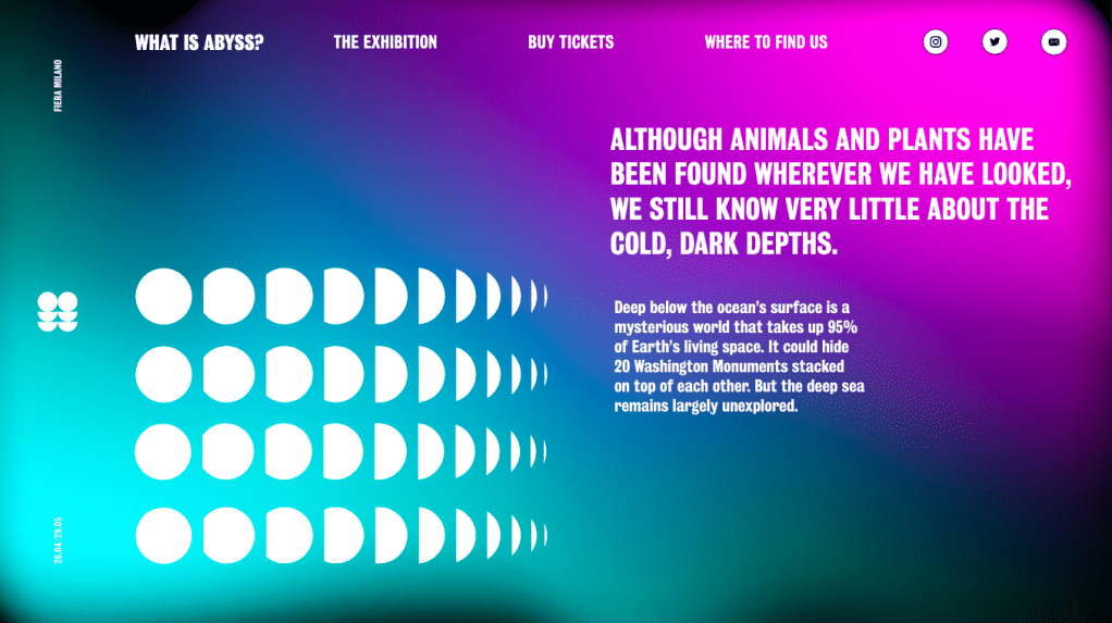
I sketched out a variety of website designs, taking inspiration from my research to create a minimal design utilising negative space to continue with the theme of the ABYSS and the unknown. I wanted to use the idea of hierarchy which I noticed within the website designs and used within my booklet deigns, I wanted my visuals and important information to be the largest things on each of the page, followed by the menu which will fit around the edges of the page. I didn’t want to overcomplicate the website design by adding lots of different pages of information into the mix so decided to design 3 separate pages which would show how the website would work to display information. I wanted to ensure the social media links were on the page, as well as the logo design. Although the visuals are the largest thing on the page, I think the most recognisable aspect of the website, as it was with the poster and booklet, will be the colour scheme as this is something which will jump off the page at the viewer as soon as they see it. Similar to the booklet, I wanted to keep a good level of pace and not be too repetitive with the colours and although I wanted the blue and pink gradient design to be a feature within each page, I didn’t want to overdo it and make it too standout.
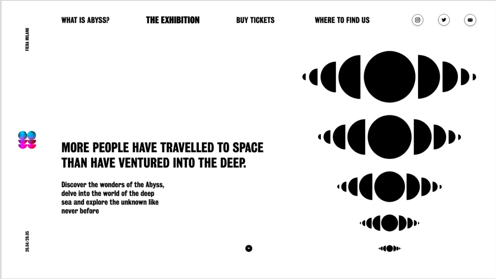
Although at this point I was very happy with the overall design of the website I thought there was still some information missing, such as where the exhibition was being held, the map etc so I wanted a way of this information to be accessible on the page without the viewer having to be directed to a different page entirely. Because of this, I added 2 pop ups onto the two pages, the map as well as date and placement of the exhibition would pop up from the bottom of the page with a small amount of information.