For the penguin cover competition, I decided to design the cover for ‘A Short History of Nearly Everything’ by Bill Bryson. I think the book was the one that really jumped out to me, more so than the other 2. It jumped out to me due to the nature of it, it was about science which is something I’m interested in anyway, but more so that it’s written using a tone of voice which is rarely used in science books. He writes very informatively but also in a very friendly way which jumps out to everyone and makes it much more friendly to readers who’s science knowledge isn’t 100%. Bryson looks to explain many of the questions we have around the concept of the world we live in, and makes many references to space and the galaxy and how we came to be in it.


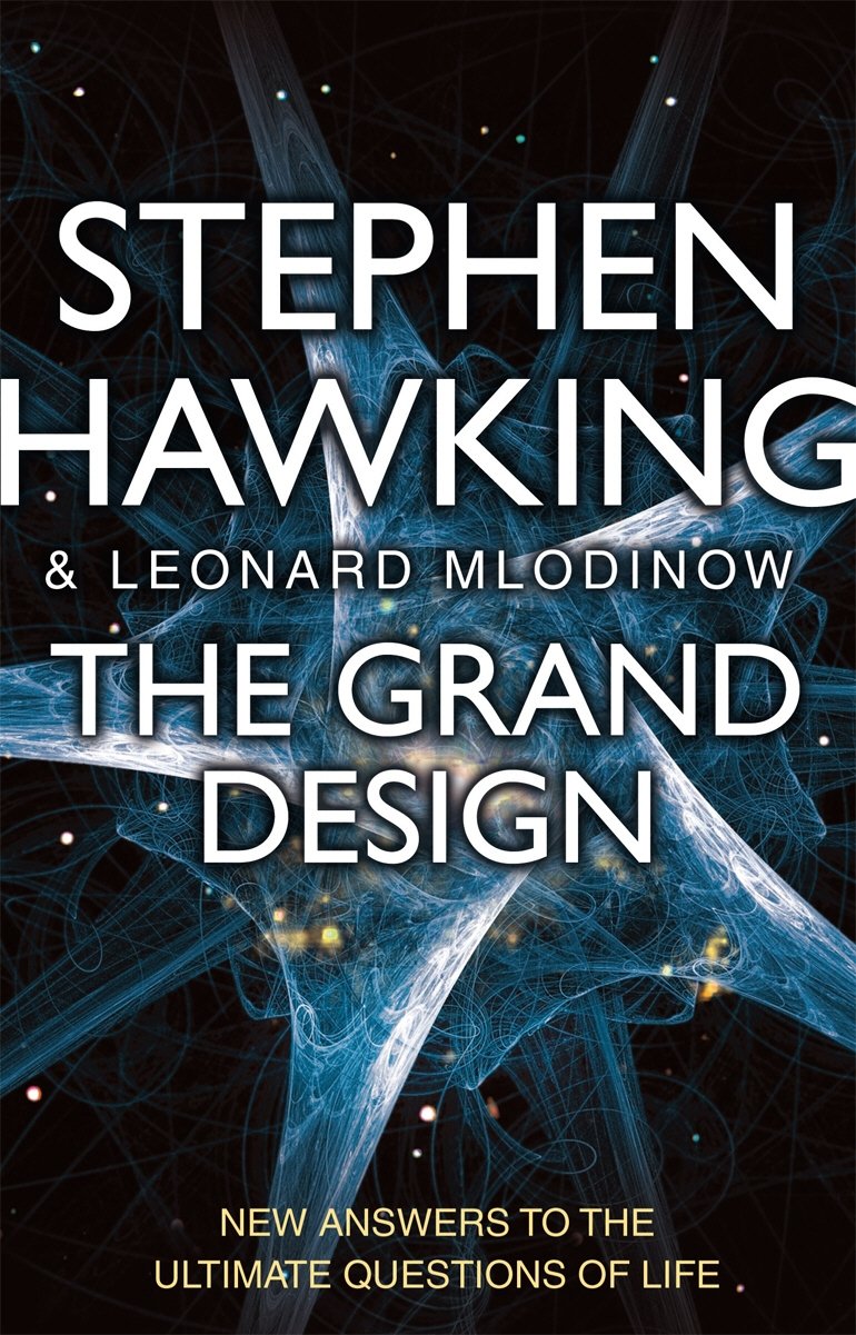
I took a look at some of the previous covers to take a look at what was done previously. One of the first things I noticed was the fact that Bill Bryson is the same size or even bigger than the name of the book itself, a common them in his books, which shows how much the name sells in itself.
From looking at these 2 alone, its very clear that the earth as well as space is a common them which the book wants to show off. The idea of space and the earth are both clearly very popular in terms of the book design and they both definitely sum the book up well, but I think going down exactly the same road is not the route im looking to take, the book to me is a modern and contemporary twist on a science book, so I think it definitely needs a more contemporary design approach.


I then took a look at a variety of other science books to take a look at how they attack the issue of science books and space. Upon reflection of many of the covers, its clear that there’s a cliche, especially when it comes to space, of using ‘science-looking’ images along with a dark background, or a photo/illustration of the earth and stars. Although these designs clearly work, as I stated before I wanted to ensure my book cover took a more modern approach to the design.
/https://public-media.si-cdn.com/filer/04/44/044437b9-053a-41fa-84d1-8196909f4193/best-art-meets-science-books-2016.jpg)
I then took a look at some science books which don’t look into space and the earth to take a look at the styles they work with. They tend to use sans serif fonts, possibly due to them trying to look more modern, and in many cases have moved away from using photographs as the covers and look to use some more artistic imagery instead.
