
After carrying out research into the book itself and previous iterations, I know how I did and didn’t want my cover to look. Firstly, it was important to me that the book took on a new, modern feel and was different from a lot of other science based books out there. I wanted to use some of the same imagery, such as space and the earth which had clearly been successful in the past, whilst trying to put a unique spin on it, something which would keep the idea and style but make it much less cliche.
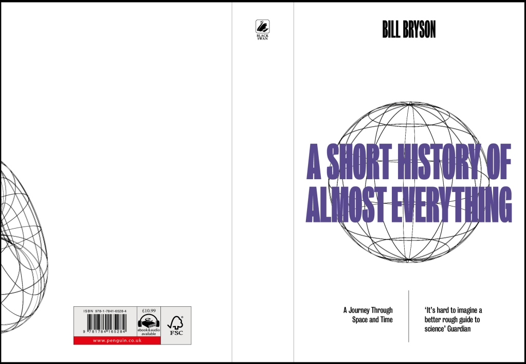
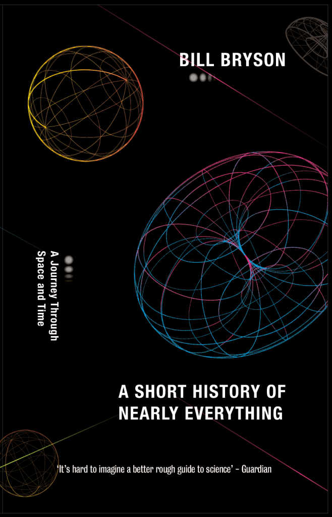
I started off very outlandish, I took inspiration from the quirkiness of the way the book is written and tried to mimic that in the design, using slightly bolder colours and shapes to make it much more standout, and give it that uniqueness which the book has.

I didn’t feel that either of the designs worked how I wanted them too, although they are both very different, neither of them showed enough of a ‘science’ vibe which was important. There was however a few notable points I took from it, for example the use of colour was definitely something which I needed to look into, as well as the shapes used in the second design, the grid-like images give me a sense of science/physicsand planets in a more contemporary way than photographs.
Taking that feedback I designed a few more ideas taking some of the touchpoint from the initial ideas.
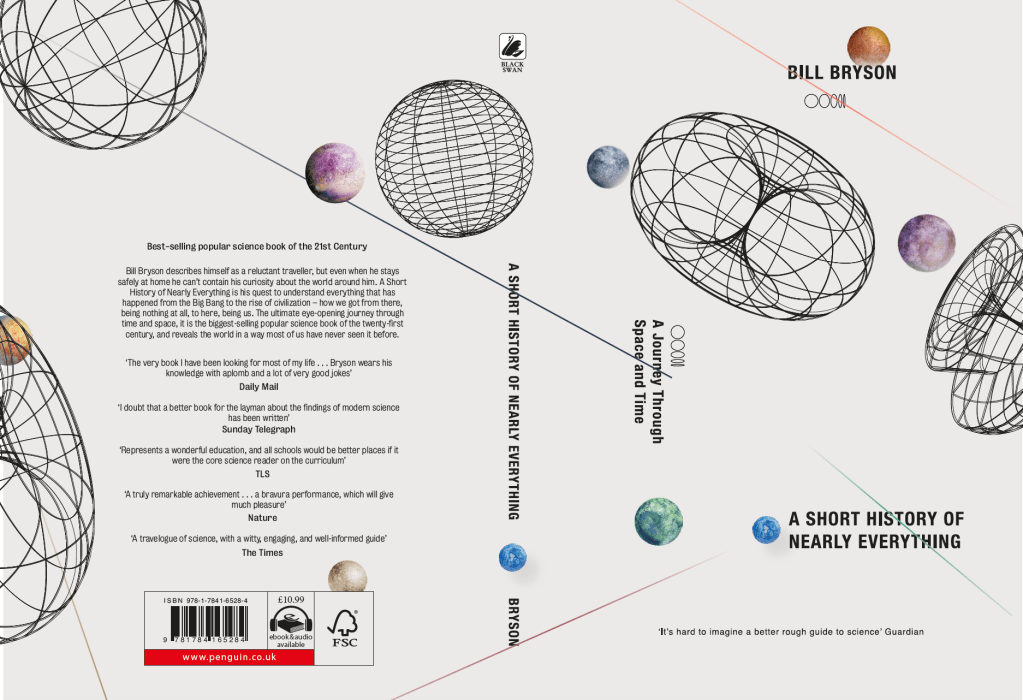

Overall I think the designs were really starting to be much better, they started to give a much stronger sense of science and space, but using a much more minimal and modern angle. After showing lecturers and peers the designs, I looked at fine tuning them which lots of advice. The white doesn’t work as although its cliche, black for space just makes sense. The although the grid shapes being in colour is very bold and striking, I think it takes too much away from the overall design of the cover, the titles and authors name etc. Finally, although I like the idea of the planets on the cover, I think using the actual plants its a touch cliche, maybe using a colours spheres of just circles might work better.
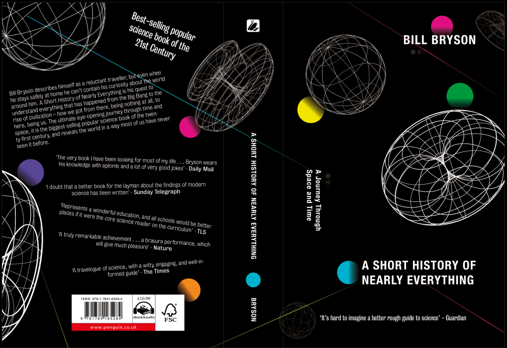
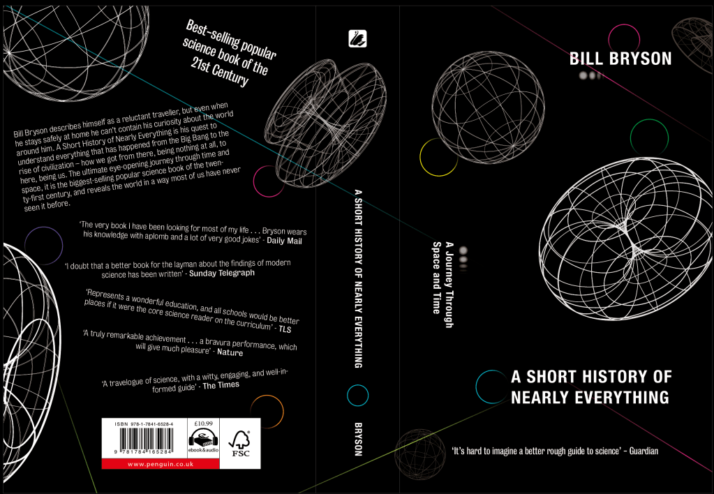
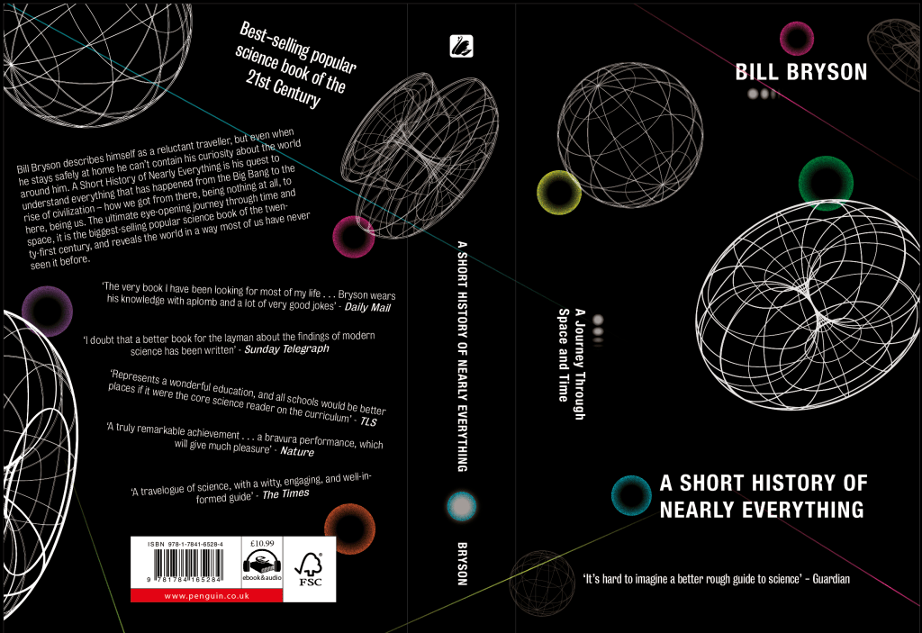
I experimented slightly with the blurb to make it more playful and to fit with the friendly and approachable vibe of the book. I think it works well to make the back of the cover look much less mundane. I then looked at changing the planets to make them less cliche whilst still keeping them bold and hoping to keep the idea of them being planets. I think all of the iterations worked fairly well, however the full circles I think are too bold and stand out off the page too much. The ring designs are far better, they give off a planet vibe whilst also keeping a very contemporary approach which is what I was looking for.
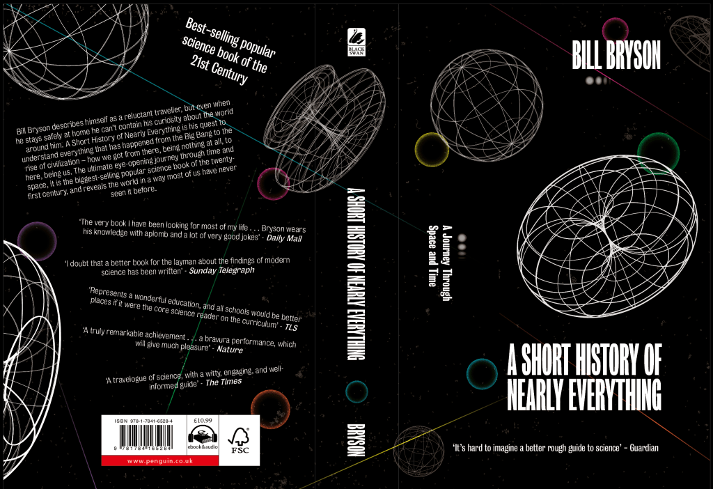
Finally the cover just needed some fine tuning, with the help of more feedback from other pupils as well as lecturers. One of the main concerns I had was how different it was from lots of the other designs of the cover, however different was definitely what I wanted, and I think it definitely comes across to me as a modern take on a science book, giving off space themes with planets without any direct space and planet imagery. I think the typesetting both on the front and back both show off the playfulness of the way the book is written which I really like, however I changed the font to a more condensed font to make it slightly bolder and more stand out. The last element I added was a slight speckled background. I didn’t want the background to resemble a starlit sky too closely, however I think a slightly lighter speckle definitely gives hints of stars in the sky without being too obvious.
