
Ideation
After carrying out research into all aspects of mental health campaigns, previous examples which I felt worked as well as some which may not have worked so well, I did some idea generation to highlight the main points I wanted to experiment with within the designs and how I felt was the best way to illustrate the point within the campaign.
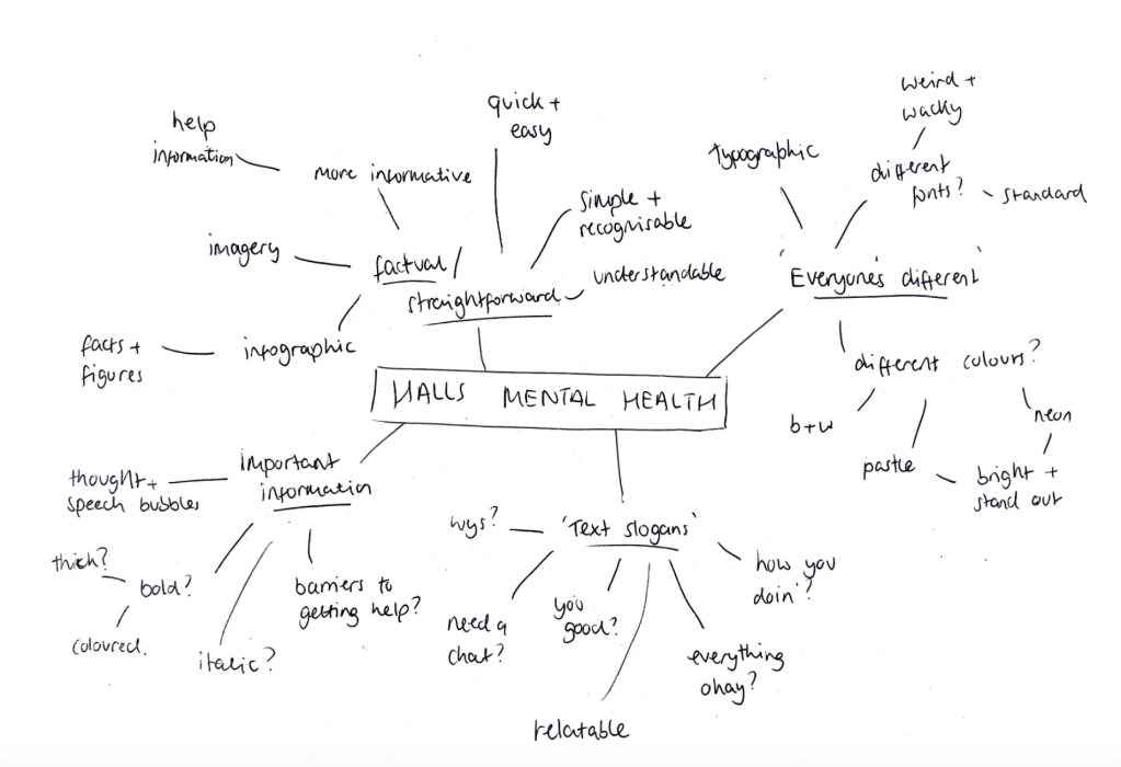
Firstly, my research as well as the client brief outlined the idea of breaking the stigma around mental health, that many students don’t reach out for help because of a variety of different reasons, for example they feel out of place and like they’re different to everyone else, so I wanted to play with this idea using a variety of ‘wacky’ fonts and stand out colours to show the audience that it’s okay to be different.
I wanted the campaign to be very straightforward in its message, to go and speak to the halls team if there is any problems by staying away from infographics and factual designs.
I also wanted to use the sort of sayings you’d ask a friend, such as ‘everything okay?’ to make it feel more personal to the students.
Firstly, my research as well as the client brief outlined the idea of breaking the stigma around mental health, that many students don’t reach out for help because of a variety of different reasons, for example they feel out of place and like they’re different to everyone else, so I wanted to play with this idea using a variety of ‘wacky’ fonts and stand out colours to show the audience that it’s okay to be different.
I wanted the campaign to be very straightforward in its message, to go and speak to the halls team if there is any problems by staying away from infographics and factual designs, from my research I outlined some now campaigns which took a very bold approach, such as the lad bibles campaign, which used bold colours and typography design to create powerful designs. Although many mental health campaign use very minimal approaches with very soft and muted designs, I wanted this particular response to be more bold and standout, something which will really stand out and be different. I also think its important for students to remember the campaign, they may see it when they first move in and not need any help until years afterwards, so it’s important that the campaign is memorable.
I also wanted to use the sort of sayings you’d ask a friend, such as ‘everything okay?’ to make it feel more personal to the students. Although the designs may be bold and stand out, the message still needs to feel personal to the viewer. Once they are drawn into the posters or other ephemera, the message needs to be strong in questioning them on how they are feeling, followed by a clear message of ‘speak to the halls team’.
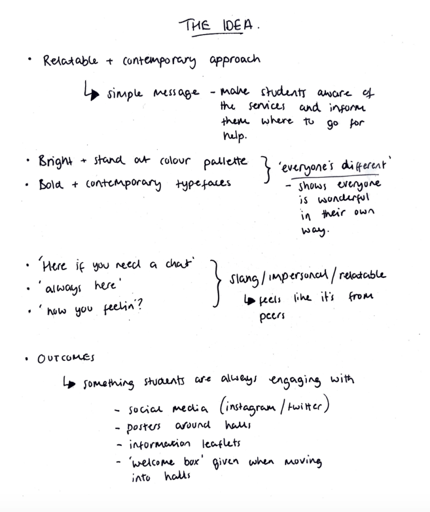
Although I wanted to use the metaphor of the fonts and the ‘everyones different, I wanted the message to be very clear, I didn’t want to play around with too many different meanings and metaphors which may take away from that message. I wanted to create a simple and relatable approach, which would purely informing students where to go to receive help if needed.
The impersonal sayings were also important, the halls team stated in the brief that they wanted it to seem like it was coming from peers and friends rather than the halls, this really influenced the sayings as well as the overall contemporary aesthetic.
Font Choices
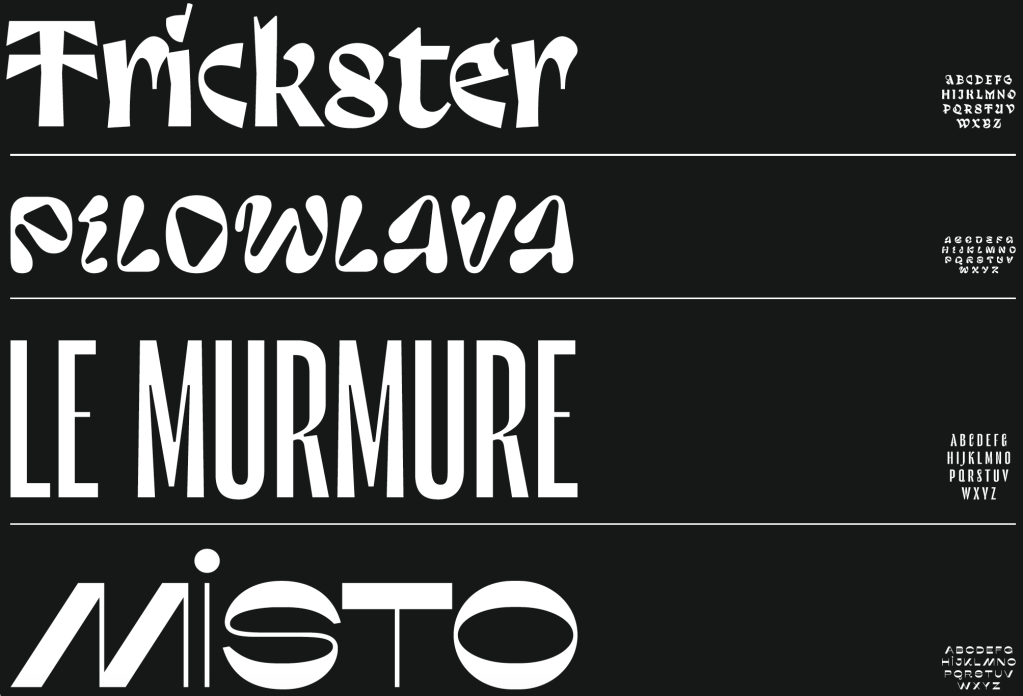
Firstly, I wanted to find a selection of slightly weird and whack fonts, one of the parts of the campaign which was important was the idea of using different fonts to illustrate the idea that there’s nothing wrong with being different. I chose 4 fonts which are all still very easy to decipher, but are also a bit different and stand out against other fonts, something which stands out against the crowd and will draw the eye.
Poster Ideation
I then looked at sketching some possible poster designs, trying to gain an idea of what the visual identity would be so the rest of the campaign and ephemera can follow the same style.
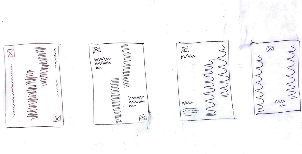
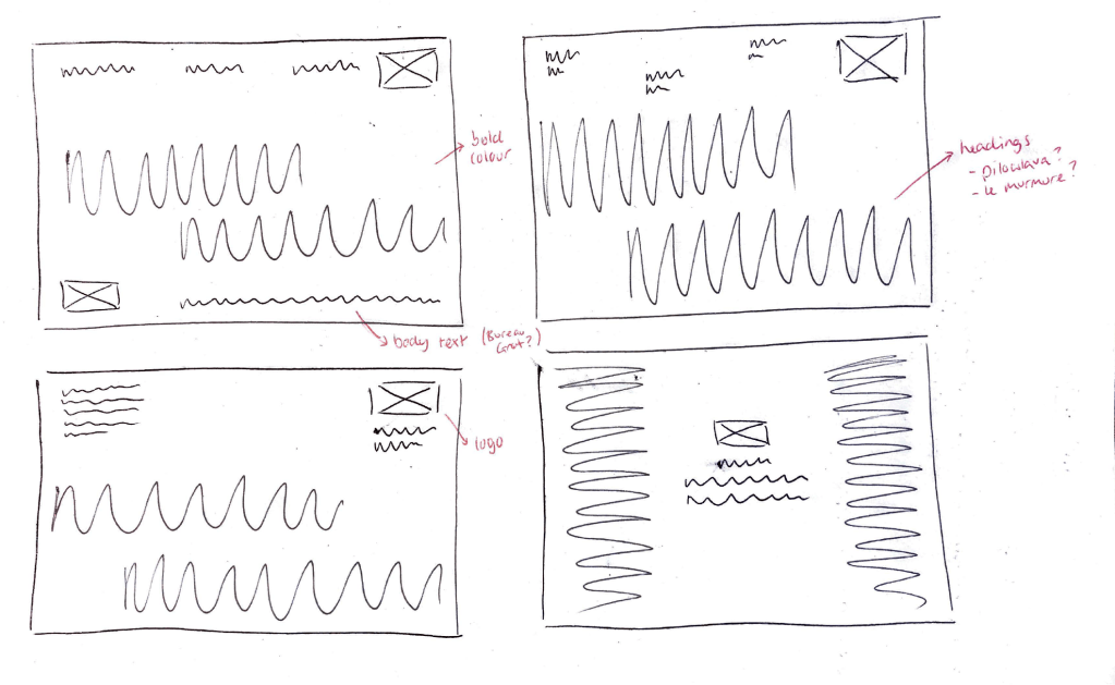
I wanted the typography using the fonts outlined to be the main focus of the page, followed by the message about where to go and who to speak too. Phrases like “you okay?” and “here if you need a chat” will occupy most of the posters, as I feel these will be the most eye catching feature which will draw the viewer in will let them know what the campaign is all about, before pointing them in the right direction.
These were the first designs for the posters and overall visual identity. Overall I think the design works and they are all particularly eye catching for the most part, the type work and colour is definitely something which would stand out, however I think they all need something more to move them on from this point. I think overall the bold type needs to be the focal point and any other bold shapes on the page take some of the focus away from it.
Development
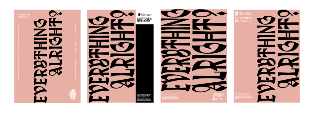
As stated previously, although i liked the overall outcomes and the way they used the typography to be bold and standout , I felt they all needed something else. I also wanted to ensure I added respeonses to the possible barriers I discussed during research, they were a vital part in the idea both for me and the client, so talking about the fact that any help will be confidential, and letting students know they aren’t the only ones is important. I decided adding a modern twist on thought and speech marks might give the chance to add some extra comments about confidentiality and the slogan ‘Everyone’s Different’.
I also felt the typesetting needed a bit of work to ensure the information is more bold and standout, it’s currently a bit too tame and unnoticeable. I think it would be improved by making the text slightly large, possibly adding bold sections to the most important parts.
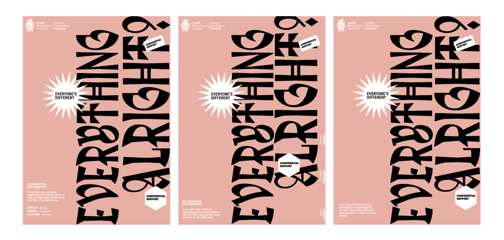
Putting together all these features, I created my a few final poster designs, using a compilation of many design features, using the bold typography, adding useful information in a body of text which does not take away from the rest of the poster, while still staying relevant and noticeable. I think the shaped which overlay the main slogans work well the break up the poster and add some useful points, as well as adding a hint of colour in the black version of the design.
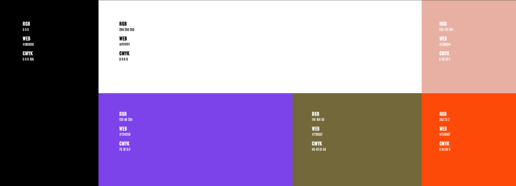
I then needed to create more poster designs using the same principles. Throughout the research, a standout feature of many campaigns was the ‘friendly’, pastel colours used. I wanted to keep the idea of having colours within the campaign to keep it bold and standout, however I didn’t think using pastel colours would work for the designs, so I chose colours which aren’t too overwhelming, but are still bright enough to make it’s presence felt.
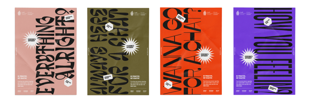
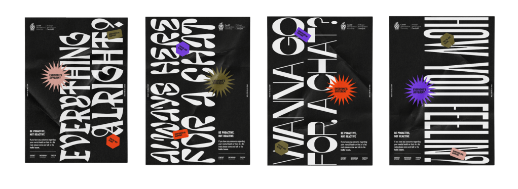
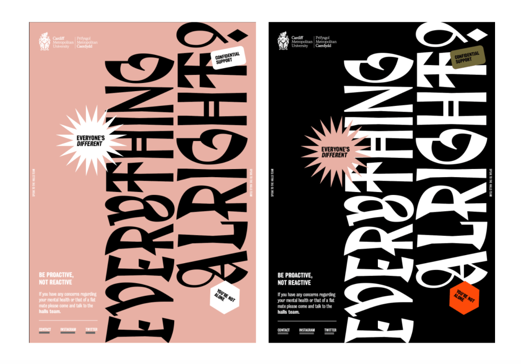
Final designs. I wanted to add a black version of all of the posters in the keep with the pace, using only colours posters might just end up being too similar, so I wanted something a bit different, whilst also keeping a small amount of the colours to make it instantly recognisable.
