
Although my website was a place for me to be expressive and show off who I am as a designer, I was also aware that too much is too much, and I wanted to do some research into other web portfolios to take a look at how other studios and designers put their work across.
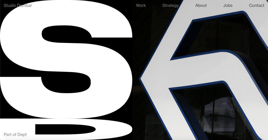
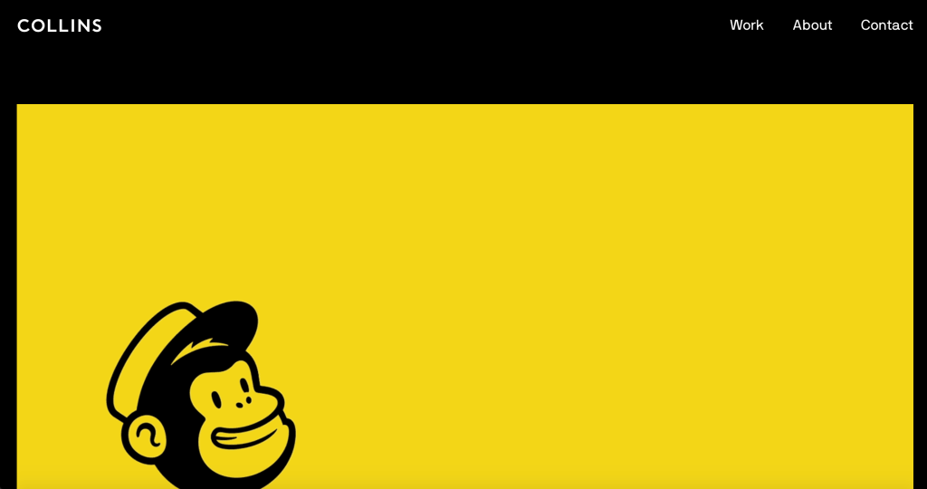

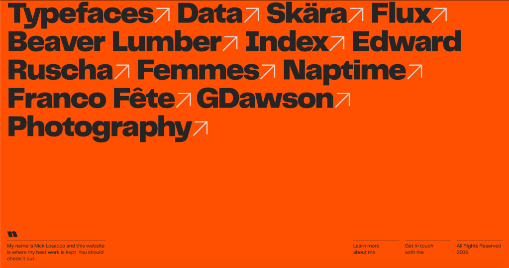
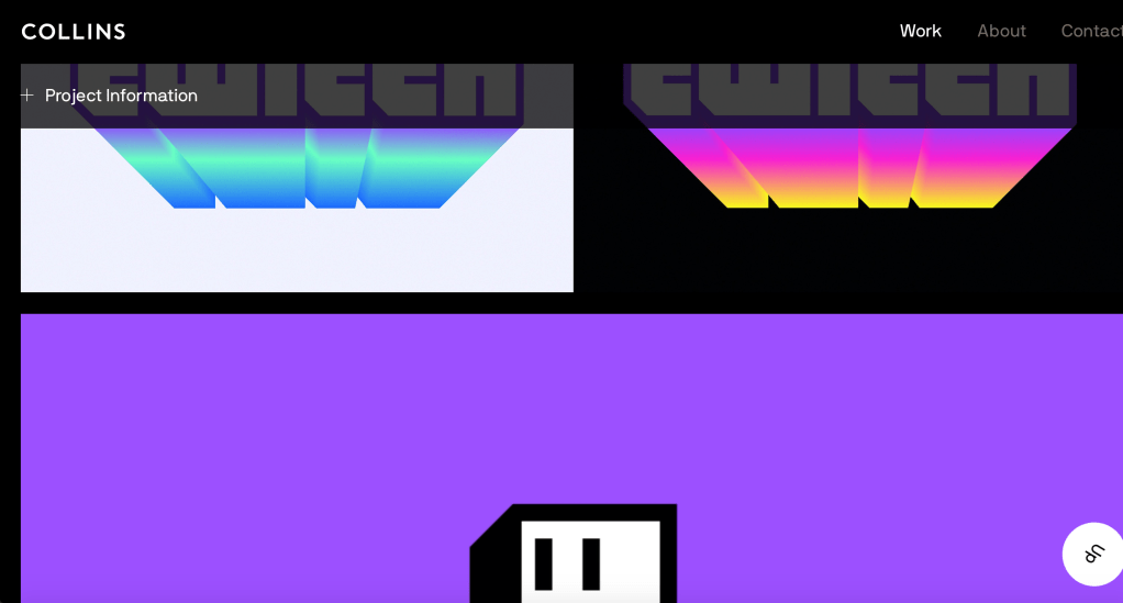
I looked at a variety of different portfolio designs, from very basic designs with just their logo and all their work, to something a bit more complex with a hero image/home screen. Although I didn’t want to go too over the top and flamboyant, it was important for me to have a home page with some sort of imagery on it to captivate the viewer and to show off my style to entice them in. The image above for example, by Nick Losacco, a type designer, has a home page which is bright and eye catching but also very simplistic at the same time. I also took influence from many other large scale companies such as Collins and Studio Dumbar to look at the menus, they all tend to be very simple menus purely outlining each page of the site.

As well as the home pages, I wanted to take a look at their work to see how it’s laid out and presented, as expected it was all very similar, displaying the work with as little distraction as possible to not take away from the work itself.
